14 Day 12: Movement
14.1 Technologies/Techniques
- Working with R Simple Features
{sf} - Incorporating
{albersusa}composite projections - Working with external data
- Using
{ggplot2}geom_sf()andgeom_curve()to draw flowing lines of commute data - Making faceted maps
14.2 Data Source: U.S. Census Commuting Flows
The U.S. Census’ American Community Survey (ACS) asks respondents about their primary workplace location. When information about workers’ residence location and workplace location are coupled, a commuting flow is generated. The origin-destination flow format informs our understanding of interconnectedness between communities, including the interchange of people, goods, and services. They make this data available online49 and I decided to take a look at all the places Mainers go (outside of Maine) to work.
The ACS Commuting Flows data is logged by county, so let’s bring in the composite county map from {albersusa}:
Now we’ll retrieve the ACS data and clean it up a bit (it’s not the worst Excel file, but it needs work):
if (!file.exists(here::here("data/table1.xlsx"))){
  download.file(
    url = "https://www2.census.gov/programs-surveys/demo/tables/metro-micro/2015/commuting-flows-2015/table1.xlsx",
    destfile = here::here("data/table1.xlsx")
  )
}read_excel(here::here("data/table1.xlsx"), skip=6) %>%
janitor::clean_names() %>%
select(
start_state_fips = state_fips_code_1,
start_county_fips = county_fips_code_2,
start_state = state_name_3,
start_county = county_name_4,
end_state_fips = state_fips_code_5,
end_county_fips = county_fips_code_6,
end_state = state_name_7,
end_county = county_name_8,
workers = workers_in_commuting_flow,
moe = margin_of_error
) %>%
mutate(end_state_fips = gsub("^0", "", end_state_fips)) -> xdf
glimpse(xdf)
## Observations: 139,435
## Variables: 10
## $ start_state_fips <chr> "01", "01", "01", "01", "01", "01", "01", "01", "01…
## $ start_county_fips <chr> "001", "001", "001", "001", "001", "001", "001", "0…
## $ start_state <chr> "Alabama", "Alabama", "Alabama", "Alabama", "Alabam…
## $ start_county <chr> "Autauga County", "Autauga County", "Autauga County…
## $ end_state_fips <chr> "01", "01", "01", "01", "01", "01", "01", "01", "01…
## $ end_county_fips <chr> "001", "013", "021", "043", "047", "051", "053", "0…
## $ end_state <chr> "Alabama", "Alabama", "Alabama", "Alabama", "Alabam…
## $ end_county <chr> "Autauga County", "Butler County", "Chilton County"…
## $ workers <dbl> 8828, 6, 504, 27, 296, 2186, 14, 271, 8, 79, 97, 31…
## $ moe <dbl> 752, 10, 228, 44, 130, 486, 23, 142, 16, 108, 68, 5…14.3 Making Commuting Flows
Now we’ll build from/to pairs of places Mainers go outside of Maine to work. First we’ll get the start/end county FIPS code:
filter(xdf, start_state == "Maine", end_state != "Maine") %>%
  filter(start_county_fips != end_county_fips) %>%
  mutate(
    start_fips = glue::glue("{start_state_fips}{start_county_fips}") %>%
      as.character() %>%
      factor(levels = levels(cmap$fips)),
    end_fips = glue::glue("{end_state_fips}{end_county_fips}") %>%
      as.character() %>%
      factor(levels = levels(cmap$fips))
  ) -> me_start

glimpse(me_start)
## Observations: 501
## Variables: 12
## $ start_state_fips  <chr> "23", "23", "23", "23", "23", "23", "23", "23", "23…
## $ start_county_fips <chr> "001", "001", "001", "001", "001", "001", "001", "0…
## $ start_state       <chr> "Maine", "Maine", "Maine", "Maine", "Maine", "Maine…
## $ start_county      <chr> "Androscoggin County", "Androscoggin County", "Andr…
## $ end_state_fips    <chr> "09", "12", "17", "17", "22", "22", "24", "25", "25…
## $ end_county_fips   <chr> "009", "086", "031", "097", "057", "109", "037", "0…
## $ end_state         <chr> "Connecticut", "Florida", "Illinois", "Illinois", "…
## $ end_county        <chr> "New Haven County", "Miami-Dade County", "Cook Coun…
## $ workers           <dbl> 4, 15, 37, 9, 22, 16, 10, 10, 53, 12, 2, 7, 8, 6, 9…
## $ moe               <dbl> 6, 19, 42, 14, 32, 26, 14, 13, 49, 13, 6, 11, 14, 9…
## $ start_fips        <fct> 23001, 23001, 23001, 23001, 23001, 23001, 23001, 23…
## $ end_fips          <fct> 09009, 12086, 17031, 17097, 22057, 22109, 24037, 25…
Then compute the county centroids so we have from/to points to use with geom_curve():
select(cmap, fips, geometry) %>%
  mutate(geometry = st_centroid(geometry)) %>%
  st_coordinates() %>%
  as_tibble() %>%
  bind_cols(
    select(cmap, fips) %>%
      as_tibble() %>%
      select(-geometry)
  ) %>%
  select(fips, lng = X, lat = Y) -> centers

glimpse(centers)
## Observations: 3,143
## Variables: 3
## $ fips <fct> 01001, 01009, 01017, 01021, 01033, 01045, 01051, 01065, 01079, 0…
## $ lng  <dbl> 1253479.8, 1237658.1, 1363279.6, 1241407.0, 1114517.1, 1367007.1…
## $ lat <dbl> -1285059.8, -1124835.1, -1224657.2, -1251718.1, -1063167.5, -139…ggplot() +
geom_point(data = centers, aes(lng, lat), size = 0.125) +
coord_sf(crs = us_laea_proj, datum = NA) +
labs(x = NULL, y = NULL) +
theme_ipsum_es(grid="")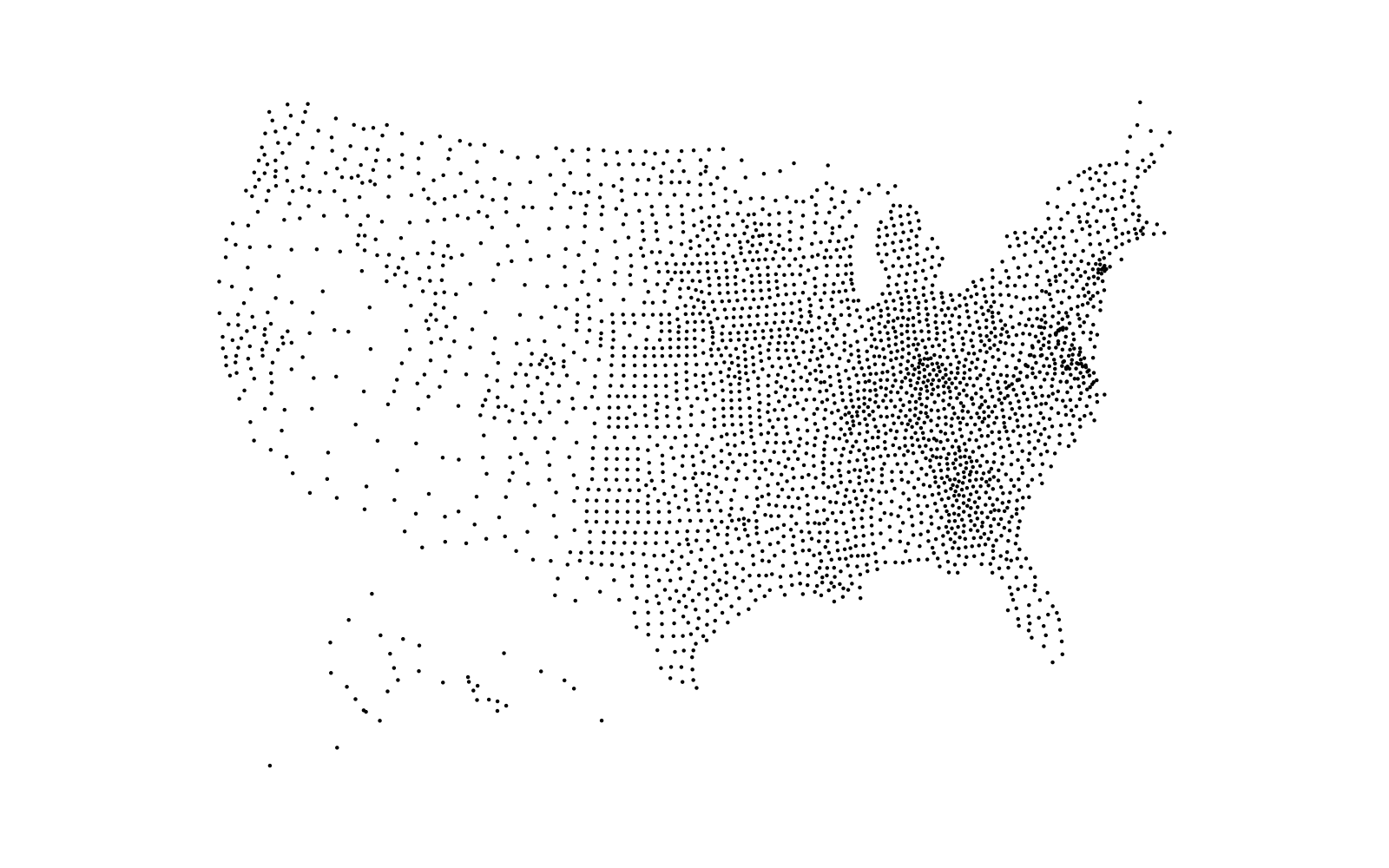
We’re going to make a faceted map by starting Maine county. We can make the facet names more useful if we include both the county name as well as how many folks move from one county to another for work:
count(me_start, start_county, wt=workers, sort=TRUE) %>%
  mutate(lab = glue::glue("{gsub(' County', '', start_county)} → {scales::comma(n, accuracy=1)}")) -> labs

glimpse(labs)
## Observations: 16
## Variables: 3
## $ start_county <chr> "York County", "Cumberland County", "Oxford County", "An…
## $ n            <dbl> 17739, 3350, 1758, 525, 516, 446, 342, 247, 188, 168, 15…
## $ lab          <glue> "York → 17,739", "Cumberland → 3,350", "Oxford → 1,758"…
Finally, we’re take those country centroids and make the final from/to pairs:
left_join(
  me_start, centers,
  by = c("start_fips"="fips")
) %>%
  rename(start_lng = lng, start_lat = lat) %>%
  left_join(centers, by = c("end_fips"="fips")) %>%
  rename(end_lng = lng, end_lat = lat) %>%
  left_join(labs, "start_county") %>%
  mutate(lab = factor(lab, levels = labs$lab)) -> start

glimpse(start)
## Observations: 501
## Variables: 18
## $ start_state_fips  <chr> "23", "23", "23", "23", "23", "23", "23", "23", "23…
## $ start_county_fips <chr> "001", "001", "001", "001", "001", "001", "001", "0…
## $ start_state       <chr> "Maine", "Maine", "Maine", "Maine", "Maine", "Maine…
## $ start_county      <chr> "Androscoggin County", "Androscoggin County", "Andr…
## $ end_state_fips    <chr> "09", "12", "17", "17", "22", "22", "24", "25", "25…
## $ end_county_fips   <chr> "009", "086", "031", "097", "057", "109", "037", "0…
## $ end_state         <chr> "Connecticut", "Florida", "Illinois", "Illinois", "…
## $ end_county        <chr> "New Haven County", "Miami-Dade County", "Cook Coun…
## $ workers           <dbl> 4, 15, 37, 9, 22, 16, 10, 10, 53, 12, 2, 7, 8, 6, 9…
## $ moe               <dbl> 6, 19, 42, 14, 32, 26, 14, 13, 49, 13, 6, 11, 14, 9…
## $ start_fips        <fct> 23001, 23001, 23001, 23001, 23001, 23001, 23001, 23…
## $ end_fips          <fct> 09009, 12086, 17031, 17097, 22057, 22109, 24037, 25…
## $ start_lng         <dbl> 2309793, 2309793, 2309793, 2309793, 2309793, 230979…
## $ start_lat         <dbl> 341072.6, 341072.6, 341072.6, 341072.6, 341072.6, 3…
## $ end_lng           <dbl> 2207736.9, 1957628.3, 1005063.9, 982123.2, 932468.6…
## $ end_lat           <dbl> -28338.31, -1928437.75, -276629.17, -225515.15, -16…
## $ n                 <dbl> 525, 525, 525, 525, 525, 525, 525, 525, 525, 525, 5…
## $ lab               <fct> Androscoggin → 525, Androscoggin → 525, Androscoggi…
14.4 Drawing the Map
For the final map product we’ll use color to help signify volume of workers since using size might overwhelm the map on some facets given how small they are. We’ll also order the facets by most number of outflows to least.
ggplot() +
  geom_sf(data = cmap, color = "#b2b2b277", size = 0.05, fill = "#3B454A") +
  geom_curve(
    data = start,
    aes(
      x = start_lng, y = start_lat, xend = end_lng, yend = end_lat,
      color = workers
    ),
    size = 0.15, arrow = arrow(type = "open", length = unit(5, "pt"))
  ) +
  scale_color_distiller(
    limits = range(start$workers), labels = scales::comma,
    trans = "log10", palette = "Reds", direction = 1, name = "Worker\nOutflow"
  ) +
  coord_sf(datum = NA, ylim = c(-2500000.0, 1500000)) +
  facet_wrap(~lab) +
  labs(
    x = NULL, y = NULL,
    title = "Oh The Places [Mainers] Will Go [For Work]!",
    subtitle = "2011-2015 5-Year ACS commuting outflows from Maine counties to out-of-state counties; sorted from most worker outflow to least.",
    caption = "Data source: <www.census.gov/data/tables/2015/demo/metro-micro/commuting-flows-2015.html> • #30DayMapChallenge"
  ) +
  theme_ft_rc(grid="", strip_text_family = font_es_bold, strip_text_size = 13) +
  theme(strip.text = element_text(color = "white"))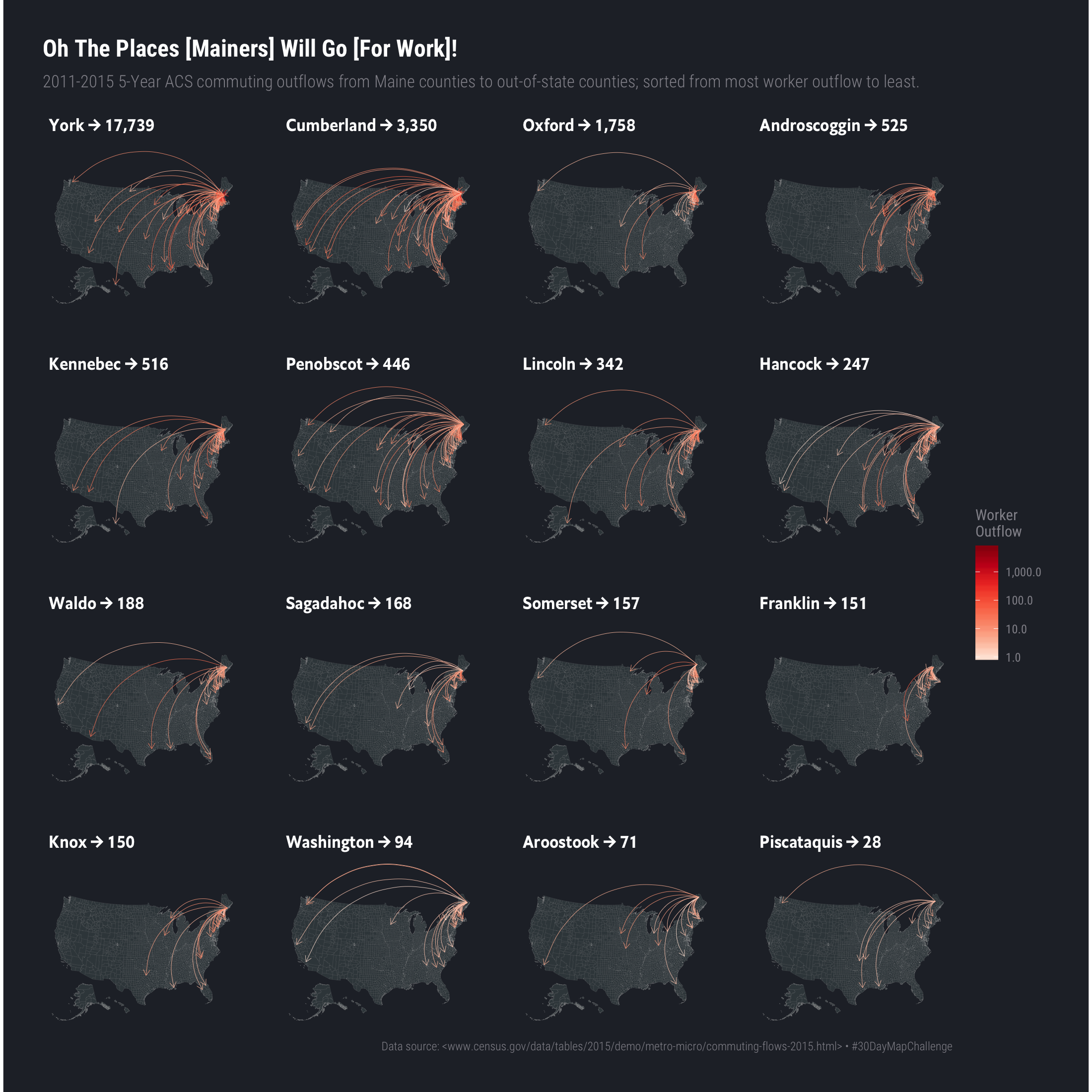
14.5 In Review
We turned a fairly bland data source into spatial data and looked at worker outflows from Maine to other states. We did this by computing county centers and associating them with the original source data. Maine only has sixteen counties so this was an easier task than it might be for other states.
14.6 Try This At Home
Try using size vs (or with) color to see if it does crowd out some map facets.
Generate large, individual maps vs facets to make it easier to see the outflows.
Use techniques from previous days to make a {mapdeck} version of the outflows.
Pick another state and focus on the top counties and compare the outflows.
Focus just on Maine county to Maine county flows and see what patterns may show up.