8 Day 6: Blue
8.1 Technologies/Techniques
- R Simple Features
{sf} - Working with
{rnaturalearth}baselayers - Using
{ggplot2}geom_sf()to make a choropleth map
8.2 Data Source: World Happiness Report
The World Happiness Report37 is an annual survey of the state of global happiness that ranks 156 countries by how happy their citizens perceive themselves to be. Since the opposite of “happy” is “sad” and another word for “sad” is “blue” I decided to chart just how miserable folks around the globe perceive themselves to be.
They’ve tucked the data away into a fairly usable Excel spreadsheet38:
library(sf)
library(grid)
library(gridExtra)
library(readxl)
library(rnaturalearth)
library(hrbrthemes)
library(tidyverse)
if (!file.exists(here::here("data/Chapter2OnlineData.xls"))) {
download.file(
url = "https://s3.amazonaws.com/happiness-report/2019/Chapter2OnlineData.xls",
destfile = here::here("data/Chapter2OnlineData.xls")
)
}
read_excel(here::here("data/Chapter2OnlineData.xls"), 2) %>%
janitor::clean_names() %>%
select(country, happiness_score) %>%
mutate(country = case_when(
country == "Russia" ~ "Russian Federation",
country == "Taiwan Province of China" ~ "Taiwan",
country == "Congo (Brazzaville)" ~ "Democratic Republic of the Congo",
country == "Congo (Kinshasa)" ~ "Republic of Congo",
country == "Gambia" ~ "The Gambia",
country == "Ivory Coast" ~ "Côte d'Ivoire",
country == "North Cyprus" ~ "Northern Cyprus",
country == "Palestinian Territories" ~ "Palestine",
country == "South Korea" ~ "Republic of Korea",
country == "Hong Kong S.A.R. of China" ~ "Hong Kong",
country == "Laos" ~ "Lao PDR",
TRUE ~ country
)) -> happy
glimpse(happy)
## Observations: 156
## Variables: 2
## $ country <chr> "Finland", "Denmark", "Norway", "Iceland", "Netherlan…
## $ happiness_score <dbl> 7.7689, 7.6001, 7.5539, 7.4936, 7.4876, 7.4802, 7.343…You likely noticed the cleanup of some country names. We need to do that since we are going to join the data with the {rnaturalearth} country polygons and the names aren’t exactly the same in that shapefile:
ne_countries(scale = "medium", returnclass = "sf") %>%
  filter(name != "Antarctica") %>%
  st_transform("+proj=eqearth +wktext") -> world

left_join(world, happy, by=c("name_long"="country")) %>%
  select(country=name_long, happiness_score) -> happy_sf

happy_sf
## Simple feature collection with 240 features and 2 fields
## geometry type:  MULTIPOLYGON
## dimension:      XY
## bbox:           xmin: -16920570 ymin: -6792374 xmax: 16920570 ymax: 8315130
## epsg (SRID):    NA
## proj4string:    +proj=eqearth +wktext
## First 10 features:
##                 country happiness_score                       geometry
## 1                 Aruba              NA MULTIPOLYGON (((-6621593 15...
## 2           Afghanistan          3.2033 MULTIPOLYGON (((6470178 460...
## 3                Angola              NA MULTIPOLYGON (((1356094 -75...
## 4              Anguilla              NA MULTIPOLYGON (((-5891590 23...
## 5               Albania          4.7186 MULTIPOLYGON (((1677103 520...
## 6         Aland Islands              NA MULTIPOLYGON (((1488592 692...
## 7               Andorra              NA MULTIPOLYGON (((142647.3 51...
## 8  United Arab Emirates          6.8245 MULTIPOLYGON (((4950105 305...
## 9             Argentina          6.0863 MULTIPOLYGON (((-4903844 -6...
## 10              Armenia          4.5594 MULTIPOLYGON (((3855849 498...
8.3 Drawing the Map
For better or worse, today’s map isn’t very exciting. It’s just a choropleth (filled country polygons) of the happiness score for 2019 for each country in the survey using a custom palette created with scale_fill_gradientn().
# a custom palette to help focus on the blues
by_pal <- colorRampPalette(c("#313695", "#4575b4", "#74add1", "#abd9e9", "#e0f3f8", "#ffffbf", "#fee090"))(10)

ggplot() +
  geom_sf(
    data = happy_sf, aes(fill = happiness_score),
    size = 0.125, colour = "#2b2b2b77"
  ) +
  scale_fill_gradientn(
    name = "Happiness Score",
    colours = by_pal, limits = c(1, 10), breaks = 1:10,
    labels = c("Super Sad :-(", rep("", 3), "Meh", "...", rep("", 3), "Super Glad :-)")
  ) +
  guides(fill = guide_colorbar(title.position = "top")) +
  labs(
    title = "World Happiness Report 2019",
    subtitle = "Average Happiness across Countries (Pooled OLS); Gray indicates no measurement available.",
    caption = "Data source: <worldhappiness.report/faq/> • #30DayMapChallenge"
  ) +
  theme_ft_rc(grid="") +
  theme(plot.title = element_text(hjust = 0.5)) +
  theme(plot.subtitle = element_text(hjust = 0.5)) +
  theme(axis.text = element_blank()) +
  theme(legend.title = element_text(hjust = 0.5)) +
  theme(legend.key.width = unit(2, "lines")) +
  theme(legend.position = "bottom")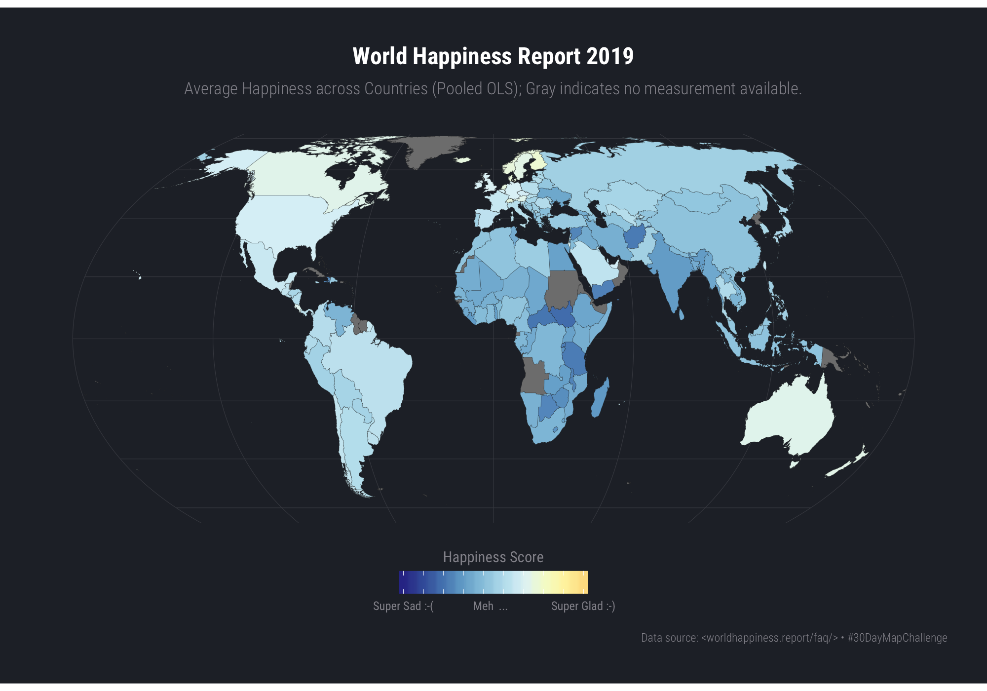
8.4 In Review
If nothing else, this challenge entry provides a base idiom for making country choropleths. It also shows that you can do a projection transformation outside of coord_sf().
8.5 Try This At Home
The World Happiness Report has multiple years of data and multiple measured values. Try animating the choropleth over time using the animation idiom from the previous chapter.