Avast me hearRties! (ok, enough of the pirate speak in a blog post)
It wouldn’t be TLAPD without out some modest code & idea pilfering from Mark Bulling & Simon Raper. While those mateys did a fine job hoisting up some R code (your really didn’t think I’d stop with the pirate speak, did you?) for their example, I took it one step furrrrther to build an animation of cumulative, yearly IRL pirate attacks from 1978 to the present. I found it a bit interesting to see how the hotspots shifted over time. Click on the graphic for the largeR version or I’ll make ye walk the plank!!.
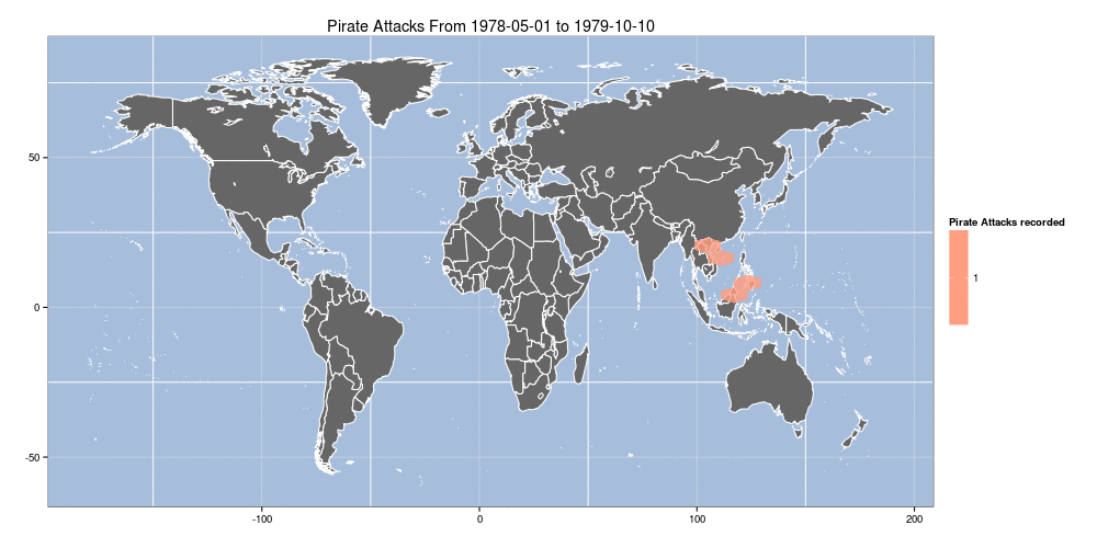
library(maps)
library(hexbin)
library(maptools)
library(ggplot2)
library(sp)
library(mapproj)

# piRate the data from the militaRy
download.file("http://msi.nga.mil/MSISiteContent/StaticFiles/Files/ASAM_shp.zip", destfile="ASAM_shp.zip")
unzip("ASAM_shp.zip")

# extRact the data fRame we need fRom the shape file
pirates.df <- as.data.frame(readShapePoints("ASAM 19 SEP 13")) # you may need to use a diffeRent name depending on d/l date

# get the woRld map data
world <- map_data("world")
world <- subset(world, region != "Antarctica") # inteRcouRse AntaRctica

# yeaRs we want to loop thoRugh
ends <- 1979:2013

# loop thRough, extRact data, build plot, save plot: BOOM
for (end in ends) {
  png(filename=sprintf("arrr-%d.png",end),width=500,height=250,bg="white") # change to 1000x500 or laRgeR
  dec.df <- pirates.df[pirates.df$DateOfOcc > "1970-01-01" & pirates.df$DateOfOcc < as.Date(sprintf("%s-12-31",end)),]
  rng <- range(dec.df$DateOfOcc)
  p <- ggplot()
  p <- p + geom_polygon(data=world, aes(x=long, y=lat, group=group), fill="gray40", colour="white")
  p <- p + stat_summary_hex(fun="length", data=dec.df, aes(x=coords.x1, y=coords.x2, z=coords.x2), alpha=0.8)
  p <- p + scale_fill_gradient(low="white", high="red", "Pirate Attacks recorded")
  p <- p + theme_bw() + labs(x="",y="", title=sprintf("Pirate Attacks From %s to %s",rng[1],rng[2]))
  p <- p + theme(panel.background = element_rect(fill='#A6BDDB', colour='white'))
  print(p)
  dev.off()
}

# requires imagemagick
system("convert -delay 45 -loop 0 arrr*g arrr500.gif")


