Skip navigation

Search Results for: zeroaccess

I’ve been doing a bit of graphing (with real, non-honeypot network data) as part of the research for the book I’m writing with @jayjacobs and thought one of the images was worth sharing (especially since it may not make it into the book :-).

Threat_View
Click image for larger view

This is a static screen capture of a D3 force-directed graph made with R, igraph & Vega of four ZeroAccess infected nodes desperately (each node tried ~200K times over a couple days) trying to break free of a firewall over the course of 11 days. The red nodes are unique destination IPs and purple ones are in the AlienVault IP Reputation database. Jay & I have read and blogged a great deal about ZeroAccess over the past year and finally had the chance to see a live slice of how pervasive (and, noisy) the network is even with just a view from a few infected nodes.

While the above graphic is the composite view of all 11 days, the following one is from just a single day with only two infected nodes trying to communicate out (this is a pure, hastily-crafted R/igraph image):

Two ZeroAccess Infected Nodes
Click image for larger view

There are some common destinations among the two, but each has a large list of unique ones; even the best, open IP reputation database on the planet only included a handful of the malicious endpoints, which means you really need to be looking at holistic behavior modeling vs port/destination alone (I filtered out legit destination traffic for these views) if you’re trying to find egressing badness (but you hopefully already knew that).

UPDATE: While the cautionary advice still (IMO) holds true, it turns out that – once I actually looked at the lat/lng pair being returned for the anomaly presented below, the weird results come from horrible precision resolution from the initial IP address → lat/lng conversion (which isn’t the fault of @fslabs, but of the service they used). It’s hard to get a ZIP code right/more precise when you only have integer resolution (38.0,-97.0).

We’re still crunching through some of the ZeroAccess data and have some (hopefully) interesting results to present, but an weirld GeoIP anomaly has come up that I wanted to quickly share.

To get some more granular data, I’m using the GeoNames API to get the latitude/longitude pairs down to various US-level ZIP codes to facilitate additional analysis. During this exercise (which hasn’t finished as of this blog post due to needing to pace the API calls), it has become quite noticeable that GeoIP-coding definitely has flaws. Take, for example, Potwin, KS:

This cozy little town (population ~450) has the largest collection of bots, so far : 800. Yes, 800 bots (computers) in a 128 acre town of 450 people. (#unlikely)

Either there’s some weirdness in the way @fslabs is tracking the bots (which is possible since we only have a lat/long file with no other context/data to look at) or we need to treat GeoIP results very lightly – or at least do some post-processing validation – since I suspect a decent portion of the 800 bots are actually in neighbor to the southwest:

I know GeoIP translation is not an exact science and is dependent upon a whole host of factors, but this one was just pretty humorous. It has caused me to slightly question the @fslabs data a bit, but I’m comfortable assuming they did sufficient due diligence before crafting an IP address list to geocode.

In case you’re wondering what the other “Top US Bots” are (with 7K more to crunch):

NOTE: A great deal of this post comes from @jayjacobs as he took a conversation we were having about thoughts on ways to look at the data and just ran like the Flash with it.

Did you know that – if you’re a US citizen – you have approximately a 1 in 5 chance of getting the flu this year? If you’re a male (no regional bias for this one), you have a 1 in 400 chance of developing Hodgkin’s Disease and a 1 in 5,000 chance of dying from testicular cancer.

Moving away from medical stats, if you’re a NJ resident, you have a 1 in 1,000 chance of winning $275 in the straight “Pick 3” lottery and a 1 in 13,983,816 chance of jackpotting the “Pick 6”.

What does this have to do with botnets? Well, we’ve determined that – if you’re a US resident – you have a 1 in 6,000 chance of getting the ZeroAccess flu (or winning the ZeroAccess lottery, whichever makes you feel better). Don’t believe me? Let’s look at the data.

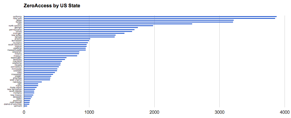
For starters, we’re working with this file which is a summary file by US state that includes actual state population, the number of internet users in that state and the number of bots in that state (data is from Internet World Statistics). As an example, Maine has:

  • 1,332,155 residents
  • 1,102,933 internet users
  • 219 bot infections

(To aspiring security data scientists out there, I should point out that we’ve had to gather or crunch through on our own much of the data we’re using. While @fsecure gave us a great beginning, there’s no free data lunch)

Where’d we get the 1 : 6000 figure? We can do some quick R math and view the histogram and summary data:

#read in the summary data
df <- read.csv("zerogeo.csv", header=T)
 
# calculate how many people for 1 bot infection per state:
df$per <- round(df$intUsers/df$bots)
 
# plot histogram of the spread
hist(df$per, breaks=10, col="#CCCCFF", freq=T, main="Internet Users per Bot Infection")

Along with the infection rate/risk, we can also do a quick linear regression to see if there’s a correlation between the number of internet users in a state and the infection rate of that state:

# "lm" is an R function that, amongst other things, can be used for linear regression
# so we use it to performa quick regression on how internet users describe bot infections
users <- lm(df$bots~df$intUsers)
 
# and, R makes it easy to plot that model
plot(df$intUsers, df$bots, xlab="Internet Users", ylab="Bots", pch=19, cex=0.7, col="#3333AA")
abline(users, col="#3333AA")

Apart from some outliers (more on that in another post), there is – as Jay puts it – “very strong (statistical) relationship between the population of internet users and the infection rate in the states.” Some of you may be saying “Duh?!” right about now, but all we’ve had up until this point are dots or colors on a map. We’ve taken that superficial view (yes, it’s just really eye candy) and given it some depth and meaning.

We’re pulling some demographic data from the US Census and will be doing another data summarization at the ZIP code level to see what other aspects (I’m really focused on analyzing median income by ZIP code to see if/how that describes bot presence).

If you made it this far, I’d really like to know what you would have thought the ZeroAccess “flu” chances were before seeing that it’s 1 : 6,000 (since your guesstimate was probably based on the map views).

Finally, Jay used the summary data to work up a choropleth in R:

# setup our environment
library(ggplot2)
library(maps)
library(colorspace)
 
# read the data
zero <- read.csv("zerogeo.csv", header=T)
 
# extract state geometries from maps library
states <- map_data("state")
 
# this "cleans up the data" to make it easier to merge with the built in state data
zero.clean <- data.frame(region=tolower(zero$state), 
                         perBot=round(zero$intUsers/zero$bots),
                         intUsers=zero$intUsers)
choro <- merge(states, zero.clean, sort = FALSE, by = "region")
 
choro <- choro[order(choro$order),]
 
# "bin" the data to enable us to use a better set of colors
choro$botBreaks <- cut(choro$perBot, 10)
 
# get the plot
c1 = qplot(long, lat, data = choro, group = group, fill = botBreaks, geom = "polygon", 
      main="Population of Internet Users to One Zero Access Botnet Infenction") +
        theme(axis.line=element_blank(),axis.text.x=element_blank(),
              axis.text.y=element_blank(),axis.ticks=element_blank(),
              axis.title.x=element_blank(),
              axis.title.y=element_blank(),
              panel.background=element_blank(),panel.border=element_blank(),panel.grid.major=element_blank(),
              panel.grid.minor=element_blank(),plot.background=element_blank())
 
# display it with modified color scheme (we hate the default ggplot2 blue)
c1 + scale_fill_brewer(palette = "Reds")

While shiny visualizations are all well-and-good, sometimes plain ol’ charts & graphs can give you the data you’re looking for.

If we take the one-liner filter from the previous example and use it to just output CSV-formatted summary data:

cat ZeroAccessGeoIPs.csv | cut -f1,1 -d\,| sort | uniq -c | sort -n | tr "[:upper:]" "[:lower:]" | while read a b ; do echo "$b, $a" ; done > bots.csv

then we can take the output file and shove it in Google Docs to do more traditional analysis, beginning with the classic bar chart:

In this view, it’s pretty obvious that the United States is an outlier with Japan a distant second. This is interesting in-and-of itself since Japan has 126,475,664 inhabitants and the United States has 313,232,044 (i.e. the U.S. has ~3x more people). If we take a look at Internet users, Japan has 101,228,736 while the U.S. has 245,203,319 (i.e. the U.S. has ~2x more internet users). If we look at GDP, Japan’s was $5.869 trillion while the U.S. cranked out $15.09 trillion (i.e. U.S. is ~3x). Yet, the botnet stats show that Japan has 10,110 bots while the U.S. has 47,880 (i.e. the U.S. has ~5x more bots). So, clearly U.S. citizens are either more targeted, have system characteristics/user-behavior or user-attributes that make them more susceptible to bot infections.

This type of data doesn’t always jump out from an eye-candy visualization.

If we filter out the U.S. outlier, there’s a more gradual progression between the other countries:

We now have some great starting points – using simple/freely available tools – to ask more questions, which is one of the fundamental goals of data analysis.

Taking this one step further before my next post, if we use some R code to convert longitude & latitude to U.S. state names (yes, there’s a US-centric bias to some of my tools :-), we can see – with a traditional bar chart – which ones were more impacted than others:


Click for larger version

We can use the state names to make a choropleth, but I’ll leave that as an exercise to the reader, or may do a sample with that in Python in an upcoming post.

The data used for these charts are all available in Google Docs.

In the spirit of the previous example this one shows you how to do a quick, country-based choropleth in D3/jQuery with some help from the command-line since not everyone is equipped to kick out some R and most folks I know are very handy at a terminal prompt.

I took the ZeroAccessGeoIPs.csv file and ran it through a quick *nix one-liner to get a JSON-ish associative array of country abbreviations to botnet counts in that country:

cat ZeroAccessGeoIPs.csv | cut -f1,1 -d\,| sort | uniq -c | sort -n | tr "[:upper:]" "[:lower:]" | while read a b ; do echo "{ \"$b\" : \"$a\" }," ; done > botcounts.js

I found a suitable SVG world map on Wikipedia that had id="ABBREV" country groupings. This is not the most #spiffy map (and, if you dig a bit more than I did, you’ll probably find a better one) but it works for this example and shows you how quickly you can find the bits you need to get a visualization together.

With that data and the SVG file pasted into the same HTML document, it’s a simple matter of generating a gradient with some d3 magic:

color = d3.scale.log().domain([1,47880]).range(["#FFEB38","#F54747"]);

and, then, looping over the associative array while using said color range to fill in the country shapes:

 $.each(botcounts, function(key, value) {
    $('#' + key).css('fill',color(value))
  });
}) ;

we get:

You can view the full, larger example on this separate page where you can do a view-source to see the entire code. I really encourage you to do this as you’ll see that there are just a handful of lines of your own code necessary to make a compelling visualization. Sure, you’ll want to add a legend and some other styling, but the basics can be done in – literally – minutes, leaving customized details to your imagination & creativity.

The entire map could have been done in D3, but I only spent about 5 minutes on the entire exercise (including the one-liner) and am still more comfortable in jQuery than I am in D3. I did this also to show that it’s perfectly fine (as Mainers are wont to say) to do pre-processing and hard-coding when cranking out visualizations. The goal is to communicate something to your audience and there are no hard-and-fast rules governing this process. As with any coding, if you think you’ll be doing this again it is a wise idea to make the solution more generic, but there’s nothing wrong with taking valid shortcuts to get results out as quickly as possible.

Definitely feel invited to share your creations in the comments, especially if you find a better map!

Since F-Secure was #spiffy enough to provide us with GeoIP data for mapping the scope of the ZeroAccess botnet, I thought that some aspiring infosec data scientists might want to see how to use something besides Google Maps & Google Earth to view the data.

If you look at the CSV file, it’s formatted as such (this is a small portion…the file is ~140K lines):

CL,"-34.9833","-71.2333"
PT,"38.679","-9.1569"
US,"42.4163","-70.9969"
BR,"-21.8667","-51.8333"

While that’s useful, we don’t need quotes and a header would be nice (esp for some of the tools I’ll be showing), so a quick cleanup in vi gives us:

Code,Latitude,Longitude
CL,-34.9833,-71.2333
PT,38.679,-9.1569
US,42.4163,-70.9969
BR,-21.8667,-51.8333

With just this information, we can see how much of the United States is covered in ZeroAccess with just a few lines of R:

# read in the csv file
bots = read.csv("ZeroAccessGeoIPs.csv")
 
# load the maps library
library(maps)
 
# draw the US outline in black and state boundaries in gray
map("state", interior = FALSE)
map("state", boundary = FALSE, col="gray", add = TRUE)
 
# plot the latitude & longitudes with a small dot
points(x=bots$Longitude,y=bots$Latitude,col='red',cex=0.25)

Can you pwn me now?

Click for larger map

If you want to see how bad your state is, it’s just as simple. Using my state (Maine) it’s just a matter of swapping out the map statements with more specific data:

bots = read.csv("ZeroAccessGeoIPs.csv")
library(maps)
 
# draw Maine state boundary in black and counties in gray
map("state","maine",interior=FALSE)
map("county","maine",boundary=FALSE,col="gray",add=TRUE)
 
points(x=bots$Longitude,y=bots$Latitude,col='red',cex=0.25)

We’re either really tech/security-savvy or don’t do much computin’ up here

Click for larger map

Because of the way the maps library handles geo-plotting, there are points outside the actual map boundaries.

You can even get a quick and dirty geo-heatmap without too much trouble:

bots = read.csv("ZeroAccessGeoIPs.csv")
 
# load the ggplot2 library
library(ggplot2)
 
# create an plot object for the heatmap
zeroheat <- qplot(xlab="Longitude",ylab="Latitude",main="ZeroAccess Botnet",geom="blank",x=bots$Longitude,y=bots$Latitude,data=bots)  + stat_bin2d(bins =300,aes(fill = log1p(..count..))) 
 
# display the heatmap
zeroheat


Click for larger map

Try playing around with the bins to see how that impacts the plots (the stat_bin2d(…) divides the “map” into “buckets” (or bins) and that informs plot how to color code the output).

If you were to pre-process the data a bit, or craft some ugly R code, a more tradtional choropleth can easily be created as well. The interesting part about using a non-boundaried plot is that this ZeroAccess network almost defines every continent for us (which is kinda scary).

That’s just a taste of what you can do with just a few, simple lines of R. If I have some time, I’ll toss up some examples in Python as well. Definitely drop a note in the comments if you put together some #spiffy visualizations with the data they provided.