Skip navigation

Category Archives: d3

WebR 0.1.0 was released! I had been git-stalking George (the absolute genius who we all must thank for this) for a while and noticed the GH org and repos being updated earlier this week, So, I was already pretty excited.

It dropped today, and you can hit that link for all the details and other links.

I threw together a small demo to show how to get it up and running without worrying about fancy “npm projects” and the like.

View-source on that link, or look below for a very small (so, hopefully accessible) example of how to start working with WASM-ified R in a web context.

UPDATE:

Four more links:


<html xmlns="http://www.w3.org/1999/xhtml"> <head> <meta charset="UTF-8"> <meta name="viewport" content="width=device-width, initial-scale=1"> <title>WebR Super Simple Demo</title> <link rel="stylesheet" href="/style.css" type="text/css"> <style> li { font-family:monospace; } .nospace { margin-bottom: 2px; } </style> </head> <body> <div id="main"> <p>Simple demo to show the basics of calling the new WebR WASM!!!!</p> <p><code>view-source</code> to see how the sausage is made</code></p> <p class="nospace">Input a number, press "Call R" (when it is enabled) and magic will happen.</p> <!-- We'll pull the value from here --> <input type="text" id="x" value="10"> <!-- This button is disabled until WebR is loaded --> <button disabled="" id="callr">Call R</button> <!-- Output goes here --> <div id="output"></div> <!-- WebR is a module so you have to do this. --> <!-- NOTE: Many browsers will not like it if `.mjs` files are served --> <!-- with a content-type that isn't text/javascript --> <!-- Try renaming it from .mjs to .js if you hit that snag. --> <script type="module"> // https://github.com/r-wasm/webr/releases/download/v0.1.0/webr-0.1.0.tar.gz // // I was lazy and just left it in one directory import { WebR } from '/webr-d3-demo/webr.mjs'; // service workers == full path starting with / const webR = new WebR(); // get ready to Rumble await webR.init(); // shot's fired console.log("WebR"); // just for me b/c I don't trust anything anymore // we call this function on the button press async function callR() { let x = document.getElementById('x').value.trim(); // get the value we input; be better than me and do validation console.log(`x = ${x}`) // as noted, i don't trust anything let result = await webR.evalR(`rnorm(${x},5,1)`); // call some R! let output = await result.toArray(); // make the result something JS can work with document.getElementById("output").replaceChildren() // clear out the <div> (this is ugly; be better than me) // d3 ops d3.select("#output").append("ul") const ul = d3.select("ul") ul.selectAll("li") .data(output) .enter() .append("li") .text(d => d) } // by the time we get here, WebR is ready, so we tell the button what to do and re-enable the button document.getElementById('callr').onclick = callR; document.getElementById('callr').disabled = false; </script> <!-- d/l from D3 site or here if you trust me --> <script src="d3.min.js"></script> </div> </body> </html>
I’ve been (mostly) keeping up with annual updates for my R/{sf} U.S. foliage post which you can find on GH. This year, we have Quarto, and it comes with so many batteries included that you’d think it was Christmas. One of those batteries is full support for the Observable runtime. These are used in {ojs} Quarto blocks, and rendered versions can run anywhere.

The Observable platform is great for both tinkering and publishing (we’re using it at work for some quick or experimental vis work), and with a few of the recent posts, here, showing how to turn Observable notebooks into Quarto documents, you’re literally two clicks or one command line away from using any public Observable notebook right in Quarto.

I made a version of the foliage vis in Observable and then did the qmd conversion using the Chrome extension, tweaked the source a bit and published the same in Quarto.

The interactive datavis uses some foundational Observable/D3 libraries:

In the JS code we set some datavis-centric values:

foliage_levels = [0.01, 0.1, 0.2, 0.3, 0.4, 0.5, 0.6]
foliage_colors = ["#83A87C", "#FCF6B4", "#FDCC5C", "#F68C3F", "#EF3C23", "#BD1F29", "#98371F"]
foliage_labels = ["No Change", "Minimal", "Patchy", "Partial", "Near Peak", "Peak", "Past Peak"]
week_label = ["Sept 5th", "Sept 12th", "Sept 19th", "Sept 26th", "Oct 3rd", "Oct 10th", "Oct 17th", "Oct 24th", "Oct 31st", "Nov 7th", "Nov 14th", "Nov 21st"]

We then borrow the U.S. Albers-projected topojson file from the Choropleth example notebook and rebuild the outline mesh and county geometry collections, since we need to get rid of Alaska and Hawaii (they’re not present in the source data). We do this by filtering out two FIPS codes:

counties = {
  var cty = topojson.feature(us, us.objects.counties);
  cty.features = cty.features.filter(
    (d) => (d.id.substr(0, 2) != "02") & (d.id.substr(0, 2) != "15")
  );
  return cty;
}

I also ended up modifying the source CSV a bit to account for missing counties.

After that, it was a straightforward call to our imported Choropleth function:

chart = Choropleth(rendered2022, {
  id: (d) => d.id.toString().padStart(5, "0"), // this is needed since the CSV id column is numeric
  value: (d) => d[week_label.indexOf(week) + 1], // this gets the foliage value based on which index the selected week is at
  scale: d3.scaleLinear, // this says to map foliage_levels to foliage_colors directly
  domain: foliage_levels,
  range: foliage_colors,
  title: (f, d) =>
    `${f.properties.name}, ${statemap.get(f.id.slice(0, 2)).properties.name}`, // this makes the county hover text the county + state names
  features: counties, // this is the counties we modified
  borders: statemesh, // this is the statemesh
  width: 975,
  height: 610
})

and placing the legend and scrubbing slider.

The only real difference between the notebook and qmd is the inclusion of the source functions rather than use Observable’s import (I’ve found that there’s a slight load delay for imports when network conditions aren’t super perfect and the inclusion of the source — WITH copyrights — makes up for that).

I’ve set up the Quarto project so that renders go to the docs/ directory, which makes it easy to publish as a GH page.

FIN

Drop issues on GH if anything needs clarifying or fixing and go experiment! You can’t break anything either on Observable or locally that version control can’t fix (yes, Observable has version control!).

Some things to consider modifying/adding:

  • have a click take you to a (selectable?) mapping service, so folks can get driving directions
  • turn the hover text into a proper tooltip
  • speed up or slow down the animation when ‘Play’ is tapped
  • use different colors
  • bring in older datasets (see the foliage GH repo) and make multiple maps or let the user select them or have them compare across years

The fine folks over at @ObservableHQ released a new javascript exploratory visualization library called Plot last week with great fanfare. It was primarily designed to be used in Observable notebooks and I quickly tested it out there (you can find them at my Observable landing page: https://observablehq.com/@hrbrmstr).

{Plot} doesn’t require Observable, however, and I threw together a small example that dynamically tracks U.S. airline passenger counts by the TSA to demonstrate how to use it in a plain web page.

It’s small enough that I can re-create it here:

TSA Total Traveler Throughput 2021 vs 2020 vs 2019 (same weekday)


and include the (lightly annotated) source:

fetch(
"https://observable-cors.glitch.me/https://www.tsa.gov/coronavirus/passenger-throughput",
{
  cache: "no-store",
  mode: "cors",
  redirect: "follow"
}
)
.then((response) => response.text()) // we get the text here
.then((html) => {

   var parser = new DOMParser();
   var doc = parser.parseFromString(html, "text/html"); // we turn it into DOM elements here

   // some helpers to make the code less crufty
   // first a function to make proper dates

   var as_date = d3.timeParse("%m/%d/%Y");

   // and, now, a little function to pull a specific <table> column and
   // convert it to a proper numeric array. I would have put this inline
   // if we were only converting one column but there are three of them,
   // so it makes sense to functionize it.

   var col_double = (col_num) => {
     return Array.from(
     doc.querySelectorAll(`table tbody tr td:nth-child(${col_num})`)
     ).map((d) => parseFloat(d.innerText.trim().replace(/,/g, "")));
   };

   // build an arquero table from the scraped columns

   var flights = aq
         .table({
            day: Array.from(
                   doc.querySelectorAll("table tbody tr td:nth-child(1)")
                 ).map((d) => as_date(d.innerText.trim().replace(/.{4}$/g, "2021"))),
            y2021: col_double(2),
            y2020: col_double(3),
            y2019: col_double(4)
        })
        .orderby("day")
        .objects()
        .filter((d) => !isNaN(d.y2021))

   document.getElementById('vis').appendChild(
     Plot.plot({
       marginLeft: 80,
       x: {
         grid: true
       },
       y: {
         grid: true,
         label: "# Passengers"
       },
       marks: [
         Plot.line(flights, { x: "day", y: "y2019", stroke: "#4E79A7" }),
         Plot.line(flights, { x: "day", y: "y2020", stroke: "#F28E2B" }),
         Plot.line(flights, { x: "day", y: "y2021", stroke: "#E15759" })
       ]
    })
  );

})
.catch((err) => err)

FIN

I’ll likely do a more in-depth piece on Plot in the coming weeks (today is Mother’s Dayin the U.S. and that’s going to consume most of my attention today), but I highly encourage y’all to play with this new, fun tool.

@theboysmithy did a [great piece](http://www.ft.com/intl/cms/s/0/6f777c84-322b-11e6-ad39-3fee5ffe5b5b.html) on coming up with an alternate view for a timeline for an FT piece.

Here’s an excerpt (read the whole piece, though, it’s worth it):

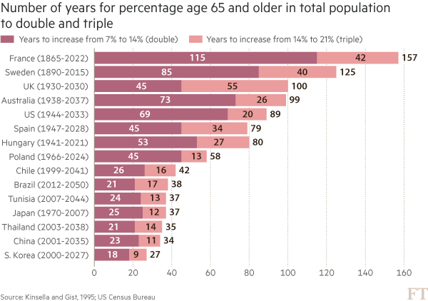
Here is an example from a story recently featured in the FT: emerging- market populations are expected to age more rapidly than those in developed countries. The figures alone are compelling: France is expected to take 157 years (from 1865 to 2022) to triple the proportion of its population aged over 65, from 7 per cent to 21 per cent; for China, the equivalent period is likely to be just 34 years (from 2001 to 2035).

You may think that visualising this story is as simple as creating a bar chart of the durations ordered by length. In fact, we came across just such a chart from a research agency.

But, to me, this approach generates “the feeling” — and further scrutiny reveals specific problems. A reader must work hard to memorise the date information next to the country labels to work out if there is a relationship between the start date and the length of time taken for the population to age. The chart is clearly not ideal, but how do we improve it?

Alan went on to talk about the process of improving the vis, eventually turning to [Joseph Priestly](https://en.wikipedia.org/wiki/Joseph_Priestley) for inspiration. Here’s their makeover:

![](http://im.ft-static.com/content/images/4a75d9ce-3223-11e6-bda0-04585c31b153.img)

Alan used D3 to make this, which had me head scratching for a bit. Bostock is genius & I :heart: D3 immensely, but I never really thought of it as a “canvas” for doing general data visualization creation for something like a print publication (it’s geared towards making incredibly data-rich interactive visualizations). It’s 100% cool to do so, though. It has fine-grained control over every aspect of a visualization and you can easily turn SVGs into PDFs or use them in programs like Illustrator to make the final enhancements. However, D3 is not the only tool that can make a chart like this.

I made the following in R (of course):

RStudio

The annotations in Alan’s image were (99% most likely) made with something like Illustrator. I stopped short of fully reproducing the image (life is super-crazy, still), but could have done so (the entire image is one `ggplot2` object).

This isn’t an “R > D3” post, though, since I use both. It’s about (a) reinforcing Alan’s posits that we should absolutely take inspiration from historical vis pioneers (so read more!) + need a diverse visualization “utility belt” (ref: Batman) to ensure you have the necessary tools to make a given visualization; (b) trusting your “Spidey-sense” when it comes to evaluating your creations/decisions; and, (c) showing that R is a great alternative to D3 for something like this :-)

Spider-man (you expected headier references from a dude with a shield avatar?) has this ability to sense danger right before it happens and if you’re making an effort to develop and share great visualizations, you definitely have this same sense in your DNA (though I would not recommend tossing pie charts at super-villains to stop them). When you’ve made something and it just doesn’t “feel right”, look to other sources of inspiration or reach out to your colleagues or the community for ideas or guidance. You _can_ and _do_ make awesome things, and you _do_ have a “Spidey-sense”. You just need to listen to it more, add depth and breadth to your “utility belt” and keep improving with each creation you release into the wild.

R code for the ggplot vis reproduction is below, and it + the CSV file referenced are in [this gist](https://gist.github.com/hrbrmstr/f12101f8ef1657f9e1457e0dde1602f8).

library(ggplot2)
library(dplyr)

ft <- read.csv("ftpop.csv", stringsAsFactors=FALSE)

arrange(ft, start_year) %>%
  mutate(country=factor(country, levels=c(" ", rev(country), "  "))) -> ft

ft_labs <- data_frame(
  x=c(1900, 1950, 2000, 2050, 1900, 1950, 2000, 2050),
  y=c(rep(" ", 4), rep("  ", 4)),
  hj=c(0.5, 0.5, 0.5, 0.5, 0.5, 0.5, 0.5, 0.5),
  vj=c(1, 1, 1, 1, 0, 0, 0, 0)
)

ft_lines <- data_frame(x=c(1900, 1950, 2000, 2050))

ft_ticks <- data_frame(x=seq(1860, 2050, 10))

gg <- ggplot()

# tick marks & gridlines
gg <- gg + geom_segment(data=ft_lines, aes(x=x, xend=x, y=2, yend=16),
                        linetype="dotted", size=0.15)
gg <- gg + geom_segment(data=ft_ticks, aes(x=x, xend=x, y=16.9, yend=16.6),
                        linetype="dotted", size=0.15)
gg <- gg + geom_segment(data=ft_ticks, aes(x=x, xend=x, y=1.1, yend=1.4),
                        linetype="dotted", size=0.15)

# double & triple bars
gg <- gg + geom_segment(data=ft, size=5, color="#b0657b",
                        aes(x=start_year, xend=start_year+double, y=country, yend=country))
gg <- gg + geom_segment(data=ft, size=5, color="#eb9c9d",
                        aes(x=start_year+double, xend=start_year+double+triple, y=country, yend=country))

# tick labels
gg <- gg + geom_text(data=ft_labs, aes(x, y, label=x, hjust=hj, vjust=vj), size=3)

# annotations
gg <- gg + geom_label(data=data.frame(), hjust=0, label.size=0, size=3,
                      aes(x=1911, y=7.5, label="France is set to take\n157 years to triple the\nproportion ot its\npopulation aged 65+,\nChina only 34 years"))
gg <- gg + geom_curve(data=data.frame(), aes(x=1911, xend=1865, y=9, yend=15.5),
                      curvature=-0.5, arrow=arrow(length=unit(0.03, "npc")))
gg <- gg + geom_curve(data=data.frame(), aes(x=1915, xend=2000, y=5.65, yend=5),
                      curvature=0.25, arrow=arrow(length=unit(0.03, "npc")))

# pretty standard stuff here
gg <- gg + scale_x_continuous(expand=c(0,0), limits=c(1860, 2060))
gg <- gg + scale_y_discrete(drop=FALSE)
gg <- gg + labs(x=NULL, y=NULL, title="Emerging markets are ageing at a rapid rate",
                subtitle="Time taken for population aged 65 and over to double and triple in proportion (from 7% of total population)",
                caption="Source: http://on.ft.com/1Ys1W2H")
gg <- gg + theme_minimal()
gg <- gg + theme(axis.text.x=element_blank())
gg <- gg + theme(panel.grid=element_blank())
gg <- gg + theme(plot.margin=margin(10,10,10,10))
gg <- gg + theme(plot.title=element_text(face="bold"))
gg <- gg + theme(plot.subtitle=element_text(size=9.5, margin=margin(b=10)))
gg <- gg + theme(plot.caption=element_text(size=7, margin=margin(t=-10)))
gg

As I said, I’m kinda obsessed with the “nuclear” data set. So much so that I made a D3 version that’s similar to the R version I made the other day. I tried not to code much today (too much Easter fun going on), so I left off the size & color legends, but it drops the bombs and fills the radiation meters bars as each year progresses.

Working in raw D3 reminds me how nice it is to work in R. Much cruft is abstracted away and the “API” in R (at least list ops and ggplot2) seem more consistent or at least less verbose.

One big annoyance (besides tweaking projection settings) is that I had to set:

script-src 'self' 'unsafe-eval';

on the [content security policy](http://content-security-policy.com/) since D3 uses “eval” a bit.

It’s embedded below and you can bust the frame via [this link](/projects/nucleard3/index.html). I made no effort to have it fit on tiny screens (it just requires fidgeting with the heights/widths of things), but it’s pretty complete code (including browser/touch icons, content security policy & open graph tags) and it’s annotated to help R folks map between ggplot2 and D3. If you build anything on it, drop a note in the comments.


>UPDATE: I rejiggered the function to actually now, y’know, do what it says it should do :-)

A friend, we’ll call him _Alen_ put a call out for some function that could take an image and produce a per-row “histogram” along the edge for the number of filled-in points. That requirement eventually scope-creeped to wanting “histograms” on both the edge and bottom. In, essence there was a desire to be able to compare the number of pixels in each row/line to each other.

Now, you’re all like _”Well, you used ggplot to make the image so…”_ Yeah, not so much. They had done some basic charting in D3. And, it turns out, that it would be handy to compare the data between different images since they had different sets of data they were charting in the same place.

I can’t show you their images as they are part of super seekrit research which will eventually solve world hunger and land a family on Mars. But, I _can_ do a minor re-creation. I made a really simple D3 page that draws random lines in a specified color. Like this:


You can view the source of to see the dead-simple D3 that generates that. You’ll see something different in that image every time since it’s javascript and js has no decent built-in random routines (well it does _now_ but the engine functionality in browsers hasn’t caught up yet). So, you won’t be able to 100% replicate the results below but it will work.

First, we need to be able to get the image from the `div` into a bitmap so we can do some pixel counting. We’ll use the new `webshot` package for that.

library(webshot)
 
tmppng1 <- tempfile(fileext=".png")
webshot("http://rud.is/projects/randomlines.html?linecol=f6743d", 
        file=tmppng1,
        selector="#vis")

The image that produced looks like this:

img1

To make the “histograms” on the right and bottom, we’ll use the `raster` capabilities in R to let us treat the data like a matrix so we can easily add columns and rows. I made a function (below) that takes in a `png` file and either a list of colors to look for or a list of colors to exclude and the color you want the “histograms” to be drawn in. This way you can just exclude the background and annotation colors or count specific sets of colors. The counting is fueled by `fastmatch` which makes for super-fast comparisons.

#' Make a "row color density" histogram for an image file
#' 
#' Takes a file path to a png and returns displays it with a histogram of 
#' pixel density
#' 
#' @param img_file path to png file
#' @param target_colors,ignore_colors colors to count or ignore. Either one should be 
#'        \code{NULL} or \code{ignore_colors} should be \code{NULL}. Whichever is
#'        not \code{NULL} should be a vector of hex strings (can be huge vector of 
#'        hex strings as it uses \code{fastmatch}). The alpha channel is thrown away 
#'        if any, so you only need to specify \code{#rrggbb} hex strings
#' @param color to use for the density histogram line
selective_image_color_histogram <- function(img_file, 
                                            target_colors=NULL,
                                            ignore_colors=c("#ffffff", "#000000"),
                                            hist_col="steelblue",
                                            plot=TRUE) {
 
  require(png)
  require(grid)
  require(raster)
  require(fastmatch)
  require(gridExtra)
 
  "%fmin%" <- function(x, table) { fmatch(x, table, nomatch = 0) > 0 }
  "%!fmin%" <- function(x, table) { !fmatch(x, table, nomatch = 0) > 0 }
 
  if (is.null(target_colors) & is.null(ignore_colors)) {
    stop("Only one of 'target_colors' or 'ignore_colors' can be 'NULL'", call.=FALSE)
  }
 
  # clean up params
  target_colors <- tolower(target_colors)  
  ignore_colors <- tolower(ignore_colors)  
 
  # read in file and convert to usable data structure  
  png_file <- readPNG(img_file)
  img <- substr(tolower(as.matrix(as.raster(png_file))), 1, 7)
 
  if (length(target_colors)==0) {
    tf_img <- matrix(img %!fmin% ignore_colors, nrow=nrow(img), ncol=ncol(img))
  } else {
    tf_img <- matrix(img %fmin% target_colors, nrow=nrow(img), ncol=ncol(img))
  }  
 
  # count the pixels
  wvals <- rowSums(tf_img)
  hvals <- colSums(tf_img)
 
  # add a slight right & bottom margin
  wdth <- max(wvals) + round(0.1*max(wvals))
  hght <- max(hvals) + round(0.1*max(hvals))
 
  # create the "histogram" 
  col_mat <- matrix(rep("#ffffff", wdth*nrow(img)), nrow=nrow(img), ncol=wdth)
  for (row in 1:nrow(img)) { 
    col_mat[row, 1:wvals[row]] <- hist_col
  }
 
  # make bigger image
  new_img <- cbind(img, col_mat)
 
  # create the "histogram"
  row_mat <- matrix(rep("#ffffff", hght*ncol(new_img)), ncol=ncol(new_img), nrow=hght)
  for (col in 1:ncol(img)) { 
    row_mat[1:hvals[col], col] <- hist_col
  }
 
  # make a new bigger image and turn it into something we can use with 
  # grid since we can also use it with ggplot this way if we really wanted to
  # and friends don't let friends use base graphics
  rg1 <- rasterGrob(rbind(new_img, row_mat))
 
  # if we want to plot it, now is the time
  if (plot) grid.arrange(rg1)
 
  # return a list with each "histogram"
  return(list(row_hist=wvals, col_hist=hvals))
 
}

After reading in the `png` as a raster, the function counts up all the specified pixels by row and extends the matrix width-wise. Then it does the same by column and extends the matrix height-wise. Finally, it makes a `rasterGrob` (b/c friends don’t let friends use base graphics) and optionally plots the output. It also returns the counts by row and by column. That will let us compare between images.

Now we can do:

a <- selective_image_color_histogram(tmppng, hist_col="#f6743d", plot=TRUE)

hist1

And, make a counterpart image for it:

tmppng2 <- tempfile(fileext=".png")
webshot("http://rud.is/projects/randomlines.html?linecol=80b1d4", 
        file=tmppng2,
        selector="#vis")
 
b <- selective_image_color_histogram(tmppng2, hist_col="#80b1d4", plot=TRUE)

hist2

You can definitely visually compare to see which ones had more “activity” in which row(s) (or column(s)) but why not let R do that for you (you’ll probably need to change the font to something boring like `”Helvetica”`)?

library(ggplot2)
library(dplyr)
 
gg <- ggplot(data_frame(x=1:length(a$row_hist),
                        diff=a$row_hist - b$row_hist,
                        `A vs B`=factor(sign(diff), levels=c(-1, 0, 1), 
                                        labels=c("A", "Neutral", "B"))))
gg <- gg + geom_segment(aes(x=x, xend=x, y=0, yend=diff, color=`A vs B`))
gg <- gg + scale_x_continuous(expand=c(0,0))
gg <- gg + scale_y_continuous(expand=c(0,0))
gg <- gg + scale_color_manual(values=c("#f6743d", "#2b2b2b", "#80b1d4"))
gg <- gg + labs(x="Row", y="Difference")
gg <- gg + coord_flip()
gg <- gg + ggthemes::theme_tufte(base_family="URW Geometric Semi Bold")
gg <- gg + theme(panel.grid=element_line(color="#2b2b2b", size=0.15))
gg <- gg + theme(panel.grid.major.y=element_blank())
gg <- gg + theme(panel.grid.minor=element_blank())
gg <- gg + theme(axis.ticks=element_blank())
gg <- gg + theme(axis.text.y=element_blank())
gg <- gg + theme(axis.title.x=element_text(hjust=0))
gg <- gg + theme(axis.title.y=element_text(hjust=0))
gg

vertdif

This way, you let the _power of data science_ show you the answer. (The column processing chart is an exercise left to the reader).

The code may only be useful to _Alen_, but it was a fun and quick enough exercise that I thought it might be useful to the broader community.

Poke holes or improve upon it at will and tell me how horrible my code is in the comments (I have not looked to see if I subtracted in the right direction as I’m on solo dad duty for a cpl days and #4 is hungry).

This post comes hot off the heels of the [nigh-feature-complete release of `vegalite`](http://rud.is/b/2016/02/27/create-vega-lite-specs-widgets-with-the-vegalite-package/) (virtually all the components of Vega-Lite are now implemented and just need real-world user testing). I’ve had a few and seen a few questions about “why Vega-Lite”? I _think_ my previous post gave some good answers to “why”. However, Vega-Lite and Vega provide different ways to think about composing statistical graphs than folks seem to be used to (which is part of the “why?”).

Vega-Lite attempts to simplify the way charts are specified (i.e. the way you create a “spec”) in Vega. Vega-proper is rich and complex. You interleave data, operations on data, chart aesthetics and chart element interactions all in one giant JSON file. Vega-Lite 1.0 is definitely more limited than Vega-proper and even when it does add more interactivity (like “brushing”) it will _still_ be more limited, _on purpose_. The reduction in complexity makes it more accessible to both humans and apps, especially apps that don’t grok the Grammar of Graphics (GoG) well.

Even though `ggplot2` lets you mix and match statistical operations on data, I’m going to demonstrate the difference in paradigms/idioms through a single chart. I grabbed the [FRED data on historical WTI crude oil prices](https://research.stlouisfed.org/fred2/series/DCOILWTICO) and will show a chart that displays the minimum monthly price per-decade for a barrel of this cancerous, greed-inducing, global-conflict-generating, atmosphere-destroying black gold.

The data consists of records of daily prices (USD) for this commodity. That means we have to:

1. compute the decade
2. compute the month
3. determine the minimum price by month and decade
4. plot the values

The goal of each idiom is to provide a way to reproduce and communicate the “research”.

Here’s the idiomatic way of doing this with Vega-Lite:

library(vegalite)
library(quantmod)
library(dplyr)
 
getSymbols("DCOILWTICO", src="FRED")
 
data_frame(date=index(DCOILWTICO),
           value=coredata(DCOILWTICO)[,1]) %>%
  mutate(decade=sprintf("%s0", substring(date, 1, 3))) -> oil
 
# i created a CSV and moved the file to my server for easier embedding but
# could just have easily embedded the data in the spec.
# remember, you can pipe a vegalite object to embed_spec() to
# get javascript embed code.
 
vegalite() %>%
  add_data("http://rud.is/dl/crude.csv") %>%
  encode_x("date", "temporal") %>%
  encode_y("value", "quantitative", aggregate="min") %>%
  encode_color("decade", "nominal") %>%
  timeunit_x("month") %>%
  axis_y(title="", format="$3d") %>%
  axis_x(labelAngle=45, labelAlign="left", 
         title="Min price for Crude Oil (WTI) by month/decade, 1986-present") %>%
  mark_tick(thickness=3) %>%
  legend_color(title="Decade", orient="left")

Here’s the “spec” that creates (wordpress was having issues with it, hence the gist embed):

And, here’s the resulting visualization:

The grouping and aggregation operations operate in-chart-craft-situ. You have to carefully, visually parse either the spec or the R code that creates the spec to really grasp what’s going on. A different way of looking at this is that you embed everything you need to reproduce the transformations and visual encodings in a single, simple JSON file.

Here’s what I believe to be the modern, idiomatic way to do this in R + `ggplot2`:

library(ggplot2)
library(quantmod)
library(dplyr)
 
getSymbols("DCOILWTICO", src="FRED")
 
data_frame(date=index(DCOILWTICO),
           value=coredata(DCOILWTICO)[,1]) %>%
  mutate(decade=sprintf("%s0", substring(date, 1, 3)),
         month=factor(format(as.Date(date), "%B"),
                      levels=month.name)) -> oil
 
filter(oil, !is.na(value)) %>%
  group_by(decade, month) %>%
  summarise(value=min(value)) %>%
  ungroup() -> oil_summary
 
ggplot(oil_summary, aes(x=month, y=value, group=decade)) +
  geom_point(aes(color=decade), shape=95, size=8) +
  scale_y_continuous(labels=scales::dollar) +
  scale_color_manual(name="Decade", 
                     values=c("#d42a2f", "#fd7f28", "#339f34", "#d42a2f")) +
  labs(x="Min price for Crude Oil (WTI) by month/decade, 1986-present", y=NULL) +
  theme_bw() +
  theme(axis.text.x=element_text(angle=-45, hjust=0)) +
  theme(legend.position="left") +
  theme(legend.key=element_blank()) +
  theme(plot.margin=grid::unit(rep(1, 4), "cm"))

(To stave off some comments, yes I do know you can be Vega-like and compute with arbitrary functions within ggplot2. This was meant to show what I’ve seen to be the modern, recommended idiom.)

You really don’t even need to know R (for the most part) to grok what’s going on. Data is acquired and transformed and we map that into the plot. Yes, you can do the same thing with Vega[-Lite] (i.e. munge the data ahead of time and just churn out marks) but _you’re not encouraged to_. The power of the Vega paradigm is that you _do blend data and operations together_ and they _stay together_.

To make the R+ggplot2 code reproducible the entirety of the script has to be shipped. It’s really the same as shipping the Vega[-Lite] spec, though since you need to reproduce either the JSON or the R code in environments that support the code (R just happens to support both ggplot2 & Vega-Lite now :-).

I like the latter approach but can appreciate both (otherwise I wouldn’t have written the `vegalite` package). I also think Vega-Lite will catch on more than Vega-proper did (though Vega itself is in use and you use under the covers whenever you use `ggvis`). If Vega-Lite does nothing more than improve visualization literacy—you _must_ understand core vis terms to use it—and foster the notion for the need for serialization, reproduction and sharing of basic statistical charts, it will have been an amazing success in my book.

[Vega-Lite](http://vega.github.io/vega-lite/) 1.0 was [released this past week](https://medium.com/@uwdata/introducing-vega-lite-438f9215f09e#.yfkl0tp1c). I had been meaning to play with it for a while but I’ve been burned before by working with unstable APIs and was waiting for this to bake to a stable release. Thankfully, there were no new shows in the Fire TV, Apple TV or Netflix queues, enabling some fast-paced nocturnal coding to make an [R `htmlwidget`s interface](https://github.com/hrbrmstr/vegalite) to the Vega-Lite code before the week was out.

What is “Vega” and why “-Lite”? [Vega](http://vega.github.io/) is _”a full declarative visualization grammar, suitable for expressive custom interactive visualization design and programmatic generation.”_ Vega-Lite _”provides a higher-level grammar for visual analysis, comparable to ggplot or Tableau, that generates complete Vega specifications.”_ Vega-Lite compiles to Vega and is more compact and accessible than Vega (IMO). Both are just JSON data files with a particular schema that let you encode the data, encodings and aesthetics for statistical charts.

Even I don’t like to write JSON by hand and I can’t imagine anyone really wanting to do that. I see Vega and Vega-Lite as amazing ways to serialize statistical charts from ggplot2 or even Tableau (or any Grammar of Graphics-friendly creation tool) and to pass around for use in other programs—like [Voyager](http://vega.github.io/voyager/) or [Pole★](http://vega.github.io/polestar/)—or directly on the web. It is “glued” to D3 (given the way data transformations are encoded and colors are specified) but it’s a pretty weak glue and one could make a Vega or Vega-Lite spec render to anything given some elbow grease.

But, enough words! Here’s how to make a simple Vega-Lite bar chart using `vegalite`:

# devtools::install_github("hrbrmstr/vegalite")
library(vegalite)
 
dat <- jsonlite::fromJSON('[
    {"a": "A","b": 28}, {"a": "B","b": 55}, {"a": "C","b": 43},
    {"a": "D","b": 91}, {"a": "E","b": 81}, {"a": "F","b": 53},
    {"a": "G","b": 19}, {"a": "H","b": 87}, {"a": "I","b": 52}
  ]')
 
vegalite() %>% 
  add_data(dat) %>%
  encode_x("a", "ordinal") %>%
  encode_y("b", "quantitative") %>%
  mark_bar()

Note that bar graph you see above is _not_ a PNG file or `iframe`d widget. If you `view-source:` you’ll see that I was able to take the Vega-Lite generated spec for that widget code (done by piping the widget to `to_spec()`) and just insert it into this post via:

<style media="screen">.wpvegadiv { display:inline-block; margin:auto }</style>
 
<center><div id="vlvis1" class="wpvegadiv"></div></center>
 
<script>
var spec1 = JSON.parse('{"description":"","data":{"values":[{"a":"A","b":28},{"a":"B","b":55},{"a":"C","b":43},{"a":"D","b":91},{"a":"E","b":81},{"a":"F","b":53},{"a":"G","b":19},{"a":"H","b":87},{"a":"I","b":52}]},"mark":"bar","encoding":{"x":{"field":"a","type":"ordinal"},"y":{"field":"b","type":"quantitative"}},"config":[],"embed":{"renderer":"svg","actions":{"export":false,"source":false,"editor":false}}} ');
 
var embedSpec = { "mode": "vega-lite", "spec": spec1, "renderer": spec1.embed.renderer, "actions": spec1.embed.actions };
 
vg.embed("#vlvis1", embedSpec, function(error, result) {});
</script>

I did have have all the necessary js libs pre-loaded like you see [in this example](http://vega.github.io/vega-lite/tutorials/getting_started.html#embed). You can use the `embed_spec()` function to generate most of that for you, too.

This means you can use R to gather, clean, tidy and analyze data. Then, generate a visualization based on that data with `vegalite`. _Then_ generate a lightweight JSON spec from it and easily embed it anywhere without having to rig up a way to get a widget working or ship giant R markdown created files (like [this one](http://rud.is/projects/vegalite01.html) which has many full `vegalite` widgets on it).

One powerful feature of Vega/Vega-Lite is that the data does not have to be embedded in the spec.

Take this streamgraph visualization about unemployment levels across various industries over time:

vegalite() %>%
  cell_size(500, 300) %>%
  add_data("https://vega.github.io/vega-editor/app/data/unemployment-across-industries.json") %>%
  encode_x("date", "temporal") %>%
  encode_y("count", "quantitative", aggregate="sum") %>%
  encode_color("series", "nominal") %>%
  scale_color_nominal(range="category20b") %>%
  timeunit_x("yearmonth") %>%
  scale_x_time(nice="month") %>%
  axis_x(axisWidth=0, format="%Y", labelAngle=0) %>%
  mark_area(interpolate="basis", stack="center")

The URL you see in the R code is placed into the JSON spec. That means whenever that data changes and the visualization is refreshed, you see updated content without going back to R (or js code).

Now, dynamically-created visualizations are great, but what if you want to actually let your viewers have a copy of it? With Vega/Vega-Lite, you don’t need to resort to hackish bookmarklets, just change a configuration option to enable an export link:

vegalite(export=TRUE) %>%
  add_data("https://vega.github.io/vega-editor/app/data/seattle-weather.csv") %>%
  encode_x("date", "temporal") %>%
  encode_y("*", "quantitative", aggregate="count") %>%
  encode_color("weather", "nominal") %>%
  scale_color_nominal(domain=c("sun","fog","drizzle","rain","snow"),
                      range=c("#e7ba52","#c7c7c7","#aec7e8","#1f77b4","#9467bd")) %>%
  timeunit_x("month") %>%
  axis_x(title="Month") %>% 
  mark_bar()

(You can style/place that link however/wherever you want. It’s a simple classed `

`.)

If you choose a `canvas` renderer, the “export” option will be PNG vs SVG.

The package is nearly (~98%) feature complete to the 1.0 Vega-Lite standard. There are some tedious bits from the Vega-Lite spec remaining to be encoded. I’ve transcribed much of the Vega-Lite documentation to R function & package documentation with links back to the Vega-Lite sources if you need more detail.

I’m hoping to be able to code up an “`as_spec()`” function to enable quick conversion of ggplot2-created graphics to Vega-Lite (and support converting a ggplot2 object to a Vega-Lite spec in `to_spec()`) but that won’t be for a while unless someone wants to jump on board and implement an Vega expression creator/parser in R for me :-)

You can work with the current code [on github](https://github.com/hrbrmstr/vegalite) and/or jump on board to help with package development or file an issue with an idea or a bug. Please note that this package is under _heavy development_ and the function interface is very likely to change as I and others work with it and develop more streamlined ways to handle the encodings. Check back to the github repo often to find out what’s different (there will be a `NEWS` file posted soon and maintained as well).