Skip navigation

Tag Archives: post

`hyphenatr`–what may be my smallest package ever–has just hit [CRAN](https://cloud.r-project.org/web/packages/hyphenatr/). It, well, _hyphenates_ words using [`libhyphen`](https://cloud.r-project.org/web/packages/hyphenatr/index.html) (a.k.a. `libhnj`). There are no external dependencies (i.e. no `brew install`, `apt get`, et. al. required) and it compiles on _everything_ CRAN supports _including_ Windows.

I started coding this to see if it could be a “poor dude’s ‘syllabifier'” (NOTE: _”dude”_ is gender agnostic and I am fully aware of the proper NLP terms to use but it’s way more fun to make up words) to make it easer to turn my [Zellingach project](http://rud.is/projects/zellingenach.html) from earlier in the year into a generalized package. In short, [Tex hyphenation rules](https://en.wikipedia.org/wiki/Hyphenation_algorithm) (which is what `libhyphen` and, hence, `hyphenatr` uses) don’t generalize to separating all syllables since–for instance–you really wouldn’t want to leave some trailing syllables hanging apart from their siblings (mostly for typographic reasons). Rather than let my investigation work be for naught, you get a package!

### What’s in the box?

`hyphenatr` ships with support for _39_ language hyphenation rules. Here’s proof:

> library(hyphenatr)
 
list_dicts()
#>  [1] "af_ZA"  "bg_BG"  "ca"     "cs_CZ"  "da_DK"  "de"     "de_AT"  "de_CH" 
#>  [9] "de_DE"  "el_GR"  "en_GB"  "en_US"  "es_ANY" "et_EE"  "fr"     "gl"    
#> [17] "hr_HR"  "hu_HU"  "is"     "it_IT"  "lt"     "lt_LT"  "lv_LV"  "nb_NO" 
#> [25] "nl_NL"  "nn_NO"  "pl_PL"  "pt_BR"  "pt_PT"  "ro_RO"  "ru_RU"  "sh"    
#> [33] "sk_SK"  "sl_SI"  "sr"     "sv"     "te_IN"  "uk_UA"  "zu_ZA"

Where underscores are present, it’s `locationcode_COUNTRYCODE` otherwise it’s just the location code and you can switch which dictionary is in use with `switch_dict()`. `en_US` is default because I’m a lazy, narcissistic American. You can read about those files [here](https://github.com/LibreOffice/dictionaries), and I followed Dirk’s (Eddelbuettel) model in [`AsioHeaders`](https://cran.rstudio.com/web/packages/AsioHeaders/index.html), keeping all individual copyrights & author credits [intact](https://cloud.r-project.org/web/packages/hyphenatr/COPYRIGHTS) (open source attribution is not as easy as you might think).

By default, `hyphenatr` will stick a `=` where hyphens can be (this is the `libhyphen` default). You can change that to anything else (examples below) _or_ you can ask `hyphenatr` to just return a split vector (i.e. components of the word split at hyphenation points).

### How does it work?

You call `hyphenate` on a vector of words. On my demure 13″ MacBook Pro it takes ~24ms to process 10,000 words. Don’t believe me? Give this a go on your own system:

library(hyphenatr)
library(microbenchmark)
 
dat <- readLines(system.file("extdata/top10000en.txt", package="hyphenatr"))
 
microbenchmark(out1 <- hyphenate(dat))
#> Unit: milliseconds
#>                    expr      min       lq     mean   median       uq      max neval
#>  out1 <- hyphenate(dat) 20.77134 22.16768 23.70809 23.65906 24.73395 30.21601   100

I extracted some of the results of that to give an idea what you get back:

out1[500:550]
#>  [1] "got"            "fam=ily"        "pol=icy"        "in=vestors"     "record"         "loss"          
#>  [7] "re=ceived"      "April"          "Ex=change"      "code"           "graph=ics"      "agency"        
#> [13] "in=creased"     "man=ager"       "keep"           "look"           "of=ten"         "de=signed"     
#> [19] "Euro=pean"      "earn=ings"      "en=vi=ron=ment" "July"           "job"            "third"         
#> [25] "wa=ter"         "net"            "banks"          "an=a=lysts"     "strong"         "party"         
#> [31] "econ=omy"       "away"           "dol=lar"        "taken"          "de=vel=oped"    "con=tinue"     
#> [37] "al=low"         "Mi=crosoft"     "key"            "ei=ther"        "se=cu=rity"     "project"       
#> [43] "agreed"         "though"         "Ja=pan"         "rather"         "coun=tries"     "plant"         
#> [49] "along"          "Ap=ple"         "ac=tion"

It’s a tad slower if you want separated vectors back (~30ms) but I think you’ll find that mode more useful if you do plan on using the package:

microbenchmark(out2 <- hyphenate(dat, simplify=FALSE))
#> Unit: milliseconds
#>                                      expr      min       lq     mean   median       uq      max neval
#>  out2 <- hyphenate(dat, simplify = FALSE) 26.32844 28.27894 29.26569 29.13235 29.80986 33.21204   100
 
jsonlite::toJSON(out2[530:540], pretty=TRUE)
#> [
#>   ["econ", "omy"],
#>   ["away"],
#>   ["dol", "lar"],
#>   ["taken"],
#>   ["de", "vel", "oped"],
#>   ["con", "tinue"],
#>   ["al", "low"],
#>   ["Mi", "crosoft"],
#>   ["key"],
#>   ["ei", "ther"],
#>   ["se", "cu", "rity"]
#> ]

As I stated earlier, you can use whatever separator you want, but you’ll pay the price as that’ll take an _excruciating_ ~31ms for this word list:

microbenchmark(out3 <- hyphenate(dat, simplify="-"))
#> Unit: milliseconds
#>                                    expr      min       lq     mean  median       uq     max neval
#>  out3 <- hyphenate(dat, simplify = "-") 26.22136 28.04543 29.82251 30.0245 31.20909 36.4886   100
 
out3[500:550]
#>  [1] "got"            "fam-ily"        "pol-icy"        "in-vestors"     "record"         "loss"          
#>  [7] "re-ceived"      "April"          "Ex-change"      "code"           "graph-ics"      "agency"        
#> [13] "in-creased"     "man-ager"       "keep"           "look"           "of-ten"         "de-signed"     
#> [19] "Euro-pean"      "earn-ings"      "en-vi-ron-ment" "July"           "job"            "third"         
#> [25] "wa-ter"         "net"            "banks"          "an-a-lysts"     "strong"         "party"         
#> [31] "econ-omy"       "away"           "dol-lar"        "taken"          "de-vel-oped"    "con-tinue"     
#> [37] "al-low"         "Mi-crosoft"     "key"            "ei-ther"        "se-cu-rity"     "project"       
#> [43] "agreed"         "though"         "Ja-pan"         "rather"         "coun-tries"     "plant"         
#> [49] "along"          "Ap-ple"         "ac-tion"

If you’re processing text for use in HTML, you could use this package to add “[soft hyphens](https://en.wikipedia.org/wiki/Soft_hyphen)” (`­`) to the words, but now we’re _dangerously close_ to a nigh intolerable ~40ms for 10,000 words:

microbenchmark(out4 <- hyphenate(dat, simplify="&shy;"))
#> Unit: milliseconds
#>                                        expr      min       lq    mean   median       uq      max neval
#>  out4 <- hyphenate(dat, simplify = "&shy;") 28.57537 29.78537 31.6346 31.31182 33.16067 37.89471   100
 
out4[500:550]
#>  [1] "got"                        "fam&shy;ily"                "pol&shy;icy"                "in&shy;vestors"            
#>  [5] "record"                     "loss"                       "re&shy;ceived"              "April"                     
#>  [9] "Ex&shy;change"              "code"                       "graph&shy;ics"              "agency"                    
#> [13] "in&shy;creased"             "man&shy;ager"               "keep"                       "look"                      
#> [17] "of&shy;ten"                 "de&shy;signed"              "Euro&shy;pean"              "earn&shy;ings"             
#> [21] "en&shy;vi&shy;ron&shy;ment" "July"                       "job"                        "third"                     
#> [25] "wa&shy;ter"                 "net"                        "banks"                      "an&shy;a&shy;lysts"        
#> [29] "strong"                     "party"                      "econ&shy;omy"               "away"                      
#> [33] "dol&shy;lar"                "taken"                      "de&shy;vel&shy;oped"        "con&shy;tinue"             
#> [37] "al&shy;low"                 "Mi&shy;crosoft"             "key"                        "ei&shy;ther"               
#> [41] "se&shy;cu&shy;rity"         "project"                    "agreed"                     "though"                    
#> [45] "Ja&shy;pan"                 "rather"                     "coun&shy;tries"             "plant"                     
#> [49] "along"

As stated, it works with other languages:

switch_dict("de_DE")
 
hyphenate("kommen")
#> [1] "kimn-men"

(I had picked a different word at random [from the internet](http://www.columbia.edu/~fdc/utf8.html), “tägelîch”, but it turned out to be a “Middle High German” words (i.e. not currently in use). I, still, equally randomly place the blame on @sooshie but thank Twitter and blog comments for pointing it out :-)

### Moving right along

If you hit any snags, drop an issue [on GitHub](https://github.com/hrbrmstr/hyphenatr). If you have any hyphenation language rules (in the supported “LibreOffice” format) please submit a PR (both including the file and updating `inst\COPYRIGHTS`).

I cannot conclude w/o giving special thanks to Edwin de Jonge & Gergely Daróczi for language testing.

Well, I really can’t conclude without impersonating a Dalek:

cat(toupper(hyphenate("Exterminate!", simplify=" - ")))

`EX – TER – MI – NATE!`

This is a follow up to a twitter-gist post & to the annotation party we’re having this week

I had not intended this to be “Annotation Week” but there was a large, positive response to my annotation “hack” post. This reaction surprised me, then someone pointed me to this link and also noted that if having to do subtitles via hacks or Illustrator annoyed me, imagine the reaction to people who actually do real work. That led me to pull up my ggplot2 fork (what, you don’t keep a fork of ggplot2 handy, too?) and work out how to augment ggplot2-proper with the functionality. It’s yet-another nod to Hadley as he designed the package so well that slipping in annotations to the label, theme & plot-building code was an actual magical experience. As I was doing this, @janschulz jumped in to add below-plot annotations to ggplot2 (which we’re calling the caption label thanks to a suggestion by @arnicas).

What’s Changed?

There are two new plot label components. The first is for subtitles that appear below the plot title. You can either do:


ggtitle("The Main Title", subtitle="A well-crafted subtitle")

or


labs(title="The Main Title", subtitle="A well-crafted subtitle")

The second is for below-plot annotations (captions), which are added via:


labs(title="Main Title", caption="Where this crazy thing game from")

These are styled via two new theme elements (both adjusted with element_text()):

  • plot.subtitle
  • plot.caption

A “casualty” of these changes is that the main plot.title is now left-justified by default (as is plot.subtitle). plot.caption is right-justified by default.

Yet-another ggplot2 Example

I have thoughts on plot typography which I’ll save for another post, but I wanted to show how to use these new components. You’ll need to devtools::install_github("hadley/ggplot2") to use them until the changes get into CRAN.

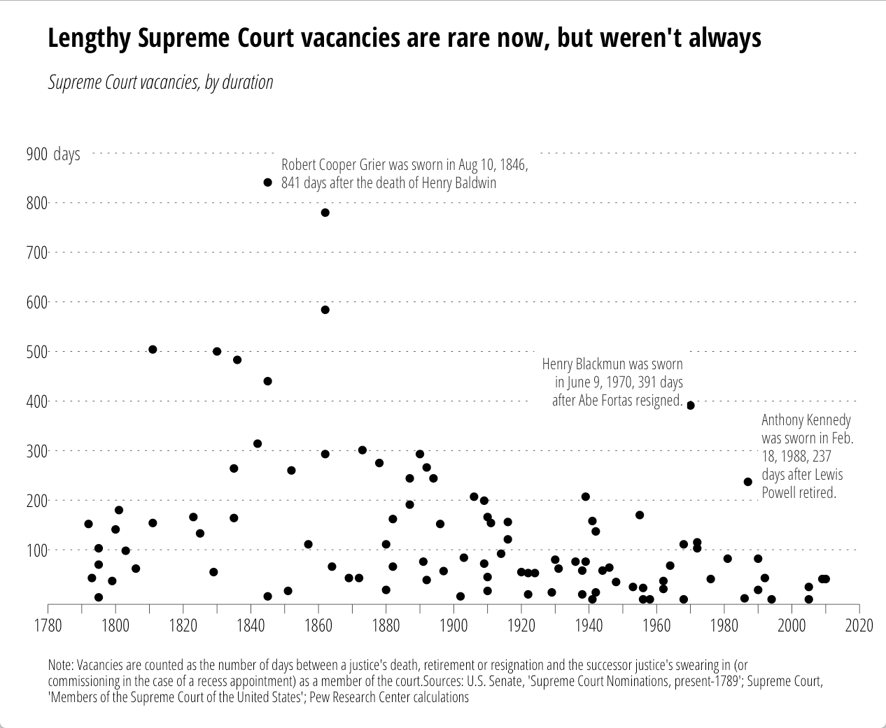
I came across this chart from the Pew Research Center on U.S. Supreme Court “wait times” this week:

supremes-pew

It seemed like a good candidate to test out the new ggplot2 additions. However, while Pew provided the chart, they did not provide data behind it. So, just for you, I used WebPlotDigitizer to encode the points (making good use of a commuter train home). Some points are (no doubt) off by one or two, but precision was not necessary for this riff. The data (and code) are in this gist. First the data.


library(ggplot2)

dat <- read.csv("supreme_court_vacancies.csv", col.names=c("year", "wait"))

Now, we want to reproduce the original chart "theme" pretty closely, so I've done quite a bit of styling outside of the subtitle/caption. One thing we can take care of right away is how to only label every other tick:

xlabs <- seq(1780, 2020, by=10)
xlabs[seq(2, 24, by=2)]  <-  " "

Now we setup the caption. It's long, so we need to wrap it (you need to play with the number of characters value to suit your needs). There's a Shiny Gadget (which is moving to the ggThemeAssist package) to help with this.


caption <- "Note: Vacancies are counted as the number of days between a justice's death, retirement or resignation and the successor justice's swearing in (or commissioning in the case of a recess appointment) as a member of the court.Sources: U.S. Senate, 'Supreme Court Nominations, present-1789'; Supreme Court, 'Members of the Supreme Court of the United States'; Pew Research Center calculations"
caption <- paste0(strwrap(caption, 160), sep="", collapse="\n")
# NOTE: you could probably just use caption <- label_wrap_gen(160)(caption) instead

We're going to try to fully reproduce all the annotations, so here are the in-plot point labels. (Adding the lines is an exercise left to the reader.)


annot <- read.table(text=
"year|wait|just|text
1848|860|0|Robert Cooper Grier was sworn in Aug 10, 1846,
841 days after the death of Henry Baldwin 1969|440|1|Henry Blackmun was sworn
in June 9, 1970, 391 days
after Abe Fortas resigned. 1990|290|0|Anthony Kennedy
was sworn in Feb.
18, 1988, 237
days after Lewis
Powell retired.", sep="|", header=TRUE, stringsAsFactors=FALSE) annot$text <- gsub("
", "\n", annot$text)

Now the fun begins.


gg <- ggplot()
gg <- gg + geom_point(data=dat, aes(x=year, y=wait))

We'll add the y-axis "title" to the inside of the plot:


gg <- gg + geom_label(aes(x=1780, y=900, label="days"),
                      family="OpenSans-CondensedLight",
                      size=3.5, hjust=0, label.size=0, color="#2b2b2b")

Now, we add our lovingly hand-crafted in-plot annotations:


gg <- gg + geom_label(data=annot, aes(x=year, y=wait, label=text, hjust=just),
                      family="OpenSans-CondensedLight", lineheight=0.95,
                      size=3, label.size=0, color="#2b2b2b")

Then, tweak the axes:


gg <- gg + scale_x_continuous(expand=c(0,0),
                              breaks=seq(1780, 2020, by=10),
                              labels=xlabs, limits=c(1780,2020))
gg <- gg + scale_y_continuous(expand=c(0,10),
                              breaks=seq(100, 900, by=100),
                              limits=c(0, 1000))

Thanks to Hadley's package design & Jan's & my additions, this is all you need to do to add the subtitle & caption:


gg <- gg + labs(x=NULL, y=NULL,
                title="Lengthy Supreme Court vacancies are rare now, but weren't always",
                subtitle="Supreme Court vacancies, by duration",
                caption=caption)

Well, perhaps not all since we need to style this puppy. You'll either need to install the font from Google Fonts or sub out the fonts for something you have.


gg <- gg + theme_minimal(base_family="OpenSans-CondensedLight")
# light, dotted major y-grid lines only
gg <- gg + theme(panel.grid=element_line())
gg <- gg + theme(panel.grid.major.y=element_line(color="#2b2b2b", linetype="dotted", size=0.15))
gg <- gg + theme(panel.grid.major.x=element_blank())
gg <- gg + theme(panel.grid.minor.x=element_blank())
gg <- gg + theme(panel.grid.minor.y=element_blank())
# light x-axis line only
gg <- gg + theme(axis.line=element_line())
gg <- gg + theme(axis.line.x=element_line(color="#2b2b2b", size=0.15))
# tick styling
gg <- gg + theme(axis.ticks=element_line())
gg <- gg + theme(axis.ticks.x=element_line(color="#2b2b2b", size=0.15))
gg <- gg + theme(axis.ticks.y=element_blank())
gg <- gg + theme(axis.ticks.length=unit(5, "pt"))
# breathing room for the plot
gg <- gg + theme(plot.margin=unit(rep(0.5, 4), "cm"))
# move the y-axis tick labels over a bit
gg <- gg + theme(axis.text.y=element_text(margin=margin(r=-5)))
# make the plot title bold and modify the bottom margin a bit
gg <- gg + theme(plot.title=element_text(family="OpenSans-CondensedBold", margin=margin(b=15)))
# make the subtitle italic 
gg <- gg + theme(plot.subtitle=element_text(family="OpenSans-CondensedLightItalic"))
# make the caption smaller, left-justified and give it some room from the main part of the panel
gg <- gg + theme(plot.caption=element_text(size=8, hjust=0, margin=margin(t=15)))
gg

That generates:

All the annotations go with the code. No more tricks, hacks or desperate calls for help on StackOverflow!

Now, this does add two new elements to the underlying gtable that gets built, so some other StackOverflow (et al) hacks may break if they don't use names (these elements are named in the gtable just like their ggplot2 names). We didn't muck with the widths/columns at all, so all those hacks (mostly for multi-plot alignment) should still work.

All the code/data is (again) in this gist.

>UPDATE: time spent per task factor order was wrong before. now fixed.

I caught this tweet today:

The WSJ folks usually do a great job, but this was either rushed or not completely thought through. There’s no way you’re going to be able to do any real comparisons between the segments across pies and direct pie % labels kinda mean they should have just made a table if they were going to phone it in.

Despite the fact that today is Pi[e] Day, these pies need to go.

If the intent was to primarily allow comparison of hours in-task, leaving some ability to compare the same time category across tasks, then bars are probably the way to go (you could do a parallel coordinates plot, but those looks like tangled guitar strings to me, so I’ll stick with bars). Here’s one possible alternative using R & ggplot2. Since I provide the data, please link to your own creations as I’d love to see how others would represent the data.

NOTE: I left direct bar labels off deliberately. My view is that (a) this is designed to be a relative comparison vs precise comparison & (b) it’s survey data and if we’re going to add #’s I’d feel compelled to communicate margin of error, etc. I don’t think that’s necessary.

library(ggplot2)
library(grid)
library(scales)
library(hrbrmisc) # devtools::install_github("hrbrmstr/hrbrmisc")
library(tidyr)
 
dat <- read.table(text=
"Task|less_than_one_hour_per_week|one_to_four_hours_per_week|one_to_three_hours_a_day|four_or_more_hours_a_day
Basic exploratory data analysis|11|32|46|12
Data cleaning|19|42|31|7
Machine learning, statistics|34|29|27|10
Creating visualizations|23|41|29|7
Presenting analysis|27|47|20|6
Extract, transform, load|43|32|20|5", sep="|", header=TRUE, stringsAsFactors=FALSE)
 
amount_trans <- c("less_than_one_hour_per_week"="<1 hr/\nwk", 
                  "one_to_four_hours_per_week"="1-4 hrs/\nwk", 
                  "one_to_three_hours_a_day"="1-3 hrs/\nday", 
                  "four_or_more_hours_a_day"="4+ hrs/\nday")
 
dat <- gather(dat, amount, value, -Task)
dat$value <- dat$value / 100
dat$amount <- factor(amount_trans[dat$amount], levels=amount_trans)
 
title_trans <- c("Basic exploratory data analysis"="Basic exploratory\ndata analysis", 
                 "Data cleaning"="Data\ncleaning", 
                 "Machine learning, statistics"="Machine learning,\nstatistics", 
                 "Creating visualizations"="Creating\nvisualizations", 
                 "Presenting analysis"="Presenting\nanalysis", 
                 "Extract, transform, load"="Extract,\ntransform, load")
 
dat$Task <-factor(title_trans[dat$Task], levels=title_trans)
 
gg <- ggplot(dat, aes(x=amount, y=value, fill=amount))
gg <- gg + geom_bar(stat="identity", width=0.75, color="#2b2b2b", size=0.05)
gg <- gg + scale_y_continuous(expand=c(0,0), labels=percent, limits=c(0, 0.5))
gg <- gg + scale_x_discrete(expand=c(0,1))
gg <- gg + scale_fill_manual(name="", values=c("#a6cdd9", "#d2e4ee", "#b7b079", "#efc750"))
gg <- gg + facet_wrap(~Task, scales="free")
gg <- gg + labs(x=NULL, y=NULL, title="Where Does the Time Go?")
gg <- gg + theme_hrbrmstr(grid="Y", axis="x", plot_title_margin=9)
gg <- gg + theme(panel.background=element_rect(fill="#efefef", color=NA))
gg <- gg + theme(strip.background=element_rect(fill="#858585", color=NA))
gg <- gg + theme(strip.text=element_text(family="OpenSans-CondensedBold", size=12, color="white", hjust=0.5))
gg <- gg + theme(panel.margin.x=unit(1, "cm"))
gg <- gg + theme(panel.margin.y=unit(0.5, "cm"))
gg <- gg + theme(legend.position="none")
gg <- gg + theme(panel.grid.major.y=element_line(color="#b2b2b2"))
gg <- gg + theme(axis.text.x=element_text(margin=margin(t=-10)))
gg <- gg + theme(axis.text.y=element_text(margin=margin(r=-10)))
 
ggplot_with_subtitle(gg, 
                     "The amount of time spent on various tasks by surveyed non-managers in data-science positions.",
                     fontfamily="OpenSans-CondensedLight", fontsize=12, bottom_margin=16)

RStudioScreenSnapz018

UPDATE: A newer blog post explaining the new ggplot2 additions: http://rud.is/b/2016/03/16/supreme-annotations/

UPDATE: this capability (+ more) are being rolled into ggplot2-proper. PR will be absorbed into ggplot2 main branch soon. exciting, annotated times ahead!

UPDATE: fontsize issue has been fixed & there’s a Shiny gadget available for interactively making subtitles. More info at the end of the post.

Subtitles aren’t always necessary for plots, but I began to use them enough that I whipped up a function for ggplot2 that does a decent job adding a subtitle to a finished plot object. More than a few folks have tried their hand at this in the past and this is just my incremental contribution until there’s proper support in ggplot2 (someone’s bound to add it via PR at some point).

We’ll nigh fully recreate the following plot from this WaPo article:

2300lawyers0116-2

Here’s a stab at that w/o the subtitle:

library(ggplot2)
library(scales)
 
data.frame(
  yrs=c("1789-90", "1849-50", "1909-10", "1965-66", "2016-16"),
  pct=c(0.526, 0.795, 0.713, 0.575, 0.365),
  xtralabs=c("", "Highest:\n", "", "", "Lowest:\n")
) -> hill_lawyers
 
gg <- ggplot(hill_lawyers, aes(yrs, pct))
gg <- gg + geom_bar(stat="identity", width=0.65)
gg <- gg + geom_label(aes(label=sprintf("%s%s", xtralabs, percent(pct))),
                      vjust=-0.4, family=c(rep("FranklinGothic-Book", 4),"FranklinGothic-Heavy"), 
                      lineheight=0.9, size=4, label.size=0)
gg <- gg + scale_x_discrete()
gg <- gg + scale_y_continuous(expand=c(0,0), limits=c(0.0, 1.0), labels=percent)
gg <- gg + labs(x=NULL, y=NULL, title="Fewer and fewer lawyers on the Hill")
gg <- gg + theme_minimal(base_family="FranklinGothic-Book")
gg <- gg + theme(axis.line=element_line(color="#2b2b2b", size=0.5))
gg <- gg + theme(axis.line.y=element_blank())
gg <- gg + theme(axis.text.x=element_text(family=c(rep("FranklinGothic-Book", 4),
                                                   "FranklinGothic-Heavy")))
gg <- gg + theme(panel.grid.major.x=element_blank())
gg <- gg + theme(panel.grid.major.y=element_line(color="#b2b2b2", size=0.1))
gg <- gg + theme(panel.grid.minor.y=element_blank())
gg <- gg + theme(plot.title=element_text(hjust=0, 
                                         family="FranklinGothic-Heavy", 
                                         margin=margin(b=10)))
gg

RStudio

(There are some “tricks” in that plotting code that may be worth spending an extra minute or two to mull over if you didn’t realize some of the function parameters were vectorized, or that you could get a white background with no border for text labels so grid lines don’t get in the way.)

Ideally, a subtitle would be part of the gtable that gets made underneath the covers so it will “travel well” with the plot object itself. The function below makes a textGrob from whatever text we pass into it and does just that; it inserts the new grob into a new table row.

#' Add a subtitle to a ggplot object and draw plot on current graphics device.
#' 
#' @param gg ggplot2 object
#' @param label subtitle label
#' @param fontfamily font family to use. The function doesn't pull any font 
#'        information from \code{gg} so you should consider specifying fonts
#'        for the plot itself and here. Or send me code to make this smarter :-)
#' @param fontsize font size
#' @param hjust,vjust horizontal/vertical justification 
#' @param bottom_margin space between bottom of subtitle and plot (code{pts})
#' @param newpage draw new (empty) page first?
#' @param vp viewport to draw plot in
#' @param ... parameters passed to \code{gpar} in call to \code{textGrob}
#' @return Invisibly returns the result of \code{\link{ggplot_build}}, which
#'   is a list with components that contain the plot itself, the data,
#'   information about the scales, panels etc.
ggplot_with_subtitle <- function(gg, 
                                 label="", 
                                 fontfamily=NULL,
                                 fontsize=10,
                                 hjust=0, vjust=0, 
                                 bottom_margin=5.5,
                                 newpage=is.null(vp),
                                 vp=NULL,
                                 ...) {
 
  if (is.null(fontfamily)) {
    gpr <- gpar(fontsize=fontsize, ...)
  } else {
    gpr <- gpar(fontfamily=fontfamily, fontsize=fontsize, ...)
  }
 
  subtitle <- textGrob(label, x=unit(hjust, "npc"), y=unit(hjust, "npc"), 
                       hjust=hjust, vjust=vjust,
                       gp=gpr)
 
  data <- ggplot_build(gg)
 
  gt <- ggplot_gtable(data)
  gt <- gtable_add_rows(gt, grobHeight(subtitle), 2)
  gt <- gtable_add_grob(gt, subtitle, 3, 4, 3, 4, 8, "off", "subtitle")
  gt <- gtable_add_rows(gt, grid::unit(bottom_margin, "pt"), 3)
 
  if (newpage) grid.newpage()
 
  if (is.null(vp)) {
    grid.draw(gt)
  } else {
    if (is.character(vp)) seekViewport(vp) else pushViewport(vp)
    grid.draw(gt)
    upViewport()
  }
 
  invisible(data)
 
}

The roxygen comments should give you an idea of how to work with it, and here it is in action:

subtitle <- "The percentage of Congressional members that are laywers has been\ncontinuously dropping since the 1960s"
 
ggplot_with_subtitle(gg, subtitle,
                     fontfamily="FranklinGothic-Book",
                     bottom_margin=20, lineheight=0.9)

Fullscreen_3_12_16__3_39_PM

It deals with long annotations pretty well, too (I strwrapped the source text for the below at 100 characters). The text is senseless here, but it’s just for show (I had it handy…don’t judge…you’re getting free code :-):

Fullscreen_3_12_16__7_44_PM

I think this beats manually re-creating the wheel, even if you only infrequently use subtitles. It definitely beats hand-editing plots and is a bit more elegant and functional than using grid.arrange (et al) to mimic the functionality. It also beats futzing with panel margins and clipping to shoehorn a frankenmashup mess of geom_text or annotation_custom calls.

Kick the tyres, tell me where it breaks and if I can cover enough edge cases (or make it smarter) I’ll add it to my ggalt package.

Shiny Subtitle Gadget

Thanks to:

you can now play with an experimental Shiny gadget which you can load by devtools::install_github("hrbrmstr/hrbrmisc") (that’s a temporary home for it, I use this pkg for testing/playing). Just select a ggplot2 object variable name in RStudio and then select “Add subtitle” from the Addins menu and give it a whirl. It looks like this:

__Development_hrbrmisc_-_master_-_RStudio

>UPDATE: I rejiggered the function to actually now, y’know, do what it says it should do :-)

A friend, we’ll call him _Alen_ put a call out for some function that could take an image and produce a per-row “histogram” along the edge for the number of filled-in points. That requirement eventually scope-creeped to wanting “histograms” on both the edge and bottom. In, essence there was a desire to be able to compare the number of pixels in each row/line to each other.

Now, you’re all like _”Well, you used ggplot to make the image so…”_ Yeah, not so much. They had done some basic charting in D3. And, it turns out, that it would be handy to compare the data between different images since they had different sets of data they were charting in the same place.

I can’t show you their images as they are part of super seekrit research which will eventually solve world hunger and land a family on Mars. But, I _can_ do a minor re-creation. I made a really simple D3 page that draws random lines in a specified color. Like this:


You can view the source of to see the dead-simple D3 that generates that. You’ll see something different in that image every time since it’s javascript and js has no decent built-in random routines (well it does _now_ but the engine functionality in browsers hasn’t caught up yet). So, you won’t be able to 100% replicate the results below but it will work.

First, we need to be able to get the image from the `div` into a bitmap so we can do some pixel counting. We’ll use the new `webshot` package for that.

library(webshot)
 
tmppng1 <- tempfile(fileext=".png")
webshot("http://rud.is/projects/randomlines.html?linecol=f6743d", 
        file=tmppng1,
        selector="#vis")

The image that produced looks like this:

img1

To make the “histograms” on the right and bottom, we’ll use the `raster` capabilities in R to let us treat the data like a matrix so we can easily add columns and rows. I made a function (below) that takes in a `png` file and either a list of colors to look for or a list of colors to exclude and the color you want the “histograms” to be drawn in. This way you can just exclude the background and annotation colors or count specific sets of colors. The counting is fueled by `fastmatch` which makes for super-fast comparisons.

#' Make a "row color density" histogram for an image file
#' 
#' Takes a file path to a png and returns displays it with a histogram of 
#' pixel density
#' 
#' @param img_file path to png file
#' @param target_colors,ignore_colors colors to count or ignore. Either one should be 
#'        \code{NULL} or \code{ignore_colors} should be \code{NULL}. Whichever is
#'        not \code{NULL} should be a vector of hex strings (can be huge vector of 
#'        hex strings as it uses \code{fastmatch}). The alpha channel is thrown away 
#'        if any, so you only need to specify \code{#rrggbb} hex strings
#' @param color to use for the density histogram line
selective_image_color_histogram <- function(img_file, 
                                            target_colors=NULL,
                                            ignore_colors=c("#ffffff", "#000000"),
                                            hist_col="steelblue",
                                            plot=TRUE) {
 
  require(png)
  require(grid)
  require(raster)
  require(fastmatch)
  require(gridExtra)
 
  "%fmin%" <- function(x, table) { fmatch(x, table, nomatch = 0) > 0 }
  "%!fmin%" <- function(x, table) { !fmatch(x, table, nomatch = 0) > 0 }
 
  if (is.null(target_colors) & is.null(ignore_colors)) {
    stop("Only one of 'target_colors' or 'ignore_colors' can be 'NULL'", call.=FALSE)
  }
 
  # clean up params
  target_colors <- tolower(target_colors)  
  ignore_colors <- tolower(ignore_colors)  
 
  # read in file and convert to usable data structure  
  png_file <- readPNG(img_file)
  img <- substr(tolower(as.matrix(as.raster(png_file))), 1, 7)
 
  if (length(target_colors)==0) {
    tf_img <- matrix(img %!fmin% ignore_colors, nrow=nrow(img), ncol=ncol(img))
  } else {
    tf_img <- matrix(img %fmin% target_colors, nrow=nrow(img), ncol=ncol(img))
  }  
 
  # count the pixels
  wvals <- rowSums(tf_img)
  hvals <- colSums(tf_img)
 
  # add a slight right & bottom margin
  wdth <- max(wvals) + round(0.1*max(wvals))
  hght <- max(hvals) + round(0.1*max(hvals))
 
  # create the "histogram" 
  col_mat <- matrix(rep("#ffffff", wdth*nrow(img)), nrow=nrow(img), ncol=wdth)
  for (row in 1:nrow(img)) { 
    col_mat[row, 1:wvals[row]] <- hist_col
  }
 
  # make bigger image
  new_img <- cbind(img, col_mat)
 
  # create the "histogram"
  row_mat <- matrix(rep("#ffffff", hght*ncol(new_img)), ncol=ncol(new_img), nrow=hght)
  for (col in 1:ncol(img)) { 
    row_mat[1:hvals[col], col] <- hist_col
  }
 
  # make a new bigger image and turn it into something we can use with 
  # grid since we can also use it with ggplot this way if we really wanted to
  # and friends don't let friends use base graphics
  rg1 <- rasterGrob(rbind(new_img, row_mat))
 
  # if we want to plot it, now is the time
  if (plot) grid.arrange(rg1)
 
  # return a list with each "histogram"
  return(list(row_hist=wvals, col_hist=hvals))
 
}

After reading in the `png` as a raster, the function counts up all the specified pixels by row and extends the matrix width-wise. Then it does the same by column and extends the matrix height-wise. Finally, it makes a `rasterGrob` (b/c friends don’t let friends use base graphics) and optionally plots the output. It also returns the counts by row and by column. That will let us compare between images.

Now we can do:

a <- selective_image_color_histogram(tmppng, hist_col="#f6743d", plot=TRUE)

hist1

And, make a counterpart image for it:

tmppng2 <- tempfile(fileext=".png")
webshot("http://rud.is/projects/randomlines.html?linecol=80b1d4", 
        file=tmppng2,
        selector="#vis")
 
b <- selective_image_color_histogram(tmppng2, hist_col="#80b1d4", plot=TRUE)

hist2

You can definitely visually compare to see which ones had more “activity” in which row(s) (or column(s)) but why not let R do that for you (you’ll probably need to change the font to something boring like `”Helvetica”`)?

library(ggplot2)
library(dplyr)
 
gg <- ggplot(data_frame(x=1:length(a$row_hist),
                        diff=a$row_hist - b$row_hist,
                        `A vs B`=factor(sign(diff), levels=c(-1, 0, 1), 
                                        labels=c("A", "Neutral", "B"))))
gg <- gg + geom_segment(aes(x=x, xend=x, y=0, yend=diff, color=`A vs B`))
gg <- gg + scale_x_continuous(expand=c(0,0))
gg <- gg + scale_y_continuous(expand=c(0,0))
gg <- gg + scale_color_manual(values=c("#f6743d", "#2b2b2b", "#80b1d4"))
gg <- gg + labs(x="Row", y="Difference")
gg <- gg + coord_flip()
gg <- gg + ggthemes::theme_tufte(base_family="URW Geometric Semi Bold")
gg <- gg + theme(panel.grid=element_line(color="#2b2b2b", size=0.15))
gg <- gg + theme(panel.grid.major.y=element_blank())
gg <- gg + theme(panel.grid.minor=element_blank())
gg <- gg + theme(axis.ticks=element_blank())
gg <- gg + theme(axis.text.y=element_blank())
gg <- gg + theme(axis.title.x=element_text(hjust=0))
gg <- gg + theme(axis.title.y=element_text(hjust=0))
gg

vertdif

This way, you let the _power of data science_ show you the answer. (The column processing chart is an exercise left to the reader).

The code may only be useful to _Alen_, but it was a fun and quick enough exercise that I thought it might be useful to the broader community.

Poke holes or improve upon it at will and tell me how horrible my code is in the comments (I have not looked to see if I subtracted in the right direction as I’m on solo dad duty for a cpl days and #4 is hungry).

It’s usually a good thing when my and infosec worlds collide. Unfortunately, this time it’s a script that R folk running on OS X can use to see if they are using a version of XQuartz that has a nasty vulnerability in the framework it uses to auto-update. If this test comes back with the warning, try to refrain from using XQuartz on insecure networks until the developers fix the issue.

**UPDATE**

Thanks to a gist prodding by @bearloga, here’s a script to scan all your applications for the vulnerability:

library(purrr)
library(dplyr)
library(XML)
 
read_plist <- safely(readKeyValueDB)
safe_compare <- safely(compareVersion)
 
apps <- list.dirs(c("/Applications", "/Applications/Utilities"), recursive=FALSE)
 
# if you have something further than this far down that's bad you're on your own
 
for (i in 1:4) {
  moar_dirs <- grep("app$", apps, value=TRUE, invert=TRUE)
  if (length(moar_dirs) > 0) { apps <- c(apps, list.dirs(moar_dirs, recursive=FALSE)) }
}
apps <- unique(grep("app$", apps, value=TRUE))
 
pb <- txtProgressBar(0, length(apps), style=3)
 
suppressWarnings(map_df(1:length(apps), function(i) {
 
  x <- apps[i]
 
  setTxtProgressBar(pb, i)
 
  is_vuln <- FALSE
  version <- ""
 
  app_name <- sub("\\.app$", "", basename(x))
  app_loc <- sub("^/", "", dirname(x))
 
  to_look <- c(sprintf("%s/Contents/Frameworks/Autoupdate.app/Contents/Info.plist", x),
               sprintf("%s/Contents/Frameworks/Sparkle.framework/Versions/A/Resources/Info.plist", x),
               sprintf("%s/Contents/Frameworks/Sparkle.framework/Versions/A/Resources/Autoupdate.app/Contents/Info.plist", x))
 
  is_there <- map_lgl(c(sprintf("%s/Contents/Frameworks/Sparkle.framework/", x), to_look), file.exists)
 
  has_sparkle <- any(is_there)
 
  to_look <- to_look[which(is_there[-1])]
 
  discard(map_chr(to_look, function(x) {
    read_plist(x)$result$CFBundleShortVersionString %||% NA
  }), is.na) -> vs
 
  if (any(map_dbl(vs, function(v) { safe_compare(v, "1.16.1")$result %||% -1 }) < 0)) {
    is_vuln <- TRUE
    version <- vs[1]
  }
 
  data_frame(app_loc, app_name, has_sparkle, is_vuln, version)
 
})) -> app_scan_results
 
close(pb)
 
select(arrange(filter(app_scan_results, has_sparkle), app_loc, app_name), -has_sparkle)

My wife tricked me into a partial-weekend project to try to get all the primary/caucus results to-date on a map (the whole us). This is challenging since not all states use counties as boundaries for aggregate results. I’m still piecing together some shapefiles for the primary/caucus summation boundaries for a couple remaining states but I didn’t want to let the data source for the election results go without a mention.

The bestest part of the `iframe` below (which can be busted with [this link](/projects/primaryplotting.html)) is the CNN JSON link. You can discover those with Developer Tools on any modern browser. Here’s [the rest](https://gist.github.com/hrbrmstr/25a53e2fcaee2aafa908) of those links (using a gist to add enough layers of redirection to hopefully keep this data free/available).

It’s really well-formatted JSON. As of this post, not all those links completely work (the Maine & PR results weren’t certified yet). Please credit the hard-working folks at CNN whenever/wherever you use this data (if you use it at all). Making a resource like this available is a great service (even if it wasn’t 100% intentional).

The rest of the post shows how to display the voting % per top-candidate in each Texas county. Because Texas uses counties for roll-up aggregation, we can also use `tigris` to get great maps.


NOTE: you won’t need to use this function if you use the [development version](https://github.com/yihui/knitr) of `knitr`


Winston Chang released his [`webshot`](https://github.com/wch/webshot) package to CRAN this past week. The package wraps the immensely useful [`phantomjs`](http://phantomjs.org/) utility and makes it dirt simple to capture whole or partial web pages in R. One beautiful bonus feature of `webshot` is that you can install `phamtomjs` with it (getting `phantomjs` to work on Windows is a pain).

You can do many things with the `webshot` package but I hastily drafted this post to put forth a means to generate a static image from an `htmlwidget`. I won’t elaborate much since I included a fully `roxygen`-doc’d function below, but the essence of `capture_widget()` is to pass in an `htmlwidget` object and have it rendered for you to a `png` file and get back either:

– a file system `path` reference (e.g. `/path/to/widget.png`)
– a `markdown` image reference (e.g. `![](file:///path/to/widget.png)`)
– an `html` image reference (e.g. ``), or
– an `inline` base64 encoded HTML imgage reference (e.g. ``)

which you can then use in R markdown documents knitted to PDF (or in any other context).

Take a look at the function, poke the tyres and drop suggestions in the comments. I’ll add this to one of my widgets soon so folks can submit complaints or enhancements via issues & PRs on github).

To use the function, just pipe a sized widget to it and use the output from it.

#' Capture a static (png) version of a widget (e.g. for use in a PDF knitr document)
#'
#' Widgets are generally interactive beasts rendered in an HTML DOM with
#' javascript. That makes them unusable in PDF documents. However, many widgets
#' initial views would work well as static images. This function renders a widget
#' to a file and make it usable in a number of contexts.
#'
#' What is returned depends on the value of \code{output}. By default (\code{"path"}),
#' the full disk path will be returned. If \code{markdown} is specified, a markdown
#' string will be returned with a \code{file:///...} URL. If \code{html} is
#' specified, an \code{<img src='file:///...'/>} tag will be returned and if
#' \code{inline} is specified, a base64 encoded \code{<img>} tag will be returned
#' (just like you'd see in a self-contained HTML file from \code{knitr}).
#'
#' @importFrom webshot webshot
#' @importFrom base64 img
#' @param wdgt htmlwidget to capture
#' @param output how to return the results of the capture (see Details section)
#' @param height,width it's important for many widget to be responsive in HTML
#'        documents. PDFs are static beasts and having a fixed image size works
#'        better for them. \code{height} & \code{width} will be passed into the
#'        rendering process, which means you should probably specify similar
#'        values in your widget creation process so the captured \code{<div>}
#'        size matches the size you specify here.
#' @param png_render_path by default, this will be a temporary file location but
#'        a fully qualified filename (with extension) can be specified. It's up to
#'        the caller to free the storage when finished with the resource.
#' @return See Details
#' @export
capture_widget <- function(wdgt,
                           output=c("path", "markdown", "html", "inline"),
                           height, width,
                           png_render_path=tempfile(fileext=".png")) {
 
  wdgt_html_tf <- tempfile(fileext=".html")
 
  htmlwidgets::saveWidget(vl, wdgt_html_tf)
 
  webshot::webshot(url=sprintf("file://%s", wdgt_html_tf),
                   selector="#htmlwidget_container",
                   file=wdgt_png_tf,
                   vwidth=width, vheight=height)
 
  # done with HTML
  unlink(wdgt_html_tf)
 
  switch(match.arg(output, c("path", "markdown", "html", "inline")),
             `path`=png_render_path,
         `markdown`=sprintf("![widget](file://%s)", png_render_path),
             `html`=sprintf("<img src='file://%s'/>", png_render_path),
           `inline`=base64::img(wdgt_png_tf))
 
}