
This is a follow up to a twitter-gist post & to the annotation party we’re having this week
I had not intended this to be “Annotation Week” but there was a large, positive response to my annotation “hack” post. This reaction surprised me, then someone pointed me to this link and also noted that if having to do subtitles via hacks or Illustrator annoyed me, imagine the reaction to people who actually do real work. That led me to pull up my ggplot2 fork (what, you don’t keep a fork of ggplot2 handy, too?) and work out how to augment ggplot2-proper with the functionality. It’s yet-another nod to Hadley as he designed the package so well that slipping in annotations to the label, theme & plot-building code was an actual magical experience. As I was doing this, @janschulz jumped in to add below-plot annotations to ggplot2 (which we’re calling the caption label thanks to a suggestion by @arnicas).
What’s Changed?
There are two new plot label components. The first is for subtitles that appear below the plot title. You can either do:
ggtitle("The Main Title", subtitle="A well-crafted subtitle")
or
labs(title="The Main Title", subtitle="A well-crafted subtitle")
The second is for below-plot annotations (captions), which are added via:
labs(title="Main Title", caption="Where this crazy thing game from")
These are styled via two new theme elements (both adjusted with element_text()):
plot.subtitleplot.caption
A “casualty” of these changes is that the main plot.title is now left-justified by default (as is plot.subtitle). plot.caption is right-justified by default.
Yet-another ggplot2 Example
I have thoughts on plot typography which I’ll save for another post, but I wanted to show how to use these new components. You’ll need to devtools::install_github("hadley/ggplot2") to use them until the changes get into CRAN.
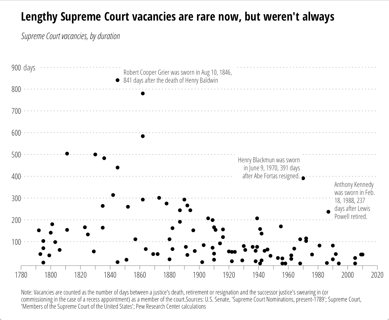
I came across this chart from the Pew Research Center on U.S. Supreme Court “wait times” this week:

It seemed like a good candidate to test out the new ggplot2 additions. However, while Pew provided the chart, they did not provide data behind it. So, just for you, I used WebPlotDigitizer to encode the points (making good use of a commuter train home). Some points are (no doubt) off by one or two, but precision was not necessary for this riff. The data (and code) are in this gist. First the data.
library(ggplot2)

dat <- read.csv("supreme_court_vacancies.csv", col.names=c("year", "wait"))
Now, we want to reproduce the original chart "theme" pretty closely, so I've done quite a bit of styling outside of the subtitle/caption. One thing we can take care of right away is how to only label every other tick:
xlabs <- seq(1780, 2020, by=10)
xlabs[seq(2, 24, by=2)]  <-  " "
Now we setup the caption. It's long, so we need to wrap it (you need to play with the number of characters value to suit your needs). There's a Shiny Gadget (which is moving to the ggThemeAssist package) to help with this.
caption <- "Note: Vacancies are counted as the number of days between a justice's death, retirement or resignation and the successor justice's swearing in (or commissioning in the case of a recess appointment) as a member of the court.Sources: U.S. Senate, 'Supreme Court Nominations, present-1789'; Supreme Court, 'Members of the Supreme Court of the United States'; Pew Research Center calculations"
caption <- paste0(strwrap(caption, 160), sep="", collapse="\n")
# NOTE: you could probably just use caption <- label_wrap_gen(160)(caption) instead
We're going to try to fully reproduce all the annotations, so here are the in-plot point labels. (Adding the lines is an exercise left to the reader.)
annot <- read.table(text=
"year|wait|just|text
1848|860|0|Robert Cooper Grier was sworn in Aug 10, 1846,
841 days after the death of Henry Baldwin
1969|440|1|Henry Blackmun was sworn
in June 9, 1970, 391 days
after Abe Fortas resigned.
1990|290|0|Anthony Kennedy
was sworn in Feb.
18, 1988, 237
days after Lewis
Powell retired.",
sep="|", header=TRUE, stringsAsFactors=FALSE)
annot$text <- gsub("
", "\n", annot$text)
Now the fun begins.
gg <- ggplot()
gg <- gg + geom_point(data=dat, aes(x=year, y=wait))
We'll add the y-axis "title" to the inside of the plot:
gg <- gg + geom_label(aes(x=1780, y=900, label="days"),
                      family="OpenSans-CondensedLight",
                      size=3.5, hjust=0, label.size=0, color="#2b2b2b")
Now, we add our lovingly hand-crafted in-plot annotations:
gg <- gg + geom_label(data=annot, aes(x=year, y=wait, label=text, hjust=just),
                      family="OpenSans-CondensedLight", lineheight=0.95,
                      size=3, label.size=0, color="#2b2b2b")
Then, tweak the axes:
gg <- gg + scale_x_continuous(expand=c(0,0),
                              breaks=seq(1780, 2020, by=10),
                              labels=xlabs, limits=c(1780,2020))
gg <- gg + scale_y_continuous(expand=c(0,10),
                              breaks=seq(100, 900, by=100),
                              limits=c(0, 1000))
Thanks to Hadley's package design & Jan's & my additions, this is all you need to do to add the subtitle & caption:
gg <- gg + labs(x=NULL, y=NULL,
                title="Lengthy Supreme Court vacancies are rare now, but weren't always",
                subtitle="Supreme Court vacancies, by duration",
                caption=caption)
Well, perhaps not all since we need to style this puppy. You'll either need to install the font from Google Fonts or sub out the fonts for something you have.
gg <- gg + theme_minimal(base_family="OpenSans-CondensedLight")
# light, dotted major y-grid lines only
gg <- gg + theme(panel.grid=element_line())
gg <- gg + theme(panel.grid.major.y=element_line(color="#2b2b2b", linetype="dotted", size=0.15))
gg <- gg + theme(panel.grid.major.x=element_blank())
gg <- gg + theme(panel.grid.minor.x=element_blank())
gg <- gg + theme(panel.grid.minor.y=element_blank())
# light x-axis line only
gg <- gg + theme(axis.line=element_line())
gg <- gg + theme(axis.line.x=element_line(color="#2b2b2b", size=0.15))
# tick styling
gg <- gg + theme(axis.ticks=element_line())
gg <- gg + theme(axis.ticks.x=element_line(color="#2b2b2b", size=0.15))
gg <- gg + theme(axis.ticks.y=element_blank())
gg <- gg + theme(axis.ticks.length=unit(5, "pt"))
# breathing room for the plot
gg <- gg + theme(plot.margin=unit(rep(0.5, 4), "cm"))
# move the y-axis tick labels over a bit
gg <- gg + theme(axis.text.y=element_text(margin=margin(r=-5)))
# make the plot title bold and modify the bottom margin a bit
gg <- gg + theme(plot.title=element_text(family="OpenSans-CondensedBold", margin=margin(b=15)))
# make the subtitle italic
gg <- gg + theme(plot.subtitle=element_text(family="OpenSans-CondensedLightItalic"))
# make the caption smaller, left-justified and give it some room from the main part of the panel
gg <- gg + theme(plot.caption=element_text(size=8, hjust=0, margin=margin(t=15)))
gg
That generates:
All the annotations go with the code. No more tricks, hacks or desperate calls for help on StackOverflow!
Now, this does add two new elements to the underlying gtable that gets built, so some other StackOverflow (et al) hacks may break if they don't use names (these elements are named in the gtable just like their ggplot2 names). We didn't muck with the widths/columns at all, so all those hacks (mostly for multi-plot alignment) should still work.
All the code/data is (again) in this gist.

17 Comments
nice script ! thanks a lot
That’s one of the prettiest ggplots I’ve seen. Nice work on the subtitle, but re the theme itself, rather than submit the code as a gist, why not convert this into a formal theme and pull-request it up to Hadley?
ty! Folks are more than welcome to take the theme code and make a PR to the
ggthemespackage (I waive all desire or right to credit! :-) I’ve got my own set of very similar personal themes in my (non-CRAN)hrbrmiscpackage, and one of the main reason I would not personally create a public theme & do a PR is that I’d have to make thebasefontHelvetica or Arial to do so and–IMO–that would kill the theme. I’ve got a post coming up on chart typography & styling and I’m nearly firmly, finally in the camp that one should “sweat the details”, including fonts, in all but one’s own quick, exploratory vis. That means tweaking the minutiae (which I actually failed to do in this plot as the title & subtitle vertical spacing is pretty darn horrible :-) and that usually means quite a bit ofthemecalls outside of a centralthemexyz()call.I agree… you should sweat the small stuff, and come up with pristine looking plots like this and then I’ll use your work and keep all the props :D. Looking forward to your next post, please do discuss how to use custom fonts.
These posts with such extensive examples are SO helpful; thank you for doing them.
Agree, thanks for the great clear post(s). I wonder what they used to create the graph in the first place haha, something slick!
the fork to ggplot2 to easily add the subtitle and caption text is most helpful
This is a fantastic post, very well explained. Thanks for sharing.
The only problem I keep encountering is that while I can specify the fonts in the title and subtitle, it does not seem to reflect font styles (bold, italic etc). The fonts are installed.
can you post a gist link? I’ve been using alot of fonts in mine and they seem to work well. Now’s the time to debug before Hadley does another CRAN push #ty
This was VERY useful thank you very much! I have only one issue: I cannot save a plot made by ggplotwithsubtitles as .png image at the end of my batch script. Can you help me please?
Indeed very useful extension of the current ggplot functionalities. However, just want to let you know that when I try to use it in combination with the ggrepel package, the ggrepel commands throw errors (not just my code, also on the standard examples of the package). The only way to solve this, seems to be to re-install ggplot2.
Don’t know what exactly causes this, but do hope to be using both together in the future.
I had similar issues when ggtern is also active. I susect it has to do with the ggplot version.
ggtern is often buggy I find.
This was very good!
Nice work as always, Harbourmaster. Small point, but for the sake of my OCD you could perhaps do:
gg + theme(elementx = element_bla(),

                   elementy = element_bla(),

                   elementz = element_bla())
Thx, but seriously unlikely. I def prefer distinct theme calls. Plus, if RStudio didn’t have full expression evaluation, it’d be lines of
gg <- gg +as well :-)I’m starting to learn R and this kind of examples helps me a lot. There are ‘theme’ options that I didn’t know their use till now.
Thank you so much!
8 Trackbacks/Pingbacks
[…] article was first published on R – rud.is, and kindly contributed to […]
[…] text. This new feature that is currently in the development version is thanks to @hrbmstr and detailed in his recent post. Basically, just add your text at the right tag and style accordingly; instant badass plotting! […]
[…] UPDATE: A newer blog post explaining the new ggplot2 additions: http://rud.is/b/2016/03/16/supreme-annotations/ […]
[…] Allowing users to manually annotate outliers and to share labels with others can be a huge step towards explaining dynamic data. Source: hrbrmstr […]
[…] in 2016, I did a post on {ggplot2} text annotations because it was a tad more challenging to do some of the things in that post back in the […]
[…] in 2016, I did a post on {ggplot2} text annotations because it was a tad more challenging to do some of the things in that post back in the […]
[…] in 2016, I did a post on {ggplot2} text annotations because it was a tad more challenging to do some of the things in that post back in the […]
[…] in 2016, I did a post on {ggplot2} text annotations because it was a tad more challenging to do some of the things in that post back in the […]