Skip navigation

Category Archives: R

I decided to forego the D3 map mentioned in the previous post in favor of a Shiny one since I had 90% of the mapping code written.

I binned the ranges into three groups, changed the color over to something more pleasant (with RColorBrewer), added an interactive table for the counties with outage and have the elements updating every minute.

You can see the Live Outage Map over at it’s live Shiny server. Source is below or over at github if you’ve got blockers enabled.

UPDATE: A Shiny (dynamic) version of this is now available.

We had yet-another power outage this morning due to the weird weather patterns of the week and it was the final catalyst I needed to crank out some R code to map the affected counties.

Central Maine Power provides an outage portal where folks can both report outages and see areas impacted by outages. They use an SAP web service that generates the outage table and the aforelinked page just embeds that URL (http://www3.cmpco.com/OutageReports/CMP.html) as an iframe. We can use the XML package in R to grab that HTML file, parse it, extract the table and then send the data to ggplot.

It should be a good starting point for anyone wishing to do something similar. The next itch to scratch for me on this is a live D3 map that uses the outage table with drill-down capabilities to the linked data.

library(maps)
library(maptools)
library(ggplot2)
library(plyr)
library(XML)
 
cmp.url <- "http://www3.cmpco.com/OutageReports/CMP.html"
# get outage table (first one on the cmp.url page)
cmp.node <- getNodeSet(htmlParse(cmp.url),"//table")[[1]]
cmp.tab <- readHTMLTable(cmp.node,
                         header=c("subregion","total.customers","without.power"),
                         skip.rows=c(1,2,3),
                         trim=TRUE, stringsAsFactors=FALSE)
 
# clean up the table to it's easier to work with
cmp.tab <- cmp.tab[-nrow(cmp.tab),] # get rid of last row
cmp.tab$subregion <- tolower(cmp.tab$subregion)
cmp.tab$total.customers <- as.numeric(gsub(",","",cmp.tab$total.customers))
cmp.tab$without.power <- as.numeric(gsub(",","",cmp.tab$without.power))
 
# get maine map with counties
county.df <- map_data('county')
me <- subset(county.df, region=="maine")
 
# get a copy with just the affected counties
out <- subset(me, subregion %in% cmp.tab$subregion)
 
# add outage into to it
out <- join(out, cmp.tab)
 
# plot the map
gg <- ggplot(me, aes(long, lat, group=group))
gg <- gg + geom_polygon(fill=NA, colour='gray50', size=0.25)
gg <- gg + geom_polygon(data=out, aes(long, lat, group=group, fill=without.power), 
                        colour='gray50', size=0.25)
gg <- gg + scale_fill_gradient2(low="#FFFFCC", mid="#FD8D3C", high="#800026")
gg <- gg + coord_map()
gg <- gg + theme_bw()
gg <- gg + labs(x="", y="", title="CMP (Maine) Customers Without Power by County")
gg <- gg + theme(panel.border = element_blank(),
                 panel.background = element_blank(),
                 panel.grid = element_blank(),
                 axis.text = element_blank(),
                 axis.ticks = element_blank(),
                 legend.position="left",
                 legend.title=element_blank())
gg

Plot_Zoom(click for larger)

The #spiffy @dseverski gave me this posit the other day:

and, I obliged shortly thereafter, but figured I’d toss a post up on the blog before heading to Strata.

To rephrase the tweet a bit, Mr. Severski asked me what alternate encoding I’d use for this grouped bar chart (larger version at the link in David’s tweet):

linkedinq31

I have almost as much disdain for grouped bar charts as I do for pie or donut charts, so appreciated the opportunity to try a makeover. However, I ran into an immediate problem: the usually #spiffy 451 Group folks did not include raw data. So, I reverse engineered the graph with WebPlotDigitizer, cleaned up the result and made a CSV from it. Then, I headed to RStudio with a plan in mind.

The old chart and data screamed faceted dot plot. The only trick necessary was to manually order the factor levels.

library(ggplot)
 
# read in the CSV file
nosql.df <- read.csv("nosql.csv", header=TRUE)
# manually order facets
nosql.df$Database <- factor(nosql.df$Database,
                            levels=c("MongoDB","Cassandra","Redis","HBase","CouchDB",
                                     "Neo4j","Riak","MarkLogic","Couchbase","DynamoDB"))
 
# start the plot
gg <- ggplot(data=nosql.df, aes(x=Quarter, y=Index))
# use points, colored by Quarter
gg <- gg + geom_point(aes(color=Quarter), size=3)
# make strips by nosql db factor
gg <- gg + facet_grid(Database~.)
# rotate the plot
gg <- gg + coord_flip()
# get rid of most of the junk
gg <- gg + theme_bw()
# add a title
gg <- gg + labs(x="", title="NoSQL LinkedIn Skills Index\nSeptember 2013")
# get rid of the legend
gg <- gg + theme(legend.position = "none")
# ensure the strip is gone
gg <- gg + theme(strip.text.x = element_blank())
gg

The result is below in SVG form (install a proper browser if you can’t see it, or run the R code :-) I think it conveys the data in a much more informative way. How would you encode the data to make it more informative and accessible?

Full source & data over at github.


UPDATE: Added some extra visualization elements since this post went live. New select menu and hover text for individual job impact detail lines in the table.

I was reviewing RSS feeds when I came across this story about “ObamaCare Employer Mandate: A List Of Cuts To Work Hours, Jobs” over on Investors.com. Efficacy of the law notwithstanding, I thought it might be interesting to visualize the data since the folks over at Investors.com provided a handy spreadsheet that they seem to maintain pretty well (link is in the article).

The spreadsheet is organized by date and lists each state where the jobs were impacted along with the employer, employer type (public/private), reason and number of jobs impacted (if available). They also have links to news stories related to each entry.

My first thought was to compare impact across states by date, so I threw together a quick R script to build a faceted bar chart:

library(ggplot2)
library(plyr)
 
# Source for job impact data:
# http://news.investors.com/politics-obamacare/092513-669013-obamacare-employer-mandate-a-list-of-cuts-to-work-hours-jobs.htm
 
emp.f <- read.csv("~/employers.csv", stringsAsFactors=FALSE)
colnames(emp.f) <- c("State","Employer","Type","Action","Jobs.Cut","Action.Date")
emp.f[is.na(emp.f$Jobs.Cut),]$Jobs.Cut = median(emp.f$Jobs.Cut, na.rm=TRUE)
emp.f[emp.f$State=="Virgina", ]$State = "Virginia"
emp.f[emp.f$State=="Washington DC", ]$State = "District of Columbia"

Yes, they really spelled “Virginia” wrong, at least in the article text where I initially scraped the data from before I saw there was a spreadsheet available. Along with fixing “Virginia”, I also changed the name of “Washington DC” to “District of Columbia” for reasons you’ll see later on in this post. I’m finding it very helpful to do as much of the data cleanup in-code (R or Python) whenever possible since it makes the process far more repeatable than performing the same tasks by hand in a text editor and is essential if you know the data is going to change/expand.

After reading in the data, it was trivial to get a ggplot of the job impacts by state (click image for larger version):

p <- ggplot(emp.f, aes(x=Action.Date, y=Jobs.Cut))
p <- p + geom_bar(aes(fill=State), stat="identity")
p <- p + facet_wrap(~State)
p <- p + theme_bw()
p <- p + theme(legend.position=0, axis.text.x = element_text(angle = 90))
p <- p + labs(x="Action Date", y="# Jobs Cut")
p

oc-facet

That visualization provided some details, but I decided to expand the scope a bit and wanted to make an interactive “bubble chart” (since folks seem to love bubbles) with circle size relative to the total job cuts per state and circle color reflecting the conservative/liberal leaning of each state (i.e. ‘red’ vs ‘blue’) to see if there was any visual correlation by that attribute. I found the political data over at Gallup and went to work prepping the data with some additional R code. (NOTE: The Gallup data was the reason for the “DC” name change since Gallup uses “District of Columbia” in their data set.)

# aggregate state data
emp.state.sum.df <- count(emp.f,c("State"),c("Jobs.Cut"))
colnames(emp.state.sum.df) <- c("State","Total.Jobs.Cut")
 
# get total (estimated) jobs impacted
total.jobs <- sum(emp.state.sum.df$Total.Jobs.Cut)
 
# Source for the red v blue state data:
# http://www.gallup.com/poll/125066/State-States.aspx
# read political leanings
red.blue.df <- read.csv("~/red-blue.csv", stringsAsFactors=FALSE)
 
# join the jobs and leaning data together
s <- join(emp.state.sum.df, red.blue.df, by="State")
 
# cheat and get leaning range for manual input into the datavis
leaning.range <- range(s$Conservative.Advantage)
 
# build the JSON data file. store state summary data for the bubbles, but also include
# the detail level for extra data for the viz
# need to clean up this file post-write and definitely run it through http://jsonlint.com/
jsfile = file("states.tmp","w")
by(s, 1:nrow(s), function(row) {
  writeLines(sprintf('      {"name": "%s", "size":%d, "leaning":%2.1f, "detail":[',row$State,row$Total.Jobs.Cut,row$Conservative.Advantage),jsfile)
  employers = emp.f[emp.f$State == row$State,]
  by(employers, 1:nrow(employers), function(emp.row) {
    writeLines(sprintf('          { "employer":"%s", "emptype":"%s", "actiondetail":"%s", "jobsimpacted":%d, "when":"%s"},',
                       emp.row$Employer, emp.row$Type, gsub('"',"'",emp.row$Action), emp.row$Jobs.Cut, emp.row$Action.Date),jsfile)
 
  })
  writeLines("]},\n",jsfile)   
})
close(jsfile)

I know the comments point out the need to tweak the resulting JSON a bit (mostly to remove “errant” commas, which is one of the annoying bits about JSON), but I wanted to re-emphasize the huge utility of JSONlint as it can save you a great deal of time debugging large amounts of gnarly JSON data.

With the data prepped, I threw together a D3 visualization that shows the bubbles on the left and details by date and employer on the right.

oc-snap.png

Since it’s D3, there’s no need to put the source code in the blog post. Just do a “view-source” on the resulting visualization or poke around the github repository. I will, however, point out a couple useful/interesting bits from the code.

First, coloring circles by political leaning took exactly one line of code since D3 provides a means to map a range of values to colors:

var ramp = d3.scale.linear().domain([-21,36]).range(["#253494","#B30000"]);

I chose the colors with Color Brewer but cheated (as I indicated in the R code) by pre-computing the range of the values for the palette. You can see the tiny District of Columbia’s very blue circle in the lower-left of the field of circles. Hopefully Investors.com will maintain the data set and we can look at changes over a larger period of time.

Second, you get rudimentary “popups” for free via element “title” tags on the SVG circles, so no need for custom tooltip code:

node.append("title")
   .text(function(d) { return d.stateName + ": " + format(d.value) + " jobs impacted"; });

I could have tweaked the display a bit more, added links to the stories and provided a means to sort the “# Jobs” column by count or date, but I took enough time away from the book to scratch this visualization itch and it came out pretty much the way I wanted it to.

If you do hack at it and build something better (which should not be terribly difficult), drop a note in the comments or over at github.

Avast me hearRties! (ok, enough of the pirate speak in a blog post)

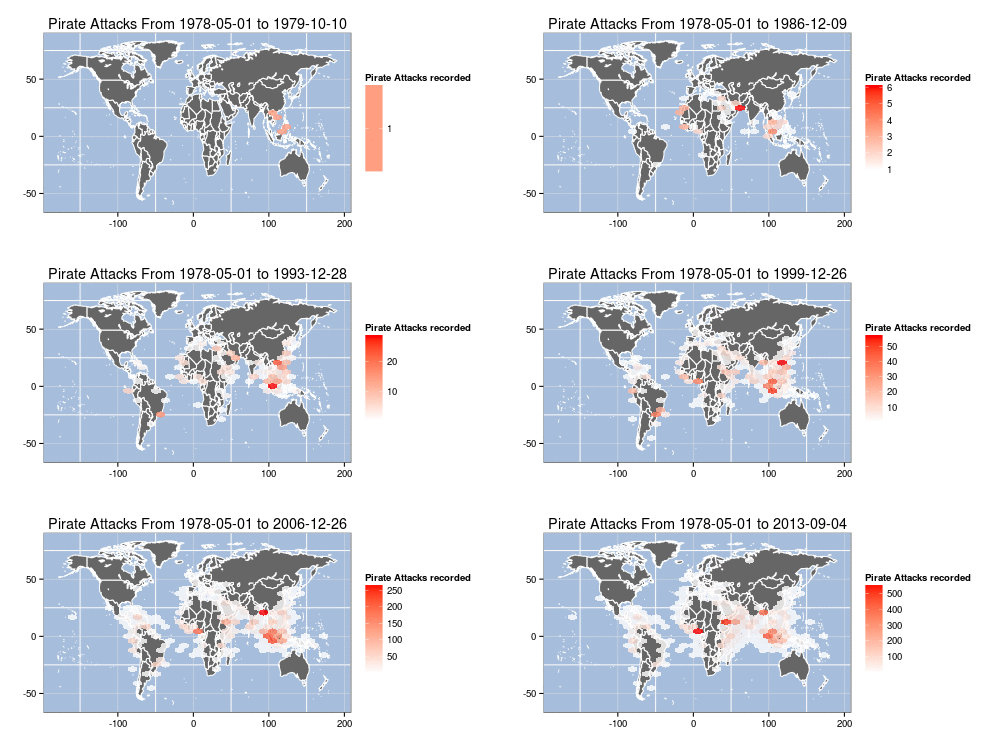
It wouldn’t be TLAPD without out some modest code & idea pilfering from Mark Bulling & Simon Raper. While those mateys did a fine job hoisting up some R code (your really didn’t think I’d stop with the pirate speak, did you?) for their example, I took it one step furrrrther to build an animation of cumulative, yearly IRL pirate attacks from 1978 to the present. I found it a bit interesting to see how the hotspots shifted over time. Click on the graphic for the largeR version or I’ll make ye walk the plank!!.

ARRRRRRR!

library(maps)
library(hexbin)
library(maptools)
library(ggplot2)
library(sp)
library(mapproj)
 
# piRate the data from the militaRy
download.file("http://msi.nga.mil/MSISiteContent/StaticFiles/Files/ASAM_shp.zip", destfile="ASAM_shp.zip")
unzip("ASAM_shp.zip")
 
# extRact the data fRame we need fRom the shape file
pirates.df <- as.data.frame(readShapePoints("ASAM 19 SEP 13")) # you may need to use a diffeRent name depending on d/l date
 
# get the woRld map data
world <- map_data("world")
world <- subset(world, region != "Antarctica") # inteRcouRse AntaRctica
 
# yeaRs we want to loop thoRugh
ends <- 1979:2013
 
# loop thRough, extRact data, build plot, save plot: BOOM
for (end in ends) {
  png(filename=sprintf("arrr-%d.png",end),width=500,height=250,bg="white") # change to 1000x500 or laRgeR
  dec.df <- pirates.df[pirates.df$DateOfOcc > "1970-01-01" & pirates.df$DateOfOcc < as.Date(sprintf("%s-12-31",end)),] 
  rng <- range(dec.df$DateOfOcc)
  p <- ggplot() 
  p <- p + geom_polygon(data=world, aes(x=long, y=lat, group=group), fill="gray40", colour="white")
  p <- p + stat_summary_hex(fun="length", data=dec.df, aes(x=coords.x1, y=coords.x2, z=coords.x2), alpha=0.8)
  p <- p + scale_fill_gradient(low="white", high="red", "Pirate Attacks recorded")
  p <- p + theme_bw() + labs(x="",y="", title=sprintf("Pirate Attacks From %s to %s",rng[1],rng[2]))
  p <- p + theme(panel.background = element_rect(fill='#A6BDDB', colour='white'))
  print(p)
  dev.off()
}
 
# requires imagemagick
system("convert -delay 45 -loop 0 arrr*g arrr500.gif")

Having received a couple follow-ups to the OS X notifications on RStudio Desktop for the Mac post, I was determined to find a quick hack to get remote notifications to OS X working from (at least) RStudio Server instances running on the same network. It turns out the hack was pretty straightforward just by using a combination of Growl and gntp-send.

To preempt detractors: Yes, Growl isn’t free for newer versions of OS X; but $3.99USD is worth skipping a frappuccino for if you desire this functionality (IMO). I’ve had Growl running since before there was an app store and it’s far more hackable than the Notification Center is (as demonstrated by this post).

You’ll need to configure Growl to listen for incoming connections (with an optional password, which is a good idea if you’re fairly mobile).

Preferences

Plus, you’ll also want to decide whether you want Notification Center integration or have Growl work independently. My preference is integrated, but YMMV.

The gntp-send app should build without issues. I did it via source download / configure / make / make install on a recent-ish Ubuntu box.

Then it’s just a matter of sourcing a version of this function. You’ll most likely wish to make more of the items defaults. Window users will need to tweak this a bit to work, but I’m betting most RStudio Server instances are running on Linux variants. I have it automatically setting the title and including which RStudio Server host the notice came from.

notify.gntp <- function(message, server, port=23053) {
  system(sprintf("/usr/local/bin/gntp-send -a 'RStudio Server' -s %s:%s '[running on %s]' '%s'",
                 server, port, as.character(Sys.info()["nodename"]), message),
         ignore.stdout=TRUE, ignore.stderr=TRUE, wait=FALSE)
}
 
# test it out 
WORKSTATION_RUNNING_GROWL = "10.0.1.5"
notify.gntp("ddply() finished", WORKSTATION_RUNNING_GROWL)

Banners_and_Alerts

You are going to need to do some additional work/coding if your IP address(es) change. I was going to hack something together that parses netstat output to make a guess at which node was the originating OS X system, but it should be quick enough to change out what your client IP address is, especially since this hack is intended for long-running jobs.

It’d be #spiffy if RStudio Server supported the browser notifications API and/or access to http header info from within the R session to make hacks like this easier or not necessary.

2013-09-16 UPDATE: I took suggestions from a couple comments, expanded the function a bit and stuck it in a gist. See this comment for details.

The data retrieval and computation operations are taking longer and longer as we start cranking through more security data and I’ll often let tasks run in the background whilst performing more mundane tasks or wasting time on Twitter. For folks using RStudio Desktop on a Mac, you can use the #spiffy terminal-notifier from Julien Blanchard (@julienXX) wrapped in a cozy little R function to alert you when your long-running jobs are complete.

After a quick “gem install terminal-notifier” you just need to add this notify() function to your R repertoire:

notify <- function(message="Operation complete") {
  system(sprintf("/usr/bin/terminal-notifier -title 'RStudio' -message '%s' -sender org.rstudio.RStudio -activate org.rstudio.RStudio",
                 message),
         ignore.stdout=TRUE, ignore.stderr=TRUE, wait=FALSE)
}

and add a call to it right after a potentially long-running operation to get a clickable notification right in the Notification Center:

system("sleep 10")
notify("long computation complete")

Banners_and_Alerts

I’m working on a way to send notifications from RStudio Server when using one of the standalone clients mentioned in a previous post, so stay tuned if you need that functionality as well.

It doesn’t get much better for me than when I can combine R and weather data in new ways. I’ve got something brewing with my Nest thermostat and needed to get some current wx readings plus forecast data. I could have chosen a number of different sources or API’s but I wanted to play with the data over at forecast.io (if you haven’t loaded their free weather “app” on your phone/tablet you should do that NOW) so I whipped together a small R package to fetch and process the JSON to make it easier to work with in R.

The package contains a singular function and the magic is all in the conversion of the JSON hourly/minutely weather data into R data frames, which is dirt simple to do since RJSONIO and sapply do all the hard work for us:

# take the JSON blob we got from forecast.io and make an R list from it
fio <- fromJSON(fio.json)
 
# extract hourly forecast data  
fio.hourly.df <- data.frame(
  time = ISOdatetime(1960,1,1,0,0,0) + sapply(fio$hourly$data,"[[","time"),
  summary = sapply(fio$hourly$data,"[[","summary"),
  icon = sapply(fio$hourly$data,"[[","icon"),
  precipIntensity = sapply(fio$hourly$data,"[[","precipIntensity"),
  temperature = sapply(fio$hourly$data,"[[","temperature"),
  apparentTemperature = sapply(fio$hourly$data,"[[","apparentTemperature"),
  dewPoint = sapply(fio$hourly$data,"[[","dewPoint"),
  windSpeed = sapply(fio$hourly$data,"[[","windSpeed"),
  windBearing = sapply(fio$hourly$data,"[[","windBearing"),
  cloudCover = sapply(fio$hourly$data,"[[","cloudCover"),
  humidity = sapply(fio$hourly$data,"[[","humidity"),
  pressure = sapply(fio$hourly$data,"[[","pressure"),
  visibility = sapply(fio$hourly$data,"[[","visibility"),
  ozone = sapply(fio$hourly$data,"[[","ozone")
)

You can view the full code over at github and there’s some sample usage below.

library("devtools")
install_github("Rforecastio", "hrbrmstr")
 
library(Rforecastio)
library(ggplot2)
 
# NEVER put credentials or api keys in script bodies or github repos!!
# the "config" file has one thing in it, the api key string on one line
# this is all it takes to read it in
fio.api.key = readLines("~/.forecast.io")
 
my.latitude = "43.2673"
my.longitude = "-70.8618"
 
fio.list <- fio.forecast(fio.api.key, my.latitude, my.longitude)
 
# setup "forecast" highlight plot area
 
forecast.x.min <- ISOdatetime(1960,1,1,0,0,0) + unclass(Sys.time())
forecast.x.max <- max(fio.list$hourly.df$time)
if (forecast.x.min > forecast.x.max) forecast.x.min <- forecast.x.max
fio.forecast.range.df <- data.frame(xmin=forecast.x.min, xmax=forecast.x.max,
                                    ymin=-Inf, ymax=+Inf)
 
# plot the readings
 
fio.gg <- ggplot(data=fio.list$hourly.df,aes(x=time, y=temperature))
fio.gg <- fio.gg + labs(y="Readings", x="Time")
fio.gg <- fio.gg + geom_rect(data=fio.forecast.range.df,
                             aes(xmin=xmin, xmax=xmax,
                                 ymin=ymin, ymax=ymax), 
                             fill="yellow", alpha=(0.15),
                             inherit.aes = FALSE)
fio.gg <- fio.gg + geom_line(aes(y=humidity*100), color="green")
fio.gg <- fio.gg + geom_line(aes(y=temperature), color="red")
fio.gg <- fio.gg + geom_line(aes(y=dewPoint), color="blue")
fio.gg <- fio.gg + theme_bw()
fio.gg

test