Skip navigation

Category Archives: ggplot

UPDATE: A newer blog post explaining the new ggplot2 additions: http://rud.is/b/2016/03/16/supreme-annotations/

UPDATE: this capability (+ more) are being rolled into ggplot2-proper. PR will be absorbed into ggplot2 main branch soon. exciting, annotated times ahead!

UPDATE: fontsize issue has been fixed & there’s a Shiny gadget available for interactively making subtitles. More info at the end of the post.

Subtitles aren’t always necessary for plots, but I began to use them enough that I whipped up a function for ggplot2 that does a decent job adding a subtitle to a finished plot object. More than a few folks have tried their hand at this in the past and this is just my incremental contribution until there’s proper support in ggplot2 (someone’s bound to add it via PR at some point).

We’ll nigh fully recreate the following plot from this WaPo article:

2300lawyers0116-2

Here’s a stab at that w/o the subtitle:

library(ggplot2)
library(scales)
 
data.frame(
  yrs=c("1789-90", "1849-50", "1909-10", "1965-66", "2016-16"),
  pct=c(0.526, 0.795, 0.713, 0.575, 0.365),
  xtralabs=c("", "Highest:\n", "", "", "Lowest:\n")
) -> hill_lawyers
 
gg <- ggplot(hill_lawyers, aes(yrs, pct))
gg <- gg + geom_bar(stat="identity", width=0.65)
gg <- gg + geom_label(aes(label=sprintf("%s%s", xtralabs, percent(pct))),
                      vjust=-0.4, family=c(rep("FranklinGothic-Book", 4),"FranklinGothic-Heavy"), 
                      lineheight=0.9, size=4, label.size=0)
gg <- gg + scale_x_discrete()
gg <- gg + scale_y_continuous(expand=c(0,0), limits=c(0.0, 1.0), labels=percent)
gg <- gg + labs(x=NULL, y=NULL, title="Fewer and fewer lawyers on the Hill")
gg <- gg + theme_minimal(base_family="FranklinGothic-Book")
gg <- gg + theme(axis.line=element_line(color="#2b2b2b", size=0.5))
gg <- gg + theme(axis.line.y=element_blank())
gg <- gg + theme(axis.text.x=element_text(family=c(rep("FranklinGothic-Book", 4),
                                                   "FranklinGothic-Heavy")))
gg <- gg + theme(panel.grid.major.x=element_blank())
gg <- gg + theme(panel.grid.major.y=element_line(color="#b2b2b2", size=0.1))
gg <- gg + theme(panel.grid.minor.y=element_blank())
gg <- gg + theme(plot.title=element_text(hjust=0, 
                                         family="FranklinGothic-Heavy", 
                                         margin=margin(b=10)))
gg

RStudio

(There are some “tricks” in that plotting code that may be worth spending an extra minute or two to mull over if you didn’t realize some of the function parameters were vectorized, or that you could get a white background with no border for text labels so grid lines don’t get in the way.)

Ideally, a subtitle would be part of the gtable that gets made underneath the covers so it will “travel well” with the plot object itself. The function below makes a textGrob from whatever text we pass into it and does just that; it inserts the new grob into a new table row.

#' Add a subtitle to a ggplot object and draw plot on current graphics device.
#' 
#' @param gg ggplot2 object
#' @param label subtitle label
#' @param fontfamily font family to use. The function doesn't pull any font 
#'        information from \code{gg} so you should consider specifying fonts
#'        for the plot itself and here. Or send me code to make this smarter :-)
#' @param fontsize font size
#' @param hjust,vjust horizontal/vertical justification 
#' @param bottom_margin space between bottom of subtitle and plot (code{pts})
#' @param newpage draw new (empty) page first?
#' @param vp viewport to draw plot in
#' @param ... parameters passed to \code{gpar} in call to \code{textGrob}
#' @return Invisibly returns the result of \code{\link{ggplot_build}}, which
#'   is a list with components that contain the plot itself, the data,
#'   information about the scales, panels etc.
ggplot_with_subtitle <- function(gg, 
                                 label="", 
                                 fontfamily=NULL,
                                 fontsize=10,
                                 hjust=0, vjust=0, 
                                 bottom_margin=5.5,
                                 newpage=is.null(vp),
                                 vp=NULL,
                                 ...) {
 
  if (is.null(fontfamily)) {
    gpr <- gpar(fontsize=fontsize, ...)
  } else {
    gpr <- gpar(fontfamily=fontfamily, fontsize=fontsize, ...)
  }
 
  subtitle <- textGrob(label, x=unit(hjust, "npc"), y=unit(hjust, "npc"), 
                       hjust=hjust, vjust=vjust,
                       gp=gpr)
 
  data <- ggplot_build(gg)
 
  gt <- ggplot_gtable(data)
  gt <- gtable_add_rows(gt, grobHeight(subtitle), 2)
  gt <- gtable_add_grob(gt, subtitle, 3, 4, 3, 4, 8, "off", "subtitle")
  gt <- gtable_add_rows(gt, grid::unit(bottom_margin, "pt"), 3)
 
  if (newpage) grid.newpage()
 
  if (is.null(vp)) {
    grid.draw(gt)
  } else {
    if (is.character(vp)) seekViewport(vp) else pushViewport(vp)
    grid.draw(gt)
    upViewport()
  }
 
  invisible(data)
 
}

The roxygen comments should give you an idea of how to work with it, and here it is in action:

subtitle <- "The percentage of Congressional members that are laywers has been\ncontinuously dropping since the 1960s"
 
ggplot_with_subtitle(gg, subtitle,
                     fontfamily="FranklinGothic-Book",
                     bottom_margin=20, lineheight=0.9)

Fullscreen_3_12_16__3_39_PM

It deals with long annotations pretty well, too (I strwrapped the source text for the below at 100 characters). The text is senseless here, but it’s just for show (I had it handy…don’t judge…you’re getting free code :-):

Fullscreen_3_12_16__7_44_PM

I think this beats manually re-creating the wheel, even if you only infrequently use subtitles. It definitely beats hand-editing plots and is a bit more elegant and functional than using grid.arrange (et al) to mimic the functionality. It also beats futzing with panel margins and clipping to shoehorn a frankenmashup mess of geom_text or annotation_custom calls.

Kick the tyres, tell me where it breaks and if I can cover enough edge cases (or make it smarter) I’ll add it to my ggalt package.

Shiny Subtitle Gadget

Thanks to:

you can now play with an experimental Shiny gadget which you can load by devtools::install_github("hrbrmstr/hrbrmisc") (that’s a temporary home for it, I use this pkg for testing/playing). Just select a ggplot2 object variable name in RStudio and then select “Add subtitle” from the Addins menu and give it a whirl. It looks like this:

__Development_hrbrmisc_-_master_-_RStudio

>UPDATE: I rejiggered the function to actually now, y’know, do what it says it should do :-)

A friend, we’ll call him _Alen_ put a call out for some function that could take an image and produce a per-row “histogram” along the edge for the number of filled-in points. That requirement eventually scope-creeped to wanting “histograms” on both the edge and bottom. In, essence there was a desire to be able to compare the number of pixels in each row/line to each other.

Now, you’re all like _”Well, you used ggplot to make the image so…”_ Yeah, not so much. They had done some basic charting in D3. And, it turns out, that it would be handy to compare the data between different images since they had different sets of data they were charting in the same place.

I can’t show you their images as they are part of super seekrit research which will eventually solve world hunger and land a family on Mars. But, I _can_ do a minor re-creation. I made a really simple D3 page that draws random lines in a specified color. Like this:


You can view the source of to see the dead-simple D3 that generates that. You’ll see something different in that image every time since it’s javascript and js has no decent built-in random routines (well it does _now_ but the engine functionality in browsers hasn’t caught up yet). So, you won’t be able to 100% replicate the results below but it will work.

First, we need to be able to get the image from the `div` into a bitmap so we can do some pixel counting. We’ll use the new `webshot` package for that.

library(webshot)
 
tmppng1 <- tempfile(fileext=".png")
webshot("http://rud.is/projects/randomlines.html?linecol=f6743d", 
        file=tmppng1,
        selector="#vis")

The image that produced looks like this:

img1

To make the “histograms” on the right and bottom, we’ll use the `raster` capabilities in R to let us treat the data like a matrix so we can easily add columns and rows. I made a function (below) that takes in a `png` file and either a list of colors to look for or a list of colors to exclude and the color you want the “histograms” to be drawn in. This way you can just exclude the background and annotation colors or count specific sets of colors. The counting is fueled by `fastmatch` which makes for super-fast comparisons.

#' Make a "row color density" histogram for an image file
#' 
#' Takes a file path to a png and returns displays it with a histogram of 
#' pixel density
#' 
#' @param img_file path to png file
#' @param target_colors,ignore_colors colors to count or ignore. Either one should be 
#'        \code{NULL} or \code{ignore_colors} should be \code{NULL}. Whichever is
#'        not \code{NULL} should be a vector of hex strings (can be huge vector of 
#'        hex strings as it uses \code{fastmatch}). The alpha channel is thrown away 
#'        if any, so you only need to specify \code{#rrggbb} hex strings
#' @param color to use for the density histogram line
selective_image_color_histogram <- function(img_file, 
                                            target_colors=NULL,
                                            ignore_colors=c("#ffffff", "#000000"),
                                            hist_col="steelblue",
                                            plot=TRUE) {
 
  require(png)
  require(grid)
  require(raster)
  require(fastmatch)
  require(gridExtra)
 
  "%fmin%" <- function(x, table) { fmatch(x, table, nomatch = 0) > 0 }
  "%!fmin%" <- function(x, table) { !fmatch(x, table, nomatch = 0) > 0 }
 
  if (is.null(target_colors) & is.null(ignore_colors)) {
    stop("Only one of 'target_colors' or 'ignore_colors' can be 'NULL'", call.=FALSE)
  }
 
  # clean up params
  target_colors <- tolower(target_colors)  
  ignore_colors <- tolower(ignore_colors)  
 
  # read in file and convert to usable data structure  
  png_file <- readPNG(img_file)
  img <- substr(tolower(as.matrix(as.raster(png_file))), 1, 7)
 
  if (length(target_colors)==0) {
    tf_img <- matrix(img %!fmin% ignore_colors, nrow=nrow(img), ncol=ncol(img))
  } else {
    tf_img <- matrix(img %fmin% target_colors, nrow=nrow(img), ncol=ncol(img))
  }  
 
  # count the pixels
  wvals <- rowSums(tf_img)
  hvals <- colSums(tf_img)
 
  # add a slight right & bottom margin
  wdth <- max(wvals) + round(0.1*max(wvals))
  hght <- max(hvals) + round(0.1*max(hvals))
 
  # create the "histogram" 
  col_mat <- matrix(rep("#ffffff", wdth*nrow(img)), nrow=nrow(img), ncol=wdth)
  for (row in 1:nrow(img)) { 
    col_mat[row, 1:wvals[row]] <- hist_col
  }
 
  # make bigger image
  new_img <- cbind(img, col_mat)
 
  # create the "histogram"
  row_mat <- matrix(rep("#ffffff", hght*ncol(new_img)), ncol=ncol(new_img), nrow=hght)
  for (col in 1:ncol(img)) { 
    row_mat[1:hvals[col], col] <- hist_col
  }
 
  # make a new bigger image and turn it into something we can use with 
  # grid since we can also use it with ggplot this way if we really wanted to
  # and friends don't let friends use base graphics
  rg1 <- rasterGrob(rbind(new_img, row_mat))
 
  # if we want to plot it, now is the time
  if (plot) grid.arrange(rg1)
 
  # return a list with each "histogram"
  return(list(row_hist=wvals, col_hist=hvals))
 
}

After reading in the `png` as a raster, the function counts up all the specified pixels by row and extends the matrix width-wise. Then it does the same by column and extends the matrix height-wise. Finally, it makes a `rasterGrob` (b/c friends don’t let friends use base graphics) and optionally plots the output. It also returns the counts by row and by column. That will let us compare between images.

Now we can do:

a <- selective_image_color_histogram(tmppng, hist_col="#f6743d", plot=TRUE)

hist1

And, make a counterpart image for it:

tmppng2 <- tempfile(fileext=".png")
webshot("http://rud.is/projects/randomlines.html?linecol=80b1d4", 
        file=tmppng2,
        selector="#vis")
 
b <- selective_image_color_histogram(tmppng2, hist_col="#80b1d4", plot=TRUE)

hist2

You can definitely visually compare to see which ones had more “activity” in which row(s) (or column(s)) but why not let R do that for you (you’ll probably need to change the font to something boring like `”Helvetica”`)?

library(ggplot2)
library(dplyr)
 
gg <- ggplot(data_frame(x=1:length(a$row_hist),
                        diff=a$row_hist - b$row_hist,
                        `A vs B`=factor(sign(diff), levels=c(-1, 0, 1), 
                                        labels=c("A", "Neutral", "B"))))
gg <- gg + geom_segment(aes(x=x, xend=x, y=0, yend=diff, color=`A vs B`))
gg <- gg + scale_x_continuous(expand=c(0,0))
gg <- gg + scale_y_continuous(expand=c(0,0))
gg <- gg + scale_color_manual(values=c("#f6743d", "#2b2b2b", "#80b1d4"))
gg <- gg + labs(x="Row", y="Difference")
gg <- gg + coord_flip()
gg <- gg + ggthemes::theme_tufte(base_family="URW Geometric Semi Bold")
gg <- gg + theme(panel.grid=element_line(color="#2b2b2b", size=0.15))
gg <- gg + theme(panel.grid.major.y=element_blank())
gg <- gg + theme(panel.grid.minor=element_blank())
gg <- gg + theme(axis.ticks=element_blank())
gg <- gg + theme(axis.text.y=element_blank())
gg <- gg + theme(axis.title.x=element_text(hjust=0))
gg <- gg + theme(axis.title.y=element_text(hjust=0))
gg

vertdif

This way, you let the _power of data science_ show you the answer. (The column processing chart is an exercise left to the reader).

The code may only be useful to _Alen_, but it was a fun and quick enough exercise that I thought it might be useful to the broader community.

Poke holes or improve upon it at will and tell me how horrible my code is in the comments (I have not looked to see if I subtracted in the right direction as I’m on solo dad duty for a cpl days and #4 is hungry).

My wife tricked me into a partial-weekend project to try to get all the primary/caucus results to-date on a map (the whole us). This is challenging since not all states use counties as boundaries for aggregate results. I’m still piecing together some shapefiles for the primary/caucus summation boundaries for a couple remaining states but I didn’t want to let the data source for the election results go without a mention.

The bestest part of the `iframe` below (which can be busted with [this link](/projects/primaryplotting.html)) is the CNN JSON link. You can discover those with Developer Tools on any modern browser. Here’s [the rest](https://gist.github.com/hrbrmstr/25a53e2fcaee2aafa908) of those links (using a gist to add enough layers of redirection to hopefully keep this data free/available).

It’s really well-formatted JSON. As of this post, not all those links completely work (the Maine & PR results weren’t certified yet). Please credit the hard-working folks at CNN whenever/wherever you use this data (if you use it at all). Making a resource like this available is a great service (even if it wasn’t 100% intentional).

The rest of the post shows how to display the voting % per top-candidate in each Texas county. Because Texas uses counties for roll-up aggregation, we can also use `tigris` to get great maps.


This post comes hot off the heels of the [nigh-feature-complete release of `vegalite`](http://rud.is/b/2016/02/27/create-vega-lite-specs-widgets-with-the-vegalite-package/) (virtually all the components of Vega-Lite are now implemented and just need real-world user testing). I’ve had a few and seen a few questions about “why Vega-Lite”? I _think_ my previous post gave some good answers to “why”. However, Vega-Lite and Vega provide different ways to think about composing statistical graphs than folks seem to be used to (which is part of the “why?”).

Vega-Lite attempts to simplify the way charts are specified (i.e. the way you create a “spec”) in Vega. Vega-proper is rich and complex. You interleave data, operations on data, chart aesthetics and chart element interactions all in one giant JSON file. Vega-Lite 1.0 is definitely more limited than Vega-proper and even when it does add more interactivity (like “brushing”) it will _still_ be more limited, _on purpose_. The reduction in complexity makes it more accessible to both humans and apps, especially apps that don’t grok the Grammar of Graphics (GoG) well.

Even though `ggplot2` lets you mix and match statistical operations on data, I’m going to demonstrate the difference in paradigms/idioms through a single chart. I grabbed the [FRED data on historical WTI crude oil prices](https://research.stlouisfed.org/fred2/series/DCOILWTICO) and will show a chart that displays the minimum monthly price per-decade for a barrel of this cancerous, greed-inducing, global-conflict-generating, atmosphere-destroying black gold.

The data consists of records of daily prices (USD) for this commodity. That means we have to:

1. compute the decade
2. compute the month
3. determine the minimum price by month and decade
4. plot the values

The goal of each idiom is to provide a way to reproduce and communicate the “research”.

Here’s the idiomatic way of doing this with Vega-Lite:

library(vegalite)
library(quantmod)
library(dplyr)
 
getSymbols("DCOILWTICO", src="FRED")
 
data_frame(date=index(DCOILWTICO),
           value=coredata(DCOILWTICO)[,1]) %>%
  mutate(decade=sprintf("%s0", substring(date, 1, 3))) -> oil
 
# i created a CSV and moved the file to my server for easier embedding but
# could just have easily embedded the data in the spec.
# remember, you can pipe a vegalite object to embed_spec() to
# get javascript embed code.
 
vegalite() %>%
  add_data("http://rud.is/dl/crude.csv") %>%
  encode_x("date", "temporal") %>%
  encode_y("value", "quantitative", aggregate="min") %>%
  encode_color("decade", "nominal") %>%
  timeunit_x("month") %>%
  axis_y(title="", format="$3d") %>%
  axis_x(labelAngle=45, labelAlign="left", 
         title="Min price for Crude Oil (WTI) by month/decade, 1986-present") %>%
  mark_tick(thickness=3) %>%
  legend_color(title="Decade", orient="left")

Here’s the “spec” that creates (wordpress was having issues with it, hence the gist embed):

And, here’s the resulting visualization:

The grouping and aggregation operations operate in-chart-craft-situ. You have to carefully, visually parse either the spec or the R code that creates the spec to really grasp what’s going on. A different way of looking at this is that you embed everything you need to reproduce the transformations and visual encodings in a single, simple JSON file.

Here’s what I believe to be the modern, idiomatic way to do this in R + `ggplot2`:

library(ggplot2)
library(quantmod)
library(dplyr)
 
getSymbols("DCOILWTICO", src="FRED")
 
data_frame(date=index(DCOILWTICO),
           value=coredata(DCOILWTICO)[,1]) %>%
  mutate(decade=sprintf("%s0", substring(date, 1, 3)),
         month=factor(format(as.Date(date), "%B"),
                      levels=month.name)) -> oil
 
filter(oil, !is.na(value)) %>%
  group_by(decade, month) %>%
  summarise(value=min(value)) %>%
  ungroup() -> oil_summary
 
ggplot(oil_summary, aes(x=month, y=value, group=decade)) +
  geom_point(aes(color=decade), shape=95, size=8) +
  scale_y_continuous(labels=scales::dollar) +
  scale_color_manual(name="Decade", 
                     values=c("#d42a2f", "#fd7f28", "#339f34", "#d42a2f")) +
  labs(x="Min price for Crude Oil (WTI) by month/decade, 1986-present", y=NULL) +
  theme_bw() +
  theme(axis.text.x=element_text(angle=-45, hjust=0)) +
  theme(legend.position="left") +
  theme(legend.key=element_blank()) +
  theme(plot.margin=grid::unit(rep(1, 4), "cm"))

(To stave off some comments, yes I do know you can be Vega-like and compute with arbitrary functions within ggplot2. This was meant to show what I’ve seen to be the modern, recommended idiom.)

You really don’t even need to know R (for the most part) to grok what’s going on. Data is acquired and transformed and we map that into the plot. Yes, you can do the same thing with Vega[-Lite] (i.e. munge the data ahead of time and just churn out marks) but _you’re not encouraged to_. The power of the Vega paradigm is that you _do blend data and operations together_ and they _stay together_.

To make the R+ggplot2 code reproducible the entirety of the script has to be shipped. It’s really the same as shipping the Vega[-Lite] spec, though since you need to reproduce either the JSON or the R code in environments that support the code (R just happens to support both ggplot2 & Vega-Lite now :-).

I like the latter approach but can appreciate both (otherwise I wouldn’t have written the `vegalite` package). I also think Vega-Lite will catch on more than Vega-proper did (though Vega itself is in use and you use under the covers whenever you use `ggvis`). If Vega-Lite does nothing more than improve visualization literacy—you _must_ understand core vis terms to use it—and foster the notion for the need for serialization, reproduction and sharing of basic statistical charts, it will have been an amazing success in my book.

We were doing some exploratory data analysis on some attacker data at work and one of the things I was interested is what were “working hours” by country. Now, I don’t put a great deal of faith in the precision of geolocated IP addresses since every geolocation database that exists thinks I live in Vermont (I don’t) and I know that these databases rely on a pretty “meh” distributed process for getting this local data. However, at a country level, the errors are tolerable provided you use a decent geolocation provider. Since a rant about the precision of IP address geolocation was not the point of this post, let’s move on.

One of the best ways to visualize these “working hours” is a temporal heatmap. Jay & I made a couple as part of our inaugural Data-Driven Security Book blog post to show how much of our collected lives were lost during the creation of our tome.

I have some paired-down, simulated data based on the attacker data we were looking at. Rather than the complete data set, I’m providing 200,000 “events” (RDP login attempts, to be precise) in the eventlog.csv file in the data/ directory that have the timestamp, and the source_country ISO 3166-1 alpha-2 country code (which is the source of the attack) plus the tz time zone of the source IP address. Let’s have a look:

library(data.table)  # faster fread() and better weekdays()
library(dplyr)       # consistent data.frame operations
library(purrr)       # consistent & safe list/vector munging
library(tidyr)       # consistent data.frame cleaning
library(lubridate)   # date manipulation
library(countrycode) # turn country codes into pretty names
library(ggplot2)     # base plots are for Coursera professors
library(scales)      # pairs nicely with ggplot2 for plot label formatting
library(gridExtra)   # a helper for arranging individual ggplot objects
library(ggthemes)    # has a clean theme for ggplot2
library(viridis)     # best. color. palette. evar.
library(knitr)       # kable : prettier data.frame output

attacks <- tbl_df(fread("data/eventlog.csv"))

kable(head(attacks))
timestamp source_country tz
2015-03-12T15:59:16.718901Z CN Asia/Shanghai
2015-03-12T16:00:48.841746Z FR Europe/Paris
2015-03-12T16:02:26.731256Z CN Asia/Shanghai
2015-03-12T16:02:38.469907Z US America/Chicago
2015-03-12T16:03:22.201903Z CN Asia/Shanghai
2015-03-12T16:03:45.984616Z CN Asia/Shanghai

For a temporal heatmap, we’re going to need the weekday and hour (or as granular as you want to get). I use a factor here so I can have ordered weekdays. I need the source timezone weekday/hour so we have to get a bit creative since the time zone parameter to virtually every date/time operation in R only handles a single element vector.

make_hr_wkday <- function(cc, ts, tz) {

  real_times <- ymd_hms(ts, tz=tz[1], quiet=TRUE)

  data_frame(source_country=cc,
             wkday=weekdays(as.Date(real_times, tz=tz[1])),
             hour=format(real_times, "%H", tz=tz[1]))

}

group_by(attacks, tz) %>%
  do(make_hr_wkday(.$source_country, .$timestamp, .$tz)) %>%
  ungroup() %>%
  mutate(wkday=factor(wkday,
                      levels=levels(weekdays(0, FALSE)))) -> attacks
kable(head(attacks))
tz source_country wkday hour
Africa/Cairo BG Saturday 22
Africa/Cairo TW Sunday 08
Africa/Cairo TW Sunday 10
Africa/Cairo CN Sunday 13
Africa/Cairo US Sunday 17
Africa/Cairo CA Monday 13

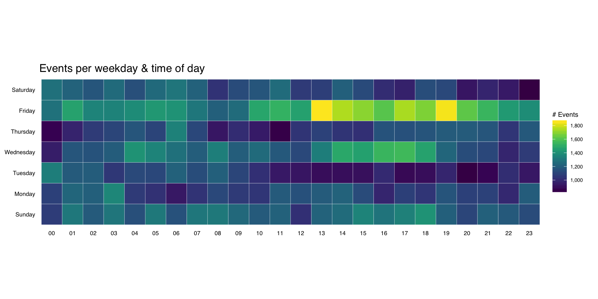
It’s pretty straightforward to make an overall heatmap of activity. Group & count the number of “attacks” by weekday and hour then use geom_tile(). I’m going to clutter up the pristine ggplot2 commands with some explanation for those still learning ggplot2:

wkdays <- count(attacks, wkday, hour)

kable(head(wkdays))
wkday hour n
Sunday 00 1076
Sunday 01 1307
Sunday 02 1189
Sunday 03 1301
Sunday 04 1145
Sunday 05 1313

Here, we’re just feeding in the new data.frame we just created to ggplot and telling it we want to use the hour column for the x-axis, the wkday column for the y-axis and that we are doing a continuous scale fill by the n aggregated count:

gg <- ggplot(wkdays, aes(x=hour, y=wkday, fill=n))

This does all the hard work. geom_tile() will make tiles at each x&y location we’ve already specified. I knew we had events for every hour, but if you had missing days or hours, you could use tidyr::complete() to fill those in. We’re also telling it to use a thin (0.1 units) white border to separate the tiles.

gg <- gg + geom_tile(color="white", size=0.1)

this has some additional magic in that it’s an awesome color scale. Read the viridis package vignette for more info. By specifying a name here, we get a nice label on the legend.

gg <- gg + scale_fill_viridis(name="# Events", label=comma)

This ensures the plot will have a 1:1 aspect ratio (i.e. geom_tile()–which draws rectangles–will draw nice squares).

gg <- gg + coord_equal()

This tells ggplot to not use an x- or y-axis label and to also not reserve any space for them. I used a pretty bland but descriptive title. If I worked for some other security company I’d’ve added “ZOMGOSH CHINA!” to it.

gg <- gg + labs(x=NULL, y=NULL, title="Events per weekday & time of day")

Here’s what makes the plot look really nice. I customize a number of theme elements, starting with a base theme of theme_tufte() from the ggthemes package. It removes alot of chart junk without having to do it manually.

gg <- gg + theme_tufte(base_family="Helvetica")

I like my plot titles left-aligned. For hjust:

  • 0 == left
  • 0.5 == centered
  • 1 == right
gg <- gg + theme(plot.title=element_text(hjust=0))

We don’t want any tick marks on the axes and I want the text to be slightly smaller than the default.

gg <- gg + theme(axis.ticks=element_blank())
gg <- gg + theme(axis.text=element_text(size=7))

For the legend, I just needed to tweak the title and text sizes a wee bit.

gg <- gg + theme(legend.title=element_text(size=8))
gg <- gg + theme(legend.text=element_text(size=6))
gg

(NOTE: there’s an alternate version of this post with SVG graphics and nicer tables)

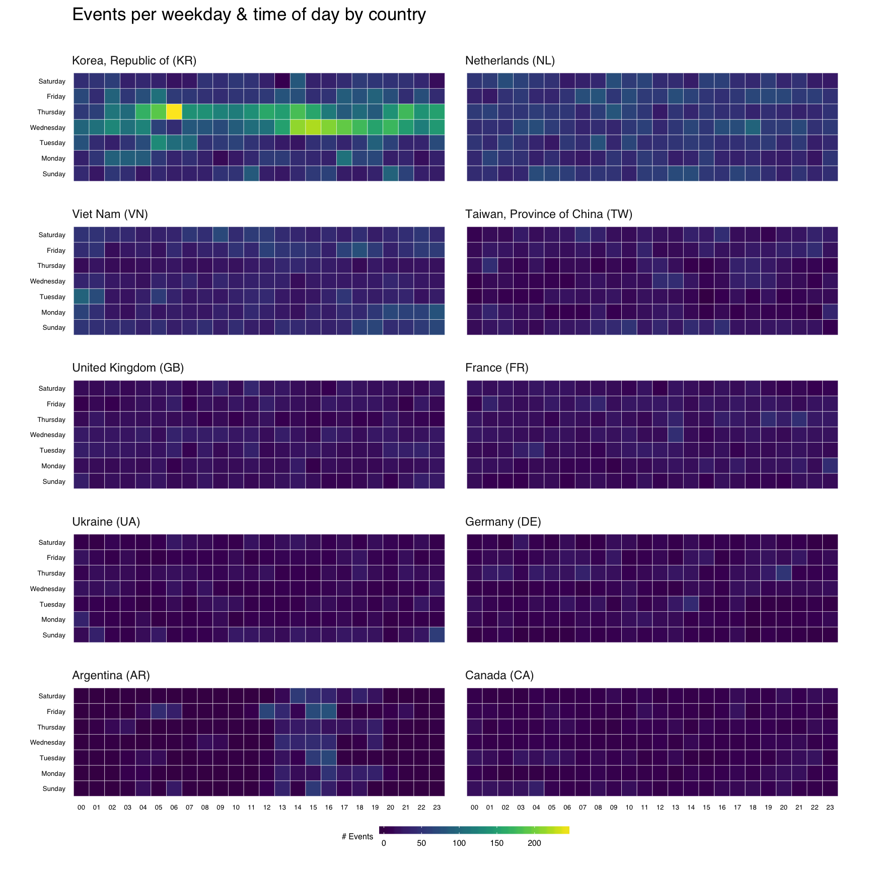
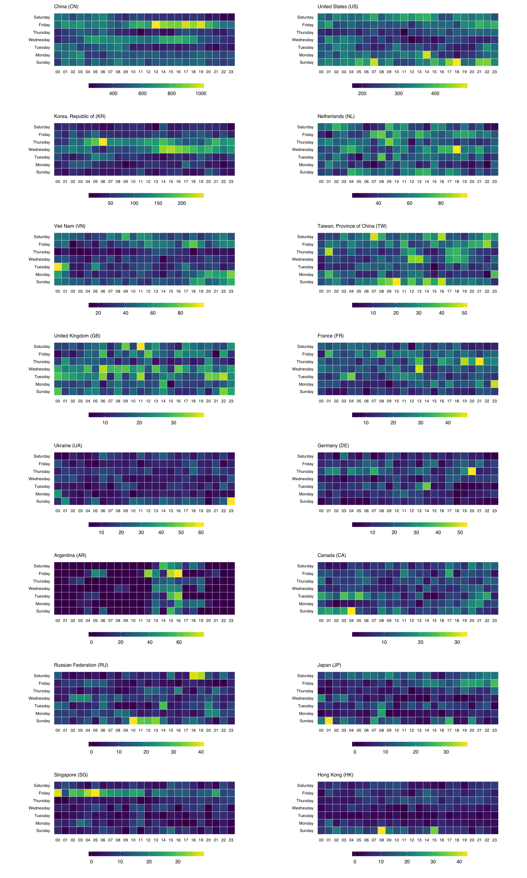
That’s great, but what if we wanted the heatmap breakdown by country? We’ll do this two ways, first with each country’s heatmap using the same scale, then with each one using it’s own scale. That will let us compare at a macro and micro level.

For either view, I want to rank-order the countries and want nice country names versus 2-letter abbreviations. We’ll do that first:

count(attacks, source_country) %>%
  mutate(percent=percent(n/sum(n)), count=comma(n)) %>%
  mutate(country=sprintf("%s (%s)",
                         countrycode(source_country, "iso2c", "country.name"),
                         source_country)) %>%
  arrange(desc(n)) -> events_by_country

kable(events_by_country[,5:3])
country count percent
China (CN) 85,243 42.6%
United States (US) 48,684 24.3%
Korea, Republic of (KR) 12,648 6.3%
Netherlands (NL) 8,572 4.3%
Viet Nam (VN) 6,340 3.2%
Taiwan, Province of China (TW) 3,469 1.7%
United Kingdom (GB) 3,266 1.6%
France (FR) 3,252 1.6%
Ukraine (UA) 2,219 1.1%
Germany (DE) 2,055 1.0%
Argentina (AR) 1,793 0.9%
Canada (CA) 1,646 0.8%
Russian Federation (RU) 1,633 0.8%
Japan (JP) 1,476 0.7%
Singapore (SG) 1,278 0.6%
Hong Kong (HK) 1,239 0.6%

Now, we’ll do a simple ggplot facet, but also exclude the top 2 attacking countries since they skew things a bit (and, we’ll see them in the last vis):

filter(attacks, source_country %in% events_by_country$source_country[3:12]) %>%
  count(source_country, wkday, hour) %>%
  ungroup() %>%
  left_join(events_by_country[,c(1,5)]) %>%
  complete(country, wkday, hour, fill=list(n=0)) %>%
  mutate(country=factor(country,
                        levels=events_by_country$country[3:12])) -> cc_heat

Before we go all crazy and plot, let me explain ^^ a bit. I’m filtering by the top 10 (excluding the top 2) countries, then doing the group/count. I need the pretty country info, so I’m joining that to the result. Not all countries attacked every day/hour, so we use that complete() operation I mentioned earlier to ensure we have values for all countries for each day/hour combination. Finally, I want to print the heatmaps in order, so I turn the country into an ordered factor.

gg <- ggplot(cc_heat, aes(x=hour, y=wkday, fill=n))
gg <- gg + geom_tile(color="white", size=0.1)
gg <- gg + scale_fill_viridis(name="# Events")
gg <- gg + coord_equal()
gg <- gg + facet_wrap(~country, ncol=2)
gg <- gg + labs(x=NULL, y=NULL, title="Events per weekday & time of day by country\n")
gg <- gg + theme_tufte(base_family="Helvetica")
gg <- gg + theme(axis.ticks=element_blank())
gg <- gg + theme(axis.text=element_text(size=5))
gg <- gg + theme(panel.border=element_blank())
gg <- gg + theme(plot.title=element_text(hjust=0))
gg <- gg + theme(strip.text=element_text(hjust=0))
gg <- gg + theme(panel.margin.x=unit(0.5, "cm"))
gg <- gg + theme(panel.margin.y=unit(0.5, "cm"))
gg <- gg + theme(legend.title=element_text(size=6))
gg <- gg + theme(legend.title.align=1)
gg <- gg + theme(legend.text=element_text(size=6))
gg <- gg + theme(legend.position="bottom")
gg <- gg + theme(legend.key.size=unit(0.2, "cm"))
gg <- gg + theme(legend.key.width=unit(1, "cm"))
gg

To get individual scales for each country we need to make n separate ggplot object and combine then using gridExtra::grid.arrange. It’s pretty much the same setup as before, only without the facet call. We’ll do the top 16 countries (not excluding anything) this way (pick any number you want, though provided you like scrolling). I didn’t bother with a legend title since you kinda know what you’re looking at by now :-)

count(attacks, source_country, wkday, hour) %>%
  ungroup() %>%
  left_join(events_by_country[,c(1,5)]) %>%
  complete(country, wkday, hour, fill=list(n=0)) %>%
  mutate(country=factor(country,
                        levels=events_by_country$country)) -> cc_heat2

lapply(events_by_country$country[1:16], function(cc) {
  gg <- ggplot(filter(cc_heat2, country==cc),
               aes(x=hour, y=wkday, fill=n, frame=country))
  gg <- gg + geom_tile(color="white", size=0.1)
  gg <- gg + scale_x_discrete(expand=c(0,0))
  gg <- gg + scale_y_discrete(expand=c(0,0))
  gg <- gg + scale_fill_viridis(name="")
  gg <- gg + coord_equal()
  gg <- gg + labs(x=NULL, y=NULL,
                  title=sprintf("%s", cc))
  gg <- gg + theme_tufte(base_family="Helvetica")
  gg <- gg + theme(axis.ticks=element_blank())
  gg <- gg + theme(axis.text=element_text(size=5))
  gg <- gg + theme(panel.border=element_blank())
  gg <- gg + theme(plot.title=element_text(hjust=0, size=6))
  gg <- gg + theme(panel.margin.x=unit(0.5, "cm"))
  gg <- gg + theme(panel.margin.y=unit(0.5, "cm"))
  gg <- gg + theme(legend.title=element_text(size=6))
  gg <- gg + theme(legend.title.align=1)
  gg <- gg + theme(legend.text=element_text(size=6))
  gg <- gg + theme(legend.position="bottom")
  gg <- gg + theme(legend.key.size=unit(0.2, "cm"))
  gg <- gg + theme(legend.key.width=unit(1, "cm"))
  gg
}) -> cclist

cclist[["ncol"]] <- 2

do.call(grid.arrange, cclist)

You can find the data and source for this R markdown document on github. You’ll need to devtools::install_github("hrbrmstr/hrbrmrkdn") first since I’m using a custom template (or just change the output: to html_document in the YAML header).

Despite being a cybersecurity professional, it’s pretty easy to social engineer me:

I’ll note that @jayjacobs does it all the time to me.

I took Thorsten’s tweet as a challenge to ggplot2-ize the Bloomberg visualizations as best as possible.

All the code in [on github](https://github.com/hrbrmstr/forceaccounted) and you can see the finished product (knitted from an Rmd file) [on this project page](http://rud.is/projects/force_accounted.html) or mini-scroll below in the `iframe`.

I encourage folks to look at the project (it’s actually a package) source as it has quite a bit of data munging and ggplot2 “tricks” that could be useful in “real” visualizations.

Moritz Stefaner started off 2016 with a [very spiffy post](http://truth-and-beauty.net/experiments/ach-ingen-zell/) on _”a visual exploration of the spatial patterns in the endings of German town and village names”_. Moritz was [exploring some new data processing & visualization tools](https://github.com/moritzstefaner/ach-ingen-zell) for the post, but when I saw what he was doing I wondered how hard it would be to do something similar in R and also used it as an opportunity to start practicing a new habit in 2016: packages vs projects.

To state more precisely the goals for this homage, the plan was to:

– use as close to the same data sets Mortiz has in his github repo, _including_ the ones in pure javascript
– generate an HTML page as output that is as close to the style in Moritz’s visualization
– use R for _everything_ (i.e. no “cheating” by sneaking in some javascript via `htmlwidgets`)
– bundle everything into a package to take advantage of all the good stuff that comes with R package validation

You may want to [take a look at the result](http://rud.is/zellingenach.html) to see if you want to continue reading (I hope you will!).

### The Setup
rud_is_zellingenach_htmlBy using an R package as the framework for the visualization, it’s possible to keep the data with the code and also organize and document the code in a way that makes it easy for folks to use and explore without cutting and pasting (our `source`ing) code. It also makes it possible to list all the dependencies for the project and help ensure they’ll be installed when someone tries to work with it.

While I _could_ have converted Moritz’s processed data into R data files, I left the CSV intact and the javascript file of suffix groupings also intact to show that R is extremely flexible when it comes to data processing (which is a “duh” for most folks by this point but the use of javascript data structures might give some folks ideas as how to reduce data duplication between projects). Both these files get stored in the `inst/alt` folder of the source package. I also end up using some CSS for the final visualization and placed that into a file in the same directory, which makes the code that generates the HTML a bit cleaner.

Because R processes some things automatically (like `.onAttach`) when it interacts with a package one can have it provide helpful instructions (in this case, how to generate the visualization) in similar fashion to the `ggplot2` loading messages.

Similarly, there both the package itself and the package functions have documentation to help folks understand both what the package and each component is doing.

### The Fun Stuff
rud_is_zellingenach_htmlThe CSV file of places looks something like this:

name,latitude,longitude
Nierskanal,49.01,13.23
Zwiefelhof,49.22,11.18
Zwiefaltendorf,48.21,9.51
Zwiefalten,48.23,9.46
Zwiedorf,53.69,13.05
Zwickgabel,48.58,8.31
Zwickau,50.72,12.48
Zwethau,51.58,13.04
Zwesten,51.05,9.17

and, the suffix groupings list looks like this:

const suffixList = [
  ["ach", "a", "aa", "ah"],
  ["ar", "ahr"],
  ["ate", "te", "nit", "net"],
  ["au", "aue", "oog", "ooge", "ohe", "oie"],
  ["bach", "bach", "bek", "beken", "beck", "bke"],
  ["berg", "bergen", "barg", "bargen"],
  ["born", "bronn"],
  ["bruch", "broich", "brook", "brock", "brauk"],
  ["bruck", "brück", "brügge"],
  ...
];

While `read.csv` (no need for `readr` as the file is small) can handle the CSV file, we use the `V8` package to source the javascript and convert it to an R object:

ct <- v8()
ct$source(system.file("alt/suffixlist.js", package="zellingenach"))
ct$get("suffixList")

We actually turn that into a vector of regular expressions (for town name ending checking) and a list of vectors (for the HTML visualization creation). Check out `suffix_regex()` and `suffix_names()` in the source code.

The `read_places()` function builds a `data.frame` of the places combined with the suffix grouping(s) they belong to:

# read in the file
plc <- read.csv(system.file("alt/placenames_de.tsv", package="zellingenach"),
                stringsAsFactors=FALSE)
 
# iterate over each suffix and identify which place names match the grouping
lapply(suf, function(regex) {
  which(stri_detect_regex(plc$name, regex))
}) -> matched_endings
 
plc$found <- ""
 
# add which grouping(s) the place was found to a new column
for(i in 1:length(matched_endings)) {
  where_found <- matched_endings[[i]]
  plc$found[where_found] <-
    paste0(plc$found[where_found], sprintf("%d|", i))
}
 
# some don't match so get rid of them
mutate(filter(plc, found != ""), found=sub("\\|$", "", found))

I do something a bit different than Moritz in that in that I allow towns to be part of multiple suffix groups, since:

– I’m neither a historian nor expert in German town naming conventions, and
– the javascript version and this R version both take a naive approach to suffix mapping.

This means my numbers (for the _”#### places”_ label) will be different for some of my maps.

R has similar shortcut functions (Mortiz uses D3) to make hexgrids out of shapefiles. Here’s the entirety of `create_hexgrid()`:

de_shp <- getData("GADM", country="DEU", level=0, path=tempdir())
 
de_hex_pts <- spsample(de_shp, type="hexagonal", n=10000, cellsize=0.19,
                       offset=c(0.5, 0.5), pretty=TRUE)
 
HexPoints2SpatialPolygons(de_hex_pts)

You can play with `cellsize` to change the number of hexes. I tried to find a good number to get close to the # in Moritz’s maps.

This all gets put together in `make_maps()` where we use `ggplot2` to build 52 gridded heatmaps (one for each suffix grouping). I used a log of the counts to map to a binned viridis color scale, so my colors come out a bit different than Moritz’s but the overall patterns are on par with his.

Finally, `display_maps()` takes the list created by `make_maps()` and builds out an HTML page using the `htmltools` package for the page framework and `svglite::htmlSVG` to make SVGs of the ggplot objects). NOTE that you can use the `output_file` option of `display_maps()` to send the HTML to a file as well as display it in the viewer/browser.

### Fin
rud_is_zellingenach_htmlBecause the project is in a pacakge, we can run package checks to see if we’re missing anything including other pacakge dependencies, function documentation and other details that the package tools are gleeful to point out. We can also include code to test out our various components to ensure they are behaving as expected (i.e. generating the right data/output).

Once nice thing about the output is that it’s “responsive”, which means it handles multiple screen sizes quite well. So, if your screen is huge, you’ll have many map boxes on one line and if it’s small (like the `iframe` below) it will have fewer.

You’ll see that my maps are a bit bigger than Moritz’s. This is due to both the hex grid size and the fact that the SVG output is just slightly larger overall than the ones made by D3. Of note: I noticed some suffix subtitle components wrapped at the “-” so I converted the plain dashes to non-breaking ones `‑`/”‑”.

The one downside to using a package for this is that it’s harder to post complete code into a blog post, but you can [clone the repo](https://github.com/hrbrmstr/zellingenach) to look at the code and skip the dissection and just generate the visualization locally via:

install.packages("ggalt")
# OR: devtools::install_github("hrbrmstr/ggalt") 
devtools::install_github("hrbrmstr/zellingenach")
display_maps()

By targeting SVG & HTML, we can make a cross-platform, crisp and responsive visualization all without leaving RStudio.

If you caught any errors or made something cool with any of the code, please drop an issue on github and a note in the comments (respectively)!

If you prefer a single- `source`-able version, please see [this gist](https://gist.github.com/hrbrmstr/f3d2568ad0f27b2384d3).

Happy New YeaR!

James Austin (@awhstin) made some #spiffy 4-panel maps with base R graphics but also posited he didn’t use ggplot2 because:

ggplot2 and maps currently do not support world maps at this point, which does not give us a great overall view.

That is certainly a box I would not put ggplot2 into, especially with the newly updated R maps (et al) packages, ggplot2 2.0 and my (still in development) ggalt package (though this was all possible before ggplot2 2.0 and ggalt). NOTE: I have no idea why I get so defensive about ggplot2 besides the fact that it’s one the best visualization tools ever created.

Here’s all you need to use the built-in facet options of ggplot2 to make the 4-panel plot (as James points out, you can get the data file from here: CLIWOC15.csv):

library(ggplot2)  # FYI you need v2.0
library(dplyr)    # yes, i could have not done this and just used 'subset' instead of 'filter'
library(ggalt)    # devtools::install_github("hrbrmstr/ggalt")
library(ggthemes) # theme_map and tableau colors
 
world <- map_data("world")
world <- world[world$region != "Antarctica",] # intercourse antarctica
 
dat <- read.csv("CLIWOC15.csv")        # having factors here by default isn't a bad thing
dat <- filter(dat, Nation != "Sweden") # I kinda feel bad for Sweden but 4 panels look better than 5 and it doesn't have much data
 
gg <- ggplot()
gg <- gg + geom_map(data=world, map=world,
                    aes(x=long, y=lat, map_id=region),
                    color="white", fill="#7f7f7f", size=0.05, alpha=1/4)
gg <- gg + geom_point(data=dat, 
                      aes(x=Lon3, y=Lat3, color=Nation), 
                      size=0.15, alpha=1/100)
gg <- gg + scale_color_tableau()
gg <- gg + coord_proj("+proj=wintri")
gg <- gg + facet_wrap(~Nation)
gg <- gg + theme_map()
gg <- gg + theme(strip.background=element_blank())
gg <- gg + theme(legend.position="none")
gg

facetmaps

You can use a separate shapefile if you want, but this is quite minimalist (a feature James suggests is desirable) and emphasizes the routes quite nicely IMO.