Skip navigation

Author Archives: hrbrmstr

Don't look at me…I do what he does — just slower. #rstats avuncular • ?Resistance Fighter • Cook • Christian • [Master] Chef des Données de Sécurité @ @rapid7

I didn’t read through the Massachusetts 2011 Report on Data Breach Notifications [PDF] until recently, but once I went through the report my brain kept telling me “something is wrong”. Not something earth shattering, but more of a “something is off” signal. This happens more than I’d like as I tend to constantly background process what I intake visually.

As Twitter followers may lament, I have been known to transcribe useful tabular information from reports such as these, especially when I need to communicate them internally and I have done so with this report [gdocs] as well.

After working through the whole document, the last page of data is where I found the “off by one” error (see figure below). Someone performed “head math” vs copying & formatting from a spreadsheet. Never a good idea if you aren’t going to double-check the report thoroughly.


Off By One

My transcription (“Lost Stolen Misplaced” tab in the aforelinked workbook) assumes the “5” and “48” are correct and has the correct total (“53”). One of the problems when an error like this crops up is that you do not know where the error occurred, but since the sums of “12” and “277” are both correct in the spreadsheet and in the report, I think I’ve found the culprit. Unfortunately, a computational error such as this does foster suspicion on the accuracy of the rest of the report data.

It’s a lesson report writers should heed well: compute twice, publish once. Errant data can cut as deeply as a saw blade.

While I Have Your Attention

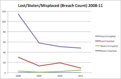
Since there aren’t many visualizations in  Massachusetts 2011 Report on Data Breach Notifications (3D numbers do not count), here are a few I made that I found helpful during my interpretation (2011 data unless otherwise specified):

# Residents Impacted By Breah Org

Number Of Breached By Org

Number of Breaches by Type 2008-2011

Residents Impacted By Breach Type

Lost/Stolen/Misplaced

Malicious/Non-Malicious


While the slides will be officially available from SIRA web site in the not-too-distant future—complete with video (for all the talks)—I figured it wouldn’t hurt to put them up here as well.

My sincere thanks, again, to @jayjacobs and the SIRA board for allowing me to have the privilege of being the first speaker at the first ever SIRA conference. If you didn’t go, you really missed some of the best thinking and content I’ve heard in this space. Every talk had useful, takeaways and the in-talk and hallway-exchanges were nothing short of amazing.

Mark your calendars for next year!

UPDATE: Fixed link to cached Obama image thx to notice from JB

While the two front-running candidates engaged in a bizarre, Klingon-esque ritual of hubris regarding which one was the better killer, their respective technical campaign staffers were failing to make the grade on security when it comes to taking your donations.

Earlier this week, I mentioned the most excellent Qualys SSL Certificate Tester and thought it would be interesting to try it on the two front-running US Presidential candidates online donation forms, especially since both candidates are focusing on how much they want to protect the American public.

Let’s just say that the results aren’t stellar, but they are better than I expected.

You can view the results directly from the SSL Labs site by hitting the following links:

While I’m not exactly hopeful either staff will end up fixing the SSL configurations, in the event they do, here are image-cached results of the scans I ran on Saturday, May 5, 2012:

But, you don’t want links, you want results, so here’s the top-level summary comparison:

Mitt Romney

Barack Obama

So, both candidates earn a “C” with Obama’s team scoring 10 total points higher than Romney, but let’s look at the details (only comparing the “bad” categories):

Candidate SSL Configuration Comparison

Romney
Obama
Issuer
USERTrust Legacy
Secure Server CA
Go Daddy Secure
Certification Authority
Supports Insecure SSL 2.0
Number Of Weak Cipher Suites
7
3
Vulnerable to the BEAST
Weak Ephemeral DH
Chart made with CompareNinja

While it’s somewhat ironic that Romney is vulnerable to the BEAST, both candidates show their true cipher weakness. Ultimately, though, I have to agree with the numerical results (Obama coming out the least bad of the two) if not solely based on Romney supporting insecure SSL 2.0 connections.

Given that the Trustworty Internet Movement‘s SSL Pulse Report made tech headlines just recently and that both the scan and the fixes take about 10 minutes to complete, these results are just, plain sad.

Hopefully no one decided to donate to either candidate while sipping their quad grande no-whip mocha macchiatos at Starbucks.

If you went to SOURCE Boston this year (2012), attended my security awareness talk and liked the Angry Birds theme to the slides, here’s a copy of the Keynote theme (it’s not really a true Keynote theme as there are divergent slides I’ve included). Here’s a sample:

You’re going to need the “Feast of Flesh BB” font (local source) by Blambot Comic Fonts & Lettering if you want to keep consistent with the Angry Birds lettering on various slides.

You can also grab my talk slides at the conference site or from my local archive.

BTW: In the event you’re also looking for a shortcut method of making some of the font-effects in the slides, I strongly suggest using some of the font manipulation tools in Microsoft Word if you don’t have more expensive tools like Adobe Acrobat kicking around. You can do some really cool things in Word, save as PDF, crop in Preview and import into Keynote or Photoshop with great results.

UPDATE: I forgot to include the MP3 of the theme song which I played as part of a transition from “blah” slides to the Angry Birds title slide. (Original files over at the Angry Birds Nest).

Just a quick post as I noticed that my nginx configuration was vulnerable to the BEAST attack thanks to the #spiffy SSL Certificate Tester from Qualys (I scored an “A”, btw :-).

The nginx docs show how to do this, now, and it’s pretty simple (very similar to the Apache configuration, in fact):

  1. ssl_ciphers RC4:HIGH:!aNULL:!MD5;
  2. ssl_prefer_server_ciphers on;

Set it to prefer RC4 ciphers and — BOOM! — you’re done.

Like many other system admins, I should have done this a long time ago. And, like many other system admins, I’ve got many other things going on. I let this slip (even though I’ve kept up on nginx patches) and I shouldn’t have. Thankfully, this was a low risk item as the site doesn’t perform truly critical transactions.

I definitely encourage folks to use the SSL Labs tool to help ensure you’ve got your site’s configuration up to snuff.

Also, make sure to follow @ivanristic on Twitter if you care at all about web app security.

Quick hit :: Over at the #tri blog, I’ve got a review of a relatively new bone-conducting headset by @AfterShokz.

Work & home chaos has me a bit behind in the “ThinkStats…in R” posts, but I “needed” to get some of the homebrew kit working in Mountain Lion Developer Preview 2 (to run some network discovery tools while waiting for #4’s surgery to be done at the hospital).

Keying off the great outline by @myobie (read that first), I managed to get (at least what I needed working) everything cranking for homebrew with the Xcode 4.4 Developer Preview 2 for Mountain Lion.

  1. Grab the Xcode 4.4. Developer Preview 2 from the Mac Dev Center “Mountain Lion” section and put it in /Applications
  2. Install the Xcode Command Line Tools via:
    Xcode→Preferences…→Downloads→Components
  3. Use xcode-select to tell the system which Xcode to use:
    xcode-select -switch /Applications/Xcode.app/Contents/Developer
  4. Grab & install XQuartz 2.7.1
  5. Start brewing!

After performing those steps, I was able to force an update install of nmap that worked perfectly. As @myobie points out, it’s important to add the --use-gcc option to your brew installs if you experience anything behaving weirdly without it.

Drop a note below if you discover any other necessary tweaks for certain homebrew operations in Mountain Lion Developer Preview 2.

As promised, this post is a bit more graphical, but I feel the need to stress the importance of the first few points in chapter 2 of the book (i.e. the difference between mean and average and why variance is meaningful). These are fundamental concepts for future work.

The “pumpkin” example (2.1) gives us an opportunity to do some very basic R:

  1. pumpkins <- c(1,1,1,3,3,591) #build an array
  2. mean(pumpkins) #mean (average)
  3. var(pumpkins) #variance
  4. sd(pumpkins) #deviation

(as you can see, I’m still trying to find the best way to embed R source code)

We move from pumpkins to babies for Example 2.2 (you’ll need the whole bit of source from previous examples (that includes all the solutions in this example) to make the rest of the code snippets work). Here, we can quickly compute and compare the standard deviations (with difference) and the means (with difference) to help us analyze the statistical significane questions in the chapter:

  1. sd(firstbabies$prglength)
  2. sd(notfirstbabies$prglength)
  3. sd(firstbabies$prglength) - sd(notfirstbabies$prglength)
  4.  
  5. mean(firstbabies$prglength)
  6. mean(notfirstbabies$prglength)
  7. mean(firstbabies$prglength) - mean(notfirstbabies$prglength)

You’ll see the power of R’s hist function in a moment, but you should be a bit surprised when you see the output if you enter to solve Example 2.3:

  1. mode(firstbabies$prglength)

That’s right, R does not have a built-in mode function. It’s pretty straightforward to compute, tho:

  1. names(sort(-table(firstbabies$prglength))[1])

(notice how “straightforward” != “simple”)

We have to use the table function to generate a table of value frequencies. It’s a two-dimensional structure with the actual value associated with the frequency represented as a string indexed at the same position. Using “-” inverts all the values (but keeps the two-dimensional indexing consistent) and sort orders the structure so we can use index “[1]” to get to the value we’re looking for. By using the names function, we get the string representing the value at the highest frequency. You can see this iteratively by breaking out the code:

  1. table(firstbabies$prglength)
  2. str(table(firstbabies$prglength))
  3. sort(table(firstbabies$prglength))
  4. sort(table(firstbabies$prglength))[1] #without the "-"
  5. sort(-table(firstbabies$prglength))[1]
  6. names(sort(-table(firstbabies$prglength))[1])

There are a plethora of other ways to compute the mode, but this one seems to work well for my needs.

Pictures Or It Didn’t Happen

I did debate putting the rest of this post into a separate example, but if you’ve stuck through this far, you deserve some stats candy. It’s actually pretty tricky to do what the book does here:

So, we’ll start off with simple histogram plots of each set being compared:

  1. hist(firstbabies$prglength)

  1. hist(notfirstbabies$prglength)

I separated those out since hist by default displays the histogram and if you just paste the lines consecutively, you’ll only see the last histogram. What does display is, well, ugly and charts should be beautiful. It will take a bit to explain the details (in another post) but this should get you started:

  1. par(mfrow=c(1,2))par(mfrow=c(1,2))
  2. hist(firstbabies$prglength, cex.lab=0.8, cex.axis=0.6, cex.main=0.8, las=1, col="white", ylim=c(0,3000),xlim=c(17,max(firstbabies$prglength)), breaks="Scott", main="Histogram of first babies", xlab="Weeks")
  3. hist(notfirstbabies$prglength, cex.lab=0.8, cex.axis=0.6, cex.main=0.8, las=1, col="blue", ylim=c(0,3000),xlim=c(17,max(notfirstbabies$prglength)), breaks="Scott", main="Histogram of other babies", xlab="Weeks")
  4. par(mfrow=c(1,1))

In the above code, we’re telling R to setup a canvas that will have one row and two plot areas. This makes it very easy to have many graphs on one canvas.

Next, the first hist sets up up some label proportions (the cex parameters), tells R to make Y labels horizontal (las=1), makes the bars white, sets up sane values for the X & Y axes, instructs R to use the “Scott” algorithm for calculating sane bins (we’ll cover this in more details next post) and sets up sane titles and X axis labels. Finally, we reset the canvas for the next plot.

There’s quite a bit to play with there and you can use the “help()” command to get information on the hist function and plot function. You can setup your own bin size by substituting an array for “Scott”. If you have specific questions, shoot a note in the comments, but I’ll explain more about what’s going on in the next post as we add in probability histograms and start looking at the data in more detail.


Click for larger image

Download R Source of Examples 2.1-2.3