Skip navigation

Tag Archives: post

This post comes hot off the heels of the [nigh-feature-complete release of `vegalite`](http://rud.is/b/2016/02/27/create-vega-lite-specs-widgets-with-the-vegalite-package/) (virtually all the components of Vega-Lite are now implemented and just need real-world user testing). I’ve had a few and seen a few questions about “why Vega-Lite”? I _think_ my previous post gave some good answers to “why”. However, Vega-Lite and Vega provide different ways to think about composing statistical graphs than folks seem to be used to (which is part of the “why?”).

Vega-Lite attempts to simplify the way charts are specified (i.e. the way you create a “spec”) in Vega. Vega-proper is rich and complex. You interleave data, operations on data, chart aesthetics and chart element interactions all in one giant JSON file. Vega-Lite 1.0 is definitely more limited than Vega-proper and even when it does add more interactivity (like “brushing”) it will _still_ be more limited, _on purpose_. The reduction in complexity makes it more accessible to both humans and apps, especially apps that don’t grok the Grammar of Graphics (GoG) well.

Even though `ggplot2` lets you mix and match statistical operations on data, I’m going to demonstrate the difference in paradigms/idioms through a single chart. I grabbed the [FRED data on historical WTI crude oil prices](https://research.stlouisfed.org/fred2/series/DCOILWTICO) and will show a chart that displays the minimum monthly price per-decade for a barrel of this cancerous, greed-inducing, global-conflict-generating, atmosphere-destroying black gold.

The data consists of records of daily prices (USD) for this commodity. That means we have to:

1. compute the decade
2. compute the month
3. determine the minimum price by month and decade
4. plot the values

The goal of each idiom is to provide a way to reproduce and communicate the “research”.

Here’s the idiomatic way of doing this with Vega-Lite:

library(vegalite)
library(quantmod)
library(dplyr)
 
getSymbols("DCOILWTICO", src="FRED")
 
data_frame(date=index(DCOILWTICO),
           value=coredata(DCOILWTICO)[,1]) %>%
  mutate(decade=sprintf("%s0", substring(date, 1, 3))) -> oil
 
# i created a CSV and moved the file to my server for easier embedding but
# could just have easily embedded the data in the spec.
# remember, you can pipe a vegalite object to embed_spec() to
# get javascript embed code.
 
vegalite() %>%
  add_data("http://rud.is/dl/crude.csv") %>%
  encode_x("date", "temporal") %>%
  encode_y("value", "quantitative", aggregate="min") %>%
  encode_color("decade", "nominal") %>%
  timeunit_x("month") %>%
  axis_y(title="", format="$3d") %>%
  axis_x(labelAngle=45, labelAlign="left", 
         title="Min price for Crude Oil (WTI) by month/decade, 1986-present") %>%
  mark_tick(thickness=3) %>%
  legend_color(title="Decade", orient="left")

Here’s the “spec” that creates (wordpress was having issues with it, hence the gist embed):

And, here’s the resulting visualization:

The grouping and aggregation operations operate in-chart-craft-situ. You have to carefully, visually parse either the spec or the R code that creates the spec to really grasp what’s going on. A different way of looking at this is that you embed everything you need to reproduce the transformations and visual encodings in a single, simple JSON file.

Here’s what I believe to be the modern, idiomatic way to do this in R + `ggplot2`:

library(ggplot2)
library(quantmod)
library(dplyr)
 
getSymbols("DCOILWTICO", src="FRED")
 
data_frame(date=index(DCOILWTICO),
           value=coredata(DCOILWTICO)[,1]) %>%
  mutate(decade=sprintf("%s0", substring(date, 1, 3)),
         month=factor(format(as.Date(date), "%B"),
                      levels=month.name)) -> oil
 
filter(oil, !is.na(value)) %>%
  group_by(decade, month) %>%
  summarise(value=min(value)) %>%
  ungroup() -> oil_summary
 
ggplot(oil_summary, aes(x=month, y=value, group=decade)) +
  geom_point(aes(color=decade), shape=95, size=8) +
  scale_y_continuous(labels=scales::dollar) +
  scale_color_manual(name="Decade", 
                     values=c("#d42a2f", "#fd7f28", "#339f34", "#d42a2f")) +
  labs(x="Min price for Crude Oil (WTI) by month/decade, 1986-present", y=NULL) +
  theme_bw() +
  theme(axis.text.x=element_text(angle=-45, hjust=0)) +
  theme(legend.position="left") +
  theme(legend.key=element_blank()) +
  theme(plot.margin=grid::unit(rep(1, 4), "cm"))

(To stave off some comments, yes I do know you can be Vega-like and compute with arbitrary functions within ggplot2. This was meant to show what I’ve seen to be the modern, recommended idiom.)

You really don’t even need to know R (for the most part) to grok what’s going on. Data is acquired and transformed and we map that into the plot. Yes, you can do the same thing with Vega[-Lite] (i.e. munge the data ahead of time and just churn out marks) but _you’re not encouraged to_. The power of the Vega paradigm is that you _do blend data and operations together_ and they _stay together_.

To make the R+ggplot2 code reproducible the entirety of the script has to be shipped. It’s really the same as shipping the Vega[-Lite] spec, though since you need to reproduce either the JSON or the R code in environments that support the code (R just happens to support both ggplot2 & Vega-Lite now :-).

I like the latter approach but can appreciate both (otherwise I wouldn’t have written the `vegalite` package). I also think Vega-Lite will catch on more than Vega-proper did (though Vega itself is in use and you use under the covers whenever you use `ggvis`). If Vega-Lite does nothing more than improve visualization literacy—you _must_ understand core vis terms to use it—and foster the notion for the need for serialization, reproduction and sharing of basic statistical charts, it will have been an amazing success in my book.

[Vega-Lite](http://vega.github.io/vega-lite/) 1.0 was [released this past week](https://medium.com/@uwdata/introducing-vega-lite-438f9215f09e#.yfkl0tp1c). I had been meaning to play with it for a while but I’ve been burned before by working with unstable APIs and was waiting for this to bake to a stable release. Thankfully, there were no new shows in the Fire TV, Apple TV or Netflix queues, enabling some fast-paced nocturnal coding to make an [R `htmlwidget`s interface](https://github.com/hrbrmstr/vegalite) to the Vega-Lite code before the week was out.

What is “Vega” and why “-Lite”? [Vega](http://vega.github.io/) is _”a full declarative visualization grammar, suitable for expressive custom interactive visualization design and programmatic generation.”_ Vega-Lite _”provides a higher-level grammar for visual analysis, comparable to ggplot or Tableau, that generates complete Vega specifications.”_ Vega-Lite compiles to Vega and is more compact and accessible than Vega (IMO). Both are just JSON data files with a particular schema that let you encode the data, encodings and aesthetics for statistical charts.

Even I don’t like to write JSON by hand and I can’t imagine anyone really wanting to do that. I see Vega and Vega-Lite as amazing ways to serialize statistical charts from ggplot2 or even Tableau (or any Grammar of Graphics-friendly creation tool) and to pass around for use in other programs—like [Voyager](http://vega.github.io/voyager/) or [Pole★](http://vega.github.io/polestar/)—or directly on the web. It is “glued” to D3 (given the way data transformations are encoded and colors are specified) but it’s a pretty weak glue and one could make a Vega or Vega-Lite spec render to anything given some elbow grease.

But, enough words! Here’s how to make a simple Vega-Lite bar chart using `vegalite`:

# devtools::install_github("hrbrmstr/vegalite")
library(vegalite)
 
dat <- jsonlite::fromJSON('[
    {"a": "A","b": 28}, {"a": "B","b": 55}, {"a": "C","b": 43},
    {"a": "D","b": 91}, {"a": "E","b": 81}, {"a": "F","b": 53},
    {"a": "G","b": 19}, {"a": "H","b": 87}, {"a": "I","b": 52}
  ]')
 
vegalite() %>% 
  add_data(dat) %>%
  encode_x("a", "ordinal") %>%
  encode_y("b", "quantitative") %>%
  mark_bar()

Note that bar graph you see above is _not_ a PNG file or `iframe`d widget. If you `view-source:` you’ll see that I was able to take the Vega-Lite generated spec for that widget code (done by piping the widget to `to_spec()`) and just insert it into this post via:

<style media="screen">.wpvegadiv { display:inline-block; margin:auto }</style>
 
<center><div id="vlvis1" class="wpvegadiv"></div></center>
 
<script>
var spec1 = JSON.parse('{"description":"","data":{"values":[{"a":"A","b":28},{"a":"B","b":55},{"a":"C","b":43},{"a":"D","b":91},{"a":"E","b":81},{"a":"F","b":53},{"a":"G","b":19},{"a":"H","b":87},{"a":"I","b":52}]},"mark":"bar","encoding":{"x":{"field":"a","type":"ordinal"},"y":{"field":"b","type":"quantitative"}},"config":[],"embed":{"renderer":"svg","actions":{"export":false,"source":false,"editor":false}}} ');
 
var embedSpec = { "mode": "vega-lite", "spec": spec1, "renderer": spec1.embed.renderer, "actions": spec1.embed.actions };
 
vg.embed("#vlvis1", embedSpec, function(error, result) {});
</script>

I did have have all the necessary js libs pre-loaded like you see [in this example](http://vega.github.io/vega-lite/tutorials/getting_started.html#embed). You can use the `embed_spec()` function to generate most of that for you, too.

This means you can use R to gather, clean, tidy and analyze data. Then, generate a visualization based on that data with `vegalite`. _Then_ generate a lightweight JSON spec from it and easily embed it anywhere without having to rig up a way to get a widget working or ship giant R markdown created files (like [this one](http://rud.is/projects/vegalite01.html) which has many full `vegalite` widgets on it).

One powerful feature of Vega/Vega-Lite is that the data does not have to be embedded in the spec.

Take this streamgraph visualization about unemployment levels across various industries over time:

vegalite() %>%
  cell_size(500, 300) %>%
  add_data("https://vega.github.io/vega-editor/app/data/unemployment-across-industries.json") %>%
  encode_x("date", "temporal") %>%
  encode_y("count", "quantitative", aggregate="sum") %>%
  encode_color("series", "nominal") %>%
  scale_color_nominal(range="category20b") %>%
  timeunit_x("yearmonth") %>%
  scale_x_time(nice="month") %>%
  axis_x(axisWidth=0, format="%Y", labelAngle=0) %>%
  mark_area(interpolate="basis", stack="center")

The URL you see in the R code is placed into the JSON spec. That means whenever that data changes and the visualization is refreshed, you see updated content without going back to R (or js code).

Now, dynamically-created visualizations are great, but what if you want to actually let your viewers have a copy of it? With Vega/Vega-Lite, you don’t need to resort to hackish bookmarklets, just change a configuration option to enable an export link:

vegalite(export=TRUE) %>%
  add_data("https://vega.github.io/vega-editor/app/data/seattle-weather.csv") %>%
  encode_x("date", "temporal") %>%
  encode_y("*", "quantitative", aggregate="count") %>%
  encode_color("weather", "nominal") %>%
  scale_color_nominal(domain=c("sun","fog","drizzle","rain","snow"),
                      range=c("#e7ba52","#c7c7c7","#aec7e8","#1f77b4","#9467bd")) %>%
  timeunit_x("month") %>%
  axis_x(title="Month") %>% 
  mark_bar()

(You can style/place that link however/wherever you want. It’s a simple classed `

`.)

If you choose a `canvas` renderer, the “export” option will be PNG vs SVG.

The package is nearly (~98%) feature complete to the 1.0 Vega-Lite standard. There are some tedious bits from the Vega-Lite spec remaining to be encoded. I’ve transcribed much of the Vega-Lite documentation to R function & package documentation with links back to the Vega-Lite sources if you need more detail.

I’m hoping to be able to code up an “`as_spec()`” function to enable quick conversion of ggplot2-created graphics to Vega-Lite (and support converting a ggplot2 object to a Vega-Lite spec in `to_spec()`) but that won’t be for a while unless someone wants to jump on board and implement an Vega expression creator/parser in R for me :-)

You can work with the current code [on github](https://github.com/hrbrmstr/vegalite) and/or jump on board to help with package development or file an issue with an idea or a bug. Please note that this package is under _heavy development_ and the function interface is very likely to change as I and others work with it and develop more streamlined ways to handle the encodings. Check back to the github repo often to find out what’s different (there will be a `NEWS` file posted soon and maintained as well).

I put this together after experimenting with `ggplot2` and `ggnetwork` earlier this week. The changes I made added `svgPanZoom` into the mix. Consequently, it has a widget in it, so it was just easier to embed the full R markdown HTML into an `iframe` than to try to extract the content piecemeal into WP.

You can bust the `iframe` via .

Read on to see how to grab some JSON, create edge list, do some basic graph stats with `igraph` and generate an interactive visualization with `ggplot2` and `svgPanZoom`.


puffs

I made Thai curry puffs for @mrshrbrmstr for Valentine’s Day (paired with Thai crispy duck red curry) and was asked to post the recipe. There are two versions, one with lard pie dough (#3, #4 & I are dairy sensitive) and one with puff pastry. Pie dough and puff pastry recipes are not part of this since everyone has their own opinion as to how to make them. You won’t be judged if you go to the store and grab pre-made pie dough sheets and puff pastry sheets :-)

NOTE: These are baked. I’m pretty sure traditional karipap is deep-fried.

Filling Ingredients

  • 3 large shallots or one large Spanish onion (small diced); I think shallots add a sweeter flavor
  • 2 large Maine Caribou Russet baking potatoes (you can use other baking potatoes, I live in Maine and am biased)
  • 2-4 Tbsp of peanut oil or safflower oil (2-3 if using a non-stick pan). If you can tolerate dairy, use ghee for a richer flavor
  • 1 Tbsp of your favorite blend of spices for a mild curry powder (you can use a fresh, store-bought curry powder mix or grab a sample of Gryffon Ridge curry powder (another fine Maine product)
  • 1 Tbsp minced ginger (not powder)
  • ½ Tbsp turmeric
  • ½ Tbsp white pepper
  • ½ paprika (not 100% necessary)
  • ½ tsp chili powder (not 100% necessary)
  • 1-2 Tbsp dark agave syrup
  • ½-1 Tbsp fish sauce
  • 2 pinches of coarse Kosher salt (add more fish sauce instead, if desired)

Ranges in quantity are so you can temper the recipe to your own taste (and to accommodate the particular ingredients you are using). Use the min if uncertain and adjust the next time you make them.

Work

Clean the potatoes, poke a few holes in them (to avoid a potato bomb explosion) and microwave them for ~10m. You know your microwave and we’re looking for a “just starting to get soft but still firm” texture.
Let them cool while you work on the onions.

Heat the oil in a deep-ish skillet (medium heat) and add the shallots/onions & ginger. Fry until soft but not caramelized then add the spices (not the salt, agave, fish sauce yet). Turn heat to low and let the cool for 5 min. While you’re waiting…

Peel and dice the potatoes (half-inch dice). If you mush some, no worries. Add them all in a bit (mushed and dice).

Turn the heat back to medium and add the fish sauce and agave syrup and salt. Mix thoroughly.

Add the potatoes. Mix to coat completely and absorb all the oil/liquid. If it stops absorbing and there’s still liquid, cook another potato and add small amounts of it until it’s absorbed. You need the filling to not have excess liquid. Once mixed and “dry”, turn off heat and remove from the burner to let cool.

Egg wash for the aripap

  • 2 large eggs
  • 1 Tbsp almond milk (you can use real milk if not dairy sensitive)

Whisk those together and keep handy.

Make the puffs

This is the same process for pie dough or puff pastry dough. If either dough starts to get “warm” or sticky, wrap it and put it back in the fridge for a bit.

Put parchment paper on a baking tray. Oven at 400°F (convection on if you have it)

Use a biscuit or cookie cutter (I used some heart shaped and circular as you can see in the picture), cut out shapes (using one “batch” of dough at a time) noting that you need to shapes to make one puff (i.e. you are cutting out halves of a whole).

Take one cutout and put egg wash on the outer edge (this will help form a seam). Put a small amount of the potato filling in the center (prbly 1 tsp or less depending on the size. The hearts took a bit more as they were larger). Put a non-egg-washed cutout half and cover this one. Pinch the edges to stretch and seal the dough. Curl the edges to make a pretty “wavy” pattern. Place on baking sheet.

Lather, rinse repeat.

Brush with egg wash, including the seams if you can.

Bake for ~25m or until firm & golden brown.

Serve with Thai chili sauce if you want a sweet kick with it or make a quick cucumber pickle dip (mirin, rice wine, small diced cucumber, small diced shallots, salt) while the puffs are cooking.

We were doing some exploratory data analysis on some attacker data at work and one of the things I was interested is what were “working hours” by country. Now, I don’t put a great deal of faith in the precision of geolocated IP addresses since every geolocation database that exists thinks I live in Vermont (I don’t) and I know that these databases rely on a pretty “meh” distributed process for getting this local data. However, at a country level, the errors are tolerable provided you use a decent geolocation provider. Since a rant about the precision of IP address geolocation was not the point of this post, let’s move on.

One of the best ways to visualize these “working hours” is a temporal heatmap. Jay & I made a couple as part of our inaugural Data-Driven Security Book blog post to show how much of our collected lives were lost during the creation of our tome.

I have some paired-down, simulated data based on the attacker data we were looking at. Rather than the complete data set, I’m providing 200,000 “events” (RDP login attempts, to be precise) in the eventlog.csv file in the data/ directory that have the timestamp, and the source_country ISO 3166-1 alpha-2 country code (which is the source of the attack) plus the tz time zone of the source IP address. Let’s have a look:

library(data.table)  # faster fread() and better weekdays()
library(dplyr)       # consistent data.frame operations
library(purrr)       # consistent & safe list/vector munging
library(tidyr)       # consistent data.frame cleaning
library(lubridate)   # date manipulation
library(countrycode) # turn country codes into pretty names
library(ggplot2)     # base plots are for Coursera professors
library(scales)      # pairs nicely with ggplot2 for plot label formatting
library(gridExtra)   # a helper for arranging individual ggplot objects
library(ggthemes)    # has a clean theme for ggplot2
library(viridis)     # best. color. palette. evar.
library(knitr)       # kable : prettier data.frame output

attacks <- tbl_df(fread("data/eventlog.csv"))

kable(head(attacks))
timestamp source_country tz
2015-03-12T15:59:16.718901Z CN Asia/Shanghai
2015-03-12T16:00:48.841746Z FR Europe/Paris
2015-03-12T16:02:26.731256Z CN Asia/Shanghai
2015-03-12T16:02:38.469907Z US America/Chicago
2015-03-12T16:03:22.201903Z CN Asia/Shanghai
2015-03-12T16:03:45.984616Z CN Asia/Shanghai

For a temporal heatmap, we’re going to need the weekday and hour (or as granular as you want to get). I use a factor here so I can have ordered weekdays. I need the source timezone weekday/hour so we have to get a bit creative since the time zone parameter to virtually every date/time operation in R only handles a single element vector.

make_hr_wkday <- function(cc, ts, tz) {

  real_times <- ymd_hms(ts, tz=tz[1], quiet=TRUE)

  data_frame(source_country=cc,
             wkday=weekdays(as.Date(real_times, tz=tz[1])),
             hour=format(real_times, "%H", tz=tz[1]))

}

group_by(attacks, tz) %>%
  do(make_hr_wkday(.$source_country, .$timestamp, .$tz)) %>%
  ungroup() %>%
  mutate(wkday=factor(wkday,
                      levels=levels(weekdays(0, FALSE)))) -> attacks
kable(head(attacks))
tz source_country wkday hour
Africa/Cairo BG Saturday 22
Africa/Cairo TW Sunday 08
Africa/Cairo TW Sunday 10
Africa/Cairo CN Sunday 13
Africa/Cairo US Sunday 17
Africa/Cairo CA Monday 13

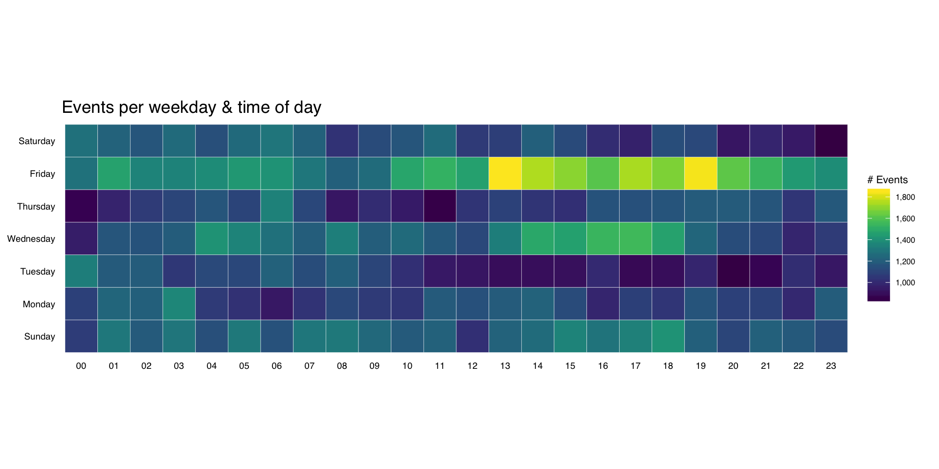
It’s pretty straightforward to make an overall heatmap of activity. Group & count the number of “attacks” by weekday and hour then use geom_tile(). I’m going to clutter up the pristine ggplot2 commands with some explanation for those still learning ggplot2:

wkdays <- count(attacks, wkday, hour)

kable(head(wkdays))
wkday hour n
Sunday 00 1076
Sunday 01 1307
Sunday 02 1189
Sunday 03 1301
Sunday 04 1145
Sunday 05 1313

Here, we’re just feeding in the new data.frame we just created to ggplot and telling it we want to use the hour column for the x-axis, the wkday column for the y-axis and that we are doing a continuous scale fill by the n aggregated count:

gg <- ggplot(wkdays, aes(x=hour, y=wkday, fill=n))

This does all the hard work. geom_tile() will make tiles at each x&y location we’ve already specified. I knew we had events for every hour, but if you had missing days or hours, you could use tidyr::complete() to fill those in. We’re also telling it to use a thin (0.1 units) white border to separate the tiles.

gg <- gg + geom_tile(color="white", size=0.1)

this has some additional magic in that it’s an awesome color scale. Read the viridis package vignette for more info. By specifying a name here, we get a nice label on the legend.

gg <- gg + scale_fill_viridis(name="# Events", label=comma)

This ensures the plot will have a 1:1 aspect ratio (i.e. geom_tile()–which draws rectangles–will draw nice squares).

gg <- gg + coord_equal()

This tells ggplot to not use an x- or y-axis label and to also not reserve any space for them. I used a pretty bland but descriptive title. If I worked for some other security company I’d’ve added “ZOMGOSH CHINA!” to it.

gg <- gg + labs(x=NULL, y=NULL, title="Events per weekday & time of day")

Here’s what makes the plot look really nice. I customize a number of theme elements, starting with a base theme of theme_tufte() from the ggthemes package. It removes alot of chart junk without having to do it manually.

gg <- gg + theme_tufte(base_family="Helvetica")

I like my plot titles left-aligned. For hjust:

  • 0 == left
  • 0.5 == centered
  • 1 == right
gg <- gg + theme(plot.title=element_text(hjust=0))

We don’t want any tick marks on the axes and I want the text to be slightly smaller than the default.

gg <- gg + theme(axis.ticks=element_blank())
gg <- gg + theme(axis.text=element_text(size=7))

For the legend, I just needed to tweak the title and text sizes a wee bit.

gg <- gg + theme(legend.title=element_text(size=8))
gg <- gg + theme(legend.text=element_text(size=6))
gg

(NOTE: there’s an alternate version of this post with SVG graphics and nicer tables)

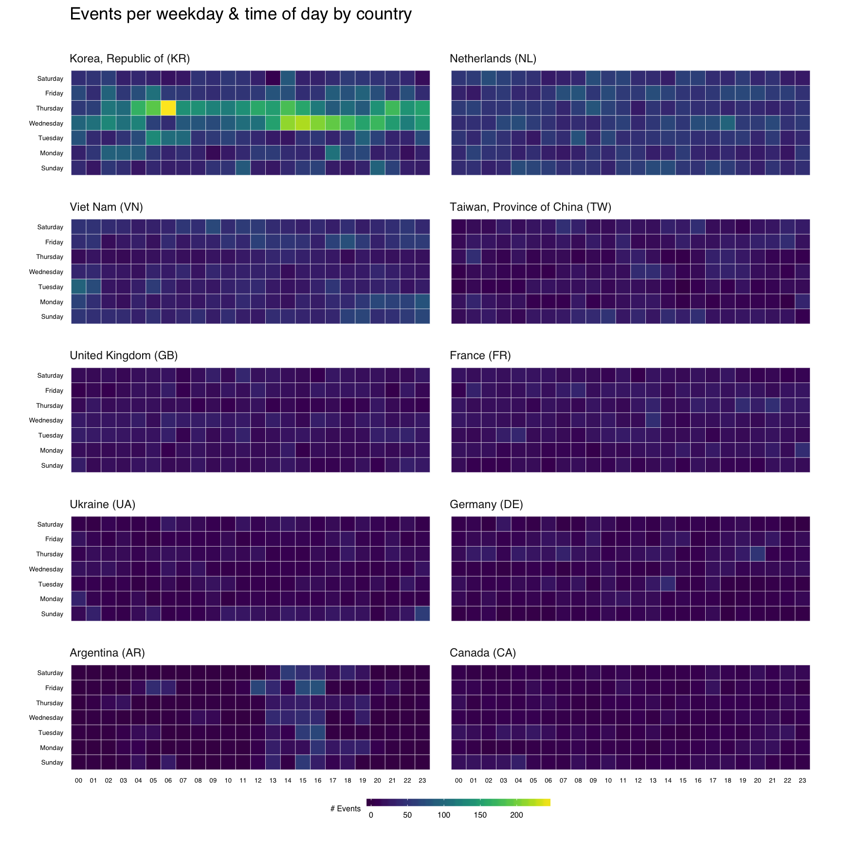
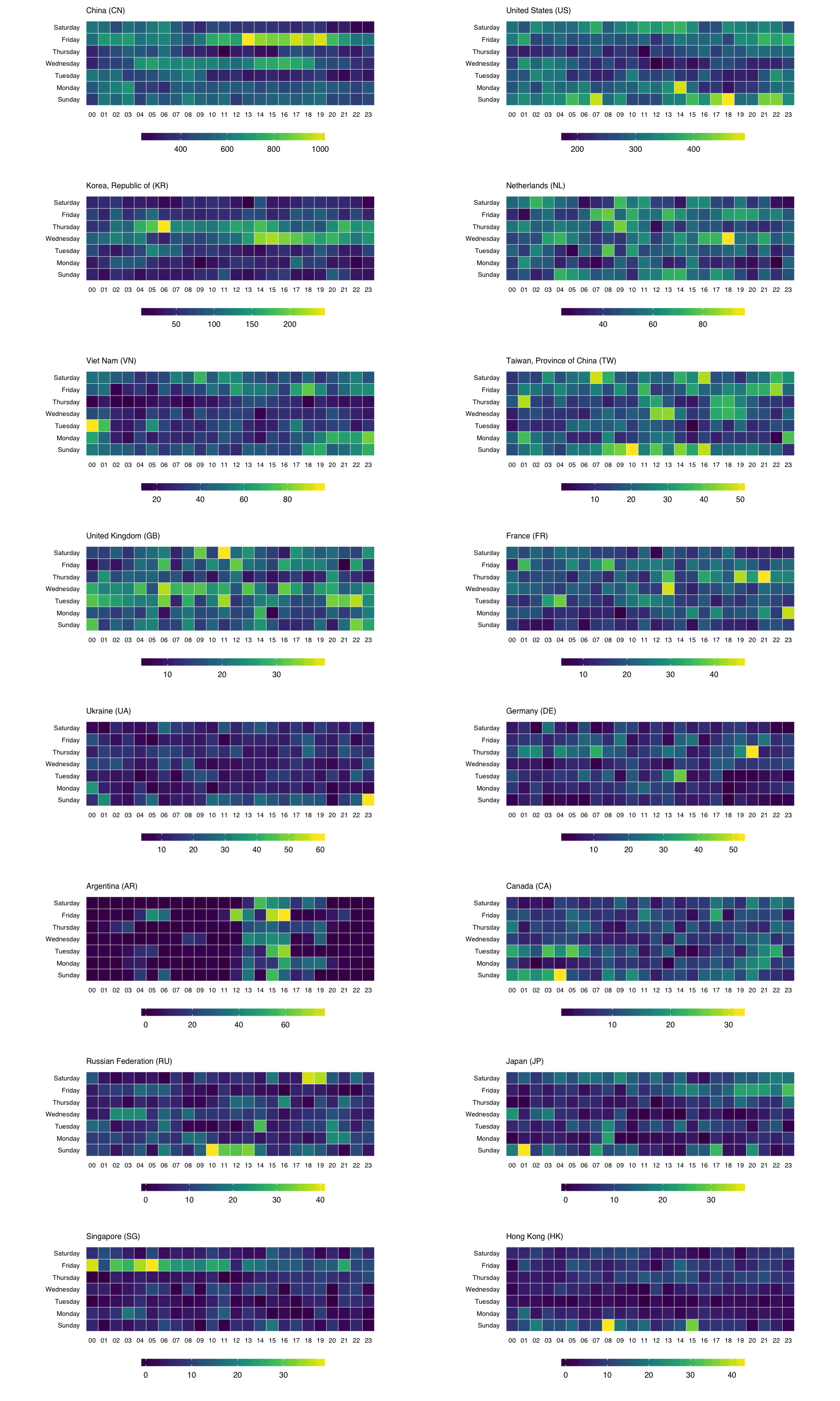
That’s great, but what if we wanted the heatmap breakdown by country? We’ll do this two ways, first with each country’s heatmap using the same scale, then with each one using it’s own scale. That will let us compare at a macro and micro level.

For either view, I want to rank-order the countries and want nice country names versus 2-letter abbreviations. We’ll do that first:

count(attacks, source_country) %>%
  mutate(percent=percent(n/sum(n)), count=comma(n)) %>%
  mutate(country=sprintf("%s (%s)",
                         countrycode(source_country, "iso2c", "country.name"),
                         source_country)) %>%
  arrange(desc(n)) -> events_by_country

kable(events_by_country[,5:3])
country count percent
China (CN) 85,243 42.6%
United States (US) 48,684 24.3%
Korea, Republic of (KR) 12,648 6.3%
Netherlands (NL) 8,572 4.3%
Viet Nam (VN) 6,340 3.2%
Taiwan, Province of China (TW) 3,469 1.7%
United Kingdom (GB) 3,266 1.6%
France (FR) 3,252 1.6%
Ukraine (UA) 2,219 1.1%
Germany (DE) 2,055 1.0%
Argentina (AR) 1,793 0.9%
Canada (CA) 1,646 0.8%
Russian Federation (RU) 1,633 0.8%
Japan (JP) 1,476 0.7%
Singapore (SG) 1,278 0.6%
Hong Kong (HK) 1,239 0.6%

Now, we’ll do a simple ggplot facet, but also exclude the top 2 attacking countries since they skew things a bit (and, we’ll see them in the last vis):

filter(attacks, source_country %in% events_by_country$source_country[3:12]) %>%
  count(source_country, wkday, hour) %>%
  ungroup() %>%
  left_join(events_by_country[,c(1,5)]) %>%
  complete(country, wkday, hour, fill=list(n=0)) %>%
  mutate(country=factor(country,
                        levels=events_by_country$country[3:12])) -> cc_heat

Before we go all crazy and plot, let me explain ^^ a bit. I’m filtering by the top 10 (excluding the top 2) countries, then doing the group/count. I need the pretty country info, so I’m joining that to the result. Not all countries attacked every day/hour, so we use that complete() operation I mentioned earlier to ensure we have values for all countries for each day/hour combination. Finally, I want to print the heatmaps in order, so I turn the country into an ordered factor.

gg <- ggplot(cc_heat, aes(x=hour, y=wkday, fill=n))
gg <- gg + geom_tile(color="white", size=0.1)
gg <- gg + scale_fill_viridis(name="# Events")
gg <- gg + coord_equal()
gg <- gg + facet_wrap(~country, ncol=2)
gg <- gg + labs(x=NULL, y=NULL, title="Events per weekday & time of day by country\n")
gg <- gg + theme_tufte(base_family="Helvetica")
gg <- gg + theme(axis.ticks=element_blank())
gg <- gg + theme(axis.text=element_text(size=5))
gg <- gg + theme(panel.border=element_blank())
gg <- gg + theme(plot.title=element_text(hjust=0))
gg <- gg + theme(strip.text=element_text(hjust=0))
gg <- gg + theme(panel.margin.x=unit(0.5, "cm"))
gg <- gg + theme(panel.margin.y=unit(0.5, "cm"))
gg <- gg + theme(legend.title=element_text(size=6))
gg <- gg + theme(legend.title.align=1)
gg <- gg + theme(legend.text=element_text(size=6))
gg <- gg + theme(legend.position="bottom")
gg <- gg + theme(legend.key.size=unit(0.2, "cm"))
gg <- gg + theme(legend.key.width=unit(1, "cm"))
gg

To get individual scales for each country we need to make n separate ggplot object and combine then using gridExtra::grid.arrange. It’s pretty much the same setup as before, only without the facet call. We’ll do the top 16 countries (not excluding anything) this way (pick any number you want, though provided you like scrolling). I didn’t bother with a legend title since you kinda know what you’re looking at by now :-)

count(attacks, source_country, wkday, hour) %>%
  ungroup() %>%
  left_join(events_by_country[,c(1,5)]) %>%
  complete(country, wkday, hour, fill=list(n=0)) %>%
  mutate(country=factor(country,
                        levels=events_by_country$country)) -> cc_heat2

lapply(events_by_country$country[1:16], function(cc) {
  gg <- ggplot(filter(cc_heat2, country==cc),
               aes(x=hour, y=wkday, fill=n, frame=country))
  gg <- gg + geom_tile(color="white", size=0.1)
  gg <- gg + scale_x_discrete(expand=c(0,0))
  gg <- gg + scale_y_discrete(expand=c(0,0))
  gg <- gg + scale_fill_viridis(name="")
  gg <- gg + coord_equal()
  gg <- gg + labs(x=NULL, y=NULL,
                  title=sprintf("%s", cc))
  gg <- gg + theme_tufte(base_family="Helvetica")
  gg <- gg + theme(axis.ticks=element_blank())
  gg <- gg + theme(axis.text=element_text(size=5))
  gg <- gg + theme(panel.border=element_blank())
  gg <- gg + theme(plot.title=element_text(hjust=0, size=6))
  gg <- gg + theme(panel.margin.x=unit(0.5, "cm"))
  gg <- gg + theme(panel.margin.y=unit(0.5, "cm"))
  gg <- gg + theme(legend.title=element_text(size=6))
  gg <- gg + theme(legend.title.align=1)
  gg <- gg + theme(legend.text=element_text(size=6))
  gg <- gg + theme(legend.position="bottom")
  gg <- gg + theme(legend.key.size=unit(0.2, "cm"))
  gg <- gg + theme(legend.key.width=unit(1, "cm"))
  gg
}) -> cclist

cclist[["ncol"]] <- 2

do.call(grid.arrange, cclist)

You can find the data and source for this R markdown document on github. You’ll need to devtools::install_github("hrbrmstr/hrbrmrkdn") first since I’m using a custom template (or just change the output: to html_document in the YAML header).

rolls

Here’s a quick/easy recipe for soft roll dough that you can use to make dairy-free Parker House rolls, knot rolls or just plain rolls.

NOTE: It makes ~3lbs of dough. I freeze it to save time in the work-weeks. Also, weigh your ingredients. I have [this scale](http://amzn.to/1o6uRuL).

Oven at 375°F

### Ingredients

– Bread flour (750g)
– Instant, dry yeast (12g)
– Almond milk, room temperature (400ml)
– Dairy-free butter substitute, soft (I use [Earth Balance](http://amzn.to/1QwpagJ)) (75g)
– Eggs (55°F) (75g) (~2 medium)
– Sugar (I use light brown) (75g)
– Salt (19g)

### Work

1. Combine flour and yeast well with whisk. Fold in the rest of the ingredients. Use a standing mixer and mix on slow for 4 minutes and then medium for 3 minutes. You’re looking for firm + elastic dough with good gluten development.
2. Ferment the whole batch for 1 hour or until it’s doubled. I leave it in the mixer bowl, but ensure it’s quasi-ball-shaped and top it with a lid from a pot and set it on our stove with the oven at 200°F; since we live in Maine and keep our house cold in the winter.
3. Remove & shape the dough into a nice round. Let it rest on a floured surface or a board with parchment paper for 20 minutes.
4. Divide it into 50g pieces and make rounds.
5. Flour the ones you won’t be using right away and freeze them.

**For Parker House**

1. Roll out each round into an oval 3mm thick. Make sure there’s no excess flour. Fold in half length-wise. Roll to make a wedge shape that’s roughly 6mm thick to 3mm thick
2. Put on baking sheet with parchment paper giving some distance between them. Brush with fake butter or really nice olive oil. Let rise for 40m. You should be able to poke it (gently) and have it resume it’s shape.
3. Bake at 375°F in (with convection turned on if you have that kind of oven) for ~20m or until golden brown.
4. Brush with more oil or fake butter.

**For Knots**

1. Roll each round into 6-inch pieces.
2. Make a knot (you really can’t mess it up but hit up YouTube for what it looks like)
3. Arrange on a sheet pan with parchment paper.
4. If you want to, make a _room temperature_ egg wash and brush it on.
5. Let them rise for ~50m. Should be springy like step #2 above.
6. Brush again if you used egg wash.
3. Bake at 375°F in (with convection turned on if you have that kind of oven) for ~15m or until golden brown.

**For “Rolls”**

1. Ensure each round is about the same size and actually as spherical as you can.
2. Arrange on a sheet pan with parchment paper.
3. Let them rise for ~25m. Should be springy like step #2 above, above.
3. Bake at 375°F in (with convection turned on if you have that kind of oven) for ~25m or until golden brown.

High resolution and SVG versions of the new R logo are finally available.

I converted the SVG to WKT (file here) which means we can use it like we would a shapefile in R. That includes plotting!

Here’s a short example of how to read that WKT and plot the logo using ggplot2:

library(sp)
library(maptools)
library(rgeos)
library(ggplot2)
library(ggthemes)
 
r_wkt_gist_file <- "https://gist.githubusercontent.com/hrbrmstr/07d0ccf14c2ff109f55a/raw/db274a39b8f024468f8550d7aeaabb83c576f7ef/rlogo.wkt"
if (!file.exists("rlogo.wkt")) download.file(r_wkt_gist_file, "rlogo.wkt")
rlogo <- readWKT(paste0(readLines("rlogo.wkt", warn=FALSE)))
 
rlogo_shp <- SpatialPolygonsDataFrame(rlogo, data.frame(poly=c("halo", "r")))
rlogo_poly <- fortify(rlogo_shp, region="poly")
 
ggplot(rlogo_poly) + 
  geom_polygon(aes(x=long, y=lat, group=id, fill=id)) + 
  scale_fill_manual(values=c(halo="#b8babf", r="#1e63b5")) +
  coord_equal() + 
  theme_map() + 
  theme(legend.position="none")

RStudio

UPDATE curlconverter will now return (as the function return value) a working R function. See the README for examples


When you visit a site like the LA Times’ NH Primary Live Results site and wish you had the data that they used to make the tables & visualizations on the site:

primary

Sometimes it’s as simple as opening up your browsers “Developer Tools” console and looking for XHR (XML HTTP Requests) calls:

XHR

You can actually see a preview of those requests (usually JSON):

Developer_Tools_-_http___graphics_latimes_com_election-2016-new-hampshire-results_

While you could go through all the headers and cookies and transcribe them into httr::GET or httr::POST requests, that’s tedious, especially when most browsers present an option to “Copy as cURL”. cURL is a command-line tool (with a corresponding systems programming library) that you can use to grab data from URIs. The RCurl and curl packages in R are built with the underlying library. The cURL command line captures all of the information necessary to replicate the request the browser made for a resource. The cURL command line for the URL that gets the Republican data is:

curl 'http://graphics.latimes.com/election-2016-31146-feed.json' 
  -H 'Pragma: no-cache' 
  -H 'DNT: 1' 
  -H 'Accept-Encoding: gzip, deflate, sdch'
  -H 'X-Requested-With: XMLHttpRequest' 
  -H 'Accept-Language: en-US,en;q=0.8' 
  -H 'User-Agent: Mozilla/5.0 (Macintosh; Intel Mac OS X 10_11_3) AppleWebKit/537.36 (KHTML, like Gecko) Chrome/49.0.2623.39 Safari/537.36' 
  -H 'Accept: */*' 
  -H 'Cache-Control: no-cache' 
  -H 'If-None-Match: "7b341d7181cbb9b72f483ae28e464dd7"' 
  -H 'Cookie: s_fid=79D97B8B22CA721F-2DD12ACE392FF3B2; s_cc=true' 
  -H 'Connection: keep-alive' 
  -H 'If-Modified-Since: Wed, 10 Feb 2016 16:40:15 GMT'
  -H 'Referer: http://graphics.latimes.com/election-2016-new-hampshire-results/' 
  --compressed

While that’s easier than manual copy/paste transcription, these requests are uniform enough that there Has To Be A Better Way. And, now there is, with curlconverter.

The curlconverter package has (for the moment) two main functions:

  • straighten() : which returns a list with all of the necessary parts to craft an httr POST or GET call
  • make_req() : which actually _returns a working httr call, pre-filled with all of the necessary information.

By default, either function reads from the clipboard (envision the workflow where you do the “Copy as cURL” then switch to R and type make_req() or req_params <- straighten()), but they can take in a vector of cURL command lines, too (NOTE: make_req() is currently limited to one while straighten() can handle as many as you want).

Let’s show what happens using election results cURL command line:

REP <- "curl 'http://graphics.latimes.com/election-2016-31146-feed.json' -H 'Pragma: no-cache' -H 'DNT: 1' -H 'Accept-Encoding: gzip, deflate, sdch' -H 'X-Requested-With: XMLHttpRequest' -H 'Accept-Language: en-US,en;q=0.8' -H 'User-Agent: Mozilla/5.0 (Macintosh; Intel Mac OS X 10_11_3) AppleWebKit/537.36 (KHTML, like Gecko) Chrome/49.0.2623.39 Safari/537.36' -H 'Accept: */*' -H 'Cache-Control: no-cache'  -H 'Cookie: s_fid=79D97B8B22CA721F-2DD12ACE392FF3B2; s_cc=true' -H 'Connection: keep-alive' -H 'If-Modified-Since: Wed, 10 Feb 2016 16:40:15 GMT' -H 'Referer: http://graphics.latimes.com/election-2016-new-hampshire-results/' --compressed"
 
resp <- curlconverter::straighten(REP)
jsonlite::toJSON(resp, pretty=TRUE)
 
    ## [
    ##   {
    ##     "url": ["http://graphics.latimes.com/election-2016-31146-feed.json"],
    ##     "method": ["get"],
    ##     "headers": {
    ##       "Pragma": ["no-cache"],
    ##       "DNT": ["1"],
    ##       "Accept-Encoding": ["gzip, deflate, sdch"],
    ##       "X-Requested-With": ["XMLHttpRequest"],
    ##       "Accept-Language": ["en-US,en;q=0.8"],
    ##       "User-Agent": ["Mozilla/5.0 (Macintosh; Intel Mac OS X 10_11_3) AppleWebKit/537.36 (KHTML, like Gecko) Chrome/49.0.2623.39 Safari/537.36"],
    ##       "Accept": ["*/*"],
    ##       "Cache-Control": ["no-cache"],
    ##       "Connection": ["keep-alive"],
    ##       "If-Modified-Since": ["Wed, 10 Feb 2016 16:40:15 GMT"],
    ##       "Referer": ["http://graphics.latimes.com/election-2016-new-hampshire-results/"]
    ##     },
    ##     "cookies": {
    ##       "s_fid": ["79D97B8B22CA721F-2DD12ACE392FF3B2"],
    ##       "s_cc": ["true"]
    ##     },
    ##     "url_parts": {
    ##       "scheme": ["http"],
    ##       "hostname": ["graphics.latimes.com"],
    ##       "port": {},
    ##       "path": ["election-2016-31146-feed.json"],
    ##       "query": {},
    ##       "params": {},
    ##       "fragment": {},
    ##       "username": {},
    ##       "password": {}
    ##     }
    ##   }
    ## ]

You can then use the items in the returned list to make a GET request manually (but still tediously).

curlconverter‘s make_req() will try to do this conversion for you automagically using httr‘s little used VERB() function. It’s easier to show than to tell:

curlconverter::make_req(REP)
VERB(verb = "GET", url = "http://graphics.latimes.com/election-2016-31146-feed.json", 
     add_headers(Pragma = "no-cache", 
                 DNT = "1", `Accept-Encoding` = "gzip, deflate, sdch", 
                 `X-Requested-With` = "XMLHttpRequest", 
                 `Accept-Language` = "en-US,en;q=0.8", 
                 `User-Agent` = "Mozilla/5.0 (Macintosh; Intel Mac OS X 10_11_3) AppleWebKit/537.36 (KHTML, like Gecko) Chrome/49.0.2623.39 Safari/537.36", 
                 Accept = "*/*", 
                 `Cache-Control` = "no-cache", 
                 Connection = "keep-alive", 
                 `If-Modified-Since` = "Wed, 10 Feb 2016 16:40:15 GMT", 
                 Referer = "http://graphics.latimes.com/election-2016-new-hampshire-results/"))

You probably don’t need all those headers, but you just need to delete what you don’t need vs trial-and-error build by hand. Try assigning the output of that function to a variable and inspecting what’s returned. I think you’ll find this is a big enhancement to your workflows (if you do alot of this “scraping without scraping”).

You can find the package on gitub. It’s built with V8 and uses a modified version of the curlconverter Node module by Nick Carneiro.

It’s still in beta and could use some tyre kicking. Convos in the comments, issues or feature requests in GH (pls).