Dear Leader has made good on his campaign promise to “crack down” on immigration from “dangerous” countries. I wanted to both see one side of the impact of that decree — how many potential immigrants per year might this be impacting — and show toss up some code that shows how to free data from PDF documents using the @rOpenSci tabulizer package — authored by (@thosjleeper) — (since knowing how to find, free and validate the veracity of U.S. gov data is kinda ++paramount now).
This is just one view and I encourage others to find, grab and blog other visa-related data and other government data in general.
So, the data is locked up in this PDF document:

As PDF documents go, it’s not horribad since the tables are fairly regular. But I’m not transcribing that and traditional PDF text extracting tools on the command-line or in R would also require writing more code than I have time for right now.
Enter: tabulizer — an R package that wraps tabula Java functions and makes them simple to use. I’m only showing one aspect of it here and you should check out the aforelinked tutorial to see all the features.
First, we need to setup our environment, download the PDF and extract the tables with tabulizer:
library(tabulizer)
library(hrbrmisc)
library(ggalt)
library(stringi)
library(tidyverse)

URL <- "https://travel.state.gov/content/dam/visas/Statistics/AnnualReports/FY2016AnnualReport/FY16AnnualReport-TableIII.pdf"
fil <- sprintf("%s", basename(URL))
if (!file.exists(fil)) download.file(URL, fil)

tabs <- tabulizer::extract_tables("FY16AnnualReport-TableIII.pdf")
You should str(tabs) in your R session. It found all our data, but put it into a list with 7 elements. You actually need to peruse this list to see where it mis-aligned columns. In the “old days”, reading this in and cleaning it up would have taken the form of splitting & replacing elements in character vectors. Now, after our inspection, we can exclude rows we don’t want, move columns around and get a nice tidy data frame with very little effort:
bind_rows(
  tbl_df(tabs[[1]][-1,]),
  tbl_df(tabs[[2]][-c(12,13),]),
  tbl_df(tabs[[3]][-c(7, 10:11), -2]),
  tbl_df(tabs[[4]][-21,]),
  tbl_df(tabs[[5]]),
  tbl_df(tabs[[6]][-c(6:7, 30:32),]),
  tbl_df(tabs[[7]][-c(11:12, 25:27),])
) %>%
  setNames(c("foreign_state", "immediate_relatives",  "special_mmigrants",
             "family_preference", "employment_preference", "diversity_immigrants","total")) %>%
  mutate_each(funs(make_numeric), -foreign_state) %>%
  mutate(foreign_state=trimws(foreign_state)) -> total_visas_2016
I’ve cleaned up PDFs before and that code was a joy to write compared to previous efforts. No use of purrr since I was referencing the list structure in the console as I entered in the various matrix coordinates to edit out.
Finally, we can extract the target “bad” countries and see how many human beings could be impacted this year by referencing immigration stats for last year:
filter(foreign_state %in% c("Iran", "Iraq", "Libya", "Somalia", "Sudan", "Syria", "Yemen")) %>%
  gather(preference, value, -foreign_state) %>%
  mutate(preference=stri_replace_all_fixed(preference, "_", " " )) %>%
  mutate(preference=stri_trans_totitle(preference)) -> banned_visas

ggplot(banned_visas, aes(foreign_state, value)) +
  geom_col(width=0.65) +
  scale_y_continuous(expand=c(0,5), label=scales::comma) +
  facet_wrap(~preference, scales="free_y") +
  labs(x="# Visas", y=NULL, title="Immigrant Visas Issued (2016)",
       subtitle="By Foreign State of Chargeability or Place of Birth; Fiscal Year 2016; [Total n=31,804] — Note free Y scales",
       caption="Visa types explanation: https://travel.state.gov/content/visas/en/general/all-visa-categories.html\nSource: https://travel.state.gov/content/visas/en/law-and-policy/statistics/annual-reports/report-of-the-visa-office-2016.html") +
  theme_hrbrmstr_msc(grid="Y") +
  theme(axis.text=element_text(size=12))
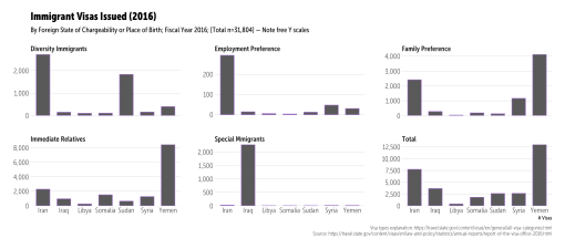
~32,000 human beings potentially impacted, many who will remain separated from family (“family preference”); plus, the business impact of losing access to skilled labor (“employment preference”).
Go forth and find more US gov data to free (before it disappears)!


The ? Resistance
I need to be up-front about something: I’m somewhat partially at fault for ? being elected. While I did not vote for him, I could not in any good conscience vote for his Democratic rival. I wrote in a ticket that had one Democrat and one Republican on it. The “who” doesn’t matter and my district in Maine went abundantly for ?’s opponent, so there was no real impact of my direct choice but I did actively point out the massive flaws in his opponent. Said flaws were many and I believe we’d be in a different bad place, but not equally as bad of a place now with her. But, that’s in the past and we’ve got a new reality to deal with, now.
This is a (hopefully) brief post about finding a way out of this mess we’re in. It’s far from comprehensive, but there’s honest-to-goodness evil afoot that needs to be met head on.
Brand Damage
You’ll note I’m not using either of their names. Branding is extremely important to both of them, but is the almost singular focus of ?. His name is his hotel brand, company brand and global identifier. Using it continues to add it to the history books and can only help inflate the power of that brand. First and foremost, do not use his name in public posts, articles, papers, etc. “POTUS”, “The President”, “The Commander in Chief”, “?” (chosen to match his skin/hair color, complexion and that comb-over tuft) are all sufficient references since there is date-context with virtually anything we post these days. Don’t help build up his brand. Don’t populate historical repositories with his name. Don’t give him what he wants most of all: attention.
Document and Defend with Data
Speaking of the historical record, we need to be blogging and publishing regularly the actual facts based on data. We also need to save data as there’s signs of a deliberate government purge going on. I’m not sure how successful said purge will be in the long run and I suspect that the long-term effects of data purging and corruption by this administration will have lasting unintended consequences.
Join/support @datarefuge to save data & preserve the historical record.
Install the Wayback Machine plugin and take the 2 seconds per site you visit to click it.
Create blog posts, tweets, news articles and papers that counter bad facts with good/accurate/honest ones. Don’t make stuff up (even a little). Validate your posits before publishing. Write said posts in a respectful tone.
Support the Media
When the POTUS’ Chief Strategist says things like “The media should be embarrassed and humiliated and keep its mouth shut and just listen for a while” it’s a deliberate attempt to curtail the Press and eventually there will be more actions to actually suppress Press freedom.
I’m not a liberal (I probably have no convenient definition) and I think the Press gave Obama a free ride during his eight year rule. They are definitely making up for that now, mostly because their very livelihoods are at stake.
The problem with them is that they are continuing to let themselves be manipulated by ?. He’s a master at this manipulation. Creating a story about the size of his hands in a picture delegitimizes you as a purveyor of news, especially when — as you’re watching his hands — he’s separating families, normalizing bigotry and undermining the Constitution. Forget about the hands and even forget about the hotels (for now). There was even a recent story trying to compare email servers (the comparison is very flawed). Stop it.
Encourage reporters to focus on things that actually matter and provide pointers to verifiable data they can use to call out the lack of veracity in ?’s policies. Personal blog posts are fleeting things but an NYT, WSJ (etc) story will live on.
Be Kind
I’ve heard and read some terrible language about rural America from what I can only classify as “liberals” in the week this post was written. Intellectual hubris and actual, visceral disdain for those who don’t think a certain way were two major reasons why ? got elected. The actual reasons he got elected are diverse and very nuanced.
Regardless of political leaning, pick your head up from your glowing rectangles and go out of your way to regularly talk to someone who doesn’t look, dress, think, eat, etc like you. Engage everyone with compassion. Regularly challenge your own beliefs.
There is a wedge that I estimate is about 1/8th of the way into the core of America now. Perpetuating this ideological “us vs them” mindset is only going to fuel the fires that created the conditions we’re in now and drive the wedge in further. The only way out is through compassion.
Remember: all life matters. Your degree, profession, bank balance or faith alignment doesn’t give you the right to believe you are better than anyone else.
FIN (for now)
I’ll probably move most of future opines to a new medium (not uppercase Medium) as you may be getting this drivel when you want recipes or R code (even though there are separate feeds for them).