Dear Leader has made good on his campaign promise to “crack down” on immigration from “dangerous” countries. I wanted to both see one side of the impact of that decree — how many potential immigrants per year might this be impacting — and show toss up some code that shows how to free data from PDF documents using the @rOpenSci tabulizer package — authored by (@thosjleeper) — (since knowing how to find, free and validate the veracity of U.S. gov data is kinda ++paramount now).
This is just one view and I encourage others to find, grab and blog other visa-related data and other government data in general.
So, the data is locked up in this PDF document:
As PDF documents go, it’s not horribad since the tables are fairly regular. But I’m not transcribing that and traditional PDF text extracting tools on the command-line or in R would also require writing more code than I have time for right now.
Enter: tabulizer — an R package that wraps tabula Java functions and makes them simple to use. I’m only showing one aspect of it here and you should check out the aforelinked tutorial to see all the features.
First, we need to setup our environment, download the PDF and extract the tables with tabulizer:
library(tabulizer)
library(hrbrmisc)
library(ggalt)
library(stringi)
library(tidyverse)

URL <- "https://travel.state.gov/content/dam/visas/Statistics/AnnualReports/FY2016AnnualReport/FY16AnnualReport-TableIII.pdf"
fil <- sprintf("%s", basename(URL))
if (!file.exists(fil)) download.file(URL, fil)

tabs <- tabulizer::extract_tables("FY16AnnualReport-TableIII.pdf")
You should str(tabs) in your R session. It found all our data, but put it into a list with 7 elements. You actually need to peruse this list to see where it mis-aligned columns. In the “old days”, reading this in and cleaning it up would have taken the form of splitting & replacing elements in character vectors. Now, after our inspection, we can exclude rows we don’t want, move columns around and get a nice tidy data frame with very little effort:
bind_rows(
  tbl_df(tabs[[1]][-1,]),
  tbl_df(tabs[[2]][-c(12,13),]),
  tbl_df(tabs[[3]][-c(7, 10:11), -2]),
  tbl_df(tabs[[4]][-21,]),
  tbl_df(tabs[[5]]),
  tbl_df(tabs[[6]][-c(6:7, 30:32),]),
  tbl_df(tabs[[7]][-c(11:12, 25:27),])
) %>%
  setNames(c("foreign_state", "immediate_relatives",  "special_mmigrants",
             "family_preference", "employment_preference", "diversity_immigrants","total")) %>%
  mutate_each(funs(make_numeric), -foreign_state) %>%
  mutate(foreign_state=trimws(foreign_state)) -> total_visas_2016
I’ve cleaned up PDFs before and that code was a joy to write compared to previous efforts. No use of purrr since I was referencing the list structure in the console as I entered in the various matrix coordinates to edit out.
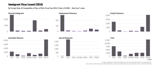
Finally, we can extract the target “bad” countries and see how many human beings could be impacted this year by referencing immigration stats for last year:
filter(foreign_state %in% c("Iran", "Iraq", "Libya", "Somalia", "Sudan", "Syria", "Yemen")) %>%
  gather(preference, value, -foreign_state) %>%
  mutate(preference=stri_replace_all_fixed(preference, "_", " " )) %>%
  mutate(preference=stri_trans_totitle(preference)) -> banned_visas

ggplot(banned_visas, aes(foreign_state, value)) +
  geom_col(width=0.65) +
  scale_y_continuous(expand=c(0,5), label=scales::comma) +
  facet_wrap(~preference, scales="free_y") +
  labs(x="# Visas", y=NULL, title="Immigrant Visas Issued (2016)",
       subtitle="By Foreign State of Chargeability or Place of Birth; Fiscal Year 2016; [Total n=31,804] — Note free Y scales",
       caption="Visa types explanation: https://travel.state.gov/content/visas/en/general/all-visa-categories.html\nSource: https://travel.state.gov/content/visas/en/law-and-policy/statistics/annual-reports/report-of-the-visa-office-2016.html") +
  theme_hrbrmstr_msc(grid="Y") +
  theme(axis.text=element_text(size=12))
~32,000 human beings potentially impacted, many who will remain separated from family (“family preference”); plus, the business impact of losing access to skilled labor (“employment preference”).
Go forth and find more US gov data to free (before it disappears)!


