While shiny visualizations are all well-and-good, sometimes plain ol’ charts & graphs can give you the data you’re looking for.
If we take the one-liner filter from the previous example and use it to just output CSV-formatted summary data:
cat ZeroAccessGeoIPs.csv | cut -f1,1 -d\,| sort | uniq -c | sort -n | tr "[:upper:]" "[:lower:]" | while read a b ; do echo "$b, $a" ; done > bots.csv
then we can take the output file and shove it in Google Docs to do more traditional analysis, beginning with the classic bar chart:
In this view, it’s pretty obvious that the United States is an outlier with Japan a distant second. This is interesting in-and-of itself since Japan has 126,475,664 inhabitants and the United States has 313,232,044 (i.e. the U.S. has ~3x more people). If we take a look at Internet users, Japan has 101,228,736 while the U.S. has 245,203,319 (i.e. the U.S. has ~2x more internet users). If we look at GDP, Japan’s was $5.869 trillion while the U.S. cranked out $15.09 trillion (i.e. U.S. is ~3x). Yet, the botnet stats show that Japan has 10,110 bots while the U.S. has 47,880 (i.e. the U.S. has ~5x more bots). So, clearly U.S. citizens are either more targeted, have system characteristics/user-behavior or user-attributes that make them more susceptible to bot infections.
This type of data doesn’t always jump out from an eye-candy visualization.
If we filter out the U.S. outlier, there’s a more gradual progression between the other countries:
We now have some great starting points – using simple/freely available tools – to ask more questions, which is one of the fundamental goals of data analysis.
Taking this one step further before my next post, if we use some R code to convert longitude & latitude to U.S. state names (yes, there’s a US-centric bias to some of my tools :-), we can see – with a traditional bar chart – which ones were more impacted than others:
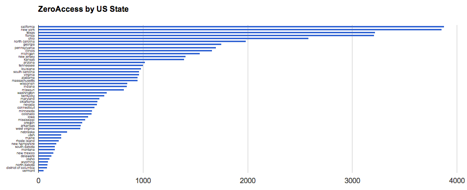
Click for larger version
We can use the state names to make a choropleth, but I’ll leave that as an exercise to the reader, or may do a sample with that in Python in an upcoming post.
The data used for these charts are all available in Google Docs.
