Skip navigation

Category Archives: R

[`fiery`](https://github.com/thomasp85/fiery) is a new `Rook`/`httuv`-based R web server in town created by @thomasp85 that aims to fill the gap between raw http & websockets and Shiny with a flexible framework for handling requests and serving up responses.

The intent of this post is to provide a quick-start to using it setup a prediction API service.

We’ll be using the _super complex model_ described in the first example of the `predict.lm` manual page and save the fitted model out so we can load it up in the web server and use it for predicting values from inputs.

set.seed(1492)
x <- rnorm(15)
y <- x + rnorm(15)
fit <- lm(y ~ x)
saveRDS(fit, "model.rds")

The code is annotated, but the gist is to:

– Fire up the server (NOTE: it puts itself on `0.0.0.0` _by default_ so *CHANGE THIS* until you’re ready for production)
– Load the saved model
– Setup the routing for the requests
– Send back the model as JSON (since it’s an API vs something meant for humans)

Here’s the code (jump past it for more info):

suppressPackageStartupMessages(library(fiery))
suppressPackageStartupMessages(library(utils))
suppressPackageStartupMessages(library(jsonlite))
suppressPackageStartupMessages(library(shiny))

app <- Fire$new()

# This is absolutely necessary unless you're deliberately trying
# to expose the service to the entire network you are on which
# you probably don't want to do until in test / stage / prod

app$host <- "127.0.0.1"
app$port <- 9123 # completely arbitrary selection, make it whatevs

model <- NULL

# When the app starts, we'll load the model we saved. This
# particular one is just the first example on ?predict.lm.
# This doesn't have to be global, per se, but this makes
# for a quick example of how to setup an model API server

app$on("start", function(server, ...) {
  message(sprintf("Running on %s:%s", app$host, app$port))
  model <<- readRDS("model.rds")
  message("Model loaded")
})

# when the request comes in, route it properly. this will
# be *much* nicer with Thomas' `routr` plugin, but you can
# get up and running now this way until it's fully documented
# and on CRAN.
#
# 3 routes:
#
# if "/" then return an empty HTML page
# if "/info" give some data about the server (just for example purposes)
# if "/predict?val=##" run the value through the model
#
# No error checking or anything as this is (again) a simple
# example

app$on('request', function(server, id, request, ...) {

  response <- list(
    status = 200L,
    headers = list('Content-Type'='text/html'),
    body = ""
  )

  # this helps us see what the path is
  path <- get("PATH_INFO", envir=request)
  if (path == "/info") {

    # Build a list of all the request headers so we can 
    # regurgitate them

    out <- sapply(grep("^[A-Z_0-9]+", names(request), value=TRUE), function(x) {
      sprintf("%s: %s", x, get(x, envir=request))
    })
    out <- paste0(out, collapse="\n")

    response$body <- sprintf("<pre>Connection Id: %s\n\n%s</pre>", id, out)

  } else if (grepl("^/predict", path)) {

    # this gets the query string; we're expecting val=##
    # but aren't going to do any error checking here.
    # You also would want to ensure there is nothing 
    # malicious in the query string.
    query  <- get("QUERY_STRING", envir=request)

    # handy helper function from the Shiny folks
    input <- shiny::parseQueryString(query)

    message(sprintf("Input: %s", input$val))

    # run the prediction and add the input var value to the list
    res <- predict(model, data.frame(x=as.numeric(input$val)), se.fit = TRUE)
    res$INPUT <- input$val

    # we want to return JSON
    response$headers <- list("Content-Type"="application/json")
    response$body <- jsonlite::toJSON(res, auto_unbox=TRUE, pretty=TRUE)

  }

  response

})

# don't fire off a browser call
app$ignite(showcase=FALSE)

Assuming you’ve saved that as `modelserver.r`, you can fire that up in R/RStudio-proper or on the command-line with `Rscript modelserver.r` (also assuming the fitted model RDS file is in the same directory which is prbly not a good idea for production as well).

You can either enter something like `http://127.0.0.1:9123/predict?val=-1.5` into your browser to see the JSON result there ore use `cURL`:

$ curl http://127.0.0.1:9123/predict?val=-1.5
{
  "fit": -0.8545,
  "se.fit": 0.5116,
  "df": 13,
  "residual.scale": 1.1088,
  "INPUT": "-1.5"
}

or even `httr`:

httr::content(httr::GET("http://127.0.0.1:9123/predict?val=-1.5"))
$fit
[1] -0.8545

$se.fit
[1] 0.5116

$df
[1] 13

$residual.scale
[1] 1.1088

$INPUT
[1] "-1.5"

Try hitting `http://127.0.0.1:9123/` and `http://127.0.0.1:9123/info` in similar ways to see what you get.

Keep a watchful eye on [`routr`](https://github.com/thomasp85/routr) as it will make setting up API servers in R much easier than this. So far I’m finding `fiery` a nice middle-ground between writing raw `httuv` servers, abusing Shiny (since it’s really meant for UX work) or dealing with the slightly more complex `opencpu` package for turning R into a web request handling engine.

Ideally, one would put this behind a security-aware reverse proxy for both safety (you can add some web application firewall-ish rules) and load balancing, but for in-house/local testing, this is a super quick way to publish your models for wider use. Depending on the adoption rate of `fiery`, I’ll create some future posts that deal with the complexities of security and performance, along with how to put this all into something like Docker for rapid, controlled deployments.

Once again, @albertocairo notices an interesting chart and spurs pondering in the visualization community with [his post](http://www.thefunctionalart.com/2016/06/defying-conventions-in-visualization.html) covering an unusual “vertical time series” chart produced for the print version of the NYTimes:

IMG_0509-1

I’m actually less concerned about the vertical time series chart component here since I agree with TAVE* Cairo that folks are smart enough to grok it and that it will be a standard convention soon enough given the prevalence of our collective tiny, glowing rectangles. The Times folks plotted Martin-Quinn (M-Q) scores for the U.S. Supreme Court justices which are estimates of how liberal or conservative a justice was in a particular term. Since they are estimates they aren’t exact and while it’s fine to plot the mean value (as suggested by the M-Q folks), if we’re going to accept the intelligence of the reader to figure out the nouveau time series layout, perhaps we can also show them some of the uncertainty behind these estimates.

What I’ve done below is take the data provided by the M-Q folks and make what I’ll call a vertical time series river plot using the mean, median and one standard deviation. This shows the possible range of real values the estimates can take and provides a less-precise but more forthright view of the values (in my opinion). You can see right away that they estimates are not so precise, but there is still an overall trend for the justices to become more liberal in modern times.

Cursor_and_RStudio

The ggplot2 code is a bit intricate, which is one reason I’m posting it. You need to reorient your labeling mind due to the need to use `coord_flip()`. I also added an arrow on the Y-axis to show how time flows. I think the vis community will need to help standardize on some good practices for how to deal with these vertical time series charts to help orient readers more quickly. In a more dynamic visualization, either using something like D3 or even just stop-motion animation, the flow could actually draw in the direction time flows, which would definitely make it easier immediately orient the reader.

However, the main point here is to not be afraid to show uncertainty. In fact, the more we all work at it, the better we’ll all be able to come up with effective ways to show it.

* == “The Awesome Visualization Expert” since he winced at my use of “Dr. Cairo” :-)

library(dplyr)
library(readr)
library(ggplot2)  # devtools::install_github("hadley/ggplot2")
library(hrbrmisc) # devtools::install_github("hrbrmstr/hrbrmisc")
library(grid)
library(scales)

URL <- "http://mqscores.berkeley.edu/media/2014/justices.csv"
fil <- basename(URL)
if (!file.exists(fil)) download.file(URL, fil)

justices <- read_csv(fil)

justices %>%
  filter(term>=1980,
         justiceName %in% c("Thomas", "Scalia", "Alito", "Roberts", "Kennedy",
                            "Breyer", "Kagan", "Ginsburg", "Sotomayor")) %>%
  mutate(col=ifelse(justiceName %in% c("Breyer", "Kagan", "Ginsburg", "Sotomayor"),
                    "Democrat", "Republican")) -> recent

just_labs <- data_frame(
  label=c("Thomas", "Scalia", "Alito", "Roberts", "Kennedy", "Breyer", "Kagan", "Ginsburg", "Sotomayor"),
      x=c(  1990.5,   1985.5,  2004.5,    2004.5,    1986.5,      1994,   2010,     1992.5,      2008.5),
      y=c(     2.9,      1.4,    1.35,       1.7,       1.0,      -0.1,   -0.9,       -0.1,          -2)
)

gg <- ggplot(recent)
gg <- gg + geom_hline(yintercept=0, alpha=0.5)
gg <- gg + geom_label(data=data.frame(x=c(0.1, -0.1),
                                      label=c("More →\nconservative", "← More\nliberal"),
                                      hjust=c(0, 1)), aes(y=x, x=1982, hjust=hjust, label=label),
                      family="Arial Narrow", fontface="bold", size=4, label.size=0, vjust=1)
gg <- gg + geom_ribbon(aes(ymin=post_mn-post_sd, ymax=post_mn+post_sd, x=term,
                             group=justice, fill=col, color=col), size=0.1, alpha=0.3)
gg <- gg + geom_line(aes(x=term, y=post_med, color=col, group=justice), size=0.1)
gg <- gg + geom_text(data=just_labs, aes(x=x, y=y, label=label),
                     family="Arial Narrow", size=2.5)
gg <- gg + scale_x_reverse(expand=c(0,0), limits=c(2014, 1982),
                           breaks=c(2014, seq(2010, 1990, -10), 1985, 1982),
                           labels=c(2014, seq(2010, 1990, -10), "1985\nTERM\n↓", ""))
gg <- gg + scale_y_continuous(expand=c(0,0), labels=c(-2, "0\nM-Q Score", 2, 4))
gg <- gg + scale_color_manual(name=NULL, values=c(Democrat="#2166ac", Republican="#b2182b"), guide=FALSE)
gg <- gg + scale_fill_manual(name="Nominated by a", values=c(Democrat="#2166ac", Republican="#b2182b"))
gg <- gg + coord_flip()
gg <- gg + labs(x=NULL, y=NULL,
                title="Martin-Quinn scores for selected justices, 1985-2014",
                subtitle="Ribbon band derived from mean plus one standard deviation. Inner line is the M-Q median.",
                caption="Data source: http://mqscores.berkeley.edu/measures.php")
gg <- gg + theme_hrbrmstr_an(grid="XY")
gg <- gg + theme(plot.subtitle=element_text(margin=margin(b=15)))
gg <- gg + theme(legend.title=element_text(face="bold"))
gg <- gg + theme(legend.position=c(0.05, 0.6))
gg <- gg + theme(plot.margin=margin(20,20,20,20))
gg

Yes, I manually positioned the names of the justices, hence the weird spacing for those lines. Also, after publishing this post, I tweaked the line-height of the “More Liberal”/”More Conservative” top labels a bit and would definitely suggest doing that to anyone attempting to reproduce this code (the setting I used was `0.9`).

The NPR vis team contributed to a recent [story](http://n.pr/1USSliN) about Armslist, a “craigslist for guns”. Now, I’m neither pro-“gun” or anti-“gun” since this subject, like most heated ones, has more than two sides. What I _am_ is pro-*data*, and the U.S. Congress is so [deep in the pockets of the NRA](http://abcnews.go.com/Health/cdc-launched-comprehensive-gun-study-15-years/story?id=39873289) that there’s no way for there to be any Federally-supported, data-driven research on gun injuries/deaths. Thankfully, California is going to [start funding research](http://www.wired.com/2016/06/congress-refuses-california-funds-gun-violence-research-center/), so we may see some evidence-based papers in the (hopefully) not-too-distant future.

When I read the NPR story I couldn’t believe it was easier to get a gun than it is get [pick your vice or other bit of dangerous contraband]. The team at NPR ended up [scraping the Armslist site](http://blog.apps.npr.org/2016/06/17/scraping-tips.html) and provided a [CSV of the data](http://apps.npr.org/armslist-analysis/armslist-listings-2016-06-16.csv). Their own blog post admirably started off with a “Can you scrape?” section. This is an area I see so many python, R and other folks totally ignore since they seem to feel that just because you _can_ do something also gives you license to do so.

I’m glad the NPR team provided the CSV of their results since I suspect that Armslist will be adding some “no scraping” language to their Terms of Service. Interestingly enough, the Armslist site owners spend a great deal of verbiage across their site indemnifying themselves (that’s how proud of their service they are).

Since they provided the CSV, I poked at it a bit and produced some alternate views of the data. One bit of info I was interested in is how much the ask price was for the firearms. Since this is a craigslist-like site, some of the prices are missing and others are obviously either “filler” like `12345678` or are legitimately large (i.e. the price for a rare antique). Given the huge right-skew, I limited the initial view to “affordable” ones (which I defined as between $0.00 & $2,500 USD and if you look at the data yourself you’ll see why). I then computed the bandwidth for the density estimate and did some other basic maths to see what price range of the offers made up at least 50% of the overall listings. I probably should have excluded the $1 offers but the data is there for you to use to augment anything I’ve done here.

ask-prices-1

Most of these firearms are quite affordable (even if you ignore the $1.00 USD offers).

One other view I wanted to see was that of the listings-per-day.

per-day-1

Info from the NPR vis team suggests this is not a 100% accurate view since the listings “age out” and they did a point-in-time scrape. It would be interesting to start a daily scraper for this site or ask to work with the raw data from the site itself (but it’s unlikely Armslist would have the courage to make said data available to news organizations or researchers). Also, the value for the last segment-bar does not appear to be from a fully day’s scrape. Nothing says ‘Murica like selling guns in a sketchy way for Memorial Day.

Finally, I wanted a different view of the ranked states.

by-state-1

(The `ggplot2` code for this one is kinda interesting for any R folk who are curious). This segment-bar chart is a bit of an eye strain (click on it to make it larger) but the main thing I wanted to see was if Ohio was as gun-nutty for the three less-than-valid (IMO) types of firearms sales (which is a different view than automatic vs semi-automatic). Sure enough, Ohio leads the pack (in other news, the same states are in the top 5 across these three categories).

“Spinnable” R code for these charts is below, so go forth and see if you can tease out any other views from the data. There is a free-text listing description field which may be interesting to mine, and the R code has sorted lists by manufacturer and caliber you can view if you run/spin it. It might be interesting to get data [like this for Ohio](https://en.wikipedia.org/wiki/Gun_laws_in_Ohio) for other states and do some clustering based on the legal categories outlined in the table.

#' ---
#' output:
#'   html_document:
#'     keep_md: true
#' ---

#+ message=FALSE, echo=FALSE, warning=FALSE
library(dplyr)
library(readr)
library(ggalt)
library(hrbrmisc)
library(KernSmooth)
library(scales)
library(stringi)
library(extrafont)
library(DT)

loadfonts()

arms <- read_csv("armslist-listings-2016-06-16.csv")
arms <- mutate(arms,
               price=ifelse(price=="FREE", 0, price),
               price=ifelse(price=="Offer", NA, price),
               price=make_numeric(price))
arms <- mutate(arms,
               listed_date=gsub("^.*y, ", "", listed_date),
               listed_date=as.Date(listed_date, "%B %d, %Y"))

affordable <- filter(arms, price>0 & price<2500)

bw <- dpik(affordable$price, scalest="stdev")

a_dens <- bkde(affordable$price, bandwidth=bw,
               range.x=range(affordable$price),
               truncate=TRUE)

peaks <- data_frame(
  pk=which(diff(sign(diff(c(0, a_dens$y)))) == -2),
  x=a_dens$x[pk],
  y=a_dens$y[pk]
)

ann <- sprintf('%s (%s of all listings) firearms are\noffered between $1 & $600 USD',
               comma(nrow(filter(affordable, between(price, 1, 600)))),
               percent(nrow(filter(affordable, between(price, 1, 600)))/nrow(arms)))

grps <- setNames(1:6, unique(arms$category))

ggplot() +
  geom_segment(data=cbind.data.frame(a_dens), aes(x, xend=x, 0, yend=y),
               color="#2b2b2b", size=0.15) +
  geom_vline(data=peaks[c(1,8),], aes(xintercept=x), size=0.5,
             linetype="dotted", color="#b2182b") +
  geom_label(data=peaks[c(1,8),], label.size=0,
            aes(x, y, label=dollar(floor(x)), hjust=c(0, 0)),
            nudge_x=c(10, 10), vjust=0, size=3,
            family="Arial Narrow") +
  geom_label(data=data.frame(), hjust=0, label.size=0, size=3,
             aes(label=ann, x=800, y=min(a_dens$y) + sum(range(a_dens$y))*0.7),
             family="Arial Narrow") +
  scale_x_continuous(expand=c(0,0), breaks=seq(0, 2500, 500), label=dollar, limits=c(0, 2500)) +
  scale_y_continuous(expand=c(0,0), limits=c(0, max(a_dens$y*1.05))) +
  labs(x=NULL, y="density",
       title="Distribution of firearm ask prices on Armslist",
       subtitle=sprintf("Counts are across all firearm types (%s)",
                        stri_replace_last_regex(paste0(names(grps), collapse=", "), ",", " &")),
       caption="Source: NPR http://n.pr/1USSliN") +
  theme_hrbrmstr_an(grid="X=Y", subtitle_size=10) +
  theme(axis.text.x=element_text(hjust=c(0, rep(0.5, 4), 1))) +
  theme(axis.text.y=element_blank()) +
  theme(plot.margin=margin(10,10,10,10)) -> gg

#+ ask-prices, dev="png", fig.width=8, fig.height=4, fig.retina=2, message=FALSE, echo=FALSE, warning=FALSE
gg

count(arms, state, category) %>%
  group_by(category) %>%
  mutate(f=paste0(paste0(rep(" ", grps[category[1]]), collapse=""), state, collaspe="")) %>%
  ungroup() %>%
  arrange(desc(n)) %>%
  mutate(f=factor(f, levels=rev(f))) %>%
  filter(category %in% c("Handguns", "Rifles", "Shotguns")) %>%
  ggplot(aes(x=n, y=f)) +
  geom_segment(aes(yend=f, xend=0), size=0.5) +
  scale_x_continuous(expand=c(0,0), label=comma) +
  facet_wrap(~category, scales="free") +
  labs(x="Note: free x-axis scale", y=NULL,
       title="Distribution of firearm listing by state",
       subtitle="Listings of Antique Firearms, Muzzle Loaders & NFA Firearms are not included in this view",
       caption="Source: NPR http://n.pr/1USSliN") +
  theme_hrbrmstr_an(grid="X", subtitle_size=10) +
  theme(axis.text.y=element_text(size=6)) -> gg

#+ by-state, dev="png", fig.width=8, fig.height=6, fig.retina=2, message=FALSE, echo=FALSE, warning=FALSE
gg

count(arms, listed_date) %>%
  ggplot(aes(listed_date, n)) +
  geom_segment(aes(xend=listed_date, yend=0)) +
  geom_vline(xintercept=c(as.numeric(c(as.Date("2016-05-26"),
                                       as.Date("2016-05-28"),
                                       as.Date("2016-06-02")))), color="#b2182b", size=0.5, linetype="dotted") +
  geom_label(data=data.frame(), hjust=1, vjust=1, nudge_x=-0.5, label.size=0, size=3,
             aes(x=as.Date("2016-05-26"), y=1800, label="NYT & CNN Gun Editorials"),
             family="Arial Narrow", color="#b2182b") +
  geom_label(data=data.frame(), hjust=1, vjust=1, nudge_x=-0.5, label.size=0, size=3,
             aes(x=as.Date("2016-05-28"), y=8500, label="Memorial Day"),
             family="Arial Narrow", color="#b2182b") +
  geom_label(data=data.frame(), hjust=0, vjust=1, nudge_x=0.5,
             label.size=0, size=3, lineheight=0.9,
             aes(x=as.Date("2016-06-02"), y=7000,
                 label="National Gun\nViolence\nAwareness Day"),
             family="Arial Narrow", color="#b2182b") +
  scale_x_date(expand=c(0,1), label=date_format("%B 2016")) +
  scale_y_continuous(expand=c(0,0), label=comma, limit=c(0, 9000)) +
  labs(x=NULL, y=NULL,
       title="Armslist firearm new listings per day",
       subtitle="Period range: March 16, 2016 to June 16, 2016",
       caption="Source: NPR http://n.pr/1USSliN") +
  theme_hrbrmstr_an(grid="XY") +
  theme(plot.margin=margin(10,10,10,10)) -> gg

#+ per-day, dev="png", fig.width=8, fig.height=5, fig.retina=2, message=FALSE, echo=FALSE, warning=FALSE
gg

count(arms, manufacturer) %>%
  filter(!is.na(manufacturer)) %>%
  arrange(desc(n)) %>%
  select(Manufacturer=manufacturer, Count=n) %>%
  datatable() %>%
  formatCurrency(columns="Count", currency="")

count(arms, caliber) %>%
  filter(!is.na(caliber)) %>%
  arrange(desc(n)) %>%
  select(Caliber=caliber, Count=n) %>%
  datatable() %>%
  formatCurrency(columns="Count", currency="")

@theboysmithy did a [great piece](http://www.ft.com/intl/cms/s/0/6f777c84-322b-11e6-ad39-3fee5ffe5b5b.html) on coming up with an alternate view for a timeline for an FT piece.

Here’s an excerpt (read the whole piece, though, it’s worth it):

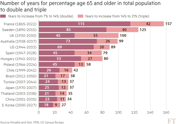
Here is an example from a story recently featured in the FT: emerging- market populations are expected to age more rapidly than those in developed countries. The figures alone are compelling: France is expected to take 157 years (from 1865 to 2022) to triple the proportion of its population aged over 65, from 7 per cent to 21 per cent; for China, the equivalent period is likely to be just 34 years (from 2001 to 2035).

You may think that visualising this story is as simple as creating a bar chart of the durations ordered by length. In fact, we came across just such a chart from a research agency.

But, to me, this approach generates “the feeling” — and further scrutiny reveals specific problems. A reader must work hard to memorise the date information next to the country labels to work out if there is a relationship between the start date and the length of time taken for the population to age. The chart is clearly not ideal, but how do we improve it?

Alan went on to talk about the process of improving the vis, eventually turning to [Joseph Priestly](https://en.wikipedia.org/wiki/Joseph_Priestley) for inspiration. Here’s their makeover:

![](http://im.ft-static.com/content/images/4a75d9ce-3223-11e6-bda0-04585c31b153.img)

Alan used D3 to make this, which had me head scratching for a bit. Bostock is genius & I :heart: D3 immensely, but I never really thought of it as a “canvas” for doing general data visualization creation for something like a print publication (it’s geared towards making incredibly data-rich interactive visualizations). It’s 100% cool to do so, though. It has fine-grained control over every aspect of a visualization and you can easily turn SVGs into PDFs or use them in programs like Illustrator to make the final enhancements. However, D3 is not the only tool that can make a chart like this.

I made the following in R (of course):

RStudio

The annotations in Alan’s image were (99% most likely) made with something like Illustrator. I stopped short of fully reproducing the image (life is super-crazy, still), but could have done so (the entire image is one `ggplot2` object).

This isn’t an “R > D3” post, though, since I use both. It’s about (a) reinforcing Alan’s posits that we should absolutely take inspiration from historical vis pioneers (so read more!) + need a diverse visualization “utility belt” (ref: Batman) to ensure you have the necessary tools to make a given visualization; (b) trusting your “Spidey-sense” when it comes to evaluating your creations/decisions; and, (c) showing that R is a great alternative to D3 for something like this :-)

Spider-man (you expected headier references from a dude with a shield avatar?) has this ability to sense danger right before it happens and if you’re making an effort to develop and share great visualizations, you definitely have this same sense in your DNA (though I would not recommend tossing pie charts at super-villains to stop them). When you’ve made something and it just doesn’t “feel right”, look to other sources of inspiration or reach out to your colleagues or the community for ideas or guidance. You _can_ and _do_ make awesome things, and you _do_ have a “Spidey-sense”. You just need to listen to it more, add depth and breadth to your “utility belt” and keep improving with each creation you release into the wild.

R code for the ggplot vis reproduction is below, and it + the CSV file referenced are in [this gist](https://gist.github.com/hrbrmstr/f12101f8ef1657f9e1457e0dde1602f8).

library(ggplot2)
library(dplyr)

ft <- read.csv("ftpop.csv", stringsAsFactors=FALSE)

arrange(ft, start_year) %>%
  mutate(country=factor(country, levels=c(" ", rev(country), "  "))) -> ft

ft_labs <- data_frame(
  x=c(1900, 1950, 2000, 2050, 1900, 1950, 2000, 2050),
  y=c(rep(" ", 4), rep("  ", 4)),
  hj=c(0.5, 0.5, 0.5, 0.5, 0.5, 0.5, 0.5, 0.5),
  vj=c(1, 1, 1, 1, 0, 0, 0, 0)
)

ft_lines <- data_frame(x=c(1900, 1950, 2000, 2050))

ft_ticks <- data_frame(x=seq(1860, 2050, 10))

gg <- ggplot()

# tick marks & gridlines
gg <- gg + geom_segment(data=ft_lines, aes(x=x, xend=x, y=2, yend=16),
                        linetype="dotted", size=0.15)
gg <- gg + geom_segment(data=ft_ticks, aes(x=x, xend=x, y=16.9, yend=16.6),
                        linetype="dotted", size=0.15)
gg <- gg + geom_segment(data=ft_ticks, aes(x=x, xend=x, y=1.1, yend=1.4),
                        linetype="dotted", size=0.15)

# double & triple bars
gg <- gg + geom_segment(data=ft, size=5, color="#b0657b",
                        aes(x=start_year, xend=start_year+double, y=country, yend=country))
gg <- gg + geom_segment(data=ft, size=5, color="#eb9c9d",
                        aes(x=start_year+double, xend=start_year+double+triple, y=country, yend=country))

# tick labels
gg <- gg + geom_text(data=ft_labs, aes(x, y, label=x, hjust=hj, vjust=vj), size=3)

# annotations
gg <- gg + geom_label(data=data.frame(), hjust=0, label.size=0, size=3,
                      aes(x=1911, y=7.5, label="France is set to take\n157 years to triple the\nproportion ot its\npopulation aged 65+,\nChina only 34 years"))
gg <- gg + geom_curve(data=data.frame(), aes(x=1911, xend=1865, y=9, yend=15.5),
                      curvature=-0.5, arrow=arrow(length=unit(0.03, "npc")))
gg <- gg + geom_curve(data=data.frame(), aes(x=1915, xend=2000, y=5.65, yend=5),
                      curvature=0.25, arrow=arrow(length=unit(0.03, "npc")))

# pretty standard stuff here
gg <- gg + scale_x_continuous(expand=c(0,0), limits=c(1860, 2060))
gg <- gg + scale_y_discrete(drop=FALSE)
gg <- gg + labs(x=NULL, y=NULL, title="Emerging markets are ageing at a rapid rate",
                subtitle="Time taken for population aged 65 and over to double and triple in proportion (from 7% of total population)",
                caption="Source: http://on.ft.com/1Ys1W2H")
gg <- gg + theme_minimal()
gg <- gg + theme(axis.text.x=element_blank())
gg <- gg + theme(panel.grid=element_blank())
gg <- gg + theme(plot.margin=margin(10,10,10,10))
gg <- gg + theme(plot.title=element_text(face="bold"))
gg <- gg + theme(plot.subtitle=element_text(size=9.5, margin=margin(b=10)))
gg <- gg + theme(plot.caption=element_text(size=7, margin=margin(t=-10)))
gg

The infamous @albertocairo [blogged about](http://www.thefunctionalart.com/2016/06/propublica-visualizes-seasonality-in.html) a [nice interactive piece on German company tax avoidance](https://projects.propublica.org/graphics/dividend) by @ProPublica. Here’s a snapshot of their interactive chart:

![](https://2.bp.blogspot.com/-S-8bu1UdYWM/V1rXibnBxrI/AAAAAAAAGo0/L940SpU3DvUPX90JK82jrKQN6fWMyn2IACLcB/s1600/1prop.png)

Dr. Cairo (his PhD is in the bag as far as I’m concerned :-) posited:

>_Isn’t it weird that the chart doesn’t have a scale on the Y-axis? It’s not the first time I see this, and it makes me feel uneasy._

I jumped over to the interactive piece to see if the authors used interactive tooltips since viewers can get a good idea for the scale limits if they do that and it _kinda sorta_ makes not having Y-axis label mostly OK if they compensate with said interactive notations. The interactive had no tooltips and the Y-axis was completely unlabeled.

Now, they used D3, so there _are_ built-in ways to create and add a Y-axis, so I don’t think this was an “oops…we forgot” moment. The Y values are “Short Interest Quantity” which is the quantity of stock shares that investors have sold short but not yet covered or closed out. It’s definitely a “1%-er” term and the authors already took time to explain some technical financial details and probably would have had to add even more text to explain this term properly (since that short definition is really not enough for most of us 99%-ers). It seems that they felt the the arrowed-annotations on the right hand side of the plot made up for the lack of actual Y-axis detail.

Should we _always_ have labels on a given axis? Would knowing that the Y-axis on this chart went from 0 to 800 million have aided in the decoding or groking the overall message? Here’s another example to help frame that question. This is the seminal `ggplot2::geom_density()` demo chart:

RStudio 2

Given that folks outside the realm of statistics/datasci really don’t grok what that Y-axis is saying, would it be _horribad_ to just leave it with a _”density”_ Y-label (sans unit marks) and then explain it in text (or talk to/around it in text but not go into detail)? Or should we keep the full annotations and spend a precious paragraph of text talking about measuring the area under a curve? (Another argument is to choose the right vis for the right audience but that’s another post entirely).

To further illustrate the posit, I recently made a series of what I call a “rank ordered segment plot” for a [report](https://information.rapid7.com/rs/495-KNT-277/images/rapid7-research-report-national-exposure-index-060716.pdf) that we did at @Rapid7:

ssh_rank_chart-1

There are text annotations for countries at either end of the spectrum on the X-axis but they aren’t individually labeled cuz…ewwww that’d be messy. The interactive version (coming this week over at `community.rapid7.com`) has the full table and light hover popup-annotations. But the point wasn’t to really focus on the countries as it was to depict the sad state of the ratio of unencrypted vs encrypted for a given service type within a country.

So, _should_ the ProPublica authors have tried to be more discrete w/r/t their Y-axis or is it fine the way it is? Does there _always_ need to be discrete axes annotations or is there some wiggle room? Opines are welcome in the comments since I honestly don’t think there is “one answer to rule them all” for this.

And for those that really want to see more discrete info on the ProPublica Y-axis labels, here’s a static, faceted chart (you may need to click/select/tap the chart to make it big enough to view):

Plot_Zoom

### Don’tTry This At Home!

ProPublica made that data available via two CSV files and the crosswalk org translation table via their main D3 javascript file (use Developer Tools “Inspect Element” to see such things). I ended up having to use `Sys.setlocale(‘LC_ALL’,’C’)` and expand the translation table a bit due to some of the mixed encodings in the data sets. Code to make the chart is below.

library(ggplot2)
library(dplyr)
library(stringi)
library(hrbrmisc)
library(scales)
library(ggalt)
library(sitools)

# mixed encodings ftw!
Sys.setlocale('LC_ALL','C') 

# different names in different data sets; sigh
org_crosswalk <- read.table(text='company,trans
"Adidas AG","Adidas AG"
"Allianz SE","Allianz SE"
"BASF SE","BASF SE"
"Bayer AG","Bayer AG"
"Bayerische Motoren Werke AG","BMW AG"
"BMW AG","BMW AG",
"Beiersdorf AG","Beiersdorf AG"
"Commerzbank AG","Commerzbank AG"
"Continental AG","Continental AG"
"Daimler AG","Daimler AG"
"Deutsche Bank AG","Deutsche Bank AG"
"Deutsche Boerse AG","Deutsche Boerse AG"
"Deutsche Lufthansa AG","Deutsche Lufthansa AG"
"Deutsche Post AG","Deutsche Post AG"
"Deutsche Telekom AG","Deutsche Telekom AG"
"E.ON","E.ON"
"Fresenius Medical Care AG & Co. KGaA","Fresenius Medical Care AG"
"Fresenius Medical Care AG","Fresenius Medical Care AG"
"Fresenius SE & Co KGaA","Fresenius SE & Co KGaA"
"HeidelbergCement AG","HeidelbergCement AG"
"Henkel AG & Co. KGaA","Henkel AG & Co. KGaA"
"Infineon Technologies AG","Infineon Technologies AG"
"K+S AG","K+S AG"
"Lanxess AG","Lanxess AG"
"Linde AG","Linde AG"
"Merck KGaA","Merck KGaA"
"MŸnchener RŸckversicherungs-Gesellschaft AG","Munich RE AG"
"M�nchener R�ckversicherungs-Gesellschaft AG","Munich RE AG"
"M\x9fnchener R\x9fckversicherungs-Gesellschaft AG","Munich RE AG"
"M?nchener R?ckversicherungs-Gesellschaft AG","Munich RE AG"
"Munich RE AG","Munich RE AG"
"RWE AG","RWE AG"
"SAP SE","SAP SE"
"Siemens AG","Siemens AG"
"ThyssenKrupp AG","ThyssenKrupp AG"
"Volkswagen AG","Volkswagen AG"', stringsAsFactors=FALSE, sep=",", quote='"', header=TRUE)

# quicker/less verbose than left_join()
org_trans <- setNames(org_crosswalk$trans, org_crosswalk$company)

# get and clean both data sets, being kind to the propublica bandwidth $
rec_url <- "https://projects.propublica.org/graphics/javascripts/dividend/record_dates.csv"
rec_fil <- basename(rec_url)
if (!file.exists(rec_fil)) download.file(rec_url, rec_fil)

records <- read.csv(rec_fil, stringsAsFactors=FALSE)
records %>%
  select(company=1, year=2, record_date=3) %>%
  mutate(record_date=as.Date(stri_replace_all_regex(record_date,
                                                    "([[:digit:]]+)/([[:digit:]]+)+/([[:digit:]]+)$",
                                                    "20$3-$1-$2"))) %>%
  mutate(company=ifelse(grepl("Gesellschaft", company), "Munich RE AG", company)) %>% 
  mutate(company=org_trans[company]) -> records

div_url <- "https://projects.propublica.org/graphics/javascripts/dividend/dividend.csv"
div_fil <- basename(div_url)
if (!file.exists(div_fil)) download.file(div_url, div_fil)

dividends <- read.csv(div_fil, stringsAsFactors=FALSE)

dividends %>%
  select(company=1, pricing_date=2, short_int_qty=3) %>%
  mutate(pricing_date=as.Date(stri_replace_all_regex(pricing_date,
                                                     "([[:digit:]]+)/([[:digit:]]+)+/([[:digit:]]+)$",
                                                     "20$3-$1-$2"))) %>%
  mutate(company=ifelse(grepl("Gesellschaft", company), "Munich RE AG", company)) %>% 
  mutate(company=org_trans[company]) -> dividends

# sitools::f2si() doesn't work so well for this for some reason, so mk a small helper function
m_fmt <- function (x) { sprintf("%d M", as.integer(x/1000000)) }

# gotta wrap'em all
subt <- wrap_format(160)("German companies typically pay shareholders one big dividend a year. With the help of U.S. banks, international investors briefly lend their shares to German funds that don’t have to pay a dividend tax. The avoided tax – usually 15 percent of the dividend – is split by the investors and other participants in the deal. These transactions cost the German treasury about $1 billion a year. [Y-axis == short interest quantity]")

gg <- ggplot()

# draw the markers for the dividends
gg <- gg + geom_vline(data=records,
                      aes(xintercept=as.numeric(record_date)),
                      color="#b2182b", size=0.25, linetype="dotted")

# draw the time series
gg <- gg + geom_line(data=dividends,
                     aes(pricing_date, short_int_qty, group=company),
                     size=0.15)

gg <- gg + scale_x_date(expand=c(0,0))
gg <- gg + scale_y_continuous(expand=c(0,0), labels=m_fmt,
                              limits=c(0,800000000))

gg <- gg + facet_wrap(~company, scales="free_x")

gg <- gg + labs(x="Red, dotted line == Dividend date", y=NULL,
                title="Tax Avoidance Has a Heartbeat",
                subtitle=subt,
                caption="Source: https://projects.propublica.org/graphics/dividend")

# devtools::install_github("hrbrmstr/hrbrmisc") or roll your own
gg <- gg + theme_hrbrmstr_an(grid="XY", axis="", strip_text_size=8.5,
                             subtitle_size=10)
gg <- gg + theme(axis.text=element_text(size=6))
gg <- gg + theme(panel.grid.major=element_line(size=0.05))
gg <- gg + theme(panel.background=element_rect(fill="#e2e2e233",
                                               color="#e2e2e233"))
gg <- gg + theme(panel.margin=margin(10,10,20,10))
gg <- gg + theme(plot.margin=margin(20,20,20,20))
gg <- gg + theme(axis.title.x=element_text(color="#b2182bee", size=9, hjust=1))
gg <- gg + theme(plot.caption=element_text(margin=margin(t=5)))
gg

This made the rounds on social media last week:

One of the original versions was static and was not nearly as popular, but—as you can see—this one went viral.

Despite the public’s infatuation with circles (I’m lookin’ at you, pie charts), I’m not going to reproduce this polar coordinate visualization in ggplot2. I believe others have already done so (or are doing so) and you can mimic the animation pretty easily with `coord_polar()` and @drob’s enhanced ggplot2 animation tools.

NOTE: If you’re more interested in the stats/science than a spirograph or colorful D3 animation (below), Gavin Simpson (@ucfagls) has an [awesome post](http://www.fromthebottomoftheheap.net/2016/03/25/additive-modeling-global-temperature-series-revisited/) with a detailed view of the HadCRUT data set.

## HadCRUT in R

I noticed that [the original data source](http://www.metoffice.gov.uk/hadobs/hadcrut4/), had 12 fields, two of which (columns 11 & 12) are the lower+upper bounds of the 95% confidence interval of the combined effects of all the uncertainties described in the HadCRUT4 error model (measurement and sampling, bias and coverage uncertainties). The spinning vis of doom may be mesmerizing, but it only shows the median. I thought it might be fun to try to make a good looking visualization using the CI as well (you can pick one of the other pairs to try this at home), both in R and then in D3. I chose D3 for the animated version mostly to play with the new 4.0 main branch, but I think it’s possible to do more with dynamic visualizations in D3 than it is with R (and it doesn’t require stop-motion techniques).

The following code:

– reads in the data set (and saves it locally to be nice to their bandwidth bill)
– does some munging to get fields we need
– saves a version out for use with D3
– uses `geom_segment()` + `geom_point()` to do the heavy lifting
– colors the segments by year using the `viridis` palette (the Plasma version)
– labels the plot by decade using facets and some fun facet margin “tricks” to make it look like the x-axis labels are on top

library(readr)    # read_table() / write_csv()
library(dplyr)
library(zoo)      # as.yearmon()
library(ggplot2)  # devtools::install_github("hadley/ggplot2")
library(hrbrmisc) # devtools::install_github("hrbrmstr/hrbrmisc")
library(viridis)

URL <- "http://www.metoffice.gov.uk/hadobs/hadcrut4/data/current/time_series/HadCRUT.4.4.0.0.monthly_ns_avg.txt"
fil <- sprintf("data/%s", basename(URL))
if (!file.exists(fil)) download.file(URL, fil)

global_temps <- read_table(fil, col_names=FALSE)

global_temps %>%
  select(year_mon=1, median=2, lower=11, upper=12) %>%
  mutate(year_mon=as.Date(as.yearmon(year_mon, format="%Y/%m")),
         year=as.numeric(format(year_mon, "%Y")),
         decade=(year %/% 10) * 10,
         month=format(year_mon, "%b")) %>%
  mutate(month=factor(month, levels=month.abb)) %>%
  filter(year != 2016) -> global_temps

# for D3 vis
write_csv(global_temps, "data/temps.csv")

#+ hadcrut, fig.retina=2, fig.width=12, fig.height=6
gg <- ggplot(global_temps)
gg <- gg + geom_segment(aes(x=year_mon, xend=year_mon, y=lower, yend=upper, color=year), size=0.2)
gg <- gg + geom_point(aes(x=year_mon, y=median), color="white", shape=".", size=0.01)
gg <- gg + scale_x_date(name="Median in white", expand=c(0,0.5))
gg <- gg + scale_y_continuous(name=NULL, breaks=c(0, 1.5, 2),
                              labels=c("0°C", "1.5°C", "2.0°C"), limits=c(-1.6, 2.25))
gg <- gg + scale_color_viridis(option="C")
gg <- gg + facet_wrap(~decade, nrow=1, scales="free_x")
gg <- gg + labs(title="Global Temperature Change (1850-2016)",
                subtitle="Using lower and upper bounds of the 95% confidence interval of the combined effects of all the uncertainties described in the HadCRUT4 error model (measurement and sampling, bias and coverage uncertainties; fields 11 & 12)",
                caption="HadCRUT4 (http://www.metoffice.gov.uk/hadobs/hadcrut4/index.html)")
gg <- gg + theme_hrbrmstr_my(grid="XY")
gg <- gg + theme(panel.background=element_rect(fill="black", color="#2b2b2b", size=0.15))
gg <- gg + theme(panel.margin=margin(0,0,0,0))
gg <- gg + theme(panel.grid.major.y=element_line(color="#b2182b", size=0.25))
gg <- gg + theme(strip.text=element_text(hjust=0.5))
gg <- gg + theme(axis.title.x=element_text(hjust=0, margin=margin(t=-10)))
gg <- gg + theme(axis.text.x=element_blank())
gg <- gg + theme(axis.text.y=element_text(size=12, color="#b2182b"))
gg <- gg + theme(legend.position="none")
gg <- gg + theme(plot.margin=margin(10, 10, 10, 10))
gg <- gg + theme(plot.caption=element_text(margin=margin(t=-6)))
gg

hadcrut

(Click image for larger version)

My `theme_hrbrmstr_my()` required the Myriad Pro font, so you’ll need to use one of the other themes in the `hrbrmisc` package or fill in some `theme()` details on your own.

## HadCRUT in D3

While the static visualization is pretty, we can kick it up a bit with some basic animations. Rather than make a multi-file HTML+js+D3+CSS example, this is all self-contained (apart from the data) in a single `index.html` file (some folks asked for the next D3 example to be self-contained).

Some nice new features of D3 4.0 (that I ended up using here):

– easier to use `scale`s
– less verbose `axis` creation
– `viridis` is now a first-class citizen

Mike Bostock has spent much time refining the API for [D3 4.0](https://github.com/d3/d3) and it shows. I’m definitely looking forward to playing with it over the rest of the year.

The vis is below but you can bust the `iframe` via [https://rud.is/projects/hadcrut4/](https://rud.is/projects/hadcrut4/).

I have it setup as “click to view” out of laziness. It’s not hard to make it trigger on `div` scroll visibility, but this way you also get to repeat the visualization animation without it looping incessantly.

If you end up playing with the D3 code, definitely change the width. I had to make it a bit smaller to fit it into the blog theme.

## Fin

You can find the source for both the R & D3 visualizations [on github](https://github.com/hrbrmstr/hadcrut).

Keeping up with R-related news on Twitter, GitHub, CRAN & even R-Bloggers (et al) can be an all-encompassing task that may be fun, but doesn’t always make it easy to get work done. There is so much going on in the R community that we (myself and @jayjacobs) felt there was room for another podcast focused on the (highly subjective) “best of the best of the week”. We’ve dubbed this effort “R World News” and will be publishing it weekly starting this week.

Each episode will highlight new CRAN packages/developments, cutting edge releases from rOpenSci & the “GitHub”-ecosystem, book reviews, interviews and featurettes on topics such as the new feather file format. Show notes will have links to everything and we even have a small newsletter setup to let you know when new episodes are up and deliver the notes right to your inbox.

You can also follow us on Twitter (@r_world_news) to be informed there when new episodes are posted.

Episode 1 is up and you can use the following URL to subscribe to the podcast feed:


http://www.rworld.news/feed/r-world-news.xml

We’ve been approved for the iTunes Store (that link should work starting Wed/Thu) and will be getting the feed on the major podcast services as quickly as they can process requests. We’re also working on getting the companion blog (really, just a show-notes feed) up on R-bloggers, so stay tuned!

Make sure to give a shout-out to info@rworld.news with topic suggestions and drop a note in the comments for each episode over on rworld.news.

Rumors of my demise have been (almost) greatly exaggerated.

Folks have probably noticed that has stalled, as has most blogging, package & Twitter activity. I came down with a nasty bout of bronchitis after attending rOpenSci Unconf 16 (there were _so_ many people hacking [the sick kind] up a storm in SFO!) and then managed to get pneumonia (which I’m still working through) so any and all awake time has gone to work, class and fam. However, winds back up this week, a new R endeavor will be revealed and hopefully I’ll be done with getting ill until Fall.

Getting ill does have some advantages. I completely forgot about renewing SSL/TLS certificates on some (official – yikes!) sites I help manage and decided to have that not be “a thing” moving forward with some help from R. Specifically, I decided to use the `openssl` and `flexdashboard` packages to accomplish my monitoring goals. I’m probably not the only one who needs to care about SSL/TLS certificate renewals so my illness-born-invention is presented below for anyone else to use or mod.

### Flexing flexdashboard muscles

If you haven’t heard about [`flexdashboard`](http://rstudio.github.io/flexdashboard/) then you should visit that link before continuing. It’s an emerging package from the fine folks over at RStudio that makes it super-easy to create quick and pretty dashboards. You can look [at the examples](http://rstudio.github.io/flexdashboard/examples.html) if you want proof. Here’s how `flexdashboard` fit into my goals. I wanted a way to:

– provide a character vector of hosts and ports (you can run SSL/TLS on any port and for many types of services)
– retrieve the certificates at those endpoints
– compare the expiration date to the current date
– provided a dashboard-like view of the state of those certificates, ordered from soonest-expiring to longest-expiring and color-coded (to make it easier to see the certs of impending DOOM)

I immediately thought of `flexdashboard` but my hopes were quickly dashed when all attempts to provide a list of `valueBox()` elements (as I could with `htmlwidgets` in R markdown documents) failed to deliver the desired result of a scrolling, responsive set of boxes.

My workaround was to have an R script create a `flexdashboard` R markdown document on the fly then call `rmarkdown::render()` to generate the final HTML page. Rather than bore you with a tiny view of the sites I work with, I decided to scrape the list of R CRAN mirrors that are SSL/TLS-enabled and present them via this rube goldberg contraption as the show-and-tell example.

The annotated code is below and in [this gist](https://gist.github.com/hrbrmstr/910af8ddc6371572aa4414b77ae86c6a).

library(rvest)
library(urltools)
library(rmarkdown)

# Some Rmd template setup -----------------------------------------------------------

preamble <- '---
title: "CRAN Mirrors Certificate Expiration Dashboard (Days left from %s)"
output:
  flexdashboard::flex_dashboard:
    orientation: rows
    vertical_layout: scroll
---
```{r setup, include=FALSE}
library(flexdashboard)
library(openssl)
library(purrr)
library(dplyr)
library(scales)
'

after_data <- '

dsc <- safely(download_ssl_cert);

expires_delta <- function(site) {

  site_info <- strsplit(site, ":")[[1]]
  port <- as.numeric(site_info[2])

  chain_res <- dsc(site_info[1], port)
  if (!is.null(chain_res$result)) {

    chain <- chain_res$result

    valid_from <- as.Date(as.POSIXct(as.list(chain[[1]])$validity[1],
                                     "%b %d %H:%M:%S %Y", tz="GMT"))
    expires_on <- as.Date(as.POSIXct(as.list(chain[[1]])$validity[2],
                                     "%b %d %H:%M:%S %Y", tz="GMT"))

    data_frame(site=site_info[1],
               valid_from=valid_from,
               expires_on=expires_on,
               cert_valid_length=expires_on-valid_from,
               days_left_from_valid=expires_on - valid_from,
               days_left_from_today=expires_on - Sys.Date(),
               days_left_from_today_lab=comma(expires_on - Sys.Date()),
               color="primary",
               color=ifelse(days_left_from_today<=15, "danger", color),
               color=ifelse(days_left_from_today>15 & days_left_from_today<60, "warning", color))

  } else {

    data_frame(site=site_info[1],
               valid_from=NA,
               expires_on=NA,
               cert_valid_length=NA,
               days_left_from_valid=NA,
               days_left_from_today=NA,
               days_left_from_today_lab="Host unreachable",
               color="info")

  }

}

ssl_df <- arrange(map_df(sites, expires_delta), days_left_from_today)
```

'

# Get a list of all https-enabled CRAN mirrors --------------------------------------

pg <- read_html("https://cran.r-project.org/mirrors.html")
sites <- sprintf("%s:443", domain(html_attr(html_nodes(pg, "td > a[href^='https:']"), "href")))

# Capture this vector for use in the R markdown template ----------------------------

setup_data <- capture.output(dput(sites))

# Create a temporary Rmd file -------------------------------------------------------

dashfile <- tempfile(fileext=".Rmd")

# Write out the initial template bits we've been making -----------------------------

cat(sprintf(preamble, Sys.Date()), "sites <- ", setup_data, after_data, file=dashfile)

# 5 valueBoxes per row seems like a good # ----------------------------------------

max_vbox_per_row <- 5

n_dashrows <- ceiling(length(sites)/max_vbox_per_row)

# Generate a valueBox() per site, making rows every max_vbox_per_row ----------------

for (i in 1:length(sites)) {

  if (((i-1) %% max_vbox_per_row) == 0) {
    cat('
Row
-------------------------------------

', file=dashfile, append=TRUE)
  }

  cat(sprintf("\n### %s\n```{r}\n", gsub(":.*$", "", sites[i])), file=dashfile, append=TRUE)
  cat(sprintf('valueBox(ssl_df[%d, "days_left_from_today_lab"], icon="fa-lock", color=ssl_df[%d, "color"])\n```\n', i, i),
      file=dashfile, append=TRUE)
}

# Temporary html file (you prbly want this more readily available -------------------

dir <- tempfile()
dir.create(dir)
dash_html <- file.path(dir, "sslexpires.html")

# Render the dashboard --------------------------------------------------------------

rmarkdown::render(dashfile, output_file=dash_html)

# View in RStudio -------------------------------------------------------------------

rstudioapi::viewer(dash_html)

# Clean up --------------------------------------------------------------------------

unlink(dashfile)

You can see the output below and can use [this link](/projects/sslexpires.html) to bust the iframe.

You can use different values for the color thresholds or use a different visual display altogether. The `flexdashboard` package works with virtually any widget or static R visualization. You should also look at the frame-busted version and shrink the browser window (or view it on a mobile phone) to see the responsive nature of the framework.

I’m pretty sure the CRAN R mirror that is displaying an error is due to my accessing it via the resolved IPv6 address (I run IPV6 at home and have an IPv6 internet connection) vs the IPv4 address it’s probably actually listening on.

Keep an eye out for news and the new R project I hinted at in the intro.