Skip navigation

Category Archives: R

I made a promise to someone that my next blog would be about stringi vs stringr and I intend to keep said promise.

stringr and stringi do “string operations”: find, replace, match, extract, convert, transform, etc.

The stringr package is now part of the tidyverse and is 100% focused on string processing and is pretty much a wrapper package for stringi. The stringi package wraps chunks of the icu4c library but the stringi API frmaing was actually based on the patterns in the stringr package API. stringr did not wrap stringi at the time but does now and stringi strays a bit (on occasion) from string processing since the entire icu4c library is at it’s disposal. Confused? Good! There’s more!

The impetus for asking me to blog about this is that I’m known to say “just use stringi” in situations where someone has taken a stringr “shortcut”. Let me explain why.

Readers Digest

First, you need to read pages 4-5 of the stringi manual [PDF] and then the stringr vignette. I’m not duplicating the information on those pages. The TL;DR on them is:

  • that stringr makes some (valid) assumptions about defaults for the stringi calls it wraps
  • stringr is much easier to initially grok as it’s very focused and has far fewer functions
  • they both use ICU regular expressions
  • stringi includes more than string processing and has far more total functions:

As noted, stringr wraps stringi calls (for the most part) and some of the stringr functions reference more than one stringi function:

That’s my primary defense for “just use stringi” — stringr “just uses” it and you are forced to install stringi on every system stringr is on, so why introduce another dependency into your code?

All Wrapped Up

These are the stringr functions with a 1:~1 correspondence to stringi functions:

stri_c stri_conv stri_count stri_detect stri_dup stri_extract stri_extract_all stri_join stri_length stri_locate stri_locate_all stri_match stri_match_all stri_order stri_pad stri_replace stri_replace_all stri_replace_na stri_sort stri_split stri_split_fixed stri_sub stri_sub<- stri_subset stri_trim stri_wrap

I used 1:~1 since at the heart of the string processing capabilities of both packages lies the concept of granular control of matching behaviour. Specifically, there are four modes (so it’s really 1:4?):

  • fixed: Compare literal bytes in the string. This is very fast, but not usually what you want for non-ASCII character sets
  • coll: Compare strings respecting standard collation rules
  • regex: The default. Uses ICU regular expressions
  • boundary: Match boundaries between things

stringr has function modifiers around pattern to handle those whereas stringi requires explicit function calls. So, you’d do the following to replace a fixed char/byte sequence in each package:

  • stri_replace_all_fixed("Lorem i.sum dolor sit amet, conse.tetur adipisicing elit.", ".", "#")
  • str_replace_all("Lorem i.sum dolor sit amet, conse.tetur adipisicing elit.", fixed("."), "#")

In that case there’s not much in the way of keystroke savings, but the default mode of stringr is to use regex replacement and you do save both an i and _regex for that but add one more function call in-between you and your goal. When you work with multi-gigabyte character structures (as I do), those milliseconds often add up. If keystrokes > milliseconds in your workflow, you may want to stick with stringr.

Treasure Hunting in stringi

If you take some time to look at what’s in stringi you’ll find quite a bit (I excluded the fixed/coll/reged/boundary versions for brevity):

That’s an SVG, so zoom in as much as you need to to read it.

These are stringi gems:

  • stri_stats_general (stats abt a character vector)
  • stri_trans_totitle (For When You Want Title Case)
  • stri_flatten (paste0 but better defaults)
  • stri_rand_strings (random strings)
  • stri_rand_lipsum (random Lorem Ipsum lines!)
  • stri_count_words, stri_extract_all_words, stri_extract_first_words, stri_extract_last_words

Plus it has some helpful operators:

  • %s!=%, %s!==%, %s+%, %s<%, %s<=%, %s==%, %s===% %s>%, %s>=%, %stri!=%, %stri!==%, %stri+%, %stri<%, %stri<=%, %stri==%, %stri===%, %stri>%, %stri>=%

Of those, %s+% is ++handy for string concatenation.

Prior to readr, these were my go-to line/raw readers/writer: stri_read_raw, stri_read_lines, and stri_write_lines.

It also handles gnarly character encoding operations in a cross-platform, predictable manner.

FIN

To do a full comparison justice would have required writing a mini-book which is something I can’t spare cycles on, so my primary goals were to make sure folks knew stringr wrapped stringi and to show that stringi has much more to offer than you probably knew. If you start to get hooked on some of the more “fun” or utilitarian functions in stringi it’s probably worth switching to it. If string ops are ancillary operations to you and you normally work in regex-land, then you’re not missing out on anything and can save a few keystrokes here and there by using stringr.

Comments are extremely encouraged for this post as I’m curious if you know about stringi before and when/where/how you use it vs stringr (or, why you don’t).

I was enthused to see a mention of this on the GDELT blog since I’ve been working on an R package dubbed newsflash to work with the API that the form front-ends.

Given the current climate, I feel compelled to note that I’m neither a Clinton supporter/defender/advocate nor a ? supporter/defender/advocate) in any way, shape or form. I’m only using the example for replication and I’m very glad the article author stayed (pretty much) non-partisan apart from some color commentary about the predictability of network coverage of certain topics.

For now, the newsflash package is configured to grab raw count data, not the percent summaries since folks using R to grab this data probably want to do their own work with it. I used the following to try to replicate the author’s findings:

library(newsflash)
library(ggalt) # github version
library(hrbrmisc) # github only
library(tidyverse)
starts <- seq(as.Date("2015-01-01"), (as.Date("2017-01-26")-30), "30 days")
ends <- as.character(starts + 29)
ends[length(ends)] <- ""

pb <- progress_estimated(length(starts))
emails <- map2(starts, ends, function(x, y) {
  pb$tick()$print()
  query_tv("clinton", "email,emails,server", timespan="custom", start_date=x, end_date=y)
})

clinton_timeline <- map_df(emails, "timeline")

sum(clinton_timeline$value)
## [1] 34778

count(clinton_timeline, station, wt=value, sort=TRUE) %>%
  mutate(pct=n/sum(n), pct_lab=sprintf("%s (%s)", scales::comma(n), scales::percent(pct)),
         station=factor(station, levels=rev(station))) -> timeline_df

timeline_df

## # A tibble: 7 × 4
##             station     n         pct        pct_lab
##              <fctr> <int>       <dbl>          <chr>
## 1          FOX News 14807 0.425757663 14,807 (42.6%)
## 2      FOX Business  7607 0.218730232  7,607 (21.9%)
## 3               CNN  5434 0.156248203  5,434 (15.6%)
## 4             MSNBC  4413 0.126890563  4,413 (12.7%)
## 5 Aljazeera America  1234 0.035482201   1,234 (3.5%)
## 6         Bloomberg   980 0.028178734     980 (2.8%)
## 7              CNBC   303 0.008712404     303 (0.9%)

NOTE: I had to break up the queries since the bulk one across the two dates bump up against the API limits and may be providing helper functions for that before CRAN release.

While my package matches the total from the news article and sample query: 34,778 results my percentages are different since it’s the percentages across the raw counts for the included stations. “Percent of Sentences” (result “n” divided by the number of all sentences for each station in the time frame) — which the author used — seems to have some utility so I’ll probably add that as a query parameter or add a new function.

Tidy news text

The package also is designed to work with the tidytext package (it’s on CRAN) and provides a top_text() function which can return a tidytext-ready tibble or a plain character vector for use in other text processing packages. If you were curious as to whether this API has good data behind it, we can take a naive peek with the help of tidytext:

library(tidytext)

tops <- map_df(emails, top_text)
anti_join(tops, stop_words) %>% 
  filter(!(word %in% c("clinton", "hillary", "server", "emails", "mail", "email",
                       "mails", "secretary", "clinton's", "secretary"))) %>% 
  count(word, sort=TRUE) %>% 
  print(n=20)

## # A tibble: 26,861 × 2
##             word     n
##            <chr> <int>
## 1        private 12683
## 2     department  9262
## 3            fbi  7250
## 4       campaign  6790
## 5     classified  6337
## 6          trump  6228
## 7    information  6147
## 8  investigation  5111
## 9         people  5029
## 10          time  4739
## 11      personal  4514
## 12     president  4448
## 13        donald  4011
## 14    foundation  3972
## 15          news  3918
## 16     questions  3043
## 17           top  2862
## 18    government  2799
## 19          bill  2698
## 20      reporter  2684

I’d say the API is doing just fine.

Fin

The package also has some other bits from the API in it and if this has piqued your interest, please leave all package feature requests or problems as a github issue.

Many thanks to the Internet Archive / GDELT for making this API possible. Data like this would be amazing in any time, but is almost invaluable now.

Dear Leader has made good on his campaign promise to “crack down” on immigration from “dangerous” countries. I wanted to both see one side of the impact of that decree — how many potential immigrants per year might this be impacting — and show toss up some code that shows how to free data from PDF documents using the @rOpenSci tabulizer package — authored by (@thosjleeper) — (since knowing how to find, free and validate the veracity of U.S. gov data is kinda ++paramount now).

This is just one view and I encourage others to find, grab and blog other visa-related data and other government data in general.

So, the data is locked up in this PDF document:

As PDF documents go, it’s not horribad since the tables are fairly regular. But I’m not transcribing that and traditional PDF text extracting tools on the command-line or in R would also require writing more code than I have time for right now.

Enter: tabulizer — an R package that wraps tabula Java functions and makes them simple to use. I’m only showing one aspect of it here and you should check out the aforelinked tutorial to see all the features.

First, we need to setup our environment, download the PDF and extract the tables with tabulizer:

library(tabulizer)
library(hrbrmisc)
library(ggalt)
library(stringi)
library(tidyverse)

URL <- "https://travel.state.gov/content/dam/visas/Statistics/AnnualReports/FY2016AnnualReport/FY16AnnualReport-TableIII.pdf"
fil <- sprintf("%s", basename(URL))
if (!file.exists(fil)) download.file(URL, fil)

tabs <- tabulizer::extract_tables("FY16AnnualReport-TableIII.pdf")

You should str(tabs) in your R session. It found all our data, but put it into a list with 7 elements. You actually need to peruse this list to see where it mis-aligned columns. In the “old days”, reading this in and cleaning it up would have taken the form of splitting & replacing elements in character vectors. Now, after our inspection, we can exclude rows we don’t want, move columns around and get a nice tidy data frame with very little effort:

bind_rows(
  tbl_df(tabs[[1]][-1,]),
  tbl_df(tabs[[2]][-c(12,13),]),
  tbl_df(tabs[[3]][-c(7, 10:11), -2]),
  tbl_df(tabs[[4]][-21,]),
  tbl_df(tabs[[5]]),
  tbl_df(tabs[[6]][-c(6:7, 30:32),]),
  tbl_df(tabs[[7]][-c(11:12, 25:27),])
) %>%
  setNames(c("foreign_state", "immediate_relatives",  "special_mmigrants",
             "family_preference", "employment_preference", "diversity_immigrants","total")) %>% 
  mutate_each(funs(make_numeric), -foreign_state) %>%
  mutate(foreign_state=trimws(foreign_state)) -> total_visas_2016

I’ve cleaned up PDFs before and that code was a joy to write compared to previous efforts. No use of purrr since I was referencing the list structure in the console as I entered in the various matrix coordinates to edit out.

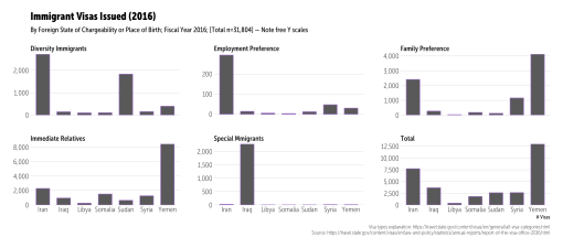
Finally, we can extract the target “bad” countries and see how many human beings could be impacted this year by referencing immigration stats for last year:

filter(foreign_state %in% c("Iran", "Iraq", "Libya", "Somalia", "Sudan", "Syria", "Yemen")) %>%
  gather(preference, value, -foreign_state) %>%
  mutate(preference=stri_replace_all_fixed(preference, "_", " " )) %>%
  mutate(preference=stri_trans_totitle(preference)) -> banned_visas

ggplot(banned_visas, aes(foreign_state, value)) +
  geom_col(width=0.65) +
  scale_y_continuous(expand=c(0,5), label=scales::comma) +
  facet_wrap(~preference, scales="free_y") +
  labs(x="# Visas", y=NULL, title="Immigrant Visas Issued (2016)",
       subtitle="By Foreign State of Chargeability or Place of Birth; Fiscal Year 2016; [Total n=31,804] — Note free Y scales",
       caption="Visa types explanation: https://travel.state.gov/content/visas/en/general/all-visa-categories.html\nSource: https://travel.state.gov/content/visas/en/law-and-policy/statistics/annual-reports/report-of-the-visa-office-2016.html") +
  theme_hrbrmstr_msc(grid="Y") +
  theme(axis.text=element_text(size=12))

~32,000 human beings potentially impacted, many who will remain separated from family (“family preference”); plus, the business impact of losing access to skilled labor (“employment preference”).

Go forth and find more US gov data to free (before it disappears)!

2021-11-04 UPDATE: Just use {arrow}.


Apache Drill is a nice tool to have in the toolbox as it provides a SQL front-end to a wide array of database and file back-ends and runs in standalone/embedded mode on every modern operating system (i.e. you can get started with or play locally with Drill w/o needing a Hadoop cluster but scale up almost effortlessly). It’s also a bit more lightweight than Spark and a nice alternative to Spark if you only need data wrangling and not the functionality in Spark’s MLlib.

When you’re in this larger-data world, parquet files are one of the core data storage formats. They’re designed to be compact and are optimized for columnar operations. Unlike CSV, JSON files or even R Data files, it’s not necessary to read or scan an entire parquet file to filter, select, aggregate, etc across columns. Unfortunately, parquet files aren’t first-class citizens in R. Well, they aren’t now, but thanks to this project it might not be too difficult to make an R interface to them. But, for now, you have to use some other means to convert or read parquet files.

Spark and sparklyr can help you write parquet files but I don’t need to run Spark all the time.

If you’re already a Drill user, you already know how easy it is to make parquet files with Drill:

CREATE TABLE dfs.tmp.sampleparquet AS 
  (SELECT trans_id, 
   cast(`date` AS date) transdate, 
   cast(`time` AS time) transtime, 
   cast(amount AS double) amountm,
   user_info, marketing_info, trans_info 
   FROM dfs.`/Users/drilluser/sample.json`);

If you’re not used to SQL, that may seem very ugly/foreign/verbose to you and you can thank Hadley for designing a better grammar of tidyness that seamlessly builds SQL queries like that behind the scenes for you. That SQL statement uses a JSON file as a data source (which you can do with Drill) make sure the field data types are correct by explicitly casting them to SQL data types (which is a good habit to get into even if it is verbose) and then tells Drill to make a parquet file (it’s actually a directory of parquet files) from it.

I’ve been working on an R package — sergeant — that provides RJDBC, direct REST and dplyr interfaces to Apache Drill for a while now. There are a number of complexities associated with creating a function to help users make parquet files from R data frames in Drill (which is why said function still does not exist in sergeant):

  • Is Drill installed or does there need to be a helper set of functions for installing and running Drill in embedded mode?
  • Even if there’s a Drill cluster running, does the user — perhaps — want to do the conversion locally in embedded mode? Embedded is way easier since all the files are local. The only real way to convert a data frame to Drill is to save a data frame to a temporary, interim file and them have Drill read it in. In a cluster mode where your local filesystem is not part of the cluster, that would mean finding the right way to get the file to the cluster. Which leads to the next item…
  • Where does the user want the necessary temporary files stored? Local dfs. file system? HDFS?
  • Do we need two different methods? One for quick conversion and one that forces explicit column data type casting?
  • Do we need to support giving the user explicit casting control and column selection capability?
  • Who put the bomp in the bomp, bomp, bomp?

OK, perhaps not that last one (but I think it still remains a mystery despite claims by Jan and Dean).

It’s difficult to wrap something like that up in a simple package that will make 80% of the possible user-base happy (having Drill and Spark operate behind the scenes like “magic” seems like a bad idea to me despite how well sparklyr masks the complexity).

As I continue to work that out (you are encouraged to file an issue with your opines on it at the gh repo) here’s a small R script that you can use it to turn R data frames into parquet files:

library(sergeant)
library(tidyverse)

# make a place to hold our temp files
# this is kinda super destructive. make sure you have the path right
unlink("/tmp/pqtrans", recursive=TRUE, force=TRUE)
dir.create("/tmp/pqtrans", showWarnings=FALSE)

# save off a large-ish tibble
write_csv(nycflights13::flights, "/tmp/pqtrans/flights.csvh")

# connect to drill
db <- src_drill("localhost")

# make the parquet file
dbGetQuery(db$con, "
CREATE TABLE dfs.tmp.`/pqtrans/flights.parquet` AS SELECT * FROM dfs.tmp.`/pqtrans/flights.csvh`
")
## # A tibble: 1 × 2
##   `Number of records written` Fragment
## *                       <int>    <chr>
## 1                      336776      0_0

# prove we did it
list.files("/tmp/pqtrans", recursive=TRUE, include.dirs=TRUE)
## [1] "flights.csvh"                  "flights.parquet"              
## [3] "flights.parquet/0_0_0.parquet"

# prove it again
flights <- tbl(db, "dfs.tmp.`/pqtrans/flights.parquet`")

flights
## Source:   query [?? x 19]
## Database: Drill 1.9.0 [localhost:8047] [8GB direct memory]
## 
##    flight arr_delay distance  year tailnum dep_time sched_dep_time origin
##     <int>     <dbl>    <dbl> <int>   <chr>    <int>          <int>  <chr>
## 1    1545        11     1400  2013  N14228      517            515    EWR
## 2    1714        20     1416  2013  N24211      533            529    LGA
## 3    1141        33     1089  2013  N619AA      542            540    JFK
## 4     725       -18     1576  2013  N804JB      544            545    JFK
## 5     461       -25      762  2013  N668DN      554            600    LGA
## 6    1696        12      719  2013  N39463      554            558    EWR
## 7     507        19     1065  2013  N516JB      555            600    EWR
## 8    5708       -14      229  2013  N829AS      557            600    LGA
## 9      79        -8      944  2013  N593JB      557            600    JFK
## 10    301         8      733  2013  N3ALAA      558            600    LGA
## # ... with more rows, and 11 more variables: sched_arr_time <int>,
## #   dep_delay <dbl>, dest <chr>, minute <dbl>, carrier <chr>, month <int>,
## #   hour <dbl>, arr_time <int>, air_time <dbl>, time_hour <dttm>,
## #   day <int>

# work with the drill parquet file
count(flights, year, origin) %>%
  collect()
## Source: local data frame [3 x 3]
## Groups: year [1]
## 
##    year origin      n
## * <int>  <chr>  <int>
## 1  2013    EWR 120835
## 2  2013    LGA 104662
## 3  2013    JFK 111279

That snippet:

  • assumes Drill is running, which is really as easy as entering drill-embedded at a shell prompt, but try out Drill in 10 Minutes if you don’t believe me
  • dfs.tmp points to /tmp (i.e. you need to modify that if yours doesn’t…see, I told you this wasn’t simple)
  • assumes we’re OK with letting Drill figure out column types
  • assumes we want ALL THE COLUMNS
  • uses the .csvh extension which tells Drill to read the column names from the first line so we don’t have to create the schema from scratch
  • is slow because of ↑ due to the need to create the csvh file first
  • exploits the fact that we can give dplyr the cold shoulder and talk directly to Drill anytime we feel like it with DBI calls by using the $con list field (the dbGetQuery(db$con, …) line).

It’s a naive and destructive snippet, but does provide a means to get your data frames into parquet and into Drill.

Most of my Drill parquet needs are converting ~20-100K JSON files a day into parquet, which is why I haven’t focused on making a nice interface for this particular use case (data frame to parquet) in R. Ultimately, I’ll likely go the “wrap parquet-cpp route” (unless you’re working on that, which — if you are — you should @-ref me in that gh-repo of yours so I can help out). But, if having a sergeant function to do this conversion would help you, drop an issue in the repo.

I had started a “52 Vis” initiative back in 2016 to encourage folks to get practice making visualizations since that’s the only way to get better at virtually anything. Life got crazy, 52 Vis fell to the wayside and now there are more visible alternatives such as Makeover Monday and Workout Wednesday. They’re geared towards the “T” crowd (I’m not giving a closed source and locked-in-data product any more marketing than two links) but that doesn’t mean R, Python or other open-tool/open-data communities can’t join in for the ride and learning experience.

This week’s workout is a challenge to reproduce or improve upon a chart by Matt Stiles. You should go to both (give them the clicks and eyeballs they both deserve since they did great work). They both chose a line chart, but the whole point of these exercises is to try out new things to help you learn how to communicate better. I chose to use geom_segment() to make mini-column charts since that:

  • eliminates the giant rose-coloured rectangles that end up everywhere
  • helps show the differences a bit better (IMO), and
  • also helps highlight some of the states that have had more difficulties than others

Click/tap to “embiggen”. I kept the same dimensions that Andy did but unlike Matt’s creation this is a plain ol’ PNG as I didn’t want to deal with web fonts (I’m on a Museo Sans Condensed kick at the moment but don’t have it in my TypeKit config yet). I went with official annual unemployment numbers as they may be calculated/adjusted differently (I didn’t check, but I knew that data source existed, so I used it).

One reason I’m doing this is a quote on the Workout Wednesday post:

This will be a very tedious exercise. To provide some context, this took me 2-3 hours to create. Don’t get discouraged and don’t feel like you have to do it all in one sitting. Basically, try to make yours look identical to mine.

This took me 10 minutes to create in R:

#' ---
#' output:
#'  html_document:
#'    keep_md: true
#' ---
#+ message=FALSE
library(ggplot2)
library(hrbrmisc)
library(readxl)
library(tidyverse)

# Use official BLS annual unemployment data vs manually calculating the average
# Source: https://data.bls.gov/timeseries/LNU04000000?years_option=all_years&periods_option=specific_periods&periods=Annual+Data
read_excel("~/Data/annual.xlsx", skip=10) %>%
  mutate(Year=as.character(as.integer(Year)), Annual=Annual/100) -> annual_rate


# The data source Andy Kriebel curated for you/us: https://1drv.ms/x/s!AhZVJtXF2-tD1UVEK7gYn2vN5Hxn #ty Andy!
read_excel("~/Data/staadata.xlsx") %>%
  left_join(annual_rate) %>%
  filter(State != "District of Columbia") %>%
  mutate(
    year = as.Date(sprintf("%s-01-01", Year)),
    pct = (Unemployed / `Civilian Labor Force Population`),
    us_diff = -(Annual-pct),
    col = ifelse(us_diff<0,
               "Better than U.S. National Average",
               "Worse than U.S. National Average")
  ) -> df

credits <- "Notes: Excludes the District of Columbia. 2016 figure represents October rate.\nData: U.S. Bureau of Labor Statistics <https://www.bls.gov/lau/staadata.txt>\nCredit: Matt Stiles/The Daily Viz <thedailyviz.com>"

#+ state_of_us, fig.height=21.5, fig.width=8.75, fig.retina=2
ggplot(df, aes(year, us_diff, group=State)) +
  geom_segment(aes(xend=year, yend=0, color=col), size=0.5) +
  scale_x_date(expand=c(0,0), date_labels="'%y") +
  scale_y_continuous(expand=c(0,0), label=scales::percent, limit=c(-0.09, 0.09)) +
  scale_color_manual(name=NULL, expand=c(0,0),
                     values=c(`Better than U.S. National Average`="#4575b4",
                              `Worse than U.S. National Average`="#d73027")) +
  facet_wrap(~State, ncol=5, scales="free_x") +
  labs(x=NULL, y=NULL, title="The State of U.S. Jobs: 1976-2016",
       subtitle="Percentage points below or above the national unemployment rate, by state. Negative values represent unemployment rates\nthat were lower — or better, from a jobs perspective — than the national rate.",
       caption=credits) +
  theme_hrbrmstr_msc(grid="Y", strip_text_size=9) +
  theme(panel.background=element_rect(color="#00000000", fill="#f0f0f055")) +
  theme(panel.spacing=unit(0.5, "lines")) +
  theme(plot.subtitle=element_text(family="MuseoSansCond-300")) +
  theme(legend.position="top")

Swap out ~/Data for where you stored the files.

The “weird” looking comments enable me to spin the script and is pretty much just the inverse markup for knitr R Markdown documents. As the comments say, you should really thank Andy for curating the BLS data for you/us.

If I really didn’t pine over aesthetics it would have taken me 5 minutes (most of that was waiting for re-rendering). Formatting the blog post took much longer. Plus, I can update the data source and re-run this in the future without clicking anything. This re-emphasizes a caution I tell my students: beware of dragon droppings (“drag-and-drop data science/visualization tools”).

Hopefully you presently follow or will start following Workout Wednesday and Makeover Monday and dedicate some time to hone your skills with those visualization katas.

It’s Davos time again. Each year the World Economic Forum (WEF) gathers the global elite together to discuss how they’re going to shape our collective future. WEF also releases their annual Global Risks Report at the same time. I read it every year and have, in the past, borrowed some risk communication visualization idioms from it since — in theory — senior executives are supposed to be able to understand them (the report is designed for consumption by senior leaders across the globe).

I also read it to gauge what the general public groks about risks associated with cybersecurity (since that’s a core part of my day job). One way to do that is to see how many “cyber”-related things appear in the report and get rated in their top 30 risks section. They intuit these risks from conducting surveys across samples of many populations (this is their visualization for the composition):

This post is less about “cyber” and more about bringing three “details” out of the report.

Detail #1 : Methodology Matters

Page 65 of the PDF report indicates they modified both the underlying foundations for the initial Impact and Likelihood scales and mentions that:

It is worth noting that, as a consequence of the scale modification, the impact results cannot be compared with those of previous years.

One more time: you can’t compare this year over year. They’ve done this re-jiggering before, so unless you’re just looking at relative positions of named big risk buckets you really can’t glean anything by looking at previous reports next to latter reports or previous risks to current risks in any detailed way. Remember: Always read the “methodology” section of any report. If it doesn’t have one, consider using it for kindling.

Detail #2 : CYA (Check Your Axes)

I generally end up giving the production team behind the Global Risks Report minor-to-major kudos each year as they usually produce a slick PDF (I’m sure the printed version looks spiffy as well) with occasional usefully-innovative visualization choices. One of their seminal charts is the global risks likelihood/impact scatterplot that I’m sure most folks familiar with risk-oriented visualizations have seen:

There’s a visible area “mini-map” with both the online and print versions:

I believe there’s going to be a very real tendency to overlook the minimap and to read the risk chart without looking at the axis values and interpret it as the risks in the lower left hand corder as being “low” and those in the upper right hand corner as being “high” (it’s how risk scatterplots are designed).

The zoomed in view will also likely cause readers to think that some risks are very widely separated from others. They’re not. They are pretty much in 3 buckets and are pseudo-squishy-medium-yellow-ish risks (which can mean that the risk estimators hedged their guesses). I realize they zoomed in to enable seeing the labels for the risks and possibly compare the diamond sizes; while not as pristine, we can show them with their names on the full risk board (tap/click it to focus only on the chart):

Remember, these are the top risks and they are squishy. They could be squishier and it’s worth noting that they also look much closer together in the macro view. Perhaps the world isn’t so risky after all.

Detail #3 : Group Responses

The methodology section of the report provides equations that document how they aggregated the risk estimates across their sample groups. The team behind the report also made interactive versions. You can & should go there to see how each group assessed the pool of risks. Thankfully, they didn’t use a closed and expensive system like Tableau to make those interactive graphics, which means we can peek behind the scenes and grab the data ourselves (github link for the cleaned & combined data at the end of the post). Here are the zoomed-in/zoomed-out breakdowns between the groups:

WEF brought “opposite” groups to the table to make risk estimates, so we can also use this data to compare their overall risk scores (with a lazy impact x likelihood valuation) between opposite groups:

Environmental risks bubbled to the top, possibly as a result of holding the survey in a time when drought and breaking ice-shelfs are top-of-mind. Keen observers will note that those are zoomed in views. Here are the same slopegraphs on the full range of risk values:

That paints an even better picture of the squishiness of said risks.

FIN

One could deep-dive into many of those charts to pull out some interesting things, especially the how various opposite groups rated various risks (though there were only a few semi-stark contrasts). Actually, you can deep dive into them as the full data from the risk rating interactive visualizations and the R code that generated the above charts are all at https://github.com/hrbrmstr/devils_in_the_davos_details.

Even if there is little efficacy to this annual event, you now have some ++gd data to practice with in ggplot2, dplyr and tidyr.

Did you know that you can completely replace the “knitting” engine in R Markdown documents? Well, you can!

Why would you want to do this? Well, in the case of this post, to commit the unpardonable sin of creating a clunky jupyter notebook from a pristine Rmd file.

I’m definitely not “a fan” of “notebook-style” interactive data science workflows (apologies to RStudio, but I don’t even like their take on the interactive notebook). However, if you work with folks who are more productive in jupyter-style environments, it can be handy to be able to move back and forth between the ipynb and Rmd formats.

The notedown module and command-line tool does just that. I came across that after seeing this notedown example. There’s a script there to do the conversion but it’s very Windows-specific and it’s a pretty manual endeavour if all you want to do is quickly generate both an ipynb file and a notebook preview html file from an Rmd you’re working on.

We can exploit the fact that you can specify a knit: parameter in the Rmd YAML header. Said parameter can be inline code or be a reference to a function in a package. When you use the “Knit” command from RStudio (button or key-cmd-shortcut) this parameter will cause the Rmd file to be passed to that function and bypass all pandoc processing. Your function has to do all the heavy lifting.

To that end, I modified my (github only for now) markdowntemplates package and added a to_jupyter() function. Provided you have jupyter setup correctly (despite what the python folk say said task is not always as easy as they’d like you to believe) and notedown installed properly, adding knit: markdowntemplates::to_jupyter to the YAML header of (in theory) any Rmd document and knitting it via RStudio will result in

  • an ipynb file being generated
  • an html file generated via nbconverting the notebook file, and
  • said HTML file being rendered in your system’s default browser

You can take this test Rmd:

---
knit: markdowntemplates::to_jupyter
---
## Notedown Test

Let's try a python block

```{r engine="python"}
def test(x):
  return x * x
test(2)
```

And a ggplot test

```{r}
suppressPackageStartupMessages(library(ggplot2))
```

We'll use an old friend

```{r}
head(mtcars)
```

and plot it:

```{r}
ggplot(mtcars, aes(wt, mpg)) + geom_point() + ggthemes::theme_fivethirtyeight()
```

and, after doing devtools::install_github("hrbrmstr/markdowntemplates") and ensuring you have notedown working, knit it in RStudio to generate the ipynb file and render an HTML file:

Note the python block is a fully functioning notebook cell. I haven’t tried other magic language cells, but they should work according to the notedown docs.

I’ve only performed light testing (on a MacBook Pro with jupyter running under python 3.x) and I’m sure there will be issues (it’s python, it’s jupyter and this is dark alchemy bridging those two universes), so when you run into errors, please file an issue. Also drop any feature requests to the same location.

The rest of the month is going to be super-hectic and it’s unlikely I’ll be able to do any more to help the push to CRAN 10K, so here’s a breakdown of CRAN and GitHub new packages & package updates that I felt were worth raising awareness on:

epidata

I mentioned this one last week but it wasn’t really a package announcement post. epidata is now on CRAN and is a package to pull data from the Economic Policy Institute (U.S. gov economic data, mostly). Their “hidden” API is well thought out and the data has been nicely curated (and seems to update monthly). It makes it super easy to do things like the following:

library(epidata)
library(tidyverse)
library(stringi)
library(hrbrmisc) # devtools::install_github("hrbrmstr/hrbrmisc")

us_unemp <- get_unemployment("e")

glimpse(us_unemp)
## Observations: 456
## Variables: 7
## $ date            <date> 1978-12-01, 1979-01-01, 1979-02-01, 1979-03-0...
## $ all             <dbl> 0.061, 0.061, 0.060, 0.060, 0.059, 0.059, 0.05...
## $ less_than_hs    <dbl> 0.100, 0.100, 0.099, 0.099, 0.099, 0.099, 0.09...
## $ high_school     <dbl> 0.055, 0.055, 0.054, 0.054, 0.054, 0.053, 0.05...
## $ some_college    <dbl> 0.050, 0.050, 0.050, 0.049, 0.049, 0.049, 0.04...
## $ college         <dbl> 0.032, 0.031, 0.031, 0.030, 0.030, 0.029, 0.03...
## $ advanced_degree <dbl> 0.021, 0.020, 0.020, 0.020, 0.020, 0.020, 0.02...

us_unemp %>%
  gather(level, rate, -date) %>%
  mutate(level=stri_replace_all_fixed(level, "_", " ") %>%
           stri_trans_totitle() %>%
           stri_replace_all_regex(c("Hs$"), c("High School")),
         level=factor(level, levels=unique(level))) -> unemp_by_edu

col <- ggthemes::tableau_color_pal()(10)

ggplot(unemp_by_edu, aes(date, rate, group=level)) +
  geom_line(color=col[1]) +
  scale_y_continuous(labels=scales::percent, limits =c(0, 0.2)) +
  facet_wrap(~level, scales="free") +
  labs(x=NULL, y="Unemployment rate",
       title=sprintf("U.S. Monthly Unemployment Rate by Education Level (%s)", paste0(range(format(us_unemp$date, "%Y")), collapse=":")),
       caption="Source: EPI analysis of basic monthly Current Population Survey microdata.") +
  theme_hrbrmstr(grid="XY")

us_unemp %>%
  select(date, high_school, college) %>%
  mutate(date_num=as.numeric(date)) %>%
  ggplot(aes(x=high_school, xend=college, y=date_num, yend=date_num)) +
  geom_segment(size=0.125, color=col[1]) +
  scale_x_continuous(expand=c(0,0), label=scales::percent, breaks=seq(0, 0.12, 0.02), limits=c(0, 0.125)) +
  scale_y_reverse(expand=c(0,100), label=function(x) format(as_date(x), "%Y")) +
  labs(x="Unemployment rate", y="Year ↓",
       title=sprintf("U.S. monthly unemployment rate gap (%s)", paste0(range(format(us_unemp$date, "%Y")), collapse=":")),
       subtitle="Segment width shows the gap between those with a high school\ndegree and those with a college degree",
       caption="Source: EPI analysis of basic monthly Current Population Survey microdata.") +
  theme_hrbrmstr(grid="X") +
  theme(panel.ontop=FALSE) +
  theme(panel.grid.major.x=element_line(size=0.2, color="#2b2b2b25")) +
  theme(axis.title.x=element_text(family="Arial", face="bold")) +
  theme(axis.title.y=element_text(family="Arial", face="bold", angle=0, hjust=1, margin=margin(r=-14)))

(right edge is high school, left edge is college…I’ll annotate it better next time)

censys

Censys is a search engine by one of the cybersecurity research partners we publish data to at work (free for use by all). The API is moderately decent (it’s mostly a thin shim authentication layer to pass on Google BigQuery query strings to the back-end) and the R package to interface to it censys is now on CRAN.

waffle

The seminal square pie chart package waffle has been updated on CRAN to work better with recent ggplot2 2.x changes and has some additional parameters you may want to check out.

cdcfluview

The viral package cdcfluview has had some updates on the GitHub version to add saner behaviour when specifying dates and had to be updated as the CDC hidden API switched to all https URLs (major push in .gov-land to do that to get better scores on their cyber report cards). I’ll be adding some features before the next CRAN push to enable retrieval of additional mortality data.

sergeant

If you work with Apache Drill (if you don’t, you should), the sergeant package (GitHub) will help you whip it into shape. I’ve mentioned it before on the blog but it has a nigh-complete dplyr interface now that works pretty well. It also has a direct REST API interface and RJDBC interface plus many helper utilities that help you avoid typing SQL strings to get cluster status info. Once I add the ability to create parquet files with it I’ll push it up to CRAN.

The one thing I’d like to do with this package is support any user-defined functions (UDFs in Drill-speak) folks have written. So, if you have a UDF you’ve written or use and you want it wrapped in the package, just drop an issue and I’ll layer it in. I’ll be releasing some open source cybersecurity-related UDFs via the work github in a few weeks.

zkcmd

Drill (in non-standalone mode) relies on Apache Zookeeper to keep everything in sync and it’s sometimes necessary to peek at what’s happening inside the zookeeper cluster, so sergeant has a sister package zkcmd that provides an R interface to zookeeper instances.

ggalt

Some helpful folks tweaked ggalt for better ggplot2 2.x compatibility (#ty!) and I added a new geom_cartogram() (before you ask if it makes warped shapefiles: it doesn’t) that restores the old (and what I believe to be the correct/sane/proper) behaviour of geom_map(). I need to get this on CRAN soon as it has both fixes and many new geoms folks will want to play with in a non-GitHub context.

FIN

There have been some awesome packages released by others in the past month+ and you should add R Weekly to your RSS feeds if you aren’t following it already (there are other things you should have there for R updates as well, but that’s for another blog). I’m definitely looking forward to new packages, visualizations, services and utilities that will be coming this year to the R community.