Skip navigation

Category Archives: ggplot

>UPDATE: Changed code to reflect the new `horizontal` parameter for `geom_lollipop()`

I make a fair share of bar charts throughout the day and really like switching to lollipop charts to mix things up a bit and enhance the visual appeal. They’re easy to do in `ggplot2`, just use your traditional `x` & `y` mapping for `geom_point()` and then use (you probably want to call this first, actually) `geom_segment()` mapping the `yend` aesthetic to `0` and the `xend` aesthetic to the same thing you used for the `x` aesthetic. But, that’s alot of typing. Hence, the need for `geom_lollipop()`.

I’ll build this example from one [provided by Stephanie Evergreen](http://stephanieevergreen.com/lollipop/) (that one’s in Excel). It’s not much code:

df <- read.csv(text="category,pct
Other,0.09
South Asian/South Asian Americans,0.12
Interngenerational/Generational,0.21
S Asian/Asian Americans,0.25
Muslim Observance,0.29
Africa/Pan Africa/African Americans,0.34
Gender Equity,0.34
Disability Advocacy,0.49
European/European Americans,0.52
Veteran,0.54
Pacific Islander/Pacific Islander Americans,0.59
Non-Traditional Students,0.61
Religious Equity,0.64
Caribbean/Caribbean Americans,0.67
Latino/Latina,0.69
Middle Eastern Heritages and Traditions,0.73
Trans-racial Adoptee/Parent,0.76
LBGTQ/Ally,0.79
Mixed Race,0.80
Jewish Heritage/Observance,0.85
International Students,0.87", stringsAsFactors=FALSE, sep=",", header=TRUE)

# devtools::install_github("hrbrmstr/ggalt")
library(ggplot2)
library(ggalt)
library(scales)

gg <- ggplot(df, aes(y=reorder(category, pct), x=pct))
gg <- gg + geom_lollipop(point.colour="steelblue", point.size=3, horizontal=TRUE)
gg <- gg + scale_x_continuous(expand=c(0,0), labels=percent,
                              breaks=seq(0, 1, by=0.2), limits=c(0, 1))
gg <- gg + coord_flip()
gg <- gg + labs(x=NULL, y=NULL, 
                title="SUNY Cortland Multicultural Alumni survey results",
                subtitle="Ranked by race, ethnicity, home land and orientation\namong the top areas of concern",
                caption="Data from http://stephanieevergreen.com/lollipop/")
gg <- gg + theme_minimal(base_family="Arial Narrow")
gg <- gg + theme(panel.grid.major.y=element_blank())
gg <- gg + theme(panel.grid.minor=element_blank())
gg <- gg + theme(axis.line.y=element_line(color="#2b2b2b", size=0.15))
gg <- gg + theme(axis.text.y=element_text(margin=margin(r=-5, l=0)))
gg <- gg + theme(plot.margin=unit(rep(30, 4), "pt"))
gg <- gg + theme(plot.title=element_text(face="bold"))
gg <- gg + theme(plot.subtitle=element_text(margin=margin(b=10)))
gg <- gg + theme(plot.caption=element_text(size=8, margin=margin(t=10)))
gg

And, I’ll reiterate Stephanie’s note that the data is fake.

download

Compare it with it’s sister bar chart:

download1

to see which one you think works better (it really does come down to personal aesthetics choice).

You can find it in the development version of [`ggalt`](https://github.com/hrbrmstr/ggalt). The API is not locked in yet so definitely provide feedback in the issues.

>UPDATE: Deadline is now 2016-04-05 23:59 EDT; next vis challenge is 2016-04-06!

Per a suggestion, I’m going to try to find a neat data set (prbly one from @jsvine) to feature each week and toss up some sample code (99% of the time prbly in R) and offer up a vis challenge. Just reply in the comments with a link to a gist/repo/rpub/blog/etc (or post directly, though inserting code requires some markup that you can ping me abt) post containing the code & vis with a brief explanation. I’ll gather up everything into a new github organization I made for this context. You can also submit a PR right to [this week’s repo](https://github.com/52vis/2016-13).

Winners get a free digital copy of [Data-Driven Security](http://amzn.to/ddsec), and if you win more than once I’ll come up with other stuff to give away (either an Amazon gift card, a book or something Captain America related).

Submissions should include a story/angle/question you were trying to answer, any notes or “gotchas” that the code/comments doesn’t explain and a [beautiful] vis. You can use whatever language or tool (even Excel or _ugh_ Tableau), but you’ll have to describe what you did step-by-step for the GUI tools or record a video, since the main point about this contest is to help folks learn about asking questions, munging data and making visualizations. Excel & Tableau lock that knowledge in and Tableau even locks that data in.

### Droning on and on

Today’s data source comes from this week’s Data Is Plural newsletter and is all about drones. @jsvine linked to the [main FAA site](http://www.faa.gov/uas/law_enforcement/uas_sighting_reports/) for drone sightings and there’s enough ways to slice the data that it should make for some interesting story angles.

I will remove one of those angles with a simple bar chart of unmanned aircraft (UAS) sightings by week, using an FAA site color for the bars. I wanted to see if there were any overt visual patterns in the time of year or if the registration requirement at the end of 2015 caused any changes (I didn’t crunch the numbers to see if there were any actual patterns that could be found statistically, but that’s something y’all can do). I’m not curious as to what caused the “spike” in August/September 2015 and the report text may have that data.

I’ve put this week’s example code & data into the [52 vis repo](https://github.com/52vis/2016-13) for this week.

library(ggplot2)
library(ggalt)
library(ggthemes)
library(readxl)
library(dplyr)
library(hrbrmisc)
library(grid)
 
# get copies of the data locally
 
URL1 <- "http://www.faa.gov/uas/media/UAS_Sightings_report_21Aug-31Jan.xlsx"
URL2 <- "http://www.faa.gov/uas/media/UASEventsNov2014-Aug2015.xls"
 
fil1 <- basename(URL1)
fil2 <- basename(URL2)
 
if (!file.exists(fil1)) download.file(URL1, fil1)
if (!file.exists(fil2)) download.file(URL2, fil2)
 
# read it in
 
xl1 <- read_excel(fil1)
xl2 <- read_excel(fil2)
 
# munge it a bit so we can play with it by various calendrical options
 
drones <- setNames(bind_rows(xl2[,1:3],
                             xl1[,c(1,3,4)]), 
                   c("ts", "city", "state"))
drones <- mutate(drones, 
                 year=format(ts, "%Y"), 
                 year_mon=format(ts, "%Y%m"), 
                 ymd=as.Date(ts), 
                 yw=format(ts, "%Y%V"))
 
# let's see them by week
by_week <- mutate(count(drones, yw), wk=as.Date(sprintf("%s1", yw), "%Y%U%u")-7)
 
# this looks like bad data but I didn't investigate it too much
by_week <- arrange(filter(by_week, wk>=as.Date("2014-11-10")), wk)
 
# plot
 
gg <- ggplot(by_week, aes(wk, n))
gg <- gg + geom_bar(stat="identity", fill="#937206")
gg <- gg + annotate("text", by_week$wk[1], 49, label="# reports", 
                    hjust=0, vjust=1, family="Cabin-Italic", size=3)
gg <- gg + scale_x_date(expand=c(0,0))
gg <- gg + scale_y_continuous(expand=c(0,0))
gg <- gg + labs(y=NULL,
                title="Weekly U.S. UAS (drone) sightings",
                subtitle="As reported to the Federal Aviation Administration",
                caption="Data from: http://www.faa.gov/uas/law_enforcement/uas_sighting_reports/")
gg <- gg + theme_hrbrmstr(grid="Y", axis="X")
gg <- gg + theme(axis.title.x=element_text(margin=margin(t=-6)))
gg

RStudioScreenSnapz024

### Fin

I’ll still keep up a weekly vis from the Data Is Plural weekly collection even if this whole contest thing doesn’t take root with folks. You can never have too many examples for budding data folks to review.

Folks who’ve been tracking this blog on R-bloggers probably remember [this post](https://rud.is/b/2014/11/16/moving-the-earth-well-alaska-hawaii-with-r/) where I showed how to create a composite U.S. map with an Albers projection (which is commonly referred to as AlbersUSA these days thanks to D3).

I’m not sure why I didn’t think of this earlier, but you don’t _need_ to do those geographical machinations every time you want a prettier & more inclusive map (Alaska & Hawaii have been states for a while, so perhaps we should make more of an effort to include them in both data sets and maps). After doing the map transformations, the composite shape can be saved out to a shapefile, preferably GeoJSON since (a) you can use `geojsonio::geojson_write()` to save it and (b) it’s a single file vs a ZIP/directory.

I did just that and saved both state and country maps out with FIPS codes and other useful data slot bits and created a small data package : [`albersusa`](https://github.com/hrbrmstr/albersusa) : with some helper functions. It’s not in CRAN yet so you need to `devtools::install_github(“hrbrmstr/albersusa”)` to use it. The github repo has some basic examples, heres a slightly more complex one.

### Mapping Obesity

I grabbed an [obesity data set](http://www.cdc.gov/diabetes/data/county.html) from the CDC and put together a compact example for how to make a composite U.S. county choropleth to show obesity rates per county (for 2012, which is the most recent data). I read in the Excel file, pull out the county FIPS code and 2012 obesity rate, then build the choropleth. It’s not a whole lot of code, but that’s one main reason for the package!

library(readxl)
library(rgeos)
library(maptools)
library(ggplot2)   # devtools::install_github("hadley/ggplot2") only if you want subtitles/captions
library(ggalt)
library(ggthemes)
library(albersusa) # devtools::install_github("hrbrmstr/albersusa")
library(viridis)
library(scales)
 
# get the data and be nice to the server and keep a copy of the data for offline use
 
URL <- "http://www.cdc.gov/diabetes/atlas/countydata/OBPREV/OB_PREV_ALL_STATES.xlsx"
fil <- basename(URL)
if (!file.exists(fil)) download.file(URL, fil)
 
# it's not a horrible Excel file, but we do need to hunt for the data
# and clean it up a bit. we just need FIPS & 2012 percent info
 
wrkbk <- read_excel(fil)
obesity_2012 <- setNames(wrkbk[-1, c(2, 61)], c("fips", "pct"))
obesity_2012$pct <- as.numeric(obesity_2012$pct) / 100
 
# I may make a version of this that returns a fortified data.frame but
# for now, we just need to read the built-in saved shapefile and turn it
# into something ggplot2 can handle
 
cmap <- fortify(counties_composite(), region="fips")
 
# and this is all it takes to make the map below
 
gg <- ggplot()
gg <- gg + geom_map(data=cmap, map=cmap,
                    aes(x=long, y=lat, map_id=id),
                    color="#2b2b2b", size=0.05, fill=NA)
gg <- gg + geom_map(data=obesity_2012, map=cmap,
                    aes(fill=pct, map_id=fips),
                    color="#2b2b2b", size=0.05)
gg <- gg + scale_fill_viridis(name="Obesity", labels=percent)
gg <- gg + coord_proj(us_laea_proj)
gg <- gg + labs(title="U.S. Obesity Rate by County (2012)",
                subtitle="Content source: Centers for Disease Control and Prevention",
           caption="Data from http://www.cdc.gov/diabetes/atlas/countydata/County_ListofIndicators.html")
gg <- gg + theme_map(base_family="Arial Narrow")
gg <- gg + theme(legend.position=c(0.8, 0.25))
gg <- gg + theme(plot.title=element_text(face="bold", size=14, margin=margin(b=6)))
gg <- gg + theme(plot.subtitle=element_text(size=10, margin=margin(b=-14)))
gg

Fullscreen_3_29_16__9_06_AM

### Fin

Note that some cartographers think of this particular map view the way I look at a pie chart, but it’s a compact & convenient way to keep the states/counties together and will make it easier to include Alaska & Hawaii in your cartographic visualizations.

The composite GeoJSON files are in:

– `system.file(“extdata/composite_us_states.geojson.gz”, package=”albersusa”)`
– `system.file(“extdata/composite_us_counties.geojson.gz”, package=”albersusa”)`

if you want to use them in another program/context.

Drop an issue [on github](https://github.com/hrbrmstr/albersusa) if you want any more default fields in the data slot and if you “need” territories (I’d rather have a PR for the latter tho :-).

> UPDATE: For folks interested in what this might look like in D3, [take a gander](https://rud.is/b/2016/03/27/nuclear-animations-in-d3/)

@jsvine (Data Editor at BuzzFeed) cleaned up and posted a [data sets of historical nuclear explosions](https://github.com/data-is-plural/nuclear-explosions) earlier this week. I used it to show a few plotting examples in class, but it’s also a really fun data set to play around with: categorial countries; time series; lat/long pairs; and, of course, nuclear explosions!

My previous machinations with the data set were all static, so I though it’d be fun to make a WarGames-esque world map animation to show who boomed where and how many booms each ended up making. The code is below (after the video). It’s commented and there are some ggplot2 tricks in there that those new to R might be interested in.

As I say in the code, I ended up tweaking `ffmpeg` parameters to get this video working on Twitter (the video file ended up being much, much smaller than the animated gif I originally toyed with making). Using `convert` from ImageMagick will quickly make a nice, local animated gif, or you can explore how to incorporate the ggplot2 frames into the `animation` package.

library(purrr)
library(dplyr)
library(tidyr)
library(sp)
library(maptools)
library(maps)
library(grid)
library(scales)
library(ggplot2)   # devtools::install_github("hadley/ggplot2")
library(ggthemes)
library(gridExtra)
library(ggalt)

# read and munge the data, being kind to github's servers
URL <- "https://raw.githubusercontent.com/data-is-plural/nuclear-explosions/master/data/sipri-report-explosions.csv"
fil <- basename(URL)
if (!file.exists(fil)) download.file(URL, fil)

read.csv(fil, stringsAsFactors=FALSE) %>%
  tbl_df() %>%
  mutate(date=as.Date(as.character(date_long), format="%Y%m%d"),
         year=as.character(year),
         yr=as.Date(sprintf("%s-01-01", year)),
         country=sub("^PAKIST$", "PAKISTAN", country)) -> dat

# doing this so we can order things by most irresponsible country to least
count(dat, country) %>%
  arrange(desc(n)) %>%
  mutate(country=factor(country, levels=unique(country))) -> booms

# Intercourse Antarctica
world_map <- filter(map_data("world"), region!="Antarctica")

scary <- "#2b2b2b" # a.k.a "slate black"
light <- "#bfbfbf" # a.k.a "off white"

proj <- "+proj=kav7" # Winkel-Tripel is *so* 2015

# In the original code I was using to play around with various themeing
# and display options this encapsulated theme_ function really helped alot
# but to do the grid.arrange with the bars it only ended up saving a teensy
# bit of typing.
#
# Also, Tungsten is ridiculously expensive but I have access via corporate
# subscriptions, so I'd suggest going with Arial Narrow vs draining your
# bank account since I really like the detailed kerning pairs but also think
# that it's just a tad too narrow. It seemed fitting for this vis, tho.

theme_scary_world_map <- function(scary="#2b2b2b", light="#8f8f8f") {
  theme_map() +
    theme(text=element_text(family="Tungsten-Light"),
          title=element_text(family="Tungsten-Semibold"),
          plot.background=element_rect(fill=scary, color=scary),
          panel.background=element_rect(fill=scary, color=scary),
          legend.background=element_rect(fill=scary),
          legend.key=element_rect(fill=scary, color=scary),
          legend.text=element_text(color=light, size=10),
          legend.title=element_text(color=light),
          axis.title=element_text(color=light),
          axis.title.x=element_text(color=light, family="Tungsten-Book", size=14),
          axis.title.y=element_blank(),
          plot.title=element_text(color=light, face="bold", size=16),
          plot.subtitle=element_text(color=light, family="Tungsten-Light",
                                     size=13, margin=margin(b=14)),
          plot.caption=element_text(color=light, family="Tungsten-ExtraLight",
                                    size=9, margin=margin(t=10)),
          plot.margin=margin(0, 0, 0, 0),
          legend.position="bottom")
}

# I wanted to see booms by unique coords
count(dat, year, country, latitude, longitude) %>%
  ungroup() %>%
  mutate(country=factor(country, levels=unique(booms$country))) -> dat_agg

years <- as.character(seq(1945, 1998, 1))

# place to hold the pngs
dir.create("booms", FALSE)

# I ended up lovingly hand-crafting ffmpeg parameters to get the animation to
# work with Twitter's posting guidelines. A plain 'old ImageMagick "convert"
# from multiple png's to animated gif will work fine for a local viewing

til <- length(years)
pb <- progress_estimated(til)
suppressWarnings(walk(1:til, function(i) {

  pb$tick()$print()
  
  # data for map
  tmp_dat <- filter(dat_agg, year<=years[i])

  # data for bars
  count(tmp_dat, country, wt=n) %>%
    arrange(desc(nn)) %>%
    mutate(country=factor(country, levels=unique(country))) %>%
    complete(country, fill=list(nn=0)) -> boom2 # this gets us all the countries on the barplot x-axis even if the had no booms yet

  gg <- ggplot()
  gg <- gg + geom_map(data=world_map, map=world_map,
                      aes(x=long, y=lat, map_id=region),
                      color=light, size=0.1, fill=scary)
  gg <- gg + geom_point(data=tmp_dat,
                        aes(x=longitude, y=latitude, size=n, color=country),
                        shape=21, stroke=0.3)

  # the "trick" here is to force the # of labeled breaks so ggplot2 doesn't
  # truncate the range on us (it's nice that way and that feature is usually helpful)
  gg <- gg + scale_radius(name="", range=c(2, 8), limits=c(1, 50),
                          breaks=c(5, 10, 25, 50),
                          labels=c("1-4", "5-9", "10-24", "25-50"))

  gg <- gg + scale_color_brewer(name="", palette="Set1", drop=FALSE)
  gg <- gg + coord_proj(proj)
  gg <- gg + labs(x=years[i], y=NULL, title="Nuclear Explosions, 1945–1998",
                  subtitle="Stockholm International Peace Research Institute (SIPRI) and Sweden's Defence Research Establishment",
                  caption=NULL)

  # order doesn't actually work but it will after I get a PR into ggplot2
  # the tweaks here let us make the legends look like we want vs just mapped
  # to the aesthetics
  gg <- gg + guides(size=guide_legend(override.aes=list(color=light, stroke=0.5)),
                    color=guide_legend(override.aes=list(alpha=1, shape=16, size=3), nrow=1))

  gg <- gg + theme_scary_world_map(scary, light)
  gg <- gg + theme(plot.margin=margin(t=6, b=-1.5, l=4, r=4))
  gg_map <- gg
  
  gg

  gg <- ggplot(boom2, aes(x=country, y=nn))
  gg <- gg + geom_bar(stat="identity", aes(fill=country), width=0.5, color=light, size=0.05)
  gg <- gg + scale_x_discrete(expand=c(0,0))
  gg <- gg + scale_y_continuous(expand=c(0,0), limits=c(0, 1100))
  gg <- gg + scale_fill_brewer(name="", palette="Set1", drop=FALSE)
  gg <- gg + labs(x=NULL, y=NULL, title=NULL, subtitle=NULL,
                  caption="Data from https://github.com/data-is-plural/nuclear-explosions")
  gg <- gg + theme_scary_world_map(scary, light)
  gg <- gg + theme(axis.text=element_text(color=light))
  gg <- gg + theme(axis.text.x=element_text(color=light, size=11, margin=margin(t=2)))
  gg <- gg + theme(axis.text.y=element_text(color=light, size=6, margin=margin(r=5)))
  gg <- gg + theme(axis.title.x=element_blank())
  gg <- gg + theme(plot.margin=margin(l=20, r=20, t=-1.5, b=5))
  gg <- gg + theme(panel.grid=element_line(color=light, size=0.15))
  gg <- gg + theme(panel.margin=margin(0, 0, 0, 0))
  gg <- gg + theme(panel.grid.major.x=element_blank())
  gg <- gg + theme(panel.grid.major.y=element_line(color=light, size=0.05))
  gg <- gg + theme(panel.grid.minor=element_blank())
  gg <- gg + theme(panel.grid.minor.x=element_blank())
  gg <- gg + theme(panel.grid.minor.y=element_blank())
  gg <- gg + theme(axis.line=element_line(color=light, size=0.1))
  gg <- gg + theme(axis.line.x=element_line(color=light, size=0.1))
  gg <- gg + theme(axis.line.y=element_blank())
  gg <- gg + theme(legend.position="none")
  gg_bars <- gg

  # dimensions arrived at via trial and error

  png(sprintf("./booms/frame_%03d.png", i), width=639.5*2, height=544*2, res=144, bg=scary)
  grid.arrange(gg_map, gg_bars, ncol=1, heights=c(0.85, 0.15), padding=unit(0, "null"), clip="on")
  dev.off()

}))

UPDATE: The dev version of ggalt has a new geom_stateface() which encapsulates the tedious bits and also included the TTF font.

I’m a huge fan of ProPublica. They have a super-savvy tech team, great reporters, awesome graphics folks and excel at data-driven journalism. Plus, they give away virtually everything, including data, text, graphics & tools.

I was reading @USATODAY’s piece on lead levels in drinking water across America and saw they had a mini-interactive piece included with their findings. A quick view in Developer Tools revealed the JSON and an equally quick use of curlconverter had the data behind the interactive loaded into R in seconds (though it turns out just the straight URL to the JSON file works without the extra cURL parameters).

I wanted to grab the data since, while I feel bad about Texas having 183 testing exceedances, I wanted to see if there’s a worse story if you normalize by population. I performed such a normalization by state (normalizing to per-100k population), but the data includes county information so a logical & necessary next step is to do that calculation as well (which a task left for another day since I think it’ll require some more munging as they used county names vs FIPS codes in the JSON and I suspect the names aren’t prefect). If any reader jumps in to do the county analysis before I do, drop a note here and I’ll update the post with a link to it. Here’s the outcome (top 10 worst states, normalized by population):

Plot_Zoom

Even at the county-level, the normalization isn’t perfect since these are testing levels at specific locations per water provider in a county. But, I made an assumption (it may be wrong, I don’t do macro-level water quality analysis for a living) that 94 exceedances in a small (both in size & population) state like mine (Maine) is probably worse than 183 exceedances across a population the size of Texas. I think I’d need to take population density per county area into account to fully address this, but this is a first stab at the data and this post was written to talk about how to use ProPublica’s stateface font in R vs do investigative data journalism :-)

What’s a ‘stateface’?

The fine folks at ProPublica took the Natural Earth shapefiles and made an icon font out of them. They have full code (with some super spiffy, clean, readable C code you can reuse) in their github repo, but they also provide just the font. However, it’s in OTF format and R kinda needs it in TTF format for widest graphics device support, so I converted it for you (& don’t get me started about fonts in R). You’ll need that font loaded to run the example. Note that ProPublica is still the license owner of that converted font (both the OTF & TTF are free to use, but give credit where it’s due…they did all the hard work). Aannnd it looks like they already had it created (I had only looked at the zip file).

ProPublica provides many support files to use these on the web, since that’s their target environment. They do provide key mappings for the font, which makes it usable in virtually any context fonts are supported. We’ll take advantage of those mappings in a bit, but you should check out their link above, they have some neat examples using these shapes as “sparkmaps” (i.e. inline in a sentence).

Using ‘stateface’ in R

After loading the font into your system, it’s super-easy to use it in R. The font family name is “StateFace-Regular” and this is the translation table from 2-digit state abbreviation to glyph character:

state_trans <- c(AL='B', AK='A', AZ='D', AR='C', CA='E', CO='F', CT='G', 
                 DE='H', DC='y', FL='I', GA='J', HI='K', ID='M', IL='N', 
                 IN='O', IA='L', KS='P', KY='Q', LA='R', ME='U', MD='T',
                 MA='S', MI='V', MN='W', MS='Y', MO='X', MT='Z', NE='c',
                 NV='g', NH='d', NJ='e', NM='f', NY='h', NC='a', ND='b', 
                 OH='i', OK='j', OR='k', PA='l', RI='m', SC='n', SD='o',
                 TN='p', TX='q', UT='r', VT='t', VA='s', WA='u', WV='w', 
                 WI='v', WY='x', US='z')

You now only need to do:

state_trans["ME"]
##  ME 
## "U"

to get the mappings.

This is the (annotated) code to generate the bar chart above:

library(dplyr)    # munging
library(ggplot2)  # plotting, req: devtools::intstall_github("hadley/ggplot2")
library(scales)   # plotting helpers
library(hrbrmisc) # my themes

# read in exceedance state/county data
dat <- read.csv("http://rud.is/dl/h2olead.csv", stringsAsFactors=FALSE)

# this is how USA TODAY's computation works, I'm just following it
xcd <- count(distinct(dat, state, county, name), state, wt=exceedances)

# get U.S. state population estimates for 2015
us_pop <- setNames(read.csv("http://www.census.gov/popest/data/state/totals/2015/tables/NST-EST2015-01.csv",
                            skip=9, nrows=51, stringsAsFactors=FALSE, header=FALSE)[,c(1,9)],
                   c("state_name", "pop"))
us_pop$state_name <- sub("^\\.", "", us_pop$state_name)
us_pop$pop <- as.numeric(gsub(",", "", us_pop$pop))

# join them to the exceedance data
state_tbl <- data_frame(state_name=state.name, state=tolower(state.abb))
us_pop <- left_join(us_pop, state_tbl)
xcd <- left_join(xcd, us_pop)

# compute the exceedance by 100k population & order the
# states by that so we get the right bar order in ggplot
xcd$per100k <- (xcd$n / xcd$pop) * 100000
xcd$state_name <- factor(xcd$state_name,
                         levels=arrange(xcd, per100k)$state_name)
xcd <- arrange(xcd, desc(state_name))

# get the top 10 worse exceedances
top_10 <- head(xcd, 10)

# map (heh) the stateface font glpyh character to the state 2-letter code
top_10$st <- state_trans[toupper(top_10$state)]

gg <- ggplot(top_10, aes(x=state_name, y=per100k))
gg <- gg + geom_bar(stat="identity", width=0.75)

# here's what you need to do to place the stateface glyphs
gg <- gg + geom_text(aes(x=state_name, y=0.25, label=st),
                     family="StateFace-Regular", color="white",
                     size=5, hjust=0)

gg <- gg + geom_text(aes(x=state_name, y=per100k,
                         label=sprintf("%s total  ", comma(n))),
                     hjust=1, color="white", family="KerkisSans", size=3.5)
gg <- gg + scale_x_discrete(expand=c(0,0))
gg <- gg + scale_y_continuous(expand=c(0,0))
gg <- gg + coord_flip()
gg <- gg + labs(x=NULL, y=NULL,
                title="Lead in the water: A nationwide look; Top 10 impacted states",
                subtitle="Exceedance count adjusted per 100K population; total exceedance displayed",
                caption="Data from USA TODAY's compliation of EPA’s Safe Drinking Water Information System (SDWIS) database.")

# you'll need the Kerkis font loaded to use this theme
# http://myria.math.aegean.gr/kerkis/
gg <- gg + theme_hrbrmstr_kerkis(grid=FALSE)

# I neee to fiddle with the theme settings so these line height tweaks
# aren't necessary in the future
gg <- gg + theme(plot.caption=element_text(lineheight=0.7))
gg <- gg + theme(plot.title=element_text(lineheight=0.7))

gg <- gg + theme(axis.text.x=element_blank())
gg <- gg + theme(panel.margin=margin(t=5, b=5, l=20, r=20, "pt"))
gg

Why 'stateface'?

People love maps and the bars seemed, well, lonely :-) Seriously, though, this (IMO) provides a nice trade off between full-on choropleths (which are usually not warranted) and bland, basic bars. The adornments here may help readers engage with the chart a bit more then they otherwise would.

Fin

As I stated, this analysis probably needs to be at the county population level to have the most efficacy, and you'd need to come up with a weighted roll-up mechanism to rank the states properly. I still think this naive normalization is better than using the raw exceednace counts, but I'd love to have comments from folks who do this macro water testing analysis for a living!

Full code is in this gist.

And, woo hoo!, Maine is #1 in blueberries, lobsters & insane governors and #3 in dangerous lead levels in public water systems.

So, I (unapologetically) did this to @Highcharts last week:

They did an awesome makeover (it’s interactive if you follow the link):

chart

And, I’m not kidding, it’s actually a really good treemap. Not too many hierarchies or discrete categories. But, it’s still hard for humans to compare things without the aid of the interaction (which is totally fair, the Highcharts folks do interaction well). I always try to find an alternative to treemaps, usually through trying to figure out the story to tell. I think there’s at least one story in the Highcharts data that we can uncover with a different visualization. Ironically, the visualization I’ve chosen is a stacked bar chart (I don’t generally like them, either). I’ll frame the story and then dissect the code.

RStudioScreenSnapz021

We looked at the number of frameworks being used with Highcharts across web-oriented programming languages. Surprisingly, four of the six top languages—Java, PHP, Python & dotNet—show Highcharts being used without an associated framework, which highlights the flexible nature of Highcharts. There seems to be—unsurprisingly—only one player in town when it comes to Ruby: Ruby on Rails, and the high prevalence of AngularJS tracks with Angular’s apparent dominance in javascript land. INSERT_MARKETING_LANGAUGE_HERE

In real life, I’d add a DataTables interactive table with this to let folks explore a bit more.

Making this in R & ggplot2

Highcharts used a Google Sheet to hold the data for their treemap makeover. That means we can have some fun with it in R. So, the two main story points are:

  1. show how the languages, and in-language frameworks rank against each other
  2. show the dominant framework in each language

As demonstrated, I’ve chosen to use stacked bar charts since there only six languages and it turns out there is a dominant category for each.

A design criteria I made was to use the main or alternate color for each language and use a gradient to segment each in-language framework. I chose the yellow alternate color for Python since it’s such cowardly language there was enough blue in the chart already. Java & Ruby are separated enough that their slightly different reds aren’t too bad/confusing (and neither language left me with much of an alternative). I picked a green from the Mozilla palette for JavaScript since they seem to dominate any Google search for JavaScript info.

Let’s get libraries out of the way. I’m using my personal theme since I really don’t feel like typing everything out. If you need me to, drop a note and I’ll see what I can do.

library(googlesheets) # get the data
library(dplyr)        # reshape the data
library(ggplot2)      # plot
library(hrbrmisc)     # theme
library(scales)       # plot helpers

First, we need the data, and that’s where @jennybryan’s excellent googlesheets package comes into play:

sheet <- gs_key("1wYm5waQmiYKGhtdofvXDS8SHdh72Mwcnygvf3bvFfoU")

langs <- gs_read(sheet)
langs <- langs[-(1:6), 2:4]

We need to be able to order the programming languages by # of frameworks and we need the colors defined:

tops <- count(langs, parent, wt=value)

parent_cols <- c(Java="#960000", PHP="#8892bf", Python="#ffdc51", 
                 JavaScript="#70ab2d", dotNet="#68217a", Ruby="#af1401")

To get bars and stacked segments sorted the right way, we need to add a helper column and arrange the overall data frame:


langs <- arrange(ungroup(mutate(group_by(langs, parent), rank=rank(value))), -rank)

Next, we need to assign colors per language and in-language framework, I do this by computing an ordered alpha value for each framework dependent on the number of frameworks in the language:

langs <- mutate(group_by(langs, parent), 
                color=alpha(parent_cols[parent[1]], seq(1, 0.3, length.out=n())))>

Finally we need the actual languages in factor order for ggplot:


langs$parent <- factor(langs$parent, levels=arrange(tops, n)$parent)

We also need the dominant frameworks separated out so we can annotate them. Extra marks for ensuring they're readable (black vs white depending on the base color):

top_f <- slice(group_by(langs, parent), 1)
top_f$color <- c("white", "white", "#2b2b2b", "#2b2b2b", "white", "white")

With the data in the right format, the actual ggplot code isn't too cumbersome:

gg <- ggplot()

# stack the bars. the bars themselvs will be ordered by the language factor and our
# computed rank will stack them in the right order. we'll use an identify fill for
# the mapped fill aesthetic

gg <- gg + geom_bar(data=langs, stat="identity", 
                    aes(x=parent, y=value, fill=color, order=rank),
                    color="white", size=0.15, width=0.65)

# text labels at the end of the bar means no need for any extra chart junk

gg <- gg + geom_text(data=tops, family="NoyhSlim-Medium",
                     aes(x=parent, y=n, label=n), 
                     hjust=-0.2, size=3)

# here's how we label the dominant framework

gg <- gg + geom_text(data=top_f, family="NoyhSlim-Medium",
                     aes(x=parent, y=value/2, label=id, color=color), 
                     hjust=0.5, size=3)

# we'll control our own panel breathing room, thanks anyway, ggplot2

gg <- gg + scale_x_discrete(expand=c(0,0))
gg <- gg + scale_y_continuous(expand=c(0,0), limits=c(0, 900))

# these tell ggplot to use the color we've specified vs map it to a scale

gg <- gg + scale_color_identity()
gg <- gg + scale_fill_identity()

# the rest doesn't need 'splainin

gg <- gg + coord_flip()
gg <- gg + labs(x=NULL, y=NULL,
                title="Popular web frameworks using Highcharts",
                subtitle="Total usage by language, including the most popular framework in-language",
                caption="Data graciously provided by Highcharts - http://jsfiddle.net/vidarbrekke/n6pd4jfo/")
gg <- gg + theme_hrbrmstr(grid=FALSE, axis="y")
gg <- gg + theme(legend.position="none")
gg <- gg + theme(axis.text.x=element_blank())
gg

If I wanted to kill more time, I'd've used the language logo vs the name in the axis.

Fin

What story/stories can you glean from the data and how would you tell them? Drop a note in the comments with your creation(s)!

Complete, contiguous code is in this gist.

Note that stacked bars aren't always a replacement for treemaps and that treemaps do have valid uses. The important part is to choose the visualization that best supports the story you want to tell.

This is a follow up to a twitter-gist post & to the annotation party we’re having this week

I had not intended this to be “Annotation Week” but there was a large, positive response to my annotation “hack” post. This reaction surprised me, then someone pointed me to this link and also noted that if having to do subtitles via hacks or Illustrator annoyed me, imagine the reaction to people who actually do real work. That led me to pull up my ggplot2 fork (what, you don’t keep a fork of ggplot2 handy, too?) and work out how to augment ggplot2-proper with the functionality. It’s yet-another nod to Hadley as he designed the package so well that slipping in annotations to the label, theme & plot-building code was an actual magical experience. As I was doing this, @janschulz jumped in to add below-plot annotations to ggplot2 (which we’re calling the caption label thanks to a suggestion by @arnicas).

What’s Changed?

There are two new plot label components. The first is for subtitles that appear below the plot title. You can either do:


ggtitle("The Main Title", subtitle="A well-crafted subtitle")

or


labs(title="The Main Title", subtitle="A well-crafted subtitle")

The second is for below-plot annotations (captions), which are added via:


labs(title="Main Title", caption="Where this crazy thing game from")

These are styled via two new theme elements (both adjusted with element_text()):

  • plot.subtitle
  • plot.caption

A “casualty” of these changes is that the main plot.title is now left-justified by default (as is plot.subtitle). plot.caption is right-justified by default.

Yet-another ggplot2 Example

I have thoughts on plot typography which I’ll save for another post, but I wanted to show how to use these new components. You’ll need to devtools::install_github("hadley/ggplot2") to use them until the changes get into CRAN.

I came across this chart from the Pew Research Center on U.S. Supreme Court “wait times” this week:

supremes-pew

It seemed like a good candidate to test out the new ggplot2 additions. However, while Pew provided the chart, they did not provide data behind it. So, just for you, I used WebPlotDigitizer to encode the points (making good use of a commuter train home). Some points are (no doubt) off by one or two, but precision was not necessary for this riff. The data (and code) are in this gist. First the data.


library(ggplot2)

dat <- read.csv("supreme_court_vacancies.csv", col.names=c("year", "wait"))

Now, we want to reproduce the original chart "theme" pretty closely, so I've done quite a bit of styling outside of the subtitle/caption. One thing we can take care of right away is how to only label every other tick:

xlabs <- seq(1780, 2020, by=10)
xlabs[seq(2, 24, by=2)]  <-  " "

Now we setup the caption. It's long, so we need to wrap it (you need to play with the number of characters value to suit your needs). There's a Shiny Gadget (which is moving to the ggThemeAssist package) to help with this.


caption <- "Note: Vacancies are counted as the number of days between a justice's death, retirement or resignation and the successor justice's swearing in (or commissioning in the case of a recess appointment) as a member of the court.Sources: U.S. Senate, 'Supreme Court Nominations, present-1789'; Supreme Court, 'Members of the Supreme Court of the United States'; Pew Research Center calculations"
caption <- paste0(strwrap(caption, 160), sep="", collapse="\n")
# NOTE: you could probably just use caption <- label_wrap_gen(160)(caption) instead

We're going to try to fully reproduce all the annotations, so here are the in-plot point labels. (Adding the lines is an exercise left to the reader.)


annot <- read.table(text=
"year|wait|just|text
1848|860|0|Robert Cooper Grier was sworn in Aug 10, 1846,
841 days after the death of Henry Baldwin 1969|440|1|Henry Blackmun was sworn
in June 9, 1970, 391 days
after Abe Fortas resigned. 1990|290|0|Anthony Kennedy
was sworn in Feb.
18, 1988, 237
days after Lewis
Powell retired.", sep="|", header=TRUE, stringsAsFactors=FALSE) annot$text <- gsub("
", "\n", annot$text)

Now the fun begins.


gg <- ggplot()
gg <- gg + geom_point(data=dat, aes(x=year, y=wait))

We'll add the y-axis "title" to the inside of the plot:


gg <- gg + geom_label(aes(x=1780, y=900, label="days"),
                      family="OpenSans-CondensedLight",
                      size=3.5, hjust=0, label.size=0, color="#2b2b2b")

Now, we add our lovingly hand-crafted in-plot annotations:


gg <- gg + geom_label(data=annot, aes(x=year, y=wait, label=text, hjust=just),
                      family="OpenSans-CondensedLight", lineheight=0.95,
                      size=3, label.size=0, color="#2b2b2b")

Then, tweak the axes:


gg <- gg + scale_x_continuous(expand=c(0,0),
                              breaks=seq(1780, 2020, by=10),
                              labels=xlabs, limits=c(1780,2020))
gg <- gg + scale_y_continuous(expand=c(0,10),
                              breaks=seq(100, 900, by=100),
                              limits=c(0, 1000))

Thanks to Hadley's package design & Jan's & my additions, this is all you need to do to add the subtitle & caption:


gg <- gg + labs(x=NULL, y=NULL,
                title="Lengthy Supreme Court vacancies are rare now, but weren't always",
                subtitle="Supreme Court vacancies, by duration",
                caption=caption)

Well, perhaps not all since we need to style this puppy. You'll either need to install the font from Google Fonts or sub out the fonts for something you have.


gg <- gg + theme_minimal(base_family="OpenSans-CondensedLight")
# light, dotted major y-grid lines only
gg <- gg + theme(panel.grid=element_line())
gg <- gg + theme(panel.grid.major.y=element_line(color="#2b2b2b", linetype="dotted", size=0.15))
gg <- gg + theme(panel.grid.major.x=element_blank())
gg <- gg + theme(panel.grid.minor.x=element_blank())
gg <- gg + theme(panel.grid.minor.y=element_blank())
# light x-axis line only
gg <- gg + theme(axis.line=element_line())
gg <- gg + theme(axis.line.x=element_line(color="#2b2b2b", size=0.15))
# tick styling
gg <- gg + theme(axis.ticks=element_line())
gg <- gg + theme(axis.ticks.x=element_line(color="#2b2b2b", size=0.15))
gg <- gg + theme(axis.ticks.y=element_blank())
gg <- gg + theme(axis.ticks.length=unit(5, "pt"))
# breathing room for the plot
gg <- gg + theme(plot.margin=unit(rep(0.5, 4), "cm"))
# move the y-axis tick labels over a bit
gg <- gg + theme(axis.text.y=element_text(margin=margin(r=-5)))
# make the plot title bold and modify the bottom margin a bit
gg <- gg + theme(plot.title=element_text(family="OpenSans-CondensedBold", margin=margin(b=15)))
# make the subtitle italic 
gg <- gg + theme(plot.subtitle=element_text(family="OpenSans-CondensedLightItalic"))
# make the caption smaller, left-justified and give it some room from the main part of the panel
gg <- gg + theme(plot.caption=element_text(size=8, hjust=0, margin=margin(t=15)))
gg

That generates:
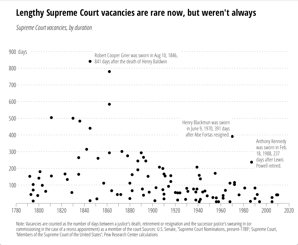
All the annotations go with the code. No more tricks, hacks or desperate calls for help on StackOverflow!

Now, this does add two new elements to the underlying gtable that gets built, so some other StackOverflow (et al) hacks may break if they don't use names (these elements are named in the gtable just like their ggplot2 names). We didn't muck with the widths/columns at all, so all those hacks (mostly for multi-plot alignment) should still work.

All the code/data is (again) in this gist.

>UPDATE: time spent per task factor order was wrong before. now fixed.

I caught this tweet today:

The WSJ folks usually do a great job, but this was either rushed or not completely thought through. There’s no way you’re going to be able to do any real comparisons between the segments across pies and direct pie % labels kinda mean they should have just made a table if they were going to phone it in.

Despite the fact that today is Pi[e] Day, these pies need to go.

If the intent was to primarily allow comparison of hours in-task, leaving some ability to compare the same time category across tasks, then bars are probably the way to go (you could do a parallel coordinates plot, but those looks like tangled guitar strings to me, so I’ll stick with bars). Here’s one possible alternative using R & ggplot2. Since I provide the data, please link to your own creations as I’d love to see how others would represent the data.

NOTE: I left direct bar labels off deliberately. My view is that (a) this is designed to be a relative comparison vs precise comparison & (b) it’s survey data and if we’re going to add #’s I’d feel compelled to communicate margin of error, etc. I don’t think that’s necessary.

library(ggplot2)
library(grid)
library(scales)
library(hrbrmisc) # devtools::install_github("hrbrmstr/hrbrmisc")
library(tidyr)
 
dat <- read.table(text=
"Task|less_than_one_hour_per_week|one_to_four_hours_per_week|one_to_three_hours_a_day|four_or_more_hours_a_day
Basic exploratory data analysis|11|32|46|12
Data cleaning|19|42|31|7
Machine learning, statistics|34|29|27|10
Creating visualizations|23|41|29|7
Presenting analysis|27|47|20|6
Extract, transform, load|43|32|20|5", sep="|", header=TRUE, stringsAsFactors=FALSE)
 
amount_trans <- c("less_than_one_hour_per_week"="<1 hr/\nwk", 
                  "one_to_four_hours_per_week"="1-4 hrs/\nwk", 
                  "one_to_three_hours_a_day"="1-3 hrs/\nday", 
                  "four_or_more_hours_a_day"="4+ hrs/\nday")
 
dat <- gather(dat, amount, value, -Task)
dat$value <- dat$value / 100
dat$amount <- factor(amount_trans[dat$amount], levels=amount_trans)
 
title_trans <- c("Basic exploratory data analysis"="Basic exploratory\ndata analysis", 
                 "Data cleaning"="Data\ncleaning", 
                 "Machine learning, statistics"="Machine learning,\nstatistics", 
                 "Creating visualizations"="Creating\nvisualizations", 
                 "Presenting analysis"="Presenting\nanalysis", 
                 "Extract, transform, load"="Extract,\ntransform, load")
 
dat$Task <-factor(title_trans[dat$Task], levels=title_trans)
 
gg <- ggplot(dat, aes(x=amount, y=value, fill=amount))
gg <- gg + geom_bar(stat="identity", width=0.75, color="#2b2b2b", size=0.05)
gg <- gg + scale_y_continuous(expand=c(0,0), labels=percent, limits=c(0, 0.5))
gg <- gg + scale_x_discrete(expand=c(0,1))
gg <- gg + scale_fill_manual(name="", values=c("#a6cdd9", "#d2e4ee", "#b7b079", "#efc750"))
gg <- gg + facet_wrap(~Task, scales="free")
gg <- gg + labs(x=NULL, y=NULL, title="Where Does the Time Go?")
gg <- gg + theme_hrbrmstr(grid="Y", axis="x", plot_title_margin=9)
gg <- gg + theme(panel.background=element_rect(fill="#efefef", color=NA))
gg <- gg + theme(strip.background=element_rect(fill="#858585", color=NA))
gg <- gg + theme(strip.text=element_text(family="OpenSans-CondensedBold", size=12, color="white", hjust=0.5))
gg <- gg + theme(panel.margin.x=unit(1, "cm"))
gg <- gg + theme(panel.margin.y=unit(0.5, "cm"))
gg <- gg + theme(legend.position="none")
gg <- gg + theme(panel.grid.major.y=element_line(color="#b2b2b2"))
gg <- gg + theme(axis.text.x=element_text(margin=margin(t=-10)))
gg <- gg + theme(axis.text.y=element_text(margin=margin(r=-10)))
 
ggplot_with_subtitle(gg, 
                     "The amount of time spent on various tasks by surveyed non-managers in data-science positions.",
                     fontfamily="OpenSans-CondensedLight", fontsize=12, bottom_margin=16)

RStudioScreenSnapz018