This is another purrr-focused post but it’s also an homage to the nascent magick package (R interface to ImageMagick) by @opencpu.
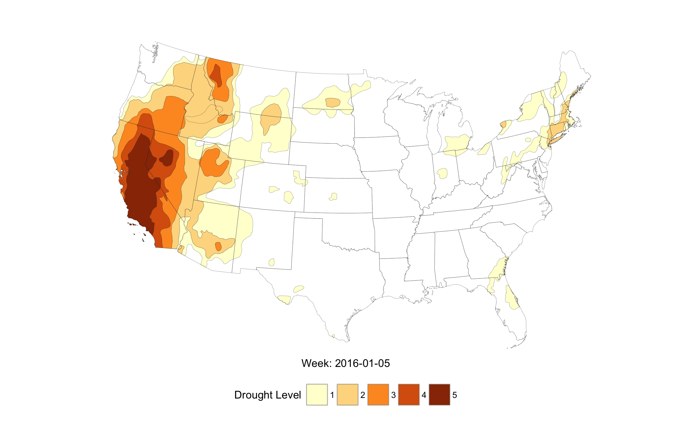
We’re starting to see/feel the impact of the increasing drought up here in southern Maine. I’ve used the data from the U.S. Drought Monitor before on the blog, but they also provide shapefiles and this seemed like a good opportunity to further demonstrate the utility of purrr and make animations directly using magick. Plus, I wanted to see the progression of the drought. Putting library() statements for purrr, magick and broom together was completely random, but I now feel compelled to find a set of functions to put into a cauldron package. But, I digress.
What does this demonstrate?
Apart from giving you an idea of the extent of the drought, working through this will help you:
- use the
quietly()function (which automagically turns off warnings for a function) - see another example of a formula function
- illustrate the utility
map_df(), and - see how to create an animation pipeline for
magick
Comments are in the code and the drought gif is at the end. I deliberately only had it loop once, so refresh the image if you want to see the progression again. Also, drop a note in the comments if anything needs more exposition. (NOTE: I was fairly bad and did virtually no file cleanup in the function, so you’ll have half a year’s shapefiles in your getwd(). Consider the cleanup an exercise for the reader :-)
library(rgdal)
library(sp)
library(albersusa) # devtools::install_github("hrbrmstr/albersusa")
library(ggplot2) # devtools::install_github("hadley/ggplot2")
library(ggthemes)
library(rgeos)

# the witch's brew
library(purrr)
library(broom)
library(magick)

#' Get a drought map shapefile and turn it into a PNG
drought_map <- function(wk) {

  # need to hush some chatty functions
  hush_tidy <- quietly(tidy)

  # some are more stubbon than others
  old_warn <- getOption("warn")
  options(warn=-1)

  week <- format(wk, "%Y%m%d")

  # get the drought shapefile only if we don't have it already
  URL <- sprintf("http://droughtmonitor.unl.edu/data/shapefiles_m/USDM_%s_M.zip", week)
  (fil <- basename(URL))
  if (!file.exists(fil)) download.file(URL, fil)
  unzip(fil)

  # read in the shapefile and reduce the polygon complexity
  dr <- readOGR(sprintf("USDM_%s.shp", week),
                sprintf("USDM_%s", week),
                verbose=FALSE,
                stringsAsFactors=FALSE)

  dr <- SpatialPolygonsDataFrame(gSimplify(dr, 0.01, TRUE), dr@data)

  # turn separate out each drought level into its own fortified data.frame
  map(dr$DM, ~subset(dr, DM==.)) %>%
    map(hush_tidy) %>%
    map_df("result", .id="DM") -> m

  # get a conus base map (prbly cld have done map_data("usa"), too)
  usa_composite() %>%
    subset(!(iso_3166_2 %in% c("AK", "HI"))) %>%
    hush_tidy() -> usa

  usa <- usa$result # an artifact of using quietly()

  # this is all Ushey's fault. the utility of cmd-enter to run
  # the entire ggplot2 chain (in RStudio) turns out to have a
  # greater productity boost (i measured it) than my shortcuts for
  # gg <- gg + snippets and hand-editing the "+" bits out when
  # editing old plot constructs. I'm not giving up on gg <- gg + tho

  # Note putting the "base" layer on top since we don't really
  # want to deal with alpha levels of the drought polygons and
  # we're only plotting the outline of the us/states, not filling
  # the interior(s).

  ggplot() +
    geom_map(data=m, map=m,
             aes(long, lat, fill=DM, map_id=id),
             color="#2b2b2b", size=0.05) +
    geom_map(data=usa, map=usa, aes(long, lat, map_id=id),
             color="#2b2b2b88", fill=NA, size=0.1) +
    scale_fill_brewer("Drought Level", palette="YlOrBr") +
    coord_map("polyconic", xlim=c(-130, -65), ylim=c(25, 50)) +
    labs(x=sprintf("Week: %s", wk)) +
    theme_map() +
    theme(axis.title=element_text()) +
    theme(axis.title.x=element_text()) +
    theme(axis.title.y=element_blank()) +
    theme(legend.position="bottom") +
    theme(legend.direction="horizontal") -> gg

  options(warn=old_warn) # put things back the way they were

  outfil <- sprintf("gg-dm-%s.png", wk)
  ggsave(outfil, gg, width=8, height=5)

  outfil

}

# - create a vector of weeks (minus the current one)
# - create the individual map PNGs
# - read the individual map PNGs into a list
# - join the images together
# - create the animated gif structure
# - write the gif to a file

seq(as.Date("2016-01-05"), Sys.Date(), by="1 week") %>%
  head(-1) %>%
  map(drought_map) %>%
  map(image_read) %>%
  image_join() %>%
  image_animate(fps=2, loop=1) %>%
  image_write("drought.gif")
NOTE: an updated, comment-free version of the above code block is in this gist and uses spdplyr::filter() vs subset(), keeps downloaded files tidy in a temporary directory and includes a progress bar vs raw, ugly download.file() messages.

4 Trackbacks/Pingbacks
[…] article was first published on R – rud.is, and kindly contributed to […]
[…] which I still love, but in the meantime I also fell in love with magick in particular since reading Bob’s post. So I decided to re-write my code with magick. On this blog I already published an article […]
[…] which I still love, but in the meantime I also fell in love with magick in particular since reading Bob’s post. So I decided to re-write my code with magick. On this blog I already published an article […]
[…] which I still love, but in the meantime I also fell in love with magick in particular since reading Bob’s post. So I decided to re-write my code with magick. On this blog I already published an article […]