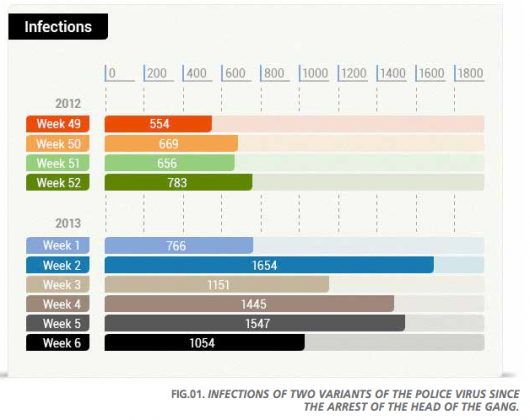
We infosec folk eat up industry reports and most of us have no doubt already gobbled up @panda_security’s recently released Q1 2013 Report [PDF]. It’s a good read (so go ahead and read it, we’ll still be here!) and I was really happy to see a nicely stylized chart in the early pages:
However, I quickly became a #sadpanda when I happened across some explosive 3D pie charts later on. Rather than deride, I thought a re-imagining would be a better use of time and let you decide which visualizations both communicate better and are more appealing.
I chose to use @Datawrapper to showcase how easy it is to build and publish pleasing and informative visualizations without even leaving your browser.
Figure 4, Original:
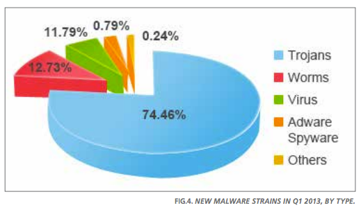
Figure 4, Alternative:
Figure 5, Original
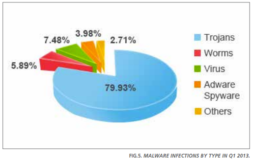
Figure 5, Alternative (horizontal vs vertical, just to mix it up a bit):
If the charts had been closer together in the report, I would have opted for vertical design for both and probably kept malware-type ordering vs sort by highest percentage.
How would you re-imagine the pie charts? Post a link to your creations in the comments and I’ll make sure they show up embedded with the post.
No comments yet.