@adammontville posited that Figure 15 from this year’s DBIR could use some slopegraph love. As I am not one to back down from a reasonable challenge, I obliged.
Here’s the original chart (produced by @jayjacobs):

and, here’s a very quick slopegraph version of it:
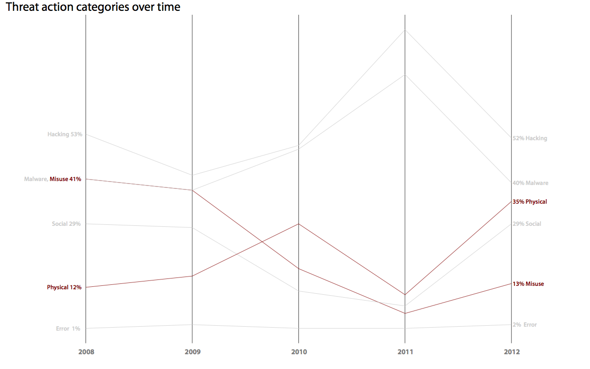
You can click on both/either for a larger version. If I had more time, I could have made the slopegraph version nicer, but it conveys a story fairly well the way it is, especially with the highlight on the two biggest changes between 2008 & 2012.
Two problems with the modified visualization are (a) multi-column slopegraphs blend into a parallel coordinate or plain old line graph pretty quickly (thus, reducing their slopegraph-y goodness); and, (b) the diversity of the year-over-year DBIR data set makes the comparison between years almost pointless (as the DBIR itself points out).
I also generated a proper/traditional slopegraph, comparing 2008 to 2012:

The visualization is far more compact and, if the goal was to show the change between 2008 and 2012, it provides a much clearer view of what has and has not changed.
No comments yet.