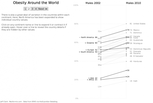
Given my obsession with slopegraphs, I’m not sure how I missed this post back in late February by @JeffClark that includes a very nicely executed interactive sloepgraph on the global obesity problem. He used Processing & Processing JS to build the visualization and I think it illustrates how well animation/interaction and slopegraphs work together. It would be even spiffier if demographic & obesity details (perhaps even a dynamic map) were displayed as you select a country/region.
You can try your hand at an alternate implementation by grabbing the data and playing along at home.
No comments yet.