Naomi Robbins is running a graph makeover challenge over at her Forbes blog and this is my entry for the B2B/B2C Traffic Sources one (click for larger version):
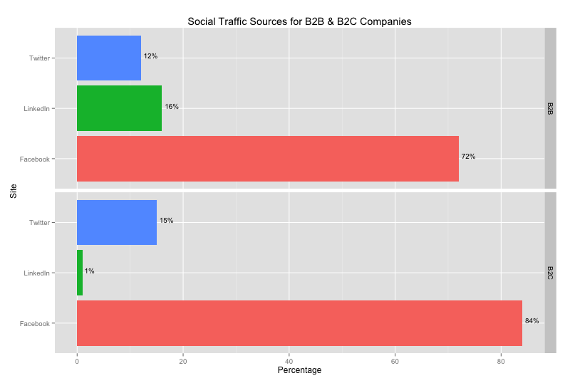
And, here’s the R source for how to generate it:
library(ggplot2)

df = read.csv("b2bb2c.csv")

ggplot(data=df,aes(x=Site,y=Percentage,fill=Site)) +
  geom_bar(stat="identity") +
  facet_grid(Venue ~ .) +
  coord_flip() +
  opts(legend.position = "none", title="Social Traffic Sources for B2B & B2C Companies") +
  stat_bin(geom="text", aes(label=sprintf("%d%%",Percentage), vjust=0, hjust=-0.2, size = 10))
And, here’s the data:
Site     Venue	Percentage
Facebook B2B	72
LinkedIn B2B	16
Twitter	 B2B	12
Facebook B2C	84
LinkedIn B2C	1
Twitter	 B2C	15
I chose to go with a latticed bar chart as I think it helps show the relative portions within each category (B2B/B2C) and also enables quick comparisons across categories for all three factors.
No comments yet.