The recent announcement of the start of egg rationing in the U.S. made me curious enough about the avian flu outbreak to try to dig into the numbers a bit. I finally stumbled upon a USDA site that had an embedded HTML table of flock outbreak statistics by state, county and date (also flock type and whether it was a commercial enterprise or “backyard” farm). Just looking at the sum of flock sizes on that page shows that nearly 50 million birds have been impacted since December, 2014.
We can scrape the data with R & rvest and then use the shapefile hexbins from previous posts to watch the spread week-over-week.
The number of packages I ended up relying on was a bit surprising. Let’s get them out of the way before focusing on the scraping and hexbin-making:
library(rvest)     # scraping
library(stringr)   # string manipulation
library(lubridate) # date conversion
library(dplyr)     # data mjnging
library(zoo)       # for locf
library(ggplot2)   # plotting
library(rgdal)     # map stuff
library(rgeos)     # map stuff
We also end up using magrittr and tidyr but only for one function, so you’ll see those with :: in the code.
Grabbing the USDA page is pretty straightforward:
url <- "http://www.aphis.usda.gov/wps/portal/aphis/ourfocus/animalhealth/sa_animal_disease_information/sa_avian_health/ct_avian_influenza_disease/!ut/p/a1/lVJbb4IwFP41e1qwFZDLI-oUnGgyswm8kAMUaAaFQNG4X7-ibnEPYtakDz3nO_kupyhAHgoYHGgGnFYMiv4daOFqa8vjKZad5c58wc7mY-Eaa13Z2qoA-AKA7xwL_53fvjpaP_-Gp_Z8jHcK2qMABTHjNc-RD3VO2zCuGCeMhwWNGmhOT7iFsOqaMK3irj2_gNESijAnUPD8tpLQlkBLQsrSqinPJi7tAwX2i4_5tSBgRUfYF_wM9mLqmCbIj2QzxZpMJMUYg6TGkSLBBCaSPEnSJIljXVH0q_kBdw_CO5sXkNnSslV9LQJTDRk7czGumy7GjnYFDOTrCw36XRJTRbt_mlo9VD1FgfuctqrVByA37szNBAPwXOpzR97gPi7tm30gb2AfQkxWVJH4ifvZLavFIsUQrA1JSUOaUV61HHnH43HUtQmMsuqA6vK9NJST9JluNlKwyPr7DT6YvRs!/?1dmy&urile=wcm%3apath%3a%2Faphis_content_library%2Fsa_our_focus%2Fsa_animal_health%2Fsa_animal_disease_information%2Fsa_avian_health%2Fsa_detections_by_states%2Fct_ai_pacific_flyway"

#' read in the data, extract the table and clean up the fields
#' also clean up the column names to since they are fairly nasty

pg <- html(url)
If you poke at the source for the page you’ll see there are two tables in the code and we only need the first one. Also, if you scan the rendered table on the USDA page by eye you’ll see that the column names are horrible for data analysis work and they are also inconsistent in the values used for various columns. Furthermore, there are commas in the flock counts and it would be handy to have the date as an actual date type. We can extract the table we need and clean all that up in a reasonably-sized dplyr pipe:
pg %>%
  html_nodes("table") %>%
  magrittr::extract2(1) %>%
  html_table(header=TRUE) %>%
  filter(`Flock size`!="pending") %>%
  mutate(Species=str_replace(tolower(Species), "s$", ""),
         `Avian influenza subtype*`=str_replace_all(`Avian influenza subtype*`, " ", ""),
         `Flock size`=as.numeric(str_replace_all(`Flock size`, ",", "")),
         `Confirmation date`=as.Date(mdy(`Confirmation date`))) %>%
  rename(state=State, county=County, flyway=Flyway, flock_type=`Flock type`,
         species=Species, subtype=`Avian influenza subtype*`, date=`Confirmation date`,
         flock_size=`Flock size`) -> birds
Let’s take a look at what we have:
glimpse(birds)

## Observations: 202
## Variables:
## $ state      (chr) "Iowa", "Minnesota", "Minnesota", "Iowa", "Minnesota", "Iowa",...
## $ county     (chr) "Sac", "Renville", "Renville", "Hamilton", "Kandiyohi", "Hamil...
## $ flyway     (chr) "Mississippi", "Mississippi", "Mississippi", "Mississippi", "M...
## $ flock_type (chr) "Commercial", "Commercial", "Commercial", "Commercial", "Comme...
## $ species    (chr) "turkey", "chicken", "turkey", "turkey", "turkey", "turkey", "...
## $ subtype    (chr) "EA/AM-H5N2", "EA/AM-H5N2", "EA/AM-H5N2", "EA/AM-H5N2", "EA/AM...
## $ date       (date) 2015-06-04, 2015-06-04, 2015-06-04, 2015-06-04, 2015-06-03, 2...
## $ flock_size (dbl) 42200, 415000, 24800, 19600, 37000, 26200, 17200, 1115700, 159...
To make an animated map of cumulative flock totals by week, we’ll need to
- group the
birdsdata frame by week and state - calculate the cumulative sums
- fill in the gaps where there are missing state/week combinations
- carry the last observations by state/week forward in this expanded data frame
- make breaks for data ranges so we can more intelligently map them to colors
This ends up being a longer dplyr pipe than I usuall like to code (I think very long ones are hard to follow) but it gets the job done and is still pretty readable:
birds %>%
  mutate(week=as.numeric(format(birds$date, "%Y%U"))) %>%
  arrange(week) %>%
  group_by(week, state) %>%
  tally(flock_size) %>%
  group_by(state) %>%
  mutate(cum=cumsum(n)) %>%
  ungroup %>%
  select(week, state, cum) %>%
  mutate(week=as.Date(paste(week, 1), "%Y%U %u")) %>%
  left_join(tidyr::expand(., week, state), .) %>%
  group_by(state) %>%
  do(na.locf(.)) %>%
  mutate(state_abb=state.abb[match(state, state.name)],
         cum=as.numeric(ifelse(is.na(cum), 0, cum)),
         brks=cut(cum,
                  breaks=c(0, 200, 50000, 1000000, 10000000, 50000000),
                  labels=c("1-200", "201-50K", "50k-1m",
                           "1m-10m", "10m-50m"))) -> by_state_and_week
Now, we perform the standard animation steps:
- determine where we’re going to break the data up
- feed that into a loop
- partition the data in the loop
- render the plot to a file
- combine all the individual images into an animation
For this graphic, I’m doing something a bit extra. The color ranges for the hexbin choropleth go from very light to very dark, so it would be helpful if the titles for the states went from very dark to very light, matching the state colors. The lines that do this check for state breaks that fall in the last two values and appropriately assign "black" or "white" as the color.
i <- 0

for (wk in unique(by_state_and_week$week)) {

  # filter by week

  by_state_and_week %>% filter(week==wk) -> this_wk

  # hack to let us color the state labels in white or black depending on
  # the value of the fill

  this_wk %>%
    filter(brks %in% c("1m-10m", "10m-50m")) %>%
    .$state_abb %>%
    unique -> white_states

  centers %>%
    mutate(txt_col="black") %>%
    mutate(txt_col=ifelse(id %in% white_states, "white", "black")) -> centers

  # setup the plot

  gg <- ggplot()
  gg <- gg + geom_map(data=us_map, map=us_map,
                      aes(x=long, y=lat, map_id=id),
                      color="white", fill="#dddddd", size=2)
  gg <- gg + geom_map(data=this_wk, map=us_map,
                      aes(fill=brks, map_id=state_abb),
                      color="white", size=2)
  gg <- gg + geom_text(data=centers,
                       aes(label=id, x=x, y=y, color=txt_col), size=4)
  gg <- gg + scale_color_identity()
  gg <- gg + scale_fill_brewer(name="Combined flock size\n(all types)",
                               palette="RdPu", na.value="#dddddd", drop=FALSE)
  gg <- gg + guides(fill=guide_legend(override.aes=list(colour=NA)))
  gg <- gg + coord_map()
  gg <- gg + labs(x=NULL, y=NULL,
                  title=sprintf("U.S. Avian Flu Total Impact as of %s\n", wk))
  gg <- gg + theme_bw()
  gg <- gg + theme(plot.title=element_text(face="bold", hjust=0, size=24))
  gg <- gg + theme(panel.border=element_blank())
  gg <- gg + theme(panel.grid=element_blank())
  gg <- gg + theme(axis.ticks=element_blank())
  gg <- gg + theme(axis.text=element_blank())
  gg <- gg + theme(legend.position="bottom")
  gg <- gg + theme(legend.direction="horizontal")
  gg <- gg + theme(legend.title.align=1)

  # save the image

  # i'm using "quartz" here since I'm on a Mac. Use what works for you system to ensure you
  # get the best looking output png

  png(sprintf("output/%03d.png", i), width=800, height=500, type="quartz")
  print(gg)
  dev.off()

  i <- i + 1

}
We could use one of the R animation packages to actually make the animation, but I know ImageMagick pretty well so I just call it as a system command:
system("convert -delay 60 -loop 1 output/*png output/avian.gif")All that results in:
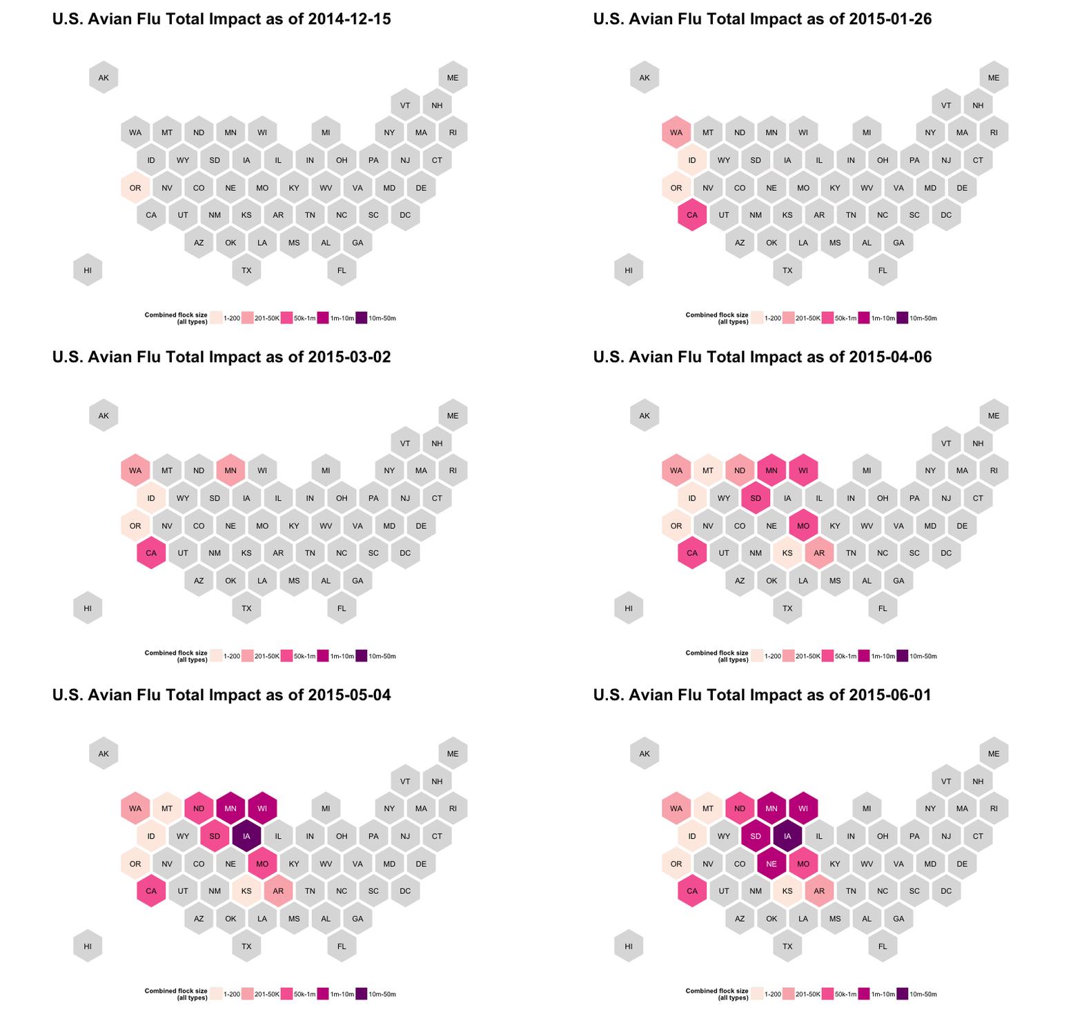
If that’s a static image, open it in a new tab/window (or just click on it). I really didn’t want to do a looping gif but if you do just make the -loop 1 into -loop 0.
Now, we can just re-run the code when the USDA refreshes the data.
The code, data and sample bitmaps are on github.
No comments yet.