This year, I’d been coming across the Archivo font on a semi-regular basis, and the revamp of the blog gave me the excuse to finally fold it into {hrbrthemes} as theme_ipsum_archivo(). I also added humanize_duration(), which turns a computed difftime into something you can shunt into prose, subtitle, or annotations to make a time range a bit more grokable.
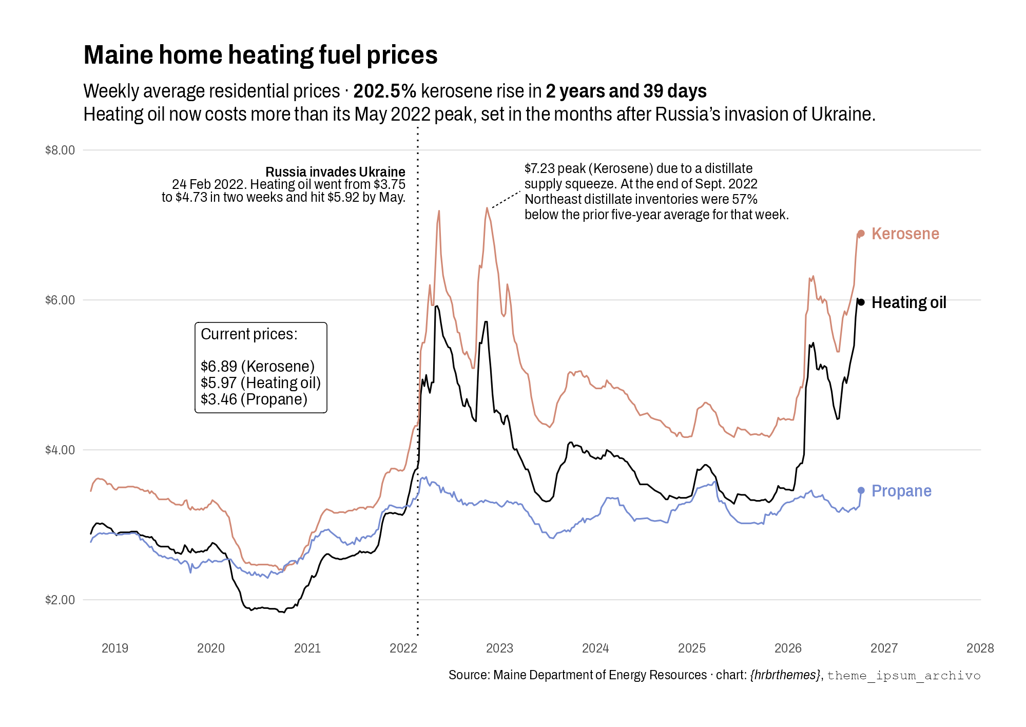
Before explaining the font choice and theme add, here’s a working example of the theme at work, including some extended annotations using Archivo.
Why Archivo
Archivo is a grotesque sans from Omnibus-Type, designed by Héctor Gatti and derived from Chivo. It was built for both print and screen and looks like a late 19th century American display type used for “job printing”.
What is “job printing”, you ask?
Printing shops split work into categories. Book work and newspaper work meant long runs of continuous text in a few sober body faces. “Job work” was everything else: handbills, posters, tickets, letterheads, trade cards, labels, auction notices, playbills, and more. Job printers needed type that grabbed attention at a glance, so they bought lots of small fonts of display faces in many sizes and styles.
The family sprawls across widths and weights. I settled on the semi-condensed variant since I’m a yuge fan of using condensed variants in {ggplot2} work. Since we haven’t talked {ggplopt2} or {hrbrthemes} here in a while, these are a few of the attributes that make it a solid choice over other condensed variants in the Archivo family:
- A tall x-height. Lowercase letters stand 526 units tall on a 1,000-unit em (the font’s design grid, which scales to whatever point size you set), against 686 units for capitals. That puts lowercase at 0.767 of cap height, taller than every other face in the package by the same measure: Goldman Sans Condensed lands at 0.755–0.761, Roboto Condensed at 0.743, Arial at 0.724, and Econ Sans Condensed at 0.700–0.717. Because point size fixes the em and leaves letter height to the designer, a taller x-height packs more readable lowercase into each point, so 9pt axis labels and 3.4pt annotation text stay legible instead of turning into gray soup.
- Semi-condensed width. This lets you fit more characters per inch, which is super helpful when you have a decade’s worth of date labels, dollar-formatted ticks, and long annotation lines that would otherwise collide with the data. The condensed variant felt a bit too “squished” for chart work.
- Real figure support. The GSUB table carries
tnum,onum,lnum, andpnumalongsidefrac,sups,subs, and a slashedzero. Tabular figures mean price labels and aligned annotation numbers stay in column, and three weights (400, 600, and 680 for bold) across five optical sizes provides for a very usable hierarchy in just a single variant.
I embedded Regular, Italic, SemiBold, SemiBold Italic, and Bold into the package each around 830 glyphs. The theme provides named variable shorthands for them: font_ar for body text, font_ar_sb for emphasis inside labels, font_ar_bold for titles, font_ar_italic and font_ar_sb_italic for the italic runs that {ggtext} markdown renders.
NOTE: run
import_archivo()once and install the fonts from theinst/fonts/archivo-semicondenseddirectory in your system font manager, or every text element silently falls back to whatever your graphics device picks next.
Humanizing a duration
The second addition is humanize_duration(), which takes seconds (numeric) or a difftime and returns English. It uses an Oxford comma when three or more units show up, pluralizes properly, maps NA to NA, and turns a zero-second span into “0 seconds”.
humanize_duration(3661)                    # "1 hour and 1 minute"
humanize_duration(3661, units_max = 3)     # "1 hour, 1 minute, and 1 second"
humanize_duration(as.difftime(770, units = "days"))  # "2 years and 39 days"
There are other packages with similar functions, but this one does what I need without forcing yet-another dependency.
The chart
The example above runs on the Maine Department of Energy Resources’ weekly residential heating fuel prices (I also have a dedicated Observable Framework site for the chart and one for the data mirror), with nearly 1,200 weekly observations from October 1, 2018 through October 5, 2026.
library(tidyverse)
library(ggtext)
library(hrbrthemes)

xdf <- read_csv("https://rud.is/data/maine-doer-fuel.csv", show_col_types = FALSE)

xdf |>
  pivot_longer(-date, names_to = "fuel", values_to = "price") |>
  filter(!is.na(price)) -> long

fuel_lab <- c(heating_oil = "Heating oil", kerosene = "Kerosene", propane = "Propane")
fuel_col <- c(heating_oil = "black", kerosene = "#d18975", propane = "#758bd1")
last_date <- max(long$date)
long |>
  filter(date == last_date) |>
  mutate(lab = fuel_lab[fuel]) |>
  arrange(desc(price)) -> ends

kd <- filter(long, fuel == "kerosene")
trof <- filter(kd, date == as.Date("2020-10-05"))
peak <- slice_max(kd, price, n = 1)
runup_days <- peak$date - trof$date
rise <- peak$price - trof$price
pct <- scales::percent(peak$price / trof$price - 1, accuracy = 0.1)

ggplot(long, aes(date, price, colour = fuel)) +
  geom_vline(
    xintercept = as.Date("2022-02-24"),
    linetype = "dotted",
    linewidth = 1/2
  ) +
  annotate(
    "richtext",
    x = as.Date("2022-02-24") - 25,
    y = 7.85,
    label = paste0(
      "<span style='font-family:\"", font_ar_sb, "\"'>Russia invades Ukraine</span><br/>",
      "24 Feb 2022. Heating oil went from $3.75<br/>",
      "to $4.73 in two weeks and hit $5.92 by May."
    ),
    family = font_ar,
    size = 3.4,
    hjust = 1,
    vjust = 1,
    lineheight = 0.875,
    fill = NA,
    label.colour = NA
  ) +
  geom_line(linewidth = 1/2, lineend = "round") +
  geom_point(data = ends, size = 1.5, show.legend = FALSE) +
  geom_text(
    data = ends,
    aes(label = lab),
    family = font_ar_sb,
    hjust = 0,
    nudge_x = 40,
    size = 4,
    show.legend = FALSE
  ) +
  annotate(
    "richtext",
    x = as.Date("2019-11-01"),
    y = 5.7,
    label = glue::glue(r"(Current prices:<br/><br/>{sprintf('$%s (%s)', ends$price, ends$lab) |> paste0(collapse="<br/>\n")})"),
    family = font_ar,
    lineheight = 0.985,
    vjust = 1,
    hjust = 0,
  ) +
  annotate(
    "segment",
    x = peak$date + 20,
    xend = as.Date("2023-03-20"),
    y = peak$price,
    yend = 7.45,
    colour = "black",
    linewidth = 0.35,
    linetype = "22"
  ) +
  annotate(
    "text",
    x = as.Date("2023-04-05"),
    y = 7.45,
    label = sprintf("$%.2f peak (Kerosene) due to a distillate\nsupply squeeze. At the end of Sept. 2022\nNortheast distillate inventories were 57%%\nbelow the prior five-year average for that week.", peak$price),
    family = font_ar,
    size = 3.4,
    colour = "black",
    hjust = 0,
    vjust = 0.5,
    lineheight = 0.875
  ) +
  scale_colour_manual(values = fuel_col, guide = "none") +
  scale_x_date(
    date_breaks = "1 year",
    date_labels = "%Y",
    expand = expansion(mult = c(0.01, 0.14))
  ) +
  scale_y_continuous(
    labels = scales::dollar_format(accuracy = 0.01),
    limits = c(NA, 8),
  ) +
  labs(
    title = "Maine home heating fuel prices",
    subtitle = glue::glue("Weekly average residential prices \u00b7 **{pct}** kerosene rise in **{humanize_duration(runup_days)}**<br/>Heating oil now costs more than its May 2022 peak, set in the months after Russia's invasion of Ukraine."),
    x = NULL, y = NULL,
    caption = "Source: Maine Department of Energy Resources \u00b7 chart: *{hrbrthemes}*, <span style='font-family:mono'>theme_ipsum_archivo</span>"
  ) +
  theme_ipsum_archivo(grid = "Y") +
  theme(
    plot.subtitle = element_textbox_simple(
      height = unit(2, "lines")
    ),
    plot.caption  = element_markdown()
  )
FIN
Both additions are in the dev mode package. Kick the tyres, and drop an note if anything feels amiss.
The included fonts are OFL, the theme is MIT, and the heating fuel series gets refreshed weekly if you want to re-run the chart against newer data (you may need to tweak the placement of the annotations).
No comments yet.