
We were doing some exploratory data analysis on some attacker data at work and one of the things I was interested is what were “working hours” by country. Now, I don’t put a great deal of faith in the precision of geolocated IP addresses since every geolocation database that exists thinks I live in Vermont (I don’t) and I know that these databases rely on a pretty “meh” distributed process for getting this local data. However, at a country level, the errors are tolerable provided you use a decent geolocation provider. Since a rant about the precision of IP address geolocation was not the point of this post, let’s move on.
One of the best ways to visualize these “working hours” is a temporal heatmap. Jay & I made a couple as part of our inaugural Data-Driven Security Book blog post to show how much of our collected lives were lost during the creation of our tome.
I have some paired-down, simulated data based on the attacker data we were looking at. Rather than the complete data set, I’m providing 200,000 “events” (RDP login attempts, to be precise) in the eventlog.csv file in the data/ directory that have the timestamp, and the source_country ISO 3166-1 alpha-2 country code (which is the source of the attack) plus the tz time zone of the source IP address. Let’s have a look:
library(data.table)  # faster fread() and better weekdays()
library(dplyr)       # consistent data.frame operations
library(purrr)       # consistent & safe list/vector munging
library(tidyr)       # consistent data.frame cleaning
library(lubridate)   # date manipulation
library(countrycode) # turn country codes into pretty names
library(ggplot2)     # base plots are for Coursera professors
library(scales)      # pairs nicely with ggplot2 for plot label formatting
library(gridExtra)   # a helper for arranging individual ggplot objects
library(ggthemes)    # has a clean theme for ggplot2
library(viridis)     # best. color. palette. evar.
library(knitr)       # kable : prettier data.frame output

attacks <- tbl_df(fread("data/eventlog.csv"))

kable(head(attacks))| timestamp | source_country | tz |
|---|---|---|
| 2015-03-12T15:59:16.718901Z | CN | Asia/Shanghai |
| 2015-03-12T16:00:48.841746Z | FR | Europe/Paris |
| 2015-03-12T16:02:26.731256Z | CN | Asia/Shanghai |
| 2015-03-12T16:02:38.469907Z | US | America/Chicago |
| 2015-03-12T16:03:22.201903Z | CN | Asia/Shanghai |
| 2015-03-12T16:03:45.984616Z | CN | Asia/Shanghai |
For a temporal heatmap, we’re going to need the weekday and hour (or as granular as you want to get). I use a factor here so I can have ordered weekdays. I need the source timezone weekday/hour so we have to get a bit creative since the time zone parameter to virtually every date/time operation in R only handles a single element vector.
make_hr_wkday <- function(cc, ts, tz) {

  real_times <- ymd_hms(ts, tz=tz[1], quiet=TRUE)

  data_frame(source_country=cc,
             wkday=weekdays(as.Date(real_times, tz=tz[1])),
             hour=format(real_times, "%H", tz=tz[1]))

}

group_by(attacks, tz) %>%
  do(make_hr_wkday(.$source_country, .$timestamp, .$tz)) %>%
  ungroup() %>%
  mutate(wkday=factor(wkday,
                      levels=levels(weekdays(0, FALSE)))) -> attacks
kable(head(attacks))| tz | source_country | wkday | hour |
|---|---|---|---|
| Africa/Cairo | BG | Saturday | 22 |
| Africa/Cairo | TW | Sunday | 08 |
| Africa/Cairo | TW | Sunday | 10 |
| Africa/Cairo | CN | Sunday | 13 |
| Africa/Cairo | US | Sunday | 17 |
| Africa/Cairo | CA | Monday | 13 |
It’s pretty straightforward to make an overall heatmap of activity. Group & count the number of “attacks” by weekday and hour then use geom_tile(). I’m going to clutter up the pristine ggplot2 commands with some explanation for those still learning ggplot2:
wkdays <- count(attacks, wkday, hour)

kable(head(wkdays))| wkday | hour | n |
|---|---|---|
| Sunday | 00 | 1076 |
| Sunday | 01 | 1307 |
| Sunday | 02 | 1189 |
| Sunday | 03 | 1301 |
| Sunday | 04 | 1145 |
| Sunday | 05 | 1313 |
Here, we’re just feeding in the new data.frame we just created to ggplot and telling it we want to use the hour column for the x-axis, the wkday column for the y-axis and that we are doing a continuous scale fill by the n aggregated count:
gg <- ggplot(wkdays, aes(x=hour, y=wkday, fill=n))This does all the hard work. geom_tile() will make tiles at each x&y location we’ve already specified. I knew we had events for every hour, but if you had missing days or hours, you could use tidyr::complete() to fill those in. We’re also telling it to use a thin (0.1 units) white border to separate the tiles.
gg <- gg + geom_tile(color="white", size=0.1)this has some additional magic in that it’s an awesome color scale. Read the viridis package vignette for more info. By specifying a name here, we get a nice label on the legend.
gg <- gg + scale_fill_viridis(name="# Events", label=comma)This ensures the plot will have a 1:1 aspect ratio (i.e. geom_tile()–which draws rectangles–will draw nice squares).
gg <- gg + coord_equal()This tells ggplot to not use an x- or y-axis label and to also not reserve any space for them. I used a pretty bland but descriptive title. If I worked for some other security company I’d’ve added “ZOMGOSH CHINA!” to it.
gg <- gg + labs(x=NULL, y=NULL, title="Events per weekday & time of day")Here’s what makes the plot look really nice. I customize a number of theme elements, starting with a base theme of theme_tufte() from the ggthemes package. It removes alot of chart junk without having to do it manually.
gg <- gg + theme_tufte(base_family="Helvetica")I like my plot titles left-aligned. For hjust:
0== left0.5== centered1== right
gg <- gg + theme(plot.title=element_text(hjust=0))We don’t want any tick marks on the axes and I want the text to be slightly smaller than the default.
gg <- gg + theme(axis.ticks=element_blank())
gg <- gg + theme(axis.text=element_text(size=7))
For the legend, I just needed to tweak the title and text sizes a wee bit.
gg <- gg + theme(legend.title=element_text(size=8))
gg <- gg + theme(legend.text=element_text(size=6))
gg
(NOTE: there’s an alternate version of this post with SVG graphics and nicer tables)
That’s great, but what if we wanted the heatmap breakdown by country? We’ll do this two ways, first with each country’s heatmap using the same scale, then with each one using it’s own scale. That will let us compare at a macro and micro level.
For either view, I want to rank-order the countries and want nice country names versus 2-letter abbreviations. We’ll do that first:
count(attacks, source_country) %>%
  mutate(percent=percent(n/sum(n)), count=comma(n)) %>%
  mutate(country=sprintf("%s (%s)",
                         countrycode(source_country, "iso2c", "country.name"),
                         source_country)) %>%
  arrange(desc(n)) -> events_by_country

kable(events_by_country[,5:3])| country | count | percent |
|---|---|---|
| China (CN) | 85,243 | 42.6% |
| United States (US) | 48,684 | 24.3% |
| Korea, Republic of (KR) | 12,648 | 6.3% |
| Netherlands (NL) | 8,572 | 4.3% |
| Viet Nam (VN) | 6,340 | 3.2% |
| Taiwan, Province of China (TW) | 3,469 | 1.7% |
| United Kingdom (GB) | 3,266 | 1.6% |
| France (FR) | 3,252 | 1.6% |
| Ukraine (UA) | 2,219 | 1.1% |
| Germany (DE) | 2,055 | 1.0% |
| Argentina (AR) | 1,793 | 0.9% |
| Canada (CA) | 1,646 | 0.8% |
| Russian Federation (RU) | 1,633 | 0.8% |
| Japan (JP) | 1,476 | 0.7% |
| Singapore (SG) | 1,278 | 0.6% |
| Hong Kong (HK) | 1,239 | 0.6% |
| … | … | … |
Now, we’ll do a simple ggplot facet, but also exclude the top 2 attacking countries since they skew things a bit (and, we’ll see them in the last vis):
filter(attacks, source_country %in% events_by_country$source_country[3:12]) %>%
  count(source_country, wkday, hour) %>%
  ungroup() %>%
  left_join(events_by_country[,c(1,5)]) %>%
  complete(country, wkday, hour, fill=list(n=0)) %>%
  mutate(country=factor(country,
                        levels=events_by_country$country[3:12])) -> cc_heat
Before we go all crazy and plot, let me explain ^^ a bit. I’m filtering by the top 10 (excluding the top 2) countries, then doing the group/count. I need the pretty country info, so I’m joining that to the result. Not all countries attacked every day/hour, so we use that complete() operation I mentioned earlier to ensure we have values for all countries for each day/hour combination. Finally, I want to print the heatmaps in order, so I turn the country into an ordered factor.
gg <- ggplot(cc_heat, aes(x=hour, y=wkday, fill=n))
gg <- gg + geom_tile(color="white", size=0.1)
gg <- gg + scale_fill_viridis(name="# Events")
gg <- gg + coord_equal()
gg <- gg + facet_wrap(~country, ncol=2)
gg <- gg + labs(x=NULL, y=NULL, title="Events per weekday & time of day by country\n")
gg <- gg + theme_tufte(base_family="Helvetica")
gg <- gg + theme(axis.ticks=element_blank())
gg <- gg + theme(axis.text=element_text(size=5))
gg <- gg + theme(panel.border=element_blank())
gg <- gg + theme(plot.title=element_text(hjust=0))
gg <- gg + theme(strip.text=element_text(hjust=0))
gg <- gg + theme(panel.margin.x=unit(0.5, "cm"))
gg <- gg + theme(panel.margin.y=unit(0.5, "cm"))
gg <- gg + theme(legend.title=element_text(size=6))
gg <- gg + theme(legend.title.align=1)
gg <- gg + theme(legend.text=element_text(size=6))
gg <- gg + theme(legend.position="bottom")
gg <- gg + theme(legend.key.size=unit(0.2, "cm"))
gg <- gg + theme(legend.key.width=unit(1, "cm"))
gg
To get individual scales for each country we need to make n separate ggplot object and combine then using gridExtra::grid.arrange. It’s pretty much the same setup as before, only without the facet call. We’ll do the top 16 countries (not excluding anything) this way (pick any number you want, though provided you like scrolling). I didn’t bother with a legend title since you kinda know what you’re looking at by now :-)
count(attacks, source_country, wkday, hour) %>%
  ungroup() %>%
  left_join(events_by_country[,c(1,5)]) %>%
  complete(country, wkday, hour, fill=list(n=0)) %>%
  mutate(country=factor(country,
                        levels=events_by_country$country)) -> cc_heat2

lapply(events_by_country$country[1:16], function(cc) {
  gg <- ggplot(filter(cc_heat2, country==cc),
               aes(x=hour, y=wkday, fill=n, frame=country))
  gg <- gg + geom_tile(color="white", size=0.1)
  gg <- gg + scale_x_discrete(expand=c(0,0))
  gg <- gg + scale_y_discrete(expand=c(0,0))
  gg <- gg + scale_fill_viridis(name="")
  gg <- gg + coord_equal()
  gg <- gg + labs(x=NULL, y=NULL,
                  title=sprintf("%s", cc))
  gg <- gg + theme_tufte(base_family="Helvetica")
  gg <- gg + theme(axis.ticks=element_blank())
  gg <- gg + theme(axis.text=element_text(size=5))
  gg <- gg + theme(panel.border=element_blank())
  gg <- gg + theme(plot.title=element_text(hjust=0, size=6))
  gg <- gg + theme(panel.margin.x=unit(0.5, "cm"))
  gg <- gg + theme(panel.margin.y=unit(0.5, "cm"))
  gg <- gg + theme(legend.title=element_text(size=6))
  gg <- gg + theme(legend.title.align=1)
  gg <- gg + theme(legend.text=element_text(size=6))
  gg <- gg + theme(legend.position="bottom")
  gg <- gg + theme(legend.key.size=unit(0.2, "cm"))
  gg <- gg + theme(legend.key.width=unit(1, "cm"))
  gg
}) -> cclist

cclist[["ncol"]] <- 2

do.call(grid.arrange, cclist)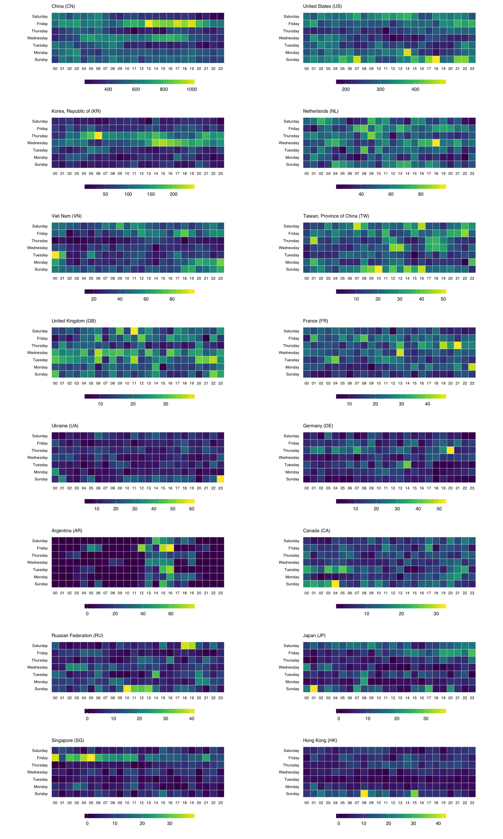
You can find the data and source for this R markdown document on github. You’ll need to devtools::install_github("hrbrmstr/hrbrmrkdn") first since I’m using a custom template (or just change the output: to html_document in the YAML header).

Pingback: Making Faceted Heatmaps with ggplot2 – Mubashir Qasim
In this block of code,
count(attacks, sourcecountry) %>%
mutate(percent=percent(n/sum(n)), count=comma(n)) %>%
mutate(country=sprintf(“%s (%s)”,
countrycode(sourcecountry, “iso2c”, “country.name”),
sourcecountry)) %>%
arrange(desc(n)) -> eventsby_country
ktable(eventsbycountry[,5:3])
did you mean
kableinstead ofktableAye. Thx. I’ve updated the post.
Nice post. Is it possible to change Weekdays ordering on Y-axis? the desired result would be “Monday”, “Tuesday”,…, “Sunday”.
Pingback: real steroids suppliers
Awesome post! I spent one day trying to face a heatmap on different free scales until I discovered this post. Direct to the point. Thanks a lot for your work!
when running the first make_hr_wkday function i get the following error:
Error in UseMethod(“weekdays”) :
no applicable method for ‘weekdays’ applied to an object of class “c(‘double’, ‘numeric’)”
Please download and use the project code that is referenced in the post: https://github.com/hrbrmstr/facetedcountryheatmaps